
Open-Source Internship opportunity by OpenGenus for programmers. Apply now.
Speaking of layout of CSS, Float, Flexbox and Grid would come in you mind? If your answer is no, do not worry, this article at OpenGenus will help you to get started on Flexbox in depth. Following this, you will be able to use this freely in your HTML/ CSS code.
You might ask only learning Flexbox is enough for me to survive in the "sea" of CSS lay-out. If your answer is still no. Congratulations. You are on the right track of learning CSS layout.
As there are lots of layout you are going to work out, the flex can’t solve all layout efficiently.
You might ask again what your blog the key point is. Good question. The blog is going to divide into five steps so as to understand flexbox:
- Step 1: Structure of flex container
- Step 2: Display property of flex
- Step 3: Properties for the flex-container
- Step 4: Properties for flex-items
- Step 5: Apply all properties
Steps:
Step 1:
Let us to look at the picture list below:
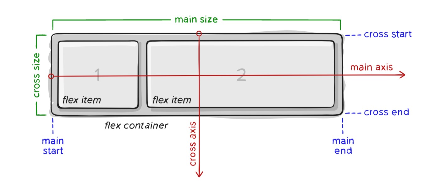
There are two points in the picture:
- main axis / cross axis
- flexbox item / container.
A flex container could contain a lots of flex items.
Default flex container main axis is horizontal and is set to row by flex-direction.
Flex container cross axis is always perpendicular to the main axis. In addtion,the main size and corss size of flex item depend on flex container direction.
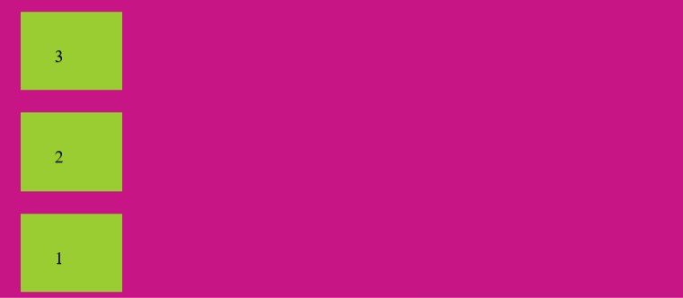
Step 2:
Step 2 is going to put emphasis on property which is called display.
The display is flex.It means that you can apply all of flex properties.Besides,the result shows flex item direction is horizantal as flex direction of container is row(horizantal) too.
Following is the HTML code to demonstrate this:
<!DOCTYPE html>
<html>
   <head>
       <meta charset="UTF-8">
       <link rel="stylesheet" href="style.css">
   </head>
   <body>
     <div class="parent">
     <div class="flex">
     <div class="item1">1</div>
     <div class="item2">2</div>
     <div class="item3">3</div>

     </div>
     </div>
   </body>
</html>
Following is the associated CSS code:
 .flex {
  display: flex;
}
.flex {
  display: flex;
  height: 300px;
  padding: 15px;
  background-color: mediumvioletred;

}

.item1{
    height: 10px;
    margin: 10px;
    padding: 30px;
    background-color: yellowgreen;
}

.item2{
    height: 10px;
    margin: 10px;
    padding: 30px;
    background-color: yellowgreen;
}

.item3{
    height: 10px;
    margin: 10px;
    padding: 30px;
    background-color: yellowgreen;
}
}
Output:
please click on this codepen to see the result and play with it further.
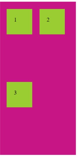
Step 3:
The step is going to tell you properties for the flex-container and how to apply each of them. They are being called flex-direction,flex-wrap ,justify-content and align-items.
flex-direction:
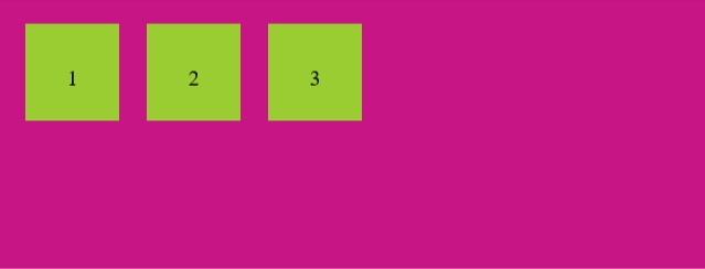
Flex-direction is row. so the flex items 123 is stay in the top left corner.
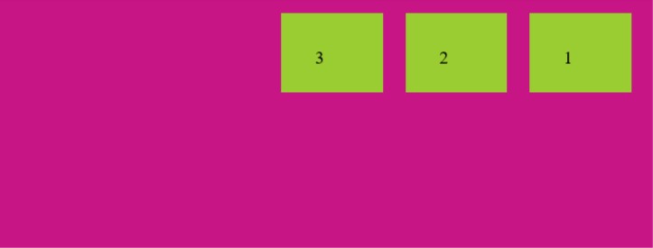
Flex-direction is row-reverse.so the flex items 123 is stay in the top right corner. Please pay attention to the direction of flex items 123 as the mian axis is from right to left.
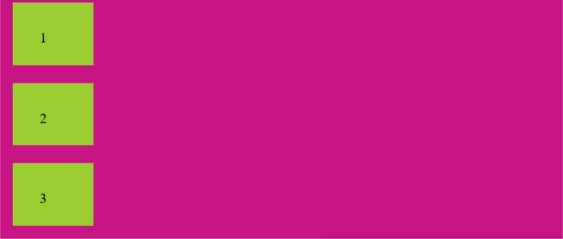
flex-direction is column.so the flex items 123 is stay in the bottom left corner.
flex-direction is column-reverse. so the flex items 123 is stay in the bottom right corner.
<!DOCTYPE html>
<html>
   <head>
       <meta charset="UTF-8">
       <link rel="stylesheet" href="style.css">
   </head>
   <body>
     <div class="parent">
     <div class="flex">
     <div class="item1">1</div>
     <div class="item2">2</div>
     <div class="item3">3</div>

     </div>
     </div>
   </body>
</html>
Following is the associated CSS code:
.flex {
  display: flex;
  height: 300px;
  padding: 15px;
  background-color: mediumvioletred;
  flex-direction: row;

}

.item1{
    height: 10px;
    width: 30px;
    margin: 10px;
    padding: 30px;
    background-color: yellowgreen;
}

.item2{
    height: 10px;
    width: 30px;
    margin: 10px;
    padding: 30px;
    background-color: yellowgreen;
}

.item3{
    height: 10px;
    width: 30px;
    margin: 10px;
    padding: 30px;
    background-color: yellowgreen;
}
}
Output:
when flex-direction is set to row:

when flex-directino is set to row-reverse:
when flex-direction is set to column:
when flex-direction is set to column-reverse:
Please click on this codepen to see the result and play with it further.
Why are flex items direction being changed by flex-direction?
Because flex-direction make main axis of flex-container.
Back to the step 1, flex items direction depend on the flex container. Therefore, flex-item derection is as same as the main axis of flex-container.
flex-wrap:
Flex-wrap is nowarp. It means whether the size of flex item is oversized,it won't be moved to other line. However, the value is wrap. it will be moved to other line.
Flex-wrap is wrap-reverse.It means when the flex item is oversized, it will not only be moved to next line but also be moved to the opposite direction.
<!DOCTYPE html>
<html>
   <head>
       <meta charset="UTF-8">
       <link rel="stylesheet" href="style1.css">
   </head>
   <body>
     <div class="parent">
     <div class="flex">
     <div class="item1">1</div>
     <div class="item2">2</div>
     <div class="item3">3</div>

     </div>
     </div>
   </body>
</html>
Following is the associated CSS code:
.flex {
  display:flex;
  width: 190px;
  height: 400px;
  padding: 10px;
  background-color: mediumvioletred;
  flex-direction:row;
  flex-wrap: wrap; /* nowrap|wrap-reverse */
}

.item1{
    height: 30px;
    width:30px;
    margin: 10px;
    padding: 20px;
    background-color: yellowgreen;
}

.item2{
    height: 30px;
    width:30px;
    margin: 10px;
    padding: 20px;
    background-color: yellowgreen;
}

.item3{
    height: 30px;
    width:30px;
    margin: 10px;
    padding: 20px;
    background-color: yellowgreen;
}
output:
Please click on this codepen to see the result and play with it further.
Justify-content and align-items:
justify-content: it defines flex-item direction is alignment along the flex container main axis.
align-items: it defines flex-item direction is aligment along the flex container cross axis.
Before looking the example of two properties, let's make sure where start/end of each axis direction is.
-
When the flex-direction is row, Main axis start is left and end is right.
-
When the flex-direction is row-reverse, Main axis start is right and end is left.
-
When the flex-direction is coloum, Main axis start is top and end is button.
-
When the flex-direction is coloum-reverse, Main axis start is bottom and end is top.
<!DOCTYPE html>
<html>
   <head>
       <meta charset="UTF-8">
       <link rel="stylesheet" href="style2.css">
   </head>
   <body>
     <div class="parent">
     <div class="flex">
     <div class="item1">1</div>
     <div class="item2">2</div>
     <div class="item3">3</div>

     </div>
     </div>
   </body>
</html>
Following is the associated CSS code:
.flex {
  display:flex;
  height: 500px;
  background-color: mediumvioletred;
  flex-direction:row;
  justify-content: flex-end;
  align-items: flex-end;

}

.item1{
    height: 30px;
    width:30px;
    margin: 10px;
    padding: 20px;
    background-color: yellowgreen;
}

.item2{
    height: 80px;
    width:80px;
    margin: 10px;
    padding: 20px;
    background-color: yellowgreen;
}

.item3{
    height: 30px;
    width:30px;
    margin: 10px;
    padding: 20px;
    background-color: yellowgreen;
}
output: 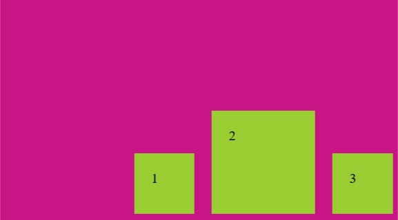
click here to see the example.
Why are flex item 123 located in the right bottom?
- Flex-direction is row. It mean the main axis start is left and acoss axis start is top.
- Justify-content is flex-end.it align items to the end point which is located in the right.
- Besides,align-items is flex-end too.It align items to the end point which is located in the bottom.
Step 4:
The step is similar to step3. However,it is going to tell you properties for flex-items. They are being called flex.
Furthermore, flex has three sub-property.In other way, it is shorthand for three properties listed below.
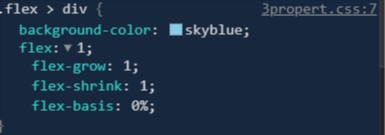
Flex:
The default three properties value are 0,1 and auto respectively.
-
flex-grow: this defines the ability for a flex-item to grow if necessary or in other way:it is growing value that means of the flex item will be given remianing space.
-
flex-shrink: this defines the ability for a flex-item to shrink if necessary or in other way:it is shrink value that means of the flex item will be shrank when remaining space is lack.
-
flex-basis:The default size of flex item or in other way:it is absolute value that means of each flex-item has same value.
Still the properties confusing you?
Please see the example :
<!DOCTYPE html>
<html>
    <head>
        <meta charset="UTF-8">
        <link rel="stylesheet" href="flexGrow.css">
    </head>
    <body>
      <div class="parent">
      <div class="flex">
      <div class="item1">first</div>
      <div class="item2">second</div>
      <div class="item3">third</div>

      </div>
      </div>
    </body>
</html>
Following is the associated CSS code:
.flex{
    display: flex;
    height: 100px;
    width: 300px;
}

.flex > div{
    background-color: skyblue;
    flex:1;
    border: 2px solid red;

}
Output:
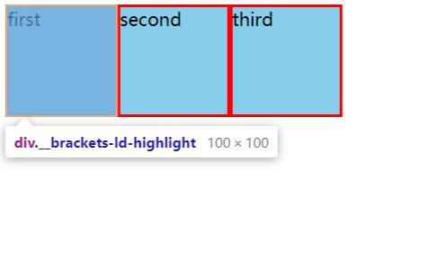
Click on this Codepen to see the example
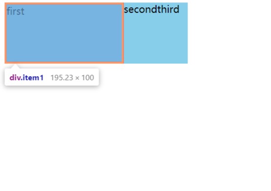
- when the flex is set to 1:
1.each flex-items has same space. same space means: same width and height. please see the picture listed above.
2.you might have a question about what happened?
because three properties we have talked before.
flex-grow, flex-shrink,flex-basis. please see the picture.
- As you can see from the picture: flex-grow is set to 1 for each flex-item . it means each item has same space. no flex-item could get more space. spaceflex-shrink is 1 too(default).
- when flex-basis is set to 50px for each flex-item , flex-grow is set to 2 on item1:
<!DOCTYPE html>
<html>
    <head>
        <meta charset="UTF-8">
        <link rel="stylesheet" href="flexGrow.css">
    </head>
    <body>
      <div class="parent">
      <div class="flex">
      <div class="item1">first</div>
      <div class="item2">second</div>
      <div class="item3">third</div>

      </div>
      </div>
    </body>
</html>
Following is the associated CSS code:
.flex{
    display: flex;
    height: 100px;
    width: 300px;
}

.flex > div{
    background-color: skyblue;
    flex:0 0 50px;

}
.item1.item1{
    flex-grow: 2;
    border: 3px solid red;
}
output:
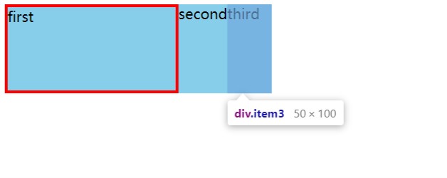
Click on this Codepen to see the example and play with it further
-
As you can see from pictures, item1 not only have flex basis 50px,but also have rest of all space.
-
item3 only have flex-basis 50px.
Step 5:
The final step is to show how to apply all properties which have been metioned before. You might change properties value to play aronud.
- example 1
<!DOCTYPE html>
<html>
<head>
<meta charset="UTF-8">
<link rel="stylesheet" href="flexExample1.css">
</head>
<body>
<div class="parent">
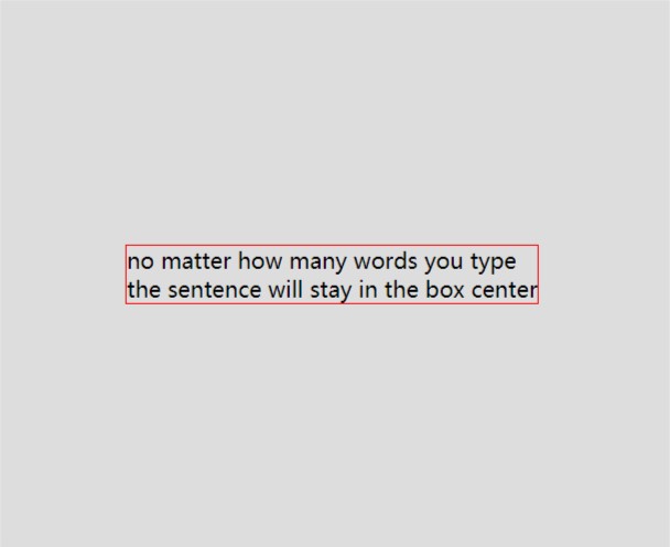
<div class="child">
no matter how many words you type<br>
the sentence will stay in the box center<br>
</div>
</div>
</body>
</html>
Following is the associated CSS code:
.parent{
    height: 400px;
    background: #ddd;
    display: flex;
    justify-content: center;
    align-items: center;
}

.child{
    border: 1px solid red;
}
Output:
Please click here to see the example
- Example 2
 <!DOCTYPE html>
<html>
    <head>
        <meta charset="UTF-8">
        <link rel="stylesheet" href="flexExample2.css">
    </head>
    <body>
      <ul>
      <li></li>
      <li></li>
      <li></li>
      <li></li>
      <li></li>
      <li></li>
      <li></li>
      <li></li>
      <li></li>
      </ul>
    </body>
</html>
Following is the associated CSS code:
 *{
    margin:0;
    padding: 0;
    box-sizing: border-box;
}
ul{list-style: none;}

ul{
    display: flex;
    flex-wrap: wrap;
    width: 350px;
    margin: auto;
    border: 2px solid black;
    justify-content: space-between;
}

li{
    width: 100px;
    height: 100px;
    background: lightblue;
    border: 2px solid red;
    margin: 10px 0;
}
Output:
Please click on this Codepen to see the example and play with it further.
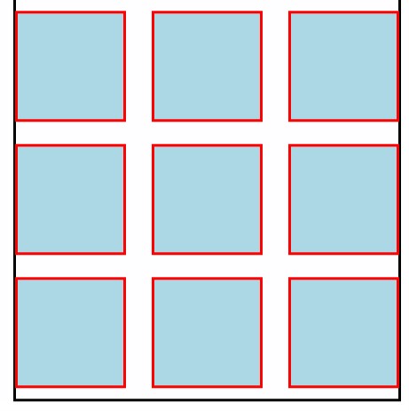
- Example 3
 <!DOCTYPE html>
<html>
    <head>
        <meta charset="UTF-8">
        <link rel="stylesheet" href="flexExample3.css">
    </head>
    <body>
     <header>
     this is classical layout
     </header>

      <div class="content">
          <aside> </aside>
          <main></main>
          <nav></nav>
      </div>
        <footer></footer>
    </body>
</html>
Following is the associated CSS code:
header{
    height: 50px;
    background: #ddd;
}

footer{
    height: 50px;
    background: #ddd;
}

.content{
    display: flex;
}
.content > aside{
  width: 100px;
  background: #444;
}
.content > main{
    height: 400px;
    flex:1;
    background: green;
}

.content> nav{
    width: 100px;
    background: #444;
}
Output:
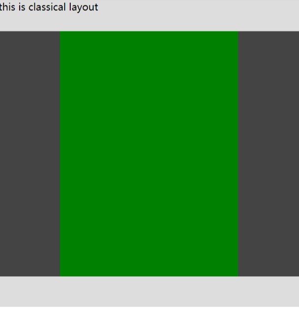
Please click on this Codepen to see the example and play with it further.
With this, you should now have a strong understanding of Flexbox layout and you will be able to use it without any problem. Try it out. If you have any doubts, you may go through this article again or ask us your questions. Enjoy.