
Open-Source Internship opportunity by OpenGenus for programmers. Apply now.
Reading time: 30 minutes
One of the most essential concepts of Web-Development is Responsive Web Design. It is about making a website look good on all devices. In this article we will be using media queries to implement responsive design.
Media queries allow you to present the same content differently on different size screens. You can think of them as a way to make the same webpage look good on a phone or a desktop computer by giving different CSS instructions for different sizes.
Syntax
Here is the basic syntax for media queries which is a part of a page's CSS code:
@media not|only media-type and (expressions) {
  CSS-Code;
}
Let us understand what each keyword means:
- @media - Initializes a media query
- not|only - Logical operators to combine various expressions
- media-type - There are mainly 4 types of media-types all, print, screen and speech. The screen media-type is used to set CSS styling for desktop, tablets and mobile devices.
- The most common expressions used are min-width and max-width for defining screen size range for specific CSS.
Here is the list of available device screen sizes
Device (Screen width)
- Desktop (1025px or higher)
- Tablets, Ipads [portrait] (Between 768px to 1024px)
- Tablets, Ipads [landscape] (Between 768px to 1024px)
- Low Resolution Tablets, Mobiles [Landscape] (Between 481px to 767px)
- Most of the Smartphones [Portrait] (Between 320px to 479px)
These dimensions will be used in our expression. We use min-width and max-width to apply specific CSS in that range only. We can only target existing CSS classes. Let us disable the nav-links and authentication buttons for Tablets and smaller devices. We will instead add a hamburger button(use an SVG file) to toggle ON and OFF a menu containing the nav-links and authentication buttons.
Demonstration
In this demonstration, we will start with a page with no media query and show the problem it causes. Following it, we will modify the code of the page by adding media queries to resolve the issues.
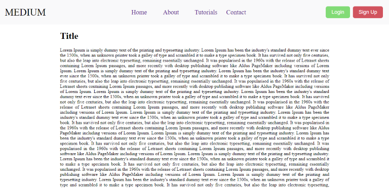
Following is the screenshot of our webpage on desktop:
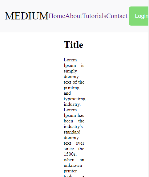
To view how the website will look in other devices in Chrome press Ctrl+Shift+M to open the responsive mode. Here you can choose any device to view your website in. Currently this is what the website looks like. Not so visually appealing is it.
Following is the screenshot of our webpage on a mobile device:
Following is the HTML and CSS of the demo so that you can try it out in your local machine. Save the HTML code in a file named code.html and the css code in a file named styles.css. Then, open the HTML code in a web browser like Chrome.
Here is the HTML code :
<!DOCTYPE html>
<html lang="en" dir="ltr">
  <head>
    <meta charset="utf-8">
    <title>Media Queries with CSS</title>
    <link rel="stylesheet" href="./styles.css">
  </head>
  <body >
    <div class="container">
      <div class="child">
        <div class="nav-title">
          <p>MEDIUM</p>
        </div>
        <div class="nav-links">
          <a href="#Home">Home</a>
          <a href="#About">About</a>
          <a href="#Tutorials">Tutorials</a>
          <a href="#Contact">Contact</a>
        </div>
        <!-- <div class="nav-input">
          <input  type="text" placeholder="Search" />
        </div> -->
        <div class="nav-auth">
          <button class="login">Login</button>
          <button class="signup">Sign Up</button>
        </div>
        <div class="nav-ham">
          <img src='./icons8-menu-96.png' width='40' height='40'/>
        </div>
      </div>
    </div>
    <div class="main">
      <h1>Title</h1>
      Lorem Ipsum is simply dummy text of the printing and typesetting industry. Lorem Ipsum has been the industry's standard dummy text ever since the 1500s, when an unknown printer took a galley of type and scrambled it to make a type specimen book. It has survived not only five centuries, but also the leap into electronic typesetting, remaining essentially unchanged. It was popularised in the 1960s with the release of Letraset sheets containing Lorem Ipsum passages, and more recently with desktop publishing software like Aldus PageMaker including versions of Lorem Ipsum.
      Lorem Ipsum is simply dummy text of the printing and typesetting industry. Lorem Ipsum has been the industry's standard dummy text ever since the 1500s, when an unknown printer took a galley of type and scrambled it to make a type specimen book. It has survived not only five centuries, but also the leap into electronic typesetting, remaining essentially unchanged. It was popularised in the 1960s with the release of Letraset sheets containing Lorem Ipsum passages, and more recently with desktop publishing software like Aldus PageMaker including versions of Lorem Ipsum.
      Lorem Ipsum is simply dummy text of the printing and typesetting industry. Lorem Ipsum has been the industry's standard dummy text ever since the 1500s, when an unknown printer took a galley of type and scrambled it to make a type specimen book. It has survived not only five centuries, but also the leap into electronic typesetting, remaining essentially unchanged. It was popularised in the 1960s with the release of Letraset sheets containing Lorem Ipsum passages, and more recently with desktop publishing software like Aldus PageMaker including versions of Lorem Ipsum.
      Lorem Ipsum is simply dummy text of the printing and typesetting industry. Lorem Ipsum has been the industry's standard dummy text ever since the 1500s, when an unknown printer took a galley of type and scrambled it to make a type specimen book. It has survived not only five centuries, but also the leap into electronic typesetting, remaining essentially unchanged. It was popularised in the 1960s with the release of Letraset sheets containing Lorem Ipsum passages, and more recently with desktop publishing software like Aldus PageMaker including versions of Lorem Ipsum.
      Lorem Ipsum is simply dummy text of the printing and typesetting industry. Lorem Ipsum has been the industry's standard dummy text ever since the 1500s, when an unknown printer took a galley of type and scrambled it to make a type specimen book. It has survived not only five centuries, but also the leap into electronic typesetting, remaining essentially unchanged. It was popularised in the 1960s with the release of Letraset sheets containing Lorem Ipsum passages, and more recently with desktop publishing software like Aldus PageMaker including versions of Lorem Ipsum.
      Lorem Ipsum is simply dummy text of the printing and typesetting industry. Lorem Ipsum has been the industry's standard dummy text ever since the 1500s, when an unknown printer took a galley of type and scrambled it to make a type specimen book. It has survived not only five centuries, but also the leap into electronic typesetting, remaining essentially unchanged. It was popularised in the 1960s with the release of Letraset sheets containing Lorem Ipsum passages, and more recently with desktop publishing software like Aldus PageMaker including versions of Lorem Ipsum.
      Lorem Ipsum is simply dummy text of the printing and typesetting industry. Lorem Ipsum has been the industry's standard dummy text ever since the 1500s, when an unknown printer took a galley of type and scrambled it to make a type specimen book. It has survived not only five centuries, but also the leap into electronic typesetting, remaining essentially unchanged. It was popularised in the 1960s with the release of Letraset sheets containing Lorem Ipsum passages, and more recently with desktop publishing software like Aldus PageMaker including versions of Lorem Ipsum.
      Lorem Ipsum is simply dummy text of the printing and typesetting industry. Lorem Ipsum has been the industry's standard dummy text ever since the 1500s, when an unknown printer took a galley of type and scrambled it to make a type specimen book. It has survived not only five centuries, but also the leap into electronic typesetting, remaining essentially unchanged. It was popularised in the 1960s with the release of Letraset sheets containing Lorem Ipsum passages, and more recently with desktop publishing software like Aldus PageMaker including versions of Lorem Ipsum.
      Lorem Ipsum is simply dummy text of the printing and typesetting industry. Lorem Ipsum has been the industry's standard dummy text ever since the 1500s, when an unknown printer took a galley of type and scrambled it to make a type specimen book. It has survived not only five centuries, but also the leap into electronic typesetting, remaining essentially unchanged. It was popularised in the 1960s with the release of Letraset sheets containing Lorem Ipsum passages, and more recently with desktop publishing software like Aldus PageMaker including versions of Lorem Ipsum.
      Lorem Ipsum is simply dummy text of the printing and typesetting industry. Lorem Ipsum has been the industry's standard dummy text ever since the 1500s, when an unknown printer took a galley of type and scrambled it to make a type specimen book. It has survived not only five centuries, but also the leap into electronic typesetting, remaining essentially unchanged. It was popularised in the 1960s with the release of Letraset sheets containing Lorem Ipsum passages, and more recently with desktop publishing software like Aldus PageMaker including versions of Lorem Ipsum.
    </div>
  </body>
</html>
And Here is the basic CSS styling for body and the Navbar
.container{
  background-color: #F9F9FA;
  margin-left: -8px;
  margin-right: -8px;
  margin-top: -8px;
  display: flex;
}

.child{
  display: flex;
  justify-content: center;
  padding: 17px;
  flex: 1;
}

.nav-title
{
    display: flex;
    flex:1;
    justify-content: flex-start;
}

.nav-title p{
  flex:1;
  margin: auto;
  font-size: 34px;
}

.nav-links{
  display: flex;
  margin: auto;
  font-size: 22px;
  flex:1;
  justify-content: center;
}

.nav-links a{
  text-decoration: none;
  flex: 1;
}

.nav-input{
  flex:1;
  display: flex;
  justify-content: flex-end;
  margin-right: 5px;
}

.nav-input input{
  padding: 5px;
  font-size: 20px;
  flex:1;
}

.nav-auth{
  flex:1;
  display: flex;
  justify-content: flex-end;
  margin: auto;
}

.nav-auth button{
  padding: 10px;
  padding-left: 20px;
  padding-right: 20px;
  border-style: none;
  margin:5px;
  border-radius: 7px;
  cursor: pointer;

}

.login{
  background-color: #82db76;
  color:#FFFFFF;
  font-size: 18px;
}

.signup{
  background-color: #d1535e;
  color:#FFFFFF;
  font-size: 18px;
}

.main{
  text-align: justify;
  margin: 20px;
  margin-left: 200px;
  margin-right: 200px;
}

.nav-ham{
   display: none;
}
Fixing issues using media query
Now we are going to use media queries to improve the appearance of the website.
 @media screen and (max-width:1024px) {
  .nav-links{
    display: none;
  }
  .nav-auth{
    display: none;
  }
  .main{
    margin-left:30px;
    margin-right: 30px;
  }

  .nav-ham{
     display:block;
  }

}
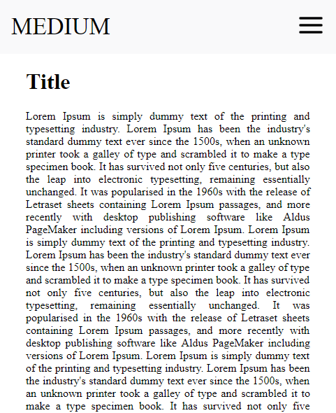
Let's inspect the code written above.We are defining CSS attributes specifically for Desktop screens, tablets and smartphones so our media-type is screen. Here we have set the max-width as the upper-limit of a Tablet, so that for any screen size exceeding 1024px the following CSS will not apply. In this case we have disabled the nav-links and nav-auth divs and enabled the nav-ham button. Also the margins have been reduced from 300px to 30px for the main body. Here is what the website finally looks like in smaller screen sizes.
Following is the screenshot of our webpage on a mobile device:
This is just the tip of the iceberg in terms of what you can do with media queries.