Figure-Ground in UX design
In this article at OpenGenus, we will know more about the concept of Figure-Ground in UX design. This will further help us to get involved in complex design and will improve our knowledge about the gesalt principles.
Table of Contents :
- Introduction
- What is figure Ground Principle
- Important Figure Ground Relationships
- Figure Ground in practice
- Conclusion
INTRODUCTION
First of all we have to look what are the Gestalt principles.These rules were developed by German psychologists in the 1920s in an effort to understand how people get meaningful impressions from the chaotic stimuli all around them. As a result, these principles enable users to arrange data and specifics that assist their viewers and audience in identifying patterns, streamlining complex visuals, and improving their perception of and understanding of the visual world.
There are 7 Gestalt principles. They are :
- Figure-ground
- Similarity
- Proximity
- Common region
- Continuity
- Closure
- Focal point
In this article our focus would be on Figure Ground in UX.
WHAT IS FIGURE GROUND PRINCIPLE
According to Universal Principles of Design, figure-ground is the state in which we perceive elements as either the objects of focus or the background. Figure-ground works through the use of positive and negative space. Figure-ground exists in practically everything we visually perceive, whether a scene, a composition, a website, a logo or an icon.

In the image above, for example, your eye instantly sees a white apple sitting on a black background.
Three types of relationships exist between the figure and the ground:
Stable: When a figure is stable, it stands out from the background and one element clearly dominates the overall composition.
Reversible - In this instance, the density of the backdrop and the figure is nearly equal. Because of this, the figure and background can be reversed by the eye (thus, "reversible"). This can be used to produce optical illusions in both art and web design. A reversible design, on the other hand, will always have a distinct figure and ground.
Ambiguous - There is minimal separation between the ground and the figure in an ambiguous design. A single element may occasionally serve as both the figure and the ground simultaneously. By blurring the lines between your ground and figure, you can create an ambiguous design.
IMPORTANT FIGURE GROUND RELATIONSHIPS
- Focus : The ground will be regarded as the objects that are out of focus, blurry, faded, or colored, while the figures will be perceived as the objects that are in focus.
- Colour : Warm colours can be employed to bolster figures because they are viewed as approaching, such as yellows, oranges, and reds. Purple, blue, and green hues are examples of cool colours that can be employed to fortify a foundation because they are seen as receding.
- Position : Elements placed lower will be regarded as figures, whereas ones placed higher will be seen as the earth. Our impression of distance is affected by this because we think objects located higher up are farther away and objects located lower down are closer to us.
- Contrast : Strong contrast is produced when white or black is combined with color, as shown in the Criminal Underworld posters. Similarly, complementary hues are fantastic for generating contrast. To improve contrast if pure colors are too strong, change the value (how dark or light the color is).
Many of these visual components are combined to generate the majority of effective figure-ground connections.
FIGURE GROUND IN PRACTICE
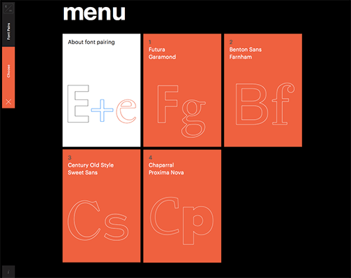
The website of R/m Design School excels in its contrast between figure and ground. Here, the menu demonstrates significant contrast by separating figure from ground with vivid color and black. Warm colors are also employed to enhance the perception of the individual approaching us.
A shadow is another method used by the bottom box on the Molson landing page above to set it out from the background. There is a faint drop shadow under the box, which you can see. This gives the impression that the box is perched on a wheat field. Further down the landing page, they utilize shadows once more to create the similar effect:

Look at the illustration from the Apple Music website below. Most likely, the smartphone image and the copy immediately to its left have caught your attention as the figure's main components. The usage of numerous graphic elements improves the figure aspects while the background starts to compete for our attention. First, the size of the smartphone and the large copy strengthen the figure. Bring the figure forward by placing the smartphone at the bottom of the screen. By toning down the background video motion, which makes the ground regress, the figure is more accentuated. Finally, the contrast between the dark background and the light screen helps to clearly distinguish between the figure and the ground.

CONCLUSION
The fundamental idea behind the Figure/Ground principle is to use visual clues to distinguish between what is significant (foreground/figure) and what is not (background/ground). There are three typical methods for doing this:
- Employing contrast (color, size, amount of detail)
- Frequently seen in hero banners
- Separating content with boxes to avoid overlap, and adding depth with shadows