Law of Prägnanz in UX Design
Table of Contents
- Introduction to Law of Prägnanz and its principles
- Applying the law of Prägnanz in UX design
Introduction to Law of Prägnanz and Its Principles
The Prägnanz theory is a Gestalt psychology concept that defines how people perceive and arrange visual inputs. It is also known as the Law of Prägnanz or the Law of Good Gestalt. The German term "prägnanz" approximately translates to "conciseness" or "pregnancy."
When humans are confronted with a complicated visual image or pattern, they will perceive it in the simplest and most stable way possible, according to the Prägnanz hypothesis. Several principles that guide perceptual organization are proposed by the theory.
Principles of Prägnanz Theory
1. Law of Figure-Ground: People usually divide a visual scene into two parts: the figure (the main object of focus) and the backdrop (the surrounding context). The person stands out against the background, which is viewed as a constant and unchanging thing.
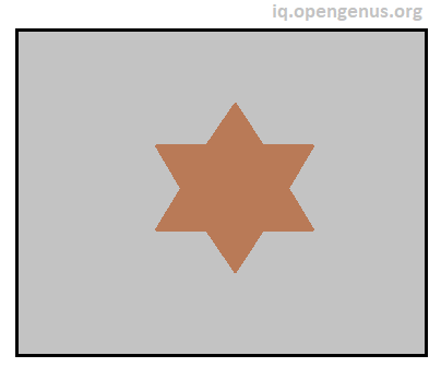
In the figre above the star is figure and the gray color is the backdrop.
2. Visual Hierarchy: According to the Law of Prägnanz, people interpret a visual scene in terms of figure and ground. Designers may utilize this idea to their advantage by creating a clear visual hierarchy that directs consumers' attention and comprehension. Use size, color, contrast, and font to distinguish between crucial and less significant pieces, ensuring that the most important information shines out and is clearly identified.
3. Grouping and Proximity: Objects that are close to each other are regarded as belonging together, according to the Law of Prägnanz. This approach may be used by UX designers by grouping relevant things together and leveraging proximity to visually connect them. Grouping similar form fields, buttons, or menu elements, for example, helps users comprehend their relationship and purpose.
4. Consistency and Similarity: According to the Law of Prägnanz, entities with comparable properties are seen as belonging to the same group. Maintaining consistency in visual aspects such as color schemes, typography, and iconography aids users in associating comparable items with related functions in UX design. Consistency increases learnability while decreasing cognitive burden.
5. Closure and Completion: According to the Law of Prägnanz, humans cognitively complete missing or incomplete visual information. Designers may employ this idea in UX design by giving enough signals or feedback to assist users comprehend the context and completion of actions or processes. When navigating multi-step forms or procedures, for example, progress indicators can provide consumers with a sense of closure and completion.
6. Continuity and Flow: According to the Law of Prägnanz, people tend to perceive smooth and continuous lines or contours. Maintaining visual consistency and logical flow in UX design assists users in navigating interfaces and understanding the links between distinct pieces. Avoid rapid shifts or interruptions that may disrupt or confuse the user's mental picture.
Applying the law of Prägnanz in UX design
Creating intuitive interfaces and engaging user experiences is critical in the realm of user experience (UX) design. The Law of Prägnanz, often known as the Law of Good Gestalt, is a key guideline that guides designers in accomplishing this aim. This Gestalt psychology-based theory emphasizes the human predisposition to receive visual input in the simplest and most meaningful way possible. Designers may create aesthetically beautiful, intuitive, and efficient interfaces by understanding and using the Law of Prägnanz. Let's take a closer look at how this approach may be used effectively in UX design.
Simplicity and Clarity:
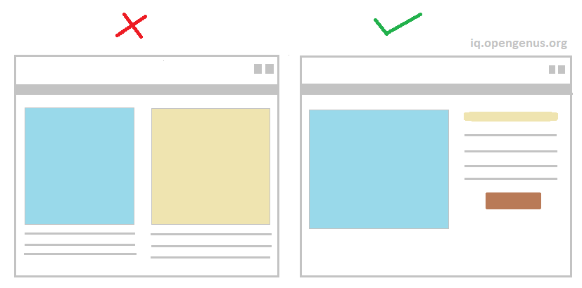
At the core of the Law of Prägnanz lies the notion of simplicity and clarity. In UX design, this principle urges designers to create interfaces that prioritize essential information and functionality, while avoiding unnecessary complexity. By decluttering the interface and removing extraneous elements, designers can help users focus on what truly matters. A clean and uncluttered interface not only enhances visual appeal but also promotes clarity and ease of use.
For example simple search engine is better for users to recognize than complicated ones. This search engine of OpenGenus IQ editor:

Visual Hierarchy:
The Law of Prägnanz stresses how a visual scene is perceived in terms of figure and ground. Designers may use this notion to their advantage by building a clear visual hierarchy inside their interfaces. Designers may direct consumers' attention and comprehension by employing size, color, contrast, and typography. Important parts should be highlighted, while less important ones should fade into the background. This visual hierarchy assists users in immediately grasping the interface's structure and navigating it with ease.
For Example:
Imagine a news website homepage where multiple articles are displayed. The design incorporates visual hierarchy to guide users' attention and emphasize important elements.
By utilizing visual hierarchy, the news website effectively guides users' attention and helps them prioritize the content on the page. The headline and featured image are visually dominant, capturing the user's initial interest. As users scan down the page, they encounter the supporting text, author, and date, providing additional details. The visual hierarchy ensures that users can quickly assess the relevance and importance of each article, allowing them to make informed decisions about which articles to explore further.
Grouping and Proximity:
Another component of the Law of Prägnanz is the propensity to see nearby items as belonging together. This approach may be used by UX designers by grouping relevant pieces and using proximity to visually connect them. Grouping similar form fields, buttons, or menu items makes it easier for users to comprehend their relationships and the function they perform. This grouping and closeness results in a unified and straightforward interface that allows people to interact confidently.
For example: Grouping navigation links together in a menu, such as a horizontal or vertical navigation bar, helps users easily identify and access different sections of a website.

Consistency and Similarity:
According to the Law of Prägnanz, entities with comparable properties are seen as belonging to the same group. Consistency is essential in UX design for generating a smooth user experience. Designers ensure that consumers link comparable items with associated functions by preserving visual consistency in color schemes, typography, and iconography. Consistency throughout the interface improves learnability while simultaneously lowering cognitive burden, allowing users to explore and engage more effectively.
For example: Applying consistent button styles, such as color, shape, and hover effects, throughout the website indicates that buttons with similar appearances perform similar actions. Users can quickly recognize and understand the purpose of buttons based on their consistent visual cues.
Closure and Completion:
Individuals cognitively fill missing or incomplete visual information, according to the Law of Prägnanz. This idea may be used by UX designers by giving indications or feedback that assist users in understanding the context and completion of activities or processes. When navigating multi-step forms or procedures, progress indicators, for example, give consumers with a sense of closure and completion. Designers create confidence in consumers by providing clear visual signals, ensuring they are aware of their progress and what needs to be done.
For example: Many logos utilize closure to create memorable and recognizable shapes. For instance, the logo of the World Wildlife Fund (WWF) features a panda formed by the combination of black and white shapes. Although the image is not fully outlined, our minds automatically complete the shape of the panda.
![]()
Continuity and Flow:
According to the Law of Prägnanz, individuals tend to see smooth and continuous lines or contours. Maintaining visual continuity and logical flow is critical in UX design. Designers assist users in navigating interfaces and understanding the relationships between different parts by establishing a consistent visual language. Avoiding sudden changes or interruptions that disturb the user's mental model improves the overall user experience and encourages users to interact more effortlessly with the interface.
Continuity and flow are important characteristics in web design because they guarantee a smooth and intuitive user experience. Here are some examples of how to use continuity and flow in web design:
Maintaining a consistent navigation layout across the website allows visitors to smoothly go from one page to the next. The location, style, and labeling of navigation menus, buttons, and links should be consistent throughout the site, allowing visitors to navigate without difficulty.