
Open-Source Internship opportunity by OpenGenus for programmers. Apply now.
Table of Contents:
- Introduction
- Prerequisites
- Starter Code
- Center Images Horizontally
- Center Images Vertically
- Center Images Both Horizontally and Vertically
- Key Takeaways
Reading Time: 20 minutes | Coding Time: 30 minutes
Introduction
If you have used CSS (Cascading Style Sheets before) to develop a webpage, you know that if not like a standard programming language in that there are no runtime errors. If the logic in your code is not correct, there will simply be no changes on your webpage. This can lead to a lot of frustration and time spent browsing Google or Stack Overflow just to get the layout of our webpages to look how we want. In this OpenGenus article, I will go over the various ways to center images on a webpage using CSS, which can be one of the more tricky tasks when building a webpage. Centering images is important not only because it allows webpages to look more aesthetically pleasing, but also because the photos immediately draws the attention of the user and can improve readability on webpages with a lot of text.
Prerequisites
- Familiarity with a text editor of your choice, such as VS Code
- This article also assumes that you are familiar with basic HTML, and CSS selectors. It would also be a good idea to learn Flexbox before reading and following along with this article.
Starter Code and Images
We will be creating a webpage that displays some images.
index.html
<!DOCTYPE html>
<html lang="en">
  <head>
    <meta charset="UTF-8" />
    <meta name="viewport" content="width=device-width, initial-scale=1.0" />
    <title>Centering Images Using CSS</title>
    <link rel="stylesheet" href="./styles.css" />
  </head>
  <body>
    <h1>Image Collection</h1>
    <img src="./colorado_1.jpg" />
    <img src="./colorado_2.jpg" />
    <img src="./london_1.jpg" />
    <img src="./london_2.jpg" />
  </body>
</html>
styles.css
h1 {
    text-align: center;
}

img {
  height: 300px;
  width: 300px;
  margin: 1px;
}
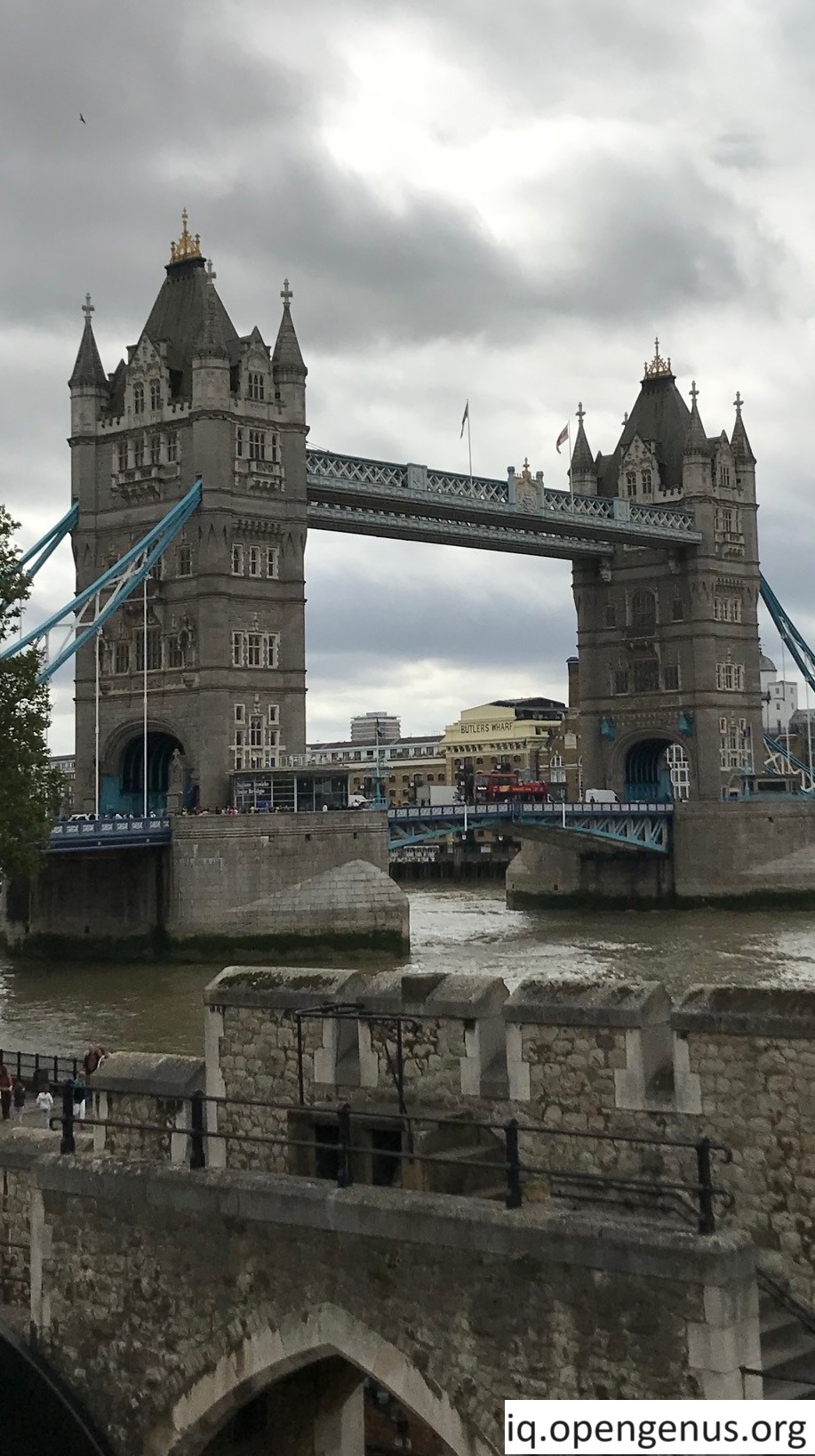
Images that we will be using. I took these images so you are free to use and distribute them. The link to download these images is provided at the bottom of the article.


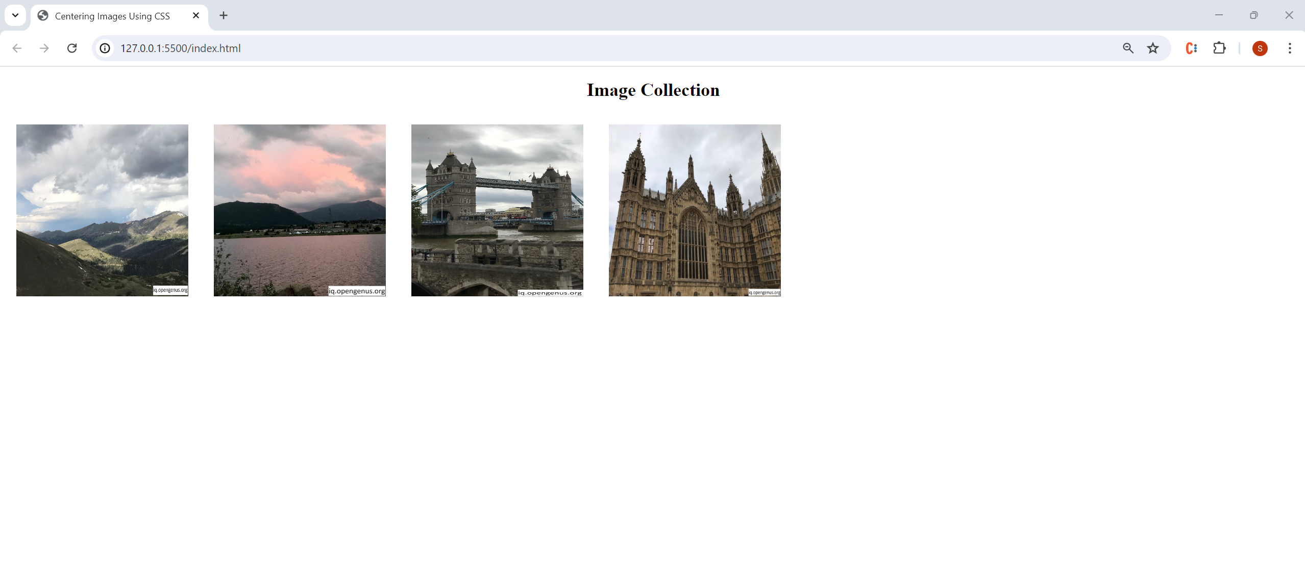
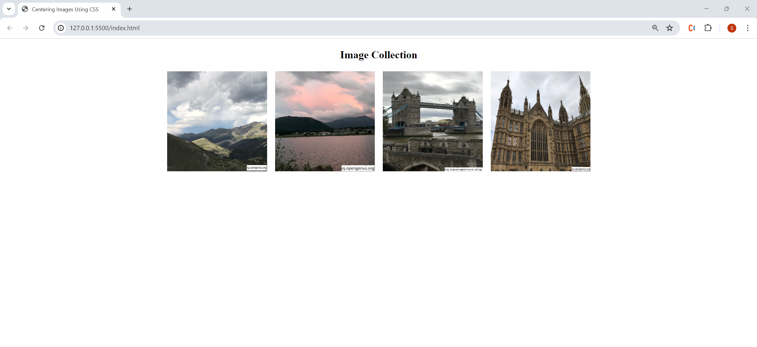
Starter Code Output:
Centering Images Horizontally
Method 1: Using text-align
Add a div tag with a class selector called "main-container" to our index.html file.
<!DOCTYPE html>
<html lang="en">
  <head>
    <meta charset="UTF-8" />
    <meta name="viewport" content="width=device-width, initial-scale=1.0" />
    <title>Centering Images Using CSS</title>
    <link rel="stylesheet" href="./styles.css" />
  </head>
  <body>
    <div class="main-container"> //---ADDED LINE ---
        <h1>Image Collection</h1>
        <img src="./colorado_1.jpg" />
        <img src="./colorado_2.jpg" />
        <img src="./london_1.jpg" />
        <img src="./london_2.jpg" />
    </div> //---ADDED LINE ---
  </body>
</html>
In our styles.css file, add the following code:
.main-container {
    text-align:center;
}
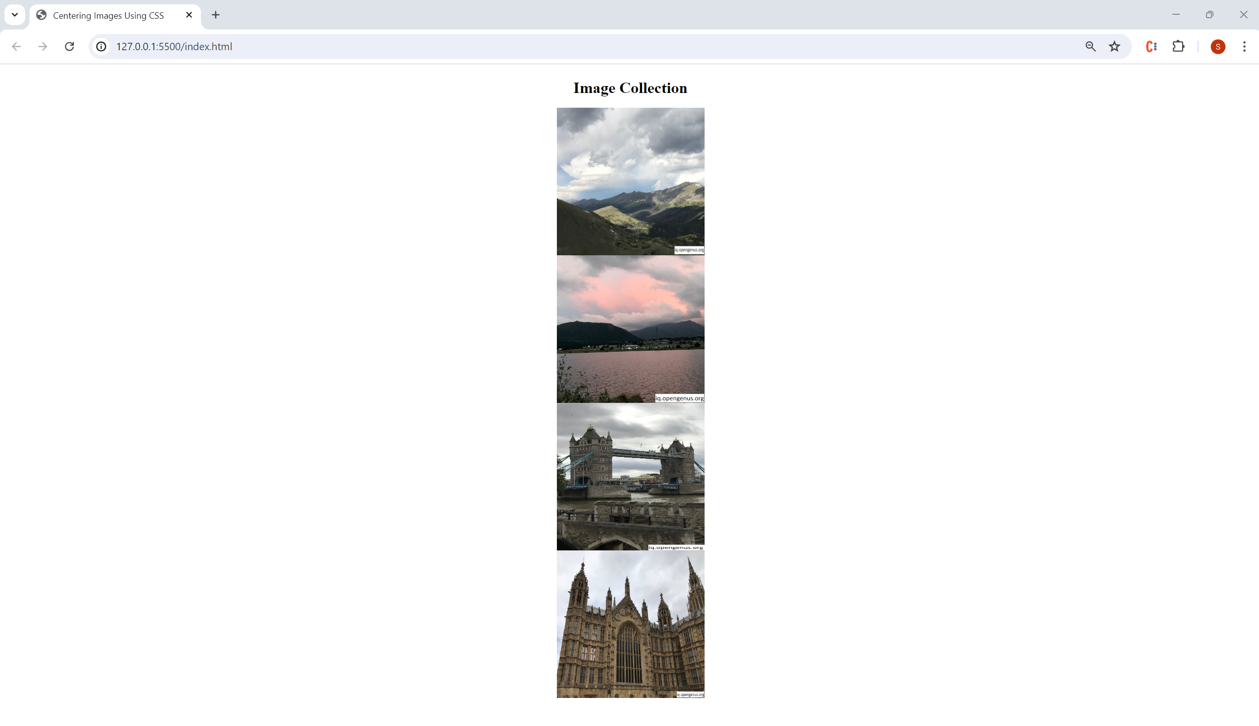
We can use text-align to center our images (the child element) because the div that they are now grouped within (the parent element) is a block level element and the text-align property only applies to block level elements.
You can think of this method as placing all the photos that we have on the top of our bookshelf side by side into a plastic container and then pushing the container to the middle of our bookshelf.
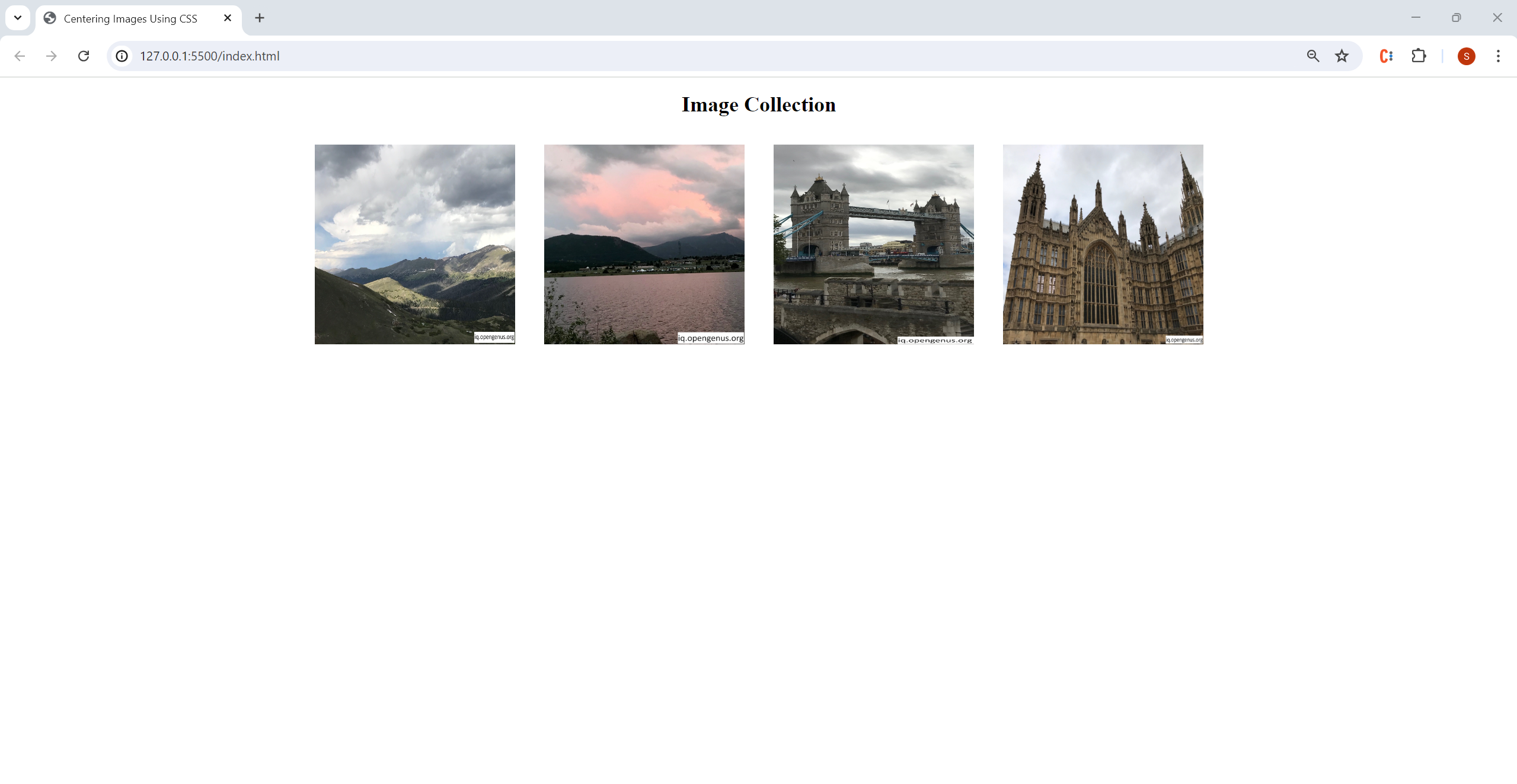
Output:
Method 2: Using Flexbox
Leaving the code in our index.html file unchanged, comment out the main-container selector that you just added in styles.css and add the following selector:
body {
  display: flex;
  justify-content: center;
}
We enable the flexbox layout mode by using display:flex(which arranges elements on our webpage side-by-side by default). Using justify-content moves all elements within the flex container (the body of our webpage in this case) to the center of the main-axis (which goes from left to right by default).
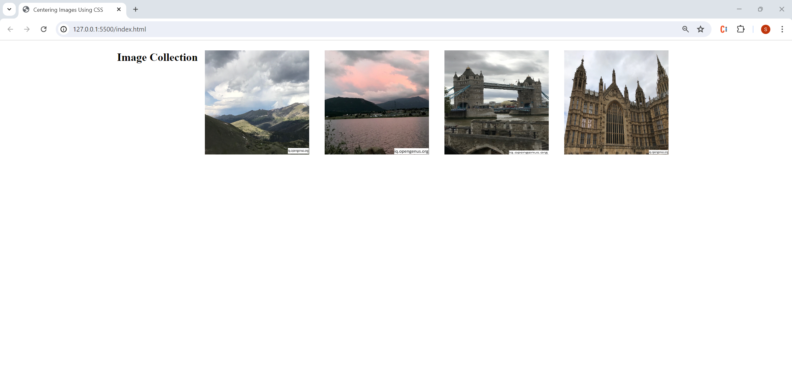
Output:
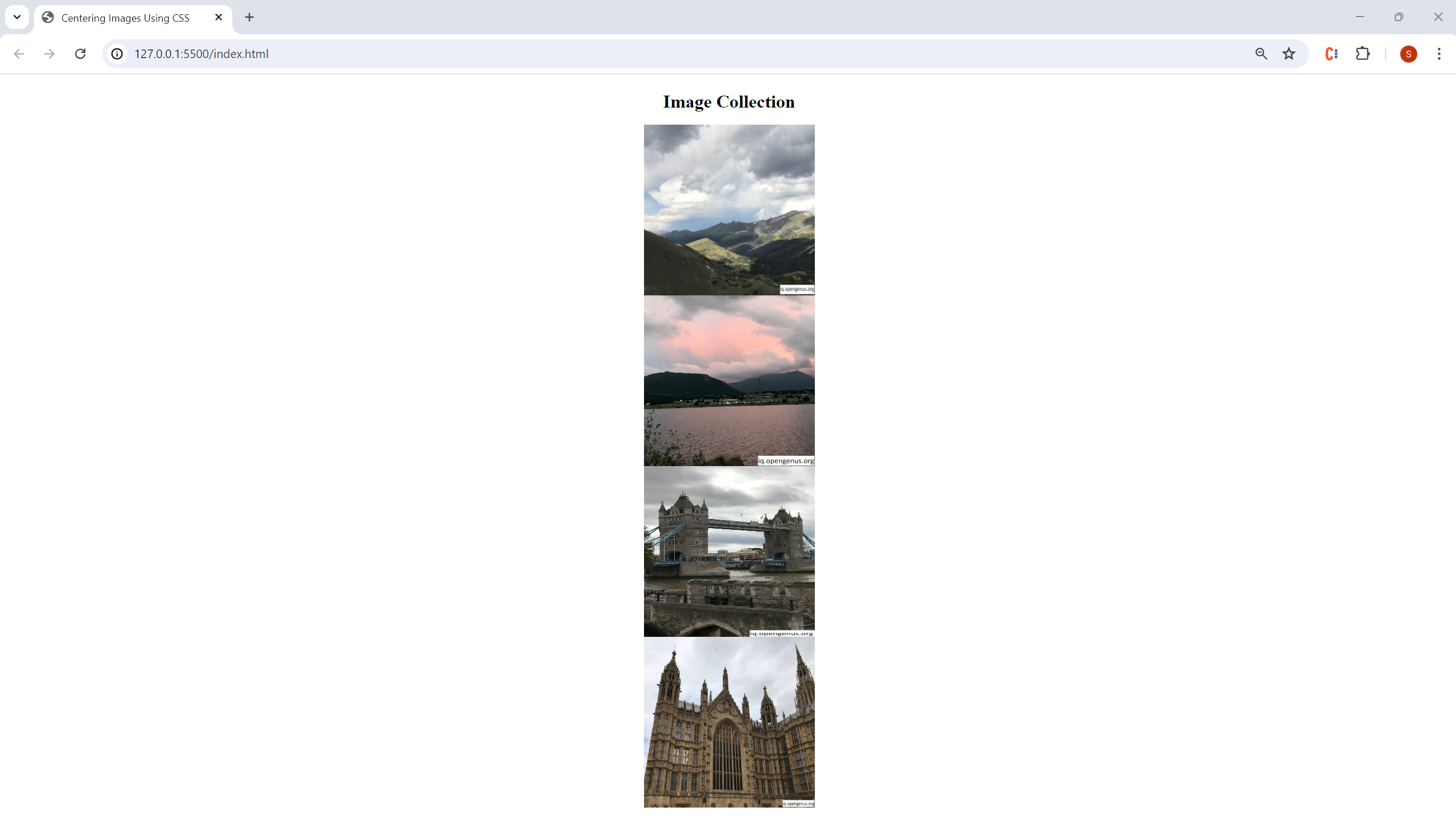
To make our webpage look more visually appealing, let's increase the space between our images and change the layout of our items using flex-direction. Using flex-direction changes the direction of our main axis so that it now runs from top to bottom instead of left to right. Therefore, we would use align-items (which controls the alignment of all items on the cross axis) instead of justify-content (which controls the alignment of all items on the main axis). If you are confused about the flexbox terminology here, refer to this article
Edit your styles.css file so that it contains the following code:
body {
  display: flex;
  flex-direction: column;
  align-items: center;
}

img {
  height: 300px;
  width: 300px;
  margin:10px;
}

h1 {
  text-align: center;
}
Output:
Questions:
- Why does
text-align: centeronly work when we group our images within themain-containerdiv? - What happens to the main-axis and cross axis when we set
flex-directionto column?
Answer to Questions
Question #1
The text-align property only applies to block level elements (such as div) and by default, images are inline elements.
Question #2
When we set flex-direction to column, our main-axis now runs from the top of the page to the bottom and our cross-axis now runs form the left of the page to the right. Therefore, our images are placed below the page title. You can think of the main-axis and cross-axis like the x and y axis on a grid; when we set flex-direction to column the x axis is switched with the y axis.
Center Images Vertically
Method 1: Using display:block and setting margins to auto
Comment out or remove all the code currently in styles.css except the starter code provided at the beginning of this article. Add the following code to the img selector:
display: block;
margin-left: auto;
margin-right: auto;
Since images are inline elements by default (meaning that they do not start on a new line), we force each image onto its own line by using display:block. Setting margin-left and margin-right to auto causes the browser to evenly distribute the remaining space on the left and right sides of the element, which centers the images vertically on the webpage.
Output:
Method 2: Using Flexbox
Edit your styles.css file so that it contains the following code:
body {
  display: flex;
  flex-direction: column;
  align-items: center;
}

h1 {
  text-align: center;
}

img {
  height: 300px;
  width: 300px;
  margin: 20px;
  display:block; //---ADDED LINE ---
}
Output:
Questions:
- In our
bodyselector, why do we usealign-items:centerinstead ofjustify-content: center? - Why can we use
display:blockin ourimgselector in order for our images to center vertically?
Answer to Questions
Question #1
We use align-items:center instead of justify-content: center because we set flex-direction: to column. As explained in the answer to the previous question, our main-axis and cross-axis are now switched, so we use align-items to center our images vertically.
Question #2
Using display:blockforces each image onto its own line/stacks our images on top of each other. Similar to the previous analogy for centering images horizontally, you can think of both Methods #1 and #2 as placing all the photos that we have on the top of our bookshelf into a plastic container, one photo on top of each other, and then pushing the container to the middle of our bookshelf.
Center Images Both Horizontally and Vertically
Using Flexbox
Edit your styles.css file so that it contains the following code:
body{
  display: flex;
  justify-content: center;
  align-items: center;
  height: 100vh;
}

h1 {
  text-align: center;
}

img {
  height: 300px;
  width: 300px;
  margin: 20px;
}
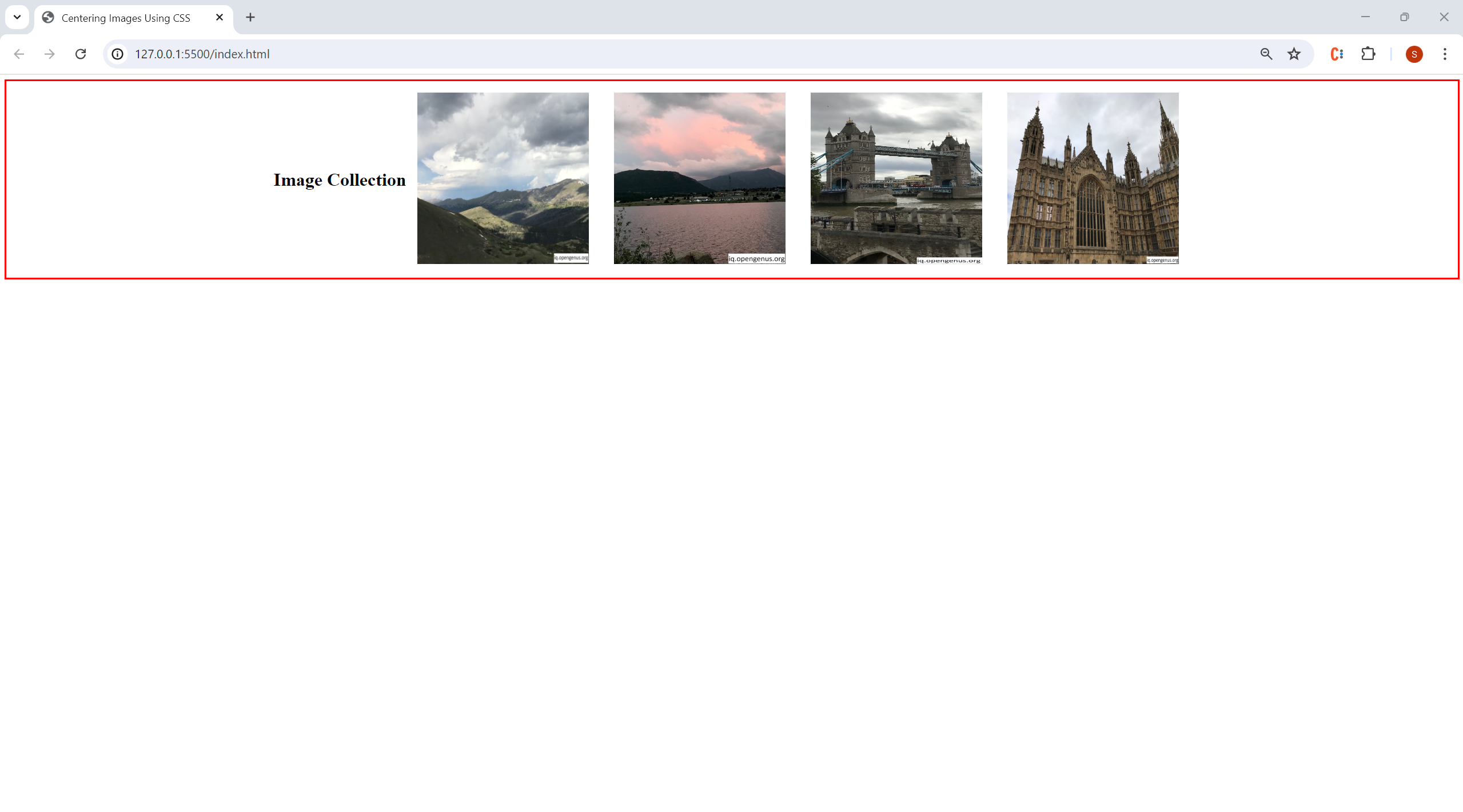
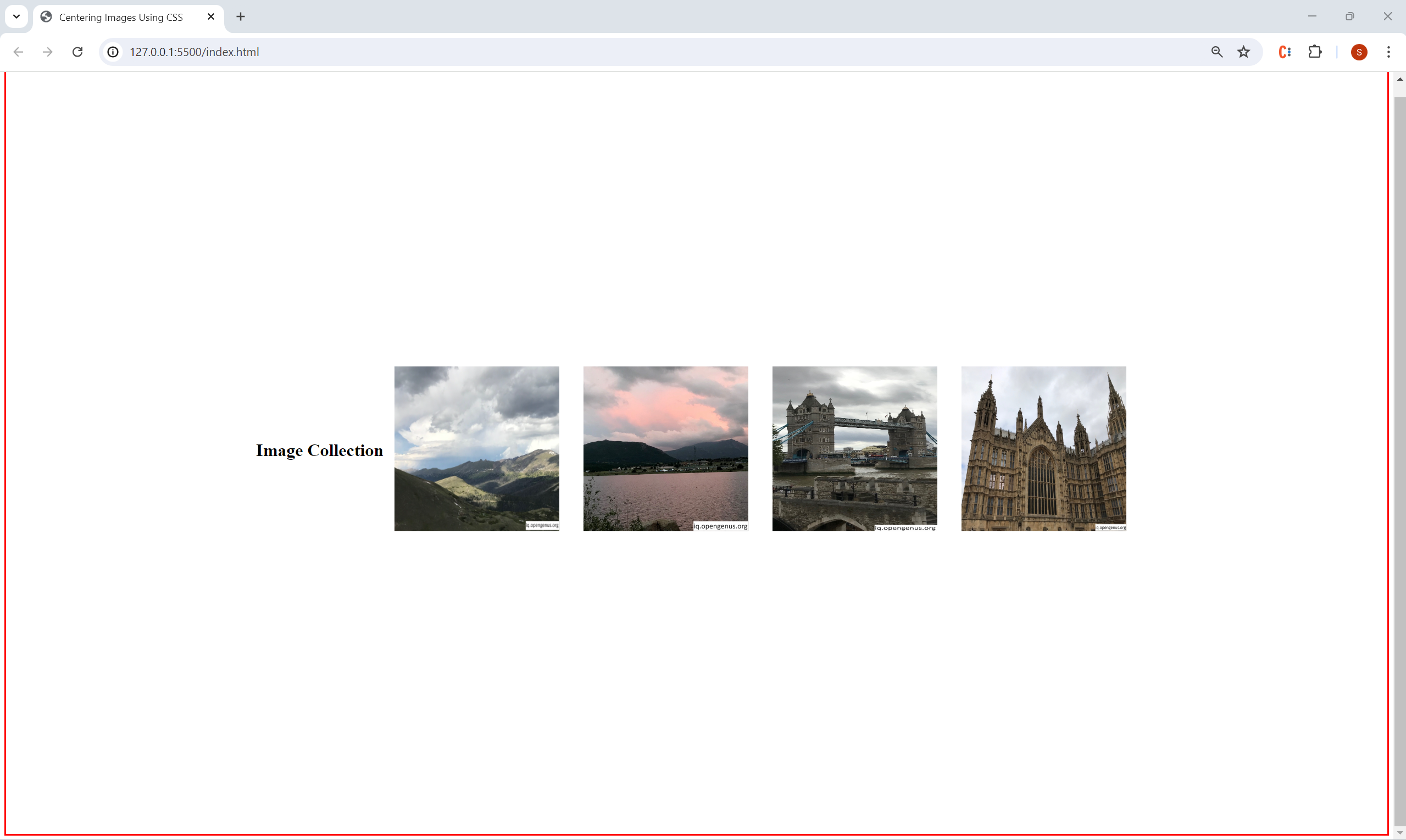
The reason that we need to include height:100vh along with align-items and justify-content is that justify-content only has an effect if there's free space left in our body flex container. By default the body container does not have any free space left over so we need to set height to 100vh, or 100% of the viewport height to center the images both horizontally and vertically on our webpage.
Output (with height:100vh removed and the border of the body container in red):
Output (with height:100vh added and the border of the body container in red):
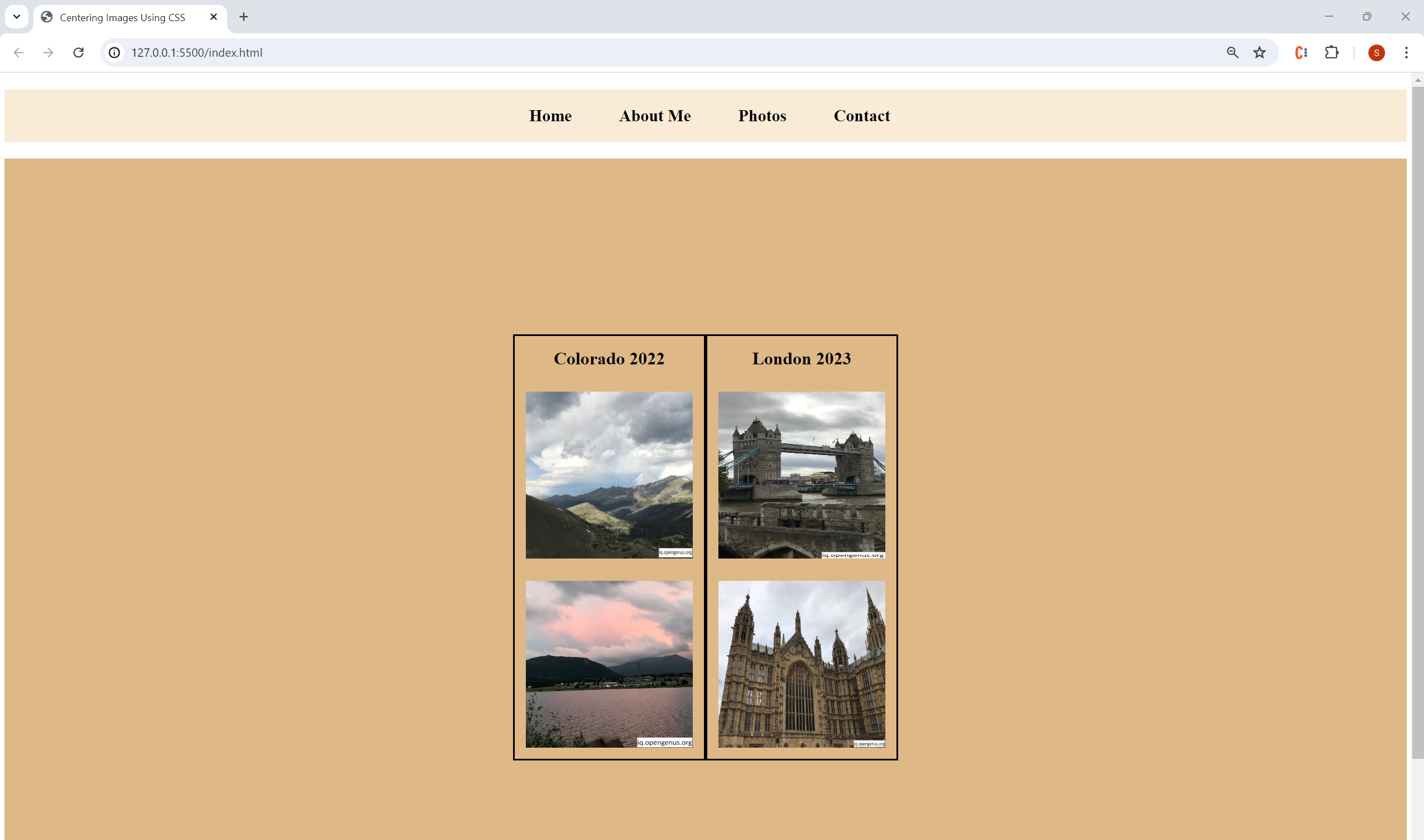
Coding Challenge
Problem: On your personal website, you are creating an album of photos from your previous vacations to share with your family and friends. Using what you have learned in this article, and given the following starter code and images from the article (links to download can be found at bottom), fill in the code for themain-container and sub-container selectors so that your webpage match the output below:
Note: The photo sub-containers should be centered both horizontally and vertically within main-container (the body of the webpage).
index.html:
<!DOCTYPE html>
<html lang="en">
  <head>
    <meta charset="UTF-8" />
    <meta name="viewport" content="width=device-width, initial-scale=1.0" />
    <title>Centering Images Using CSS</title>
    <link rel="stylesheet" href="./styles.css" />
  </head>
  <body>
    <nav>
      <ul>
        <li>Home</li>
        <li>About Me</li>
        <li>Photos</li>
        <li>Contact</li>
      </ul>
    </nav>
    <div class="main-container">
      <div class="sub-container">
        <h1>Colorado 2022</h1>
        <img src="./colorado_1.jpg" />
        <img src="./colorado_2.jpg" />
      </div>
      <div class="sub-container">
        <h1>London 2023</h1>
        <img src="./london_1.jpg" />
        <img src="./london_2.jpg" />
      </div>
    </div>
  </body>
</html>
styles.css
nav {
  background-color: antiquewhite;
}

nav ul{
  display: flex;
  font-size: 30px;
  list-style-type: none;
  font-weight: bold;
  justify-content: center;
}

nav ul li{
  margin-right: 25px;
  text-decoration: none;
  padding: 30px;
}

h1 {
  text-align: center;
}

img {
  height: 300px;
  width: 300px;
  margin: 20px;
}

.main-container {
  //ADD CODE HERE
  background-color: burlywood;
}

.sub-container{
  border: 3px solid black;
  //ADD CODE HERE
}
Answer to Coding Challenge
styles.cssnav {
background-color: antiquewhite;
}
nav ul{
display: flex;
font-size: 30px;
list-style-type: none;
font-weight: bold;
justify-content: center;
}
nav ul li{
margin-right: 25px;
text-decoration: none;
padding: 30px;
}
h1 {
text-align: center;
}
img {
height: 300px;
width: 300px;
margin: 20px;
}
.main-container {
display: flex;
justify-content: center;
align-items: center;
background-color: burlywood;
height: 100vh;
}
.sub-container{
border: 3px solid black;
display: flex;
flex-direction: column;
}
Key Takeaways
- When centering images on a webpage, is it crucial to keep in mind the relationship between parent and child elements (such as
main-containerand the images nested inside it) - In CSS, you can center images both with and without Flexbox (CSS Flexible Box Layout)
- However, using Flexbox will often be easier due to the control it gives you over responsive page layout and the fact that you will have to remember less CSS syntax/rules