
Open-Source Internship opportunity by OpenGenus for programmers. Apply now.
In today's web development crafting responsive and visually appealing layout is crucial. One common design element is an image grid, that is often used to showcase a collection of images in a visually pleasing manner, That is where Responsive Image Grids come in to play. In this OpenGenus article, we will create a responsive image grid using HTML and CSS.
Table of contents:
- What is meant by a Responsive Image Grid.
- Prerequisites.
- step 1: Set up the HTML structure.
- Step 2: Add images.
- Step 3: Styling our images using CSS grid.
- The display grid Property.
- Explaining the CSS code.
What is meant by a Responsive Image Grid.
This concept holds two concepts together that are very important in aligning images into a website.
Responsive web design (RWD) is a web design approach to make web pages render well on all screen sizes and resolutions while ensuring good usability.
Responsive Images then mean displaying images that will render on all screen sizes and and resolutions with good quality and usability.
CSS grid layout is a two-dimensional layout system for the web. It lets you organize content into rows and columns and offers many features to simplify the creation of complex layouts.
These concepts to gether form what is known as a Responsive Image Grid, a Grid of images that are rendered on a website to fit all screen sizes and resolutions. They can be used to showcase a gallery, a portfolio and other types content.
The most basic understanding you need to implement responsive image grid with a very little code is:
basic html such as familiarizing yourself with the basic html tags such as a div and attributes such as classes.
The css you need is to learn about the display property, specifically the display: grid, grid-template-columns, repeat(), min-max, auto-fill and width. These are the css property and values necessary to create responsive image grid in this particular tutorial with minimal code writing.
I will provide the minimal css code in the last section so try it out yoursel!
Prerequisites.
- code editor(eg, Visual studio code, notepad+, ...)
- browser (chrome, firefox, ...)
What I am using for this example:
Visual studio code and Firefox.
Step 1: Set Up the HTML Structure
Keep in mind that this is not a complete beginners guide to html or visual studio and I am not going to explain the html code as well as setting up vscode and creating html and css files. There are a ton of tutorials out there which will help you achieve just.
Learn htmlLearn css
vscode(optional) You can download setup and learn how to install it from their official website.
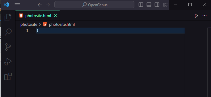
Here we will just create the base code in order to create our resposive image grid. You can do it in two ways. The easiest one being you can use a shortcut code where vscode will automatically create it for you. The other is to copy the code below to use place it into your code editor of choice or write the code your self.
To use the shortcut on vscode type ! and Enter on your keyboard, then vscode will do the work. If this doesn't work in your case I suggest you copy the code in your editor.
After you Enter, your code will be ready, or you can just copy it from below.
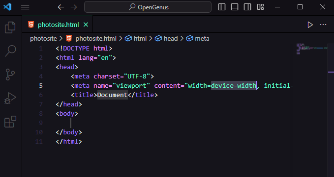
Then change the title of your document in side the head of your document to your prefered name, In my case im going to call it Responsive Image Grid.
Congrats You are ready, to move on to the next step, But before that lets just see what our website looks!
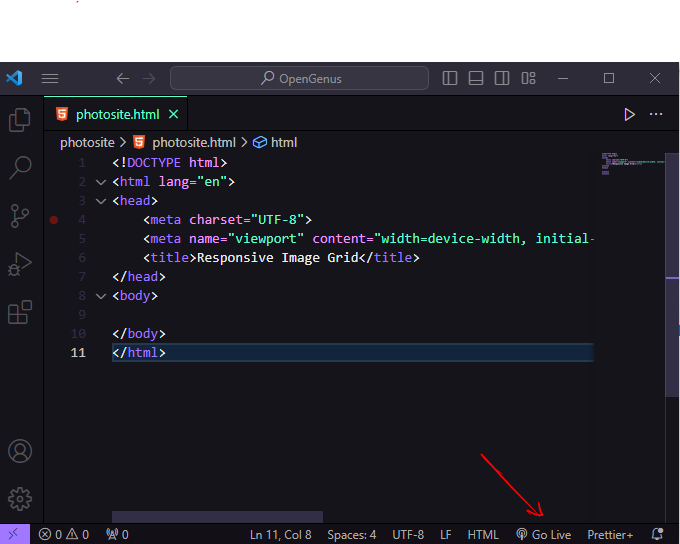
To do that you can just open your html file with your browser or use an extension, I personally like to use the vscode live server extension, which you can find in extensions tab by searching live server. This will help us view the results of our code edits without needing to refresh our browser's tab.
all you have to do is click the open live button at the bottom right of vscode editor and it will open the website.
This is what our website looks like!
Step 2: Add images
You can either add images from your local computer or you can add links from the internet. You can try pexels, unsplash or other site you prefer. I will be using lorempicsum.
Use an img tag to link to the image path using the src attribute and wrap it into a div tag with class of grid-item. img tags are used to place images to our site. src attribute is where we direct the browser to look for the image to show in the site. It can be a link as well. To style our website we add class grid-item to wrapping div.
 <div class="grid-item">
 <img src="https://picsum.photos/id/46/3264/2448" alt="Image 1">
 </div>
copy this code and place it into the body of the html you'll be able to see an image from lorempicsum.
<body>

 <div class="grid-item">
 <img src="https://picsum.photos/id/1/3264/2448" alt="Image 1">
 </div>

</body>
now replicate the div tag and change src attributes value to the different images you would like to display. I will just change the the number that comes after the id to easly switch between different photos on lorem picsum.
<body>

 <div class="grid-item">
 <img src="https://picsum.photos/id/1/3264/2448" alt="Image 1">
 </div>

  <div class="grid-item">
 <img src="https://picsum.photos/id/10/3264/2448" alt="Image 1">
 </div>

  <div class="grid-item">
 <img src="https://picsum.photos/id/20/3264/2448" alt="Image 1">
 </div>

  <div class="grid-item">
 <img src="https://picsum.photos/id/30/3264/2448" alt="Image 1">
 </div>

  <div class="grid-item">
 <img src="https://picsum.photos/id/40/3264/2448" alt="Image 1">
 </div>

  <div class="grid-item">
 <img src="https://picsum.photos/id/50/3264/2448" alt="Image 1">
 </div>

</body>
I replicated the code six times and changed the src value.
The Images appear to be too big, We need to apply styles to view them properly. Before that lets wrap all our images into a container class. Which will contain all grid-item class div elements.
<body>

 <div class="container">
    <div class="grid-item">
      <img src="https://picsum.photos/id/1/3264/2448" alt="Image 1">
    </div>

    <div class="grid-item">
      <img src="https://picsum.photos/id/10/3264/2448" alt="Image 2">
    </div>

    <div class="grid-item">
      <img src="https://picsum.photos/id/20/3264/2448" alt="Image 3">
     </div>

     <div class="grid-item">
       <img src="https://picsum.photos/id/30/3264/2448" alt="Image 4">
     </div>

     <div class="grid-item">
       <img src="https://picsum.photos/id/40/3264/2448" alt="Image 5">
     </div>

     <div class="grid-item">
       <img src="https://picsum.photos/id/50/3264/2448" alt="Image 6">
     </div>

  </div>

</body>
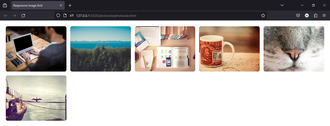
Step 3: Styling our images using CSS grid.
The display grid Property.
In order to assign different layouts to the content of our website using Grid, we need a parent element and the child element will be where the style will be applied to.
In our case we have a parent div element with a class of .container that is a parent of div elements with a class of .grid-item.
The div element with a class of .grid-item is also a parent of the img element.
Applying display: grid property on .container will apply the layout to the its child.
So make sure you apply the display grid property to the parent of the child element you want to style, and by giving the elements a class name you make the code readable and easy to control.
.container {
    display: grid;
    grid-template-columns: repeat(auto-fill, minmax(250px, 1fr));
    gap: 16px;
    padding: 16px;
}

.grid-item {
    position: relative;
    overflow: hidden;
    border-radius: 8px;
}

.grid-item img {
    display: block;
    width: 100%;
    height: auto;
    border-radius: 8px;
}
Lets see what the images look like!
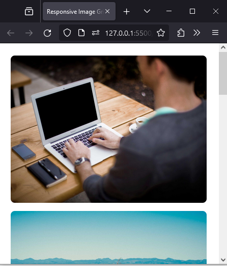
Here is what it looks on a relatively small screen size.
Explaining the CSS code.
Unlike Flexbox, the items will not immediately look any different. To see the change we need to add columns. That is where grid-templaate-columns come in.
The first value passed to the repeat() function specifies the number of times you want the listing to repeat, while the second value is a track listing, which may be one or more tracks that you want to repeat.
grid-template-columns: repeat(auto-fill, minmax(250px, 1fr)); - Creates a grid with columns that automatically fill the available space. Each column has a minimum size of 250px and can grow (1fr) to occupy any remaining space.
For details about the grid layout refer to this link.https://developer.mozilla.org/en-US/docs/Learn/CSS/CSS_layout/Grids
The minmax() function lets us set a minimum and maximum size for a track, a track basically means a single block of the columns. minmax takes two values a minimum which in this case is 250px and a maximum that is 1fr meaning it will take on all the available space.
then we set the gap to be 16px,
Now lets look at the styles applied to .grid-item
position: relative; - Positions the grid item relative to its normal position, allowing for absolute positioning of child elements.
overflow: hidden; - Clips any content that overflows the grid item, ensuring it doesn't affect neighboring items.
border-radius: 8px;- Adds rounded corners to the grid item.
Lastly lets go through styles applied to .grid-item img
display: block; - Makes the image a block-level element, allowing it to fill the entire width of its container.
width: 100%; - Sets the width of the image to 100% of its container, ensuring it is responsive.
height: auto; - Allows the image to maintain its aspect ratio when resizing.
border-radius: 8px;: Applies rounded corners to the image.
For the best experience you can try adding media queries to make it take on different appearance on different device size.
Now let me show you the minimal CSS code for the similar result but less experience and quality.
.container {
    display: grid;
    grid-template-columns: repeat(auto-fill, minmax(250px, 1fr));
}


.grid-item img {
    width: 100%;
}
Key Takeaways
- In order to use css grid, you need to have a parent element which you apply the `display: grid;` proprety to.
- Grid allows us to easily take control of the layout of our website.
- Using the grid template columns and grid template rows we can create responsive layouts for the child elements.
- Unlike flexbox you don't see any difference before and after setting the display property to grid. to see the results you will need the grid-template-columns property and its value.