
Table of Contents-
- Introduction
- Understanding the law
- Precautions
- Conclusion
Introduction
Human brain is one of the interseting scientific mysteries for various physcologists,neuroscientists & doctors. Now there are various principles all around the world about how we humans percieve the world visually & make decisions based on that perception and one such principle is Gestalt's principle - Law of Proximity which is followed in the world of UX design as well.
This principle plays a vital role in understanding how the human eye perceives connections between visual elements.
Law of Proximity in UX Design states that the elements that are closed to each other are perceived to be a part of the same group & elements that are separated from each other are perceived to be a part of different groups.
Understanding the law
Let's understand this law via an example -
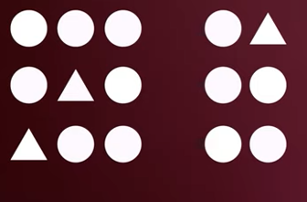
Now as soon as we see these shapes we naturally perceive them to be in two seperate groups. This proximity principle is so strong that it can easily overpower other characterstics such as color and shape. Even when we add differnces in color and shapes the whitespace between them clearly seperates the shapes into different groups.
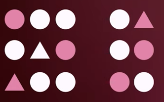
Through the above example we can also see that the whitespace between different elements plays a vital role in the law of proximity.
Precautions
Now there are certain precautions that need to be taken care of while applying law of proximity. Let's see them one by one via different examples -
- The amount of whitespace between different elements states that they have different functions from each other therefore we have to be very careful while establishing that meaning to our users. eg.-

Here in the above eg. we can see that there is a list of food items but at first glance we cannot tell if they are different from each other. However, if we'll add some whitepsace between them it'll carry a much more meaningful result for our users -

Now we can easily group our pizzas and burgers in different groups and categories which is making our design much more meaningful for our users.

- However, when similar looking elements are placed too close to one another but with different functionalities users may not be able to distinguish between them eg. -
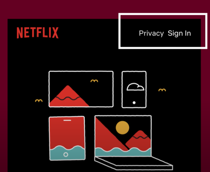
In this eg. "Privacy" & "Sign-in" are placed too close to each other due to which it may create an illusion that they maybe a single link- "PrivacySign".
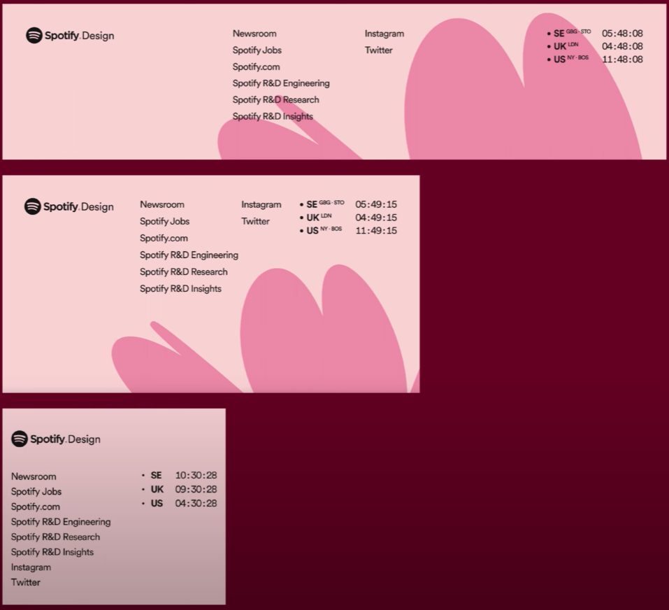
- We've to also make sure that our whitespaces are maintained even in different responsive screen sizes.Scaling down to smaller devices may squeeze our whitespaces between different elements changing the intended grouping relationships between the elements. eg -
Conclusion
In the world of UI design Law of proximity helps us in delivering meaningful & efficient grouping and we should use it help our users and not to confuse them.