
Get this book -> Problems on Array: For Interviews and Competitive Programming
A responsive nav-bar is a UI/UX based element, which is essential to improve the appearance and ease of navigation in websites. It consists of a 1D bar (usually) with icons and hyperlinks to take you to different parts of the same website. Almost all modern websites have a nav bar of some format, and the better-looking and functional it is, the more it improves user experience and gives a great impression, especially if you want to add it to your portfolio projects.
We can easily create a simple and responsive navigation bar anywhere in our page using HTML and CSS (Flexbox) . All we need to do is follow certain steps, make sure that our nav bar displays good responsiveness and we are ready to go!
(Note: We will discuss a top and side nav bar in this OpenGenus article. By the end of this article, you will get a sufficient idea of how to go about making your custom nav bar.)
Pre-requisites: Knowledge of HTML, CSS, JS, Flexbox, Bootstrap (optional).
Table of Contents:
1. How to set out the structure of the nav bar using HTML?
2. How to add styling to the nav bar using CSS?
3. How to make the nav bar responsive?
4. How to make the nav bar more interactive, using JS?
How to set out the structure of the nav bar using HTML?
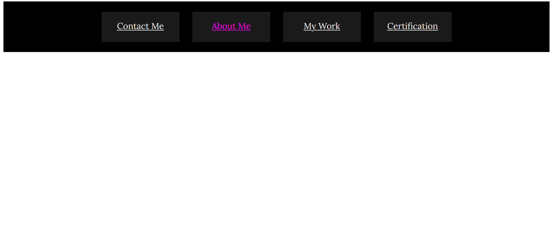
We first create the layout of it in our HTML file. As you know, top nav bars generally consist of a 1-D layout, with several buttons in the form of links to other webpages.
    <div class="navbar">
        <div class="one"> <a href="example1.link"> Contact Me </a> </div>
        <div class="two"> <a href="example2.link"> About Me </a> </div>
        <div class="three"> <a href="example3.link"> My Work </a> </div>
        <div class="four"> <a href="example4.link"> Certification </a> </div>
    </div>
How to add styling to the nav bar using CSS?
Now, we add basic CSS. In the below code, I have only added basic styling and decided on a dark theme, but you can play around with color themes, font families and text colors of your choice and customize it to your heart's content. This is just minimal styling to give you an idea on how to achieve your desired layout.
.navbar{
    display:flex;
    height:20vh;
    align-items:center;
    justify-content:center;
    gap:30px;
    background-color:rgb(0, 0, 0);
}
Now, to customize the look and to size the menu options appropriately, we add style to each of the boxes- to center align each of them and adjust the text to show up at the exact center (horizontally and vertically), to give our flexbox a professional look.
(Note: You can easily center align the content within a flexbox, using a flex within and setting justify-content: center and align-items: center.)
.one,.two,.three,.four{
    /* height:90px;  */
    background-color: rgb(27, 27, 27);
    height:50px;
    width:180px;
    text-align:center;
    padding-top:20px;
    font-family:'Lora',sans-serif;
    font-size:20px;
}
Change the font color to white, in line with our dark theme, if that's what you have decided to adopt as well.
a{
    color:whitesmoke;
}
I have also made my links appear pink upon hovering on them, to lessen the dullness of the current theme.
a:hover {
    color:magenta;
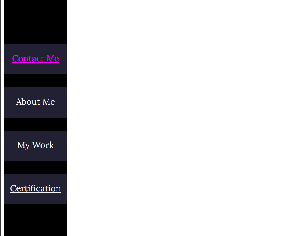
How to make the nav bar responsive?
In case a customer views your website in a device with a smaller screen than say, a laptop or huge monitor, we need to make our nav bar responsive. This is a really important part of web designing principles, and I have used @media to do this. If my screen width reduces to 800px and below, I change my top nav-bar to a side nav-bar, and accordingly, I modify my flex to a column-based form.
@media (max-width:800px){
    .navbar{
        display:flex;
        flex-direction:column;
        background-color:rgb(0, 0, 0);
        height:100vh;
        width:25vh;
    }
    .one,.two,.three,.four{
        background-color:rgb(33, 33, 51);
        width:25vh;
        text-align:center;
        padding-top:20px;
        font-family:'Lora',sans-serif;
        font-size:20px;
    }
}
Our resulting nav bar looks like this on a big screen:
and like this on a small screen:
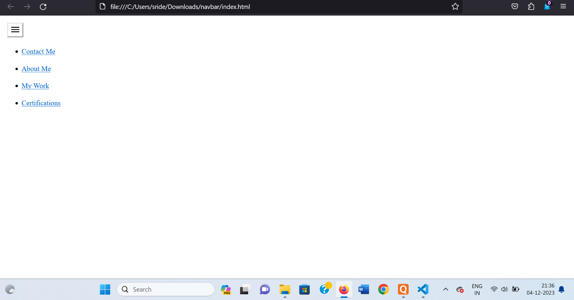
How to make the nav bar more interactive, using JS?
We can use JS to make a "hamburger" menu, which is esentially what you see in professional websites when you click on the icon with three lines and it results in a drop-down menu effect.
To achieve such an effect, firstly, we add a link to the hamburger menu icon through Google Fonts icons.
<link href="https://fonts.googleapis.com/icon?family=Material+Icons" rel="stylesheet">
To add the content to our dropdown menu, we use the same format as we did in our simple nav-bar, except that we format it as an unordered list to make it appear organized, upon being displayed as a dropdown list.
<ul class="menu">
    <li> <a class="m1" href="example1.link">Contact Me </a> </li>
    <li> <a class="m2" href="example2.link">About Me </a> </li>
    <li> <a class="m3" href="example3.link">My Work </a> </li>
    <li> <a class="m4" href="example4.link">Certifications </a> </li>
</ul>
<button class="hamburger">
    <i class="menuIcon material-icons"> My Menu </i>
</button>
Add your preferred styling to the basic CSS layout given below:
.hamburger {
    position:fixed;
    z-index:1000;
    top:1rem;
    left:1rem;
    background: white;
    cursor: pointer;
}
.menu{
    display:none;
}
.menu.open{
    display:block;
    margin-top:70px;
}
Make sure to keep a high z-index value for the hamburger icon, so that upon toggling the menu open, it stays in its original position.
You can customize it according to your style choices. I have added minimal styling since we have discussed the same under the former headings. We can skip right to the JS to add functionaliy. Our aim is to write code so as to enable the "display menu on clicking" effect we wish to elicit from the hamburger menu icon.
const button=document.querySelector('.hamburger');
const menu=document.querySelector('.menu');

button.addEventListener('click', ()=>{
  menu.classList.toggle('open');
});
We added an event listener to our menu button, so that upon user interaction with it via clicking, the menu toggles open.
Don't forget to link your JS either internally or externally!
<script src="./index.js"></script>
This is how it looks:
I hope this article helped give you an idea of how to structure your nav bar using HTML,CSS and JS. Please do note that this is one of several methods, although this is the simplest and most beginner-friendly way to go about it. You can also use Bootstrap, an external framework to achieve the same with a more professional web designer look.