
Table of Contents:
- Introduction
- Understanding the clip Property
- Examples
- Conclusion
Introduction:
CSS provides a wide array of properties to enhance the visual presentation of web pages. One such powerful yet often overlooked property is clip. The clip property allows you to define a visible region for an element by cropping its content. In this article at OpenGenus, we'll explore the clip property and its various use cases, along with code examples, to help you leverage its capabilities and create visually stunning web designs.
Understanding the clip Property:
The clip property is used to define the visible portion of an element by specifying its clipping region. This region is defined using four values: clip-top, clip-right, clip-bottom, and clip-left. These values represent the distance from the respective edges of the element's bounding box.
The clip property can be applied to elements with position: absolute or position: fixed, as it requires the element to have explicit positioning. It allows you to clip any overflowing content, revealing only the desired portion.
.clip-element {
  position: absolute;
  clip: rect(clip-top, clip-right, clip-bottom, clip-left);
}
Examples:
1. Clipping an Image:
Let's say you have an image that you want to display only a specific section of. You can achieve this by applying the clip property. Consider the following code:
<div class="image-container">
  <img src="image.jpg" alt="Image" class="clipped-image">
</div>
.image-container {
  position: relative;
  width: 400px;
  height: 300px;
  overflow: hidden;
}

.clipped-image {
  position: absolute;
  clip: rect(50px, 250px, 250px, 50px);
}

In this example, we create a container with a fixed width and height, and the image is positioned absolutely within it. The clip property is used to define the region of the image to be displayed, cropping the rest.
2. Creating Custom-Shaped Elements:
The clip property can be utilized to create custom-shaped elements. By carefully defining the clipping region, you can achieve visually appealing effects. Here's an example:
<div class="custom-shape"></div>
.custom-shape {
  position: absolute;
  width: 200px;
  height: 200px;
  background-color: #ff0000;
  clip-path: polygon(50% 0%, 100% 50%, 50% 100%, 0% 50%);
}
In this case, we create a square element with a red background color. By using the clip-path property along with the polygon function, we define a custom shape by specifying the coordinates of the clipping points. This creates a triangular shape by clipping three corners of the square.
3. Animating Clipped Content:
The clip property can also be animated, allowing you to dynamically reveal or hide content. Consider the following example:
<div class="animated-clip"></div>
.animated-clip {
  position: absolute;
  width: 200px;
  height: 200px;
  background-color: #00ff00;
  clip: rect(0, 200px, 200px, 0);
  animation: reveal 2s ease-in-out infinite alternate;
}

@keyframes reveal {
  0% {
    clip: rect(0, 200px, 200px, 0);
  }
  50% {
    clip: rect(100px, 200px, 200px, 0);
  }
  100% {
    clip: rect(0, 200px, 200px, 0);
  }
}
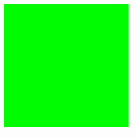
In this example, we create a square element with a green background color. By utilizing CSS animations and keyframes, we define the reveal animation, which alternates between clipping the top and bottom halves of the square, creating a visually dynamic effect.
Conclusion:
The clip property in CSS empowers you to manipulate the visibility of elements by defining clipping regions. Whether you want to crop images, create custom shapes, or animate content, the clip property provides a versatile toolset. By understanding its usage and experimenting with different values, you can unlock a world of possibilities for creating visually captivating web designs.