
Get this book -> Problems on Array: For Interviews and Competitive Programming
Table of contents:
Introduction
Over the years, design has proven to be just as important as functionality in attracting new users. Some claim that design is the hardest part of development, since it sometimes seems impossible to appease every taste and give users an intuitive feel of what the product's functionality is supposed to be.
While I don't deny all things said before, I believe that designing can actually become quite fun if you have all the right 'ingredients', that is, know a lot of properties that can help you create amazing user interfaces.
In this article at OpenGenus, we will be discussing one such property that will serve as a stepping stone in making websites seem more lively and intuitive: animations.
If we were to look at most websites today, we could probably identify a lot of animations going on, some more and others less prominent.
Of course, not all websites are filled with animations like these ones, but you are certainly likely to encounter subtle animations in most professional websites, such as fade-ins or text color switches.
Animations
Now that we are familiarized with the idea of animations, another important question comes up:
How do we actually code animations?
Well, as with most things in programming, there is no straight-up answer to this.
Keyframes
First of all, I'd like to discuss the declaration of animations. They are actually called keyframes and are declared like so:
@keyframes name {
    /* code
    ...
    ...
    */
}
The first thing we do is give it a name. Then, inside the keyframe, we need to establish a start point ( how the object we're animating looks at the start of the animation) and an end point ( how the object we're animating looks at the end of the animation ).
We can do this by using keywords from and to:
@keyframes name {
    from {
        /* start appearance */
    }
    to {
        /* end appearance */
    }
}
Besides the from and to keywords, we can also use percentages to change the object's properties at fixed times during the animation.
For example, this code is equivalent to what we've written before:
@keyframes name {
    0% {
        /* start appearance */
    }
    100% {
        /* end appearance */
    }
}
Notice how we used 0% to replace 'from' and 100% to replace 'to'? The possibilities don't stop here, though. We could define any percentage, any number of times.
For instance, this is also valid:
@keyframes name {
    0% {
        /* start appearance */
    }
    20% {
        /* change that happens at 20% through the animation */
    }
    40% {
        /* change that happens at 40% through the animation */
    }
    60% {
        /* change that happens at 60% through the animation */
    }
    100% {
        /* end appearance */
    }
}
Now, say we wanted to make the animation stop running for a part of the time and then continue right up to 100%. We can also do that by introducing a comma between values, just like this:
@keyframes name {
    0% {
        transform: translateX(0px);
    }
    50%, 80% {
        transform: translateX(30%);
    }
    100% {
        transform: translateX(90%);
    }
}
For the sake of the example, we introduced a few values. ( ! A little reminder that the transform property, in this case, translates the element across the X axis ! ) What is going to happen now, is that our element will start at the left of the page, then start slowly sliding towards the right. After half of the duration passes, it will stop when it has a margin-left of 30%. Then, the element will stagnate until 80% of the time passes. At the end, it will zoom all the way to a margin-left of 90%.
That's the gist of it. Of course, we still haven't declared anything on the actual element we'd like to animate, so we're not near being done with our animation.
Let's discuss how to apply animation on an element after we've written out the keyframe.
Animation properties
The most important properties are as follows:
- animation-name
- animation-duration
- animation-delay
- animation-iteration-count
- animation-play-state
- animation-fill-mode
- animation-direction
- animation-timing-function
Now, let's discuss each of them separately.
animation-name
This one is very intuitively named, so you have probably guessed what value it expects: the name of the animation.
animation-name: name;
What happens here is that we link the keyframe to the element.
This should mean the animation works on our element now, right?
Go ahead and try it out. I'll wait.
...
...
...
...
...
...
Assuming that you've tried, you're probably a bit disappointed. No, it doesn't work.
And why is that?
All I'm telling you is this: it has to do with the next property.
animation-duration
This one is named intuitively as well, so you have probably already guessed that it has to do with the duration of time in which the animation is set to run.
The default value is auto, which means 0s. That is why nothing happened on your screen in the experiment we did.
To make it work, you can give it a fixed value of seconds or miliseconds, like so:
animation-duration: 2s;
which is equivalent to:
animation-duration: 2000ms;
Now, your animation officially starts as soon as the page renders!
animation-delay
If you don't want the animation to start as soon as it is triggered, CSS provides another property, called 'animation-delay'.
Its values are assigned as are those of the 'animation-duration' property: in seconds and miliseconds:
animation-delay: 2s;
which is equivalent to:
animation-delay: 2000ms;
If you add this property, the animation will start 2 seconds later than it is triggered.
animation-iteration-count
This property expresses how many times the animation runs.
You can assign any integer as a value, or even a number with decimals. For example:
animation-iteration-count: 1.5;
This is actually possible, running the whole animation once and then stopping at the half in the second run.
One of the most used values, however, is the keyword infinite, which makes the animation run forever.
animation-iteration-count: infinite;
The default value for this property is 1 time.
animation-play-state
The 'animation-play-state' property tells the program whether the animation is playing or not.
The two values that can be used are:
- paused
- running
Pretty self-explanatory, right?
This property is mainly used when the programmer intends to trigger the animation based on an event, in which case one would presumably set the play state as paused in the CSS, then set it as running using the 'animationPlayState' property in Javascript.
animation-fill-mode
Now, if you've been playing around with an animation, you've probably noticed that, after it stops, it immediately zooms back into the place it was at 0%.
But can't we control where the animation remains when it starts or when it finishes?
Yes, yes we can. This is exactly what this property does.
Let's list the values we can assign to the property, then explain them one by one:
- none
- forwards
- backwards
- both
none
This value will not take into consideration any of the properties assigned in the keyframe, and the element will go back to the properties defined within the rest of the CSS.
forwards
This value is arguably the most used, since it retains the properties defined in the last keyframe. In other words, once the animation ends, it remains in place.
backwards
This value will retain the properties in the first keyframe. It also retains them before the animation starts if there is any delay set in place. In other words, both when the animation starts when it ends, the properties applied will be those from the first keyframe.
both
This value combines the forwards and backwards values. That is, if there is any delay set, the first keyframe properties will be applied, just as what happens if backwards is assigned, and, in the end, the properties retained are those of the last keyframe, just as what happens if forwards is assigned.
The default value for this property is none.
animation-direction
This property defines the order in which the keyframes are being played.
Let's list the values we can assign to the property, then explain them one by one:
- normal
- reverse
- alternate
- alternate-reverse
normal
If we assign this value to the property, the animation is played normally, starting from the first keyframe through to the last keyframe.
reverse
This value is the opposite of the 'normal' value. If we assign this value to the property, the animation is played in reverse, starting from the last keyframe through to the first keyframe.
alternate
This value only makes sense if the animation-iteration-count is set to more than 1. If we assign this value to the property, the animation is first played normally, then in reverse, and so on.
alternate-reverse
This value only makes sense if the animation-iteration-count is set to more than 1 and is the opposite of the 'alternate' value.
If this value is assigned to the property, the animation is first played in reverse, then normally, and so on.
The default value for this property is normal.
animation-timing-function
This property is a bit trickier. It sets how the animation progresses through the keyframes.
The values that can be assigned to it are called easing functions and are determined by a cubic-bezier function.
A cubic-bezier is a curve that defines how your application flows. It can be declared as such:
animation-timing-function: cubic-bezier(p1, p2, p3, p4)
,where p1 represents the start and p4 represents the end and the values of p1 and p3 must be between 0 and 1.
There are also some predefined curve values that are worth mentioning, since you may run into them quite often:
- ease
- linear
- ease-in
- ease-out
- ease-in-out
ease
Is equal to cubic-bezier(.25, .1, .25, 1). It increases in velocity towards the middle of the animation, only to slow at the end.
linear
Is equal to cubic-bezier(0, 0, 1, 1). As its name suggests, it animates at a linear speed.
ease-in
Is equal to cubic-bezier(.42, 0, 1, 1). It starts off slowly and rushes towards the end.
ease-out
Is equal to cubic-bezier(0, 0, 0.58, 1) and it is the opposite of the 'ease-in' property. It starts quickly and slows down towards the end.
ease-in-out
Is equal to cubic-bezier(.42, 0, .58, 1) and is a mix of the 'ease-in' and 'ease-out' properties. It slowly transitions, speeds up and then slows down again.
Besides the cubic-bezier function that is designed to flow, being as it is a curve, there is also a function, used significantly less, called steps.
You may assign a value of steps with an integer parameter, and the animation will be 'hopped' throughout in however many steps you define.
For example, if we do this:
animation-timing-function: steps(4);
the animation is going to be divided in 4 even steps and jump from one to the other, not maintaining any flow, unlike the bezier curve.
There is an optional second parameter to the steps function, which is called a jump-parameter.
The jump-parameter can be:
- jump-start
- jump-end
- jump-none
- jump-both
jump-start
The first jump will happen when the application begins.
jump-end
The last jump will happen when the application ends.
jump-none
There is no jump happening at the start or at the end.
jump-both
There will be jumps both at the start and at the end, and an additional jump will be added to the declared integer.
The default value for the 'animation-timing-function' property is ease.
Bonus
CSS
So, we've jotted down all the main properties that can be used to control an animation. Man, there are a lot!
But worry not, there is a shorthand property to ease your work and tired fingers!
Here it goes:
animation: /animation-name/ /animation-duration/ /animation-timing-function/
/animation-delay/ /animation-iteration-count/ /animation-direction/ /animation-fill-
mode/ /animation-play-state/
The property names, of course, will be replaced with their corresponding values.
SASS
In case you're using SASS, there is something that can ease your work even further! Here is how we can spare some time on declaring animation properties in SASS:
Instead of writing pure CSS, like this:
.animatedElement {
    animation-name: name
    animation-duration: 300ms;
    animation-timing-function: ease-in-out;
    animation-delay: 300ms;
    animation-iteration-count: infinite;
    animation-direction: alternate;
    animation-fill-mode: forwards;
    animation-play-state: running;
}
We can go ahead and shorten it like this:
.animatedElement {
    animation: {
        name: name;
        duration: 300ms;
        timing-function: ease-in-out;
        delay: 300ms;
        iteration-count: infinite;
        direction: alternate;
        fill-mode: forwards;
        play-state: running;
    }
}
You can ignore the values set, since they are all there for the sake of example, but do notice how we spared ourselves from writing 'animation' 8 times!
If you were to think that the average adult types at an average of 40 words per minute, most people would spare a minute every 5 animations written! May not seem like much of an improvement, but, I promise, it does add up!
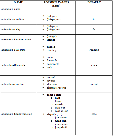
Cheat sheet
Upon creating this article at OpenGenus, I've also incorporated the things discussed throughout into a cheat sheet, for more clear viewing:
Conclusion
Thank you for making it all the way through the end of this article at OpenGenus.
I hope that this article was of use to you and you learned something today!