
Get this book -> Problems on Array: For Interviews and Competitive Programming
Popovers are overlays of content (essentially like pop-up boxes) which can be triggered upon clicking or hovering over an element in your webpage. As seen in the design of iOS, they are very helpful to provide and fit lots of secondary information about any topic or content described in element without taking up too much of the webpage space as they can be made visible or hidden as per the user's wish. In this OpenGenus article, we shall present to you 2 methods to implement a popover in your webpage- either by using simple HTML, CSS & JS or incorporating Bootstrap to give your popover a more professional look.
Pre-requisites: Knowledge of HTML, CSS, JS and JQuery
Table of Contents:
1. Why do we use popovers?
2. What is the difference between tooltips and popovers?
3. Implementation using Bootstrap
WHY DO WE USE POPOVERS?
We use popovers because oftentimes, when fitting content or information related to a topic, we find that it clutters our webpage and takes up too much of space. A better option which offers greater UX would be to customize our elements so that users can interact with it only if they want to, that is to offer information only if it is of interest to the customer, rather than info-dumping. You can observe more frequent use of popovers in websites which have a huge catalogue of products or vast amounts of information regarding subtopics. They are also preferred due to their dismissability and their capability to host interactive content which can further be used to update the user of any info regarding what they are interested in.
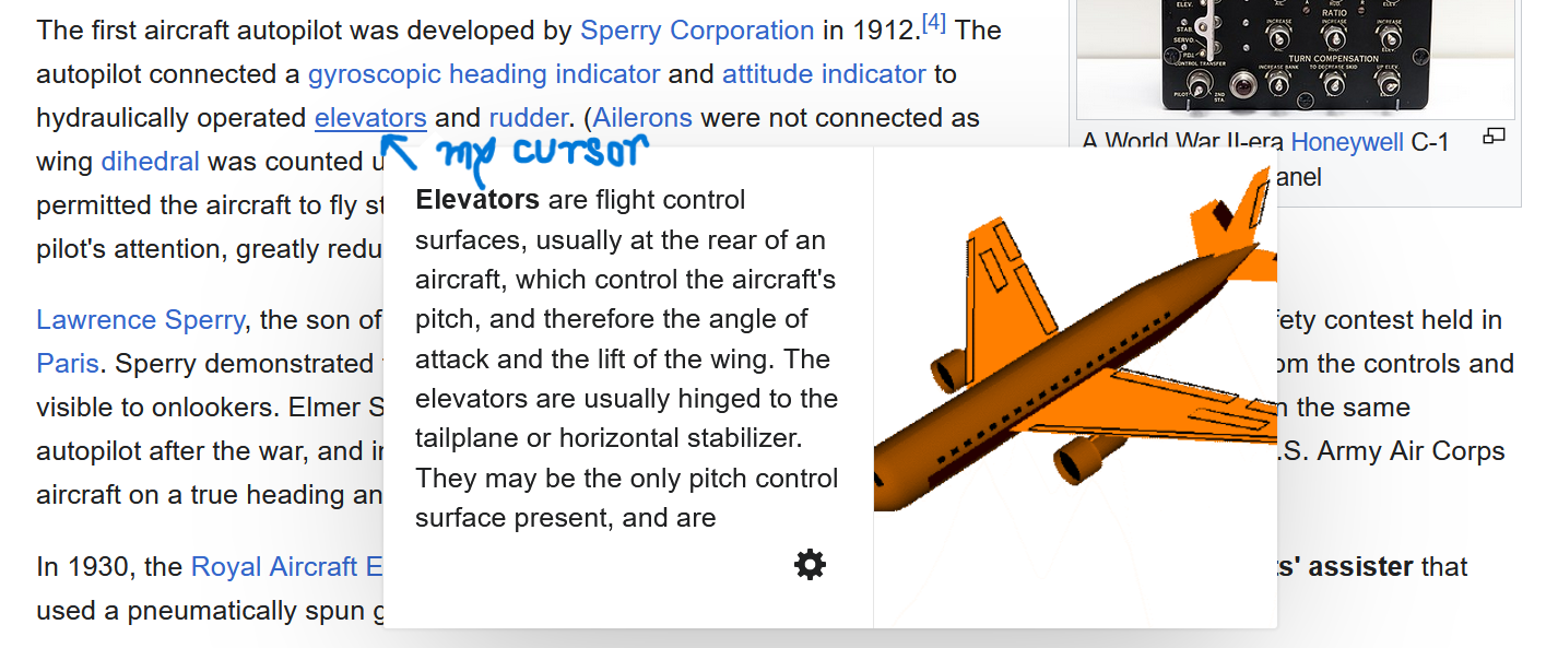
Observe, in an article from Wikipedia above, how popovers are used and how they can be used to navigate the vast reservoir of information that is Wikipedia.
WHAT'S THE DIFFERENCE BETWEEN TOOLTIPS AND POPOVERS?
Despite sharing the same functionality as popovers, tooltips are used for an altogether different purpose- to provide some short context, or additional hints about an element. Rather than hosting a whole content of information, or interactive abilities, they are designed to display one-line information, usually a short explanation of some sort, or an additional navigation link/aid to understand what the element is/does.
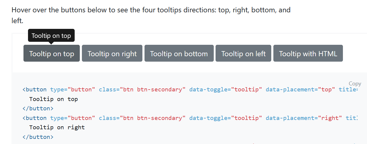
Look at this example from the Bootstrap documentation to see different styles of implementation of a tooltip.
IMPLEMENT A POPOVER USING BOOTSTRAP
An efficient and professional way to include popovers in your website is to use Bootstrap.
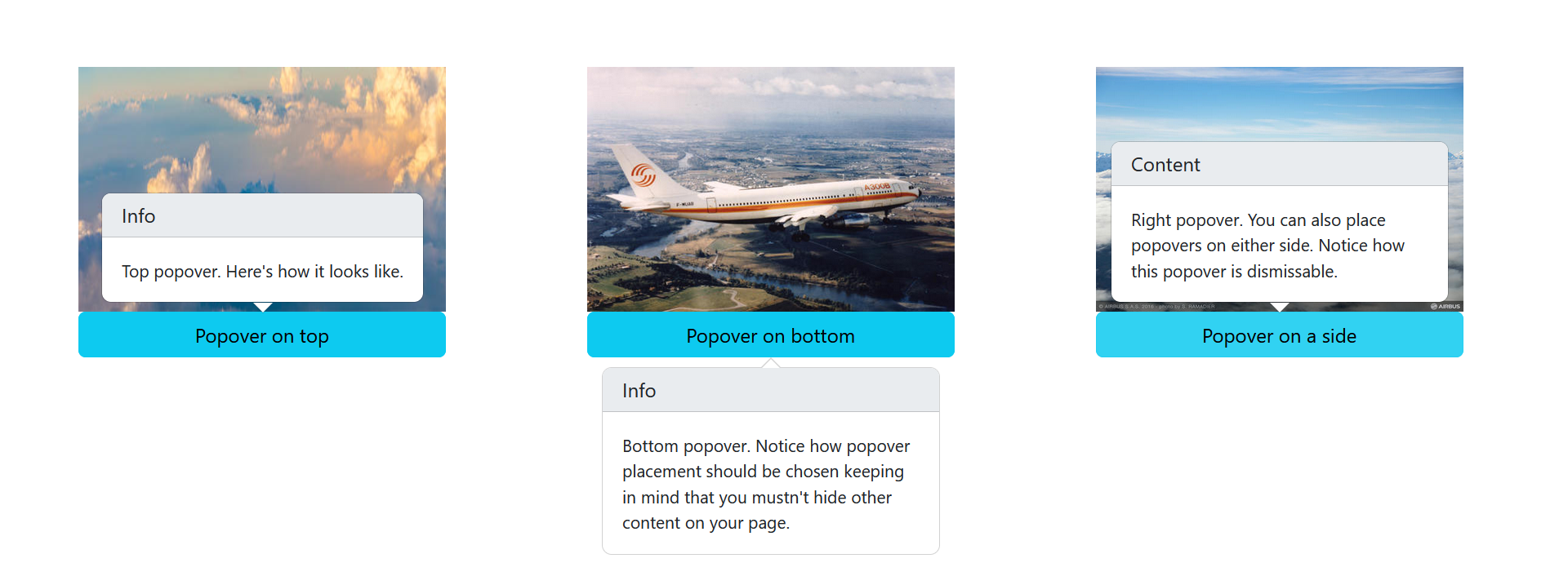
In this sample webpage, I have created 3 cards with popovers attached to them. You can also go through the code, paste it into your editor, have a play around with it and try to understand what each block of code does.
Follow these steps to include the required links and dependencies for your popovers to work:
- Include the Bootstrap CDN within the head tags.
<link href="https://cdn.jsdelivr.net/npm/bootstrap@5.3.2/dist/css/bootstrap.min.css" rel="stylesheet" integrity="sha384-T3c6CoIi6uLrA9TneNEoa7RxnatzjcDSCmG1MXxSR1GAsXEV/Dwwykc2MPK8M2HN" crossorigin="anonymous">
- Before the closing of the body tag, include the JQuery CDN as well as the Bootstrap.bundle.min.js CDN (Note: if you don't include this, you have to include the popper.js CDN as well in the previous step).
<script src= "https://ajax.googleapis.com/ajax/libs/jquery/3.3.1/jquery.min.js" />
<script src="https://cdn.jsdelivr.net/npm/bootstrap@5.3.2/dist/js/bootstrap.bundle.min.js" integrity="sha384-C6RzsynM9kWDrMNeT87bh95OGNyZPhcTNXj1NW7RuBCsyN/o0jlpcV8Qyq46cDfL" crossorigin="anonymous" />
- To initialize your popovers, paste in this code provided in the Bootstrap docs after the previous step.
    <script>
        const popoverTriggerList = document.querySelectorAll('[data-bs-toggle="popover"]')
        const popoverList = [...popoverTriggerList].map(popoverTriggerEl => new bootstrap.Popover(popoverTriggerEl))
    </script>
What this block of code does is, it uses the document.querySelectorAll method to collect all the elements which have the attribute data-bs-toggle="popover" and it returns a collection of nodes.
Then, the spread operator(...) is used to convert this collection of nodes to an array, and we use the map method to take each element in the array and create a new popover instance for each. The result of the map method is a new array which contains a list of the popover objects, all ready to be displayed when the user triggers them by clicking.
4. I have included my CSS inline, and if you wish to separate it out as an external file to avoid cluttering, you can do so. Here are my sample cards to show you a popover's functionality:
<body style="margin: 5%;">
<div class="main" style="display: flex; gap: 10%;">
<div class="content1" style="display: flex; flex-direction: column; width: 300px;">
<img src="header-A380-own-the-sky-homepage--big.jpg" height="200px" width="300px" />
<button type="button" class="btn btn-info" data-bs-container="body" data-bs-toggle="popover" data-bs-placement="top" data-bs-title="Info" data-bs-content="Top popover. Here's how it looks like.">
Popover on top
</button>
</div>
<div class="content2" style="display: flex; flex-direction: column; width: 300px;">
<img src="A300B-in-flight_0.jpg" height="200px" width="300px" />
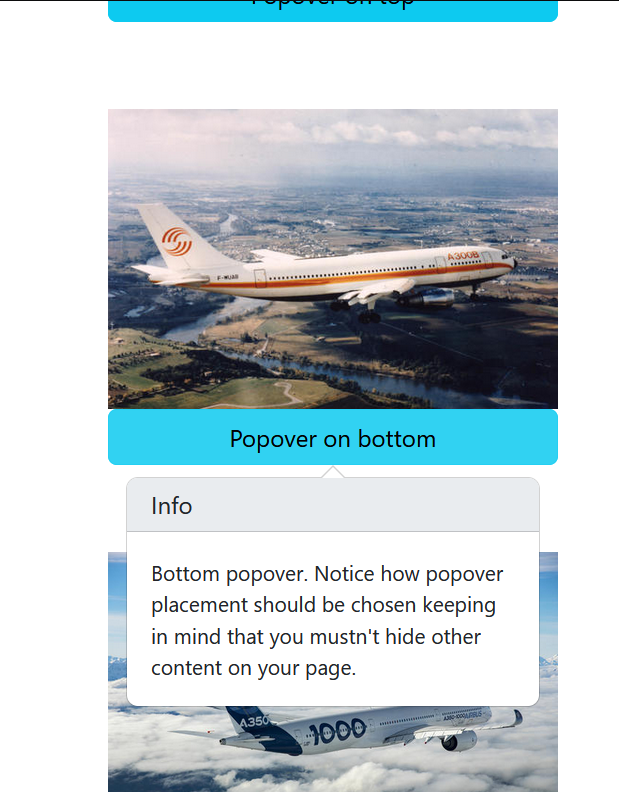
<button type="button" class="btn btn-info" data-bs-container="body" data-bs-toggle="popover" data-bs-placement="bottom" data-bs-title="Info" data-bs-content="Bottom popover. Notice how popover placement should be chosen keeping in mind that you mustn't hide other content on your page.">
Popover on bottom
</button>
</div>
<div class="content3" style="display: flex; flex-direction: column; width: 300px;">
<img src="A350-1000-in-flight.jpg" height="200px" width="300px" />
<button type="button" class="btn btn-info" data-bs-container="body" data-bs-toggle="popover" data-bs-placement="right" data-bs-title="Content" data-bs-trigger="focus" data-bs-content="Right popover. You can also place popovers on either side. Notice how this popover is dismissable.">
Popover on a side
</button>
</div>
</div>
- Let's focus on how we created the popover.
<button type="button" class="btn btn-info" data-bs-container="body" data-bs-toggle="popover" data-bs-placement="right" data-bs-title="Content" data-bs-trigger="focus" data-bs-content="Right popover. You can also place popovers on either side. Notice how this popover is dismissable.">
We created a button element using Bootstrap and created a popover trigger for it. The data-bs-container attribute is set to 'body' to avoid rendering issues when we use complex components like a button group in our case. The data-bs-placement attribute is used to determine where you want your popover to be visible when triggered- to the top, bottom, right or left of the button. The data-bs-trigger attribute is optional, and when set to focus it gives the popover the property of dismissability i.e. the popover can be dismissed upon clicking anywhere in the page.
This is useful since sometimes it can be annoying to have the popover still open when scrolling down, and we have to scroll all the way up and click on the button to close it. The data-bs-title and data-bs-content attributes are used to set the title and content of the popovers respectively. If both are ignored, the popover will not show up. You can ignore the content if you want it to act as a tooltip.
This is how our website looks:
KEY TAKEAWAYS
- Popovers are overlays which cover and provide information about their parent element. They can be dismissable and are a great way to include more information without dumping it in a linear fashion.
- In contrast to popovers, tooltips only provide one-line information, usually a reference or extra context to the parent element and are typically visible only upon mouseover- they also don't offer any interactability.
- We can include Bootstrap's popover element from their library to give our popovers a professional look and make them responsive as well.
- If you notice, we haven't given any responsiveness to our webpage, and when you decrease the screen width and try to trigger the pop-up it will shift from its default position to try and show you its full content.
- To fix this, we can add some responsiveness as internal CSS:
@media (max-width: 1200px) {
            .main {
                flex-direction: column;
                height: 120vh;
                align-items: center;
                justify-content: space-around;
            }
 }
- If you wish to further customize the popover, you can use CSS variables. Set an attribute data-bs-custom-class="custom-popover" to override the default popover design and style it in this format:
.custom-popover {
  --bs-popover-border-color: /* add a border color e.g. var(--bd-insert_color_here-bg) */;
  --bs-popover-header-bg: /* add a background color to the header e.g. var(--bd-insert_color_here-bg) */;
  --bs-popover-header-color: /* add a font color to the header e.g. var(--bs-insert_color_here) */;
}
- If you want to know further details on how to control and customize your popovers, head on to the official Bootstrap documentation to learn more.