
Open-Source Internship opportunity by OpenGenus for programmers. Apply now.
CSS grid is a layout system which provide us to create responsive website in a easy way. As flexbox is designed for 1D layout either in row or column but with grid we can create 2D layout - row and columns at the same time. This article is created to help you to understand grid system in better way.
Grid Container
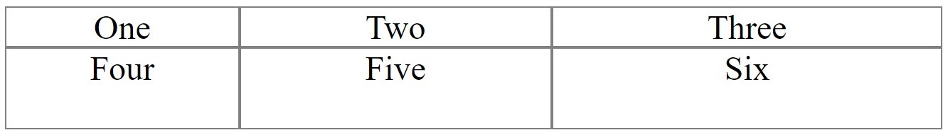
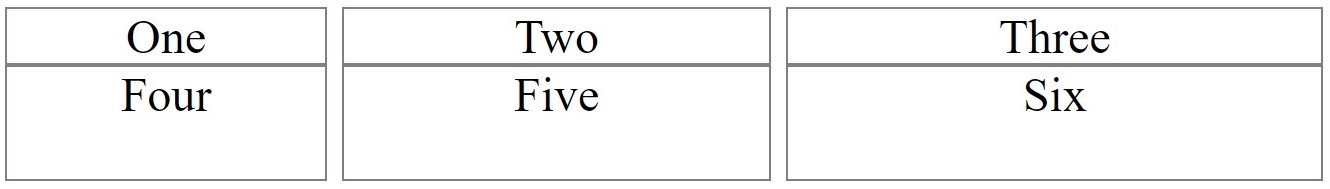
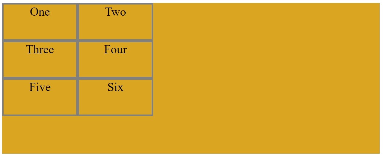
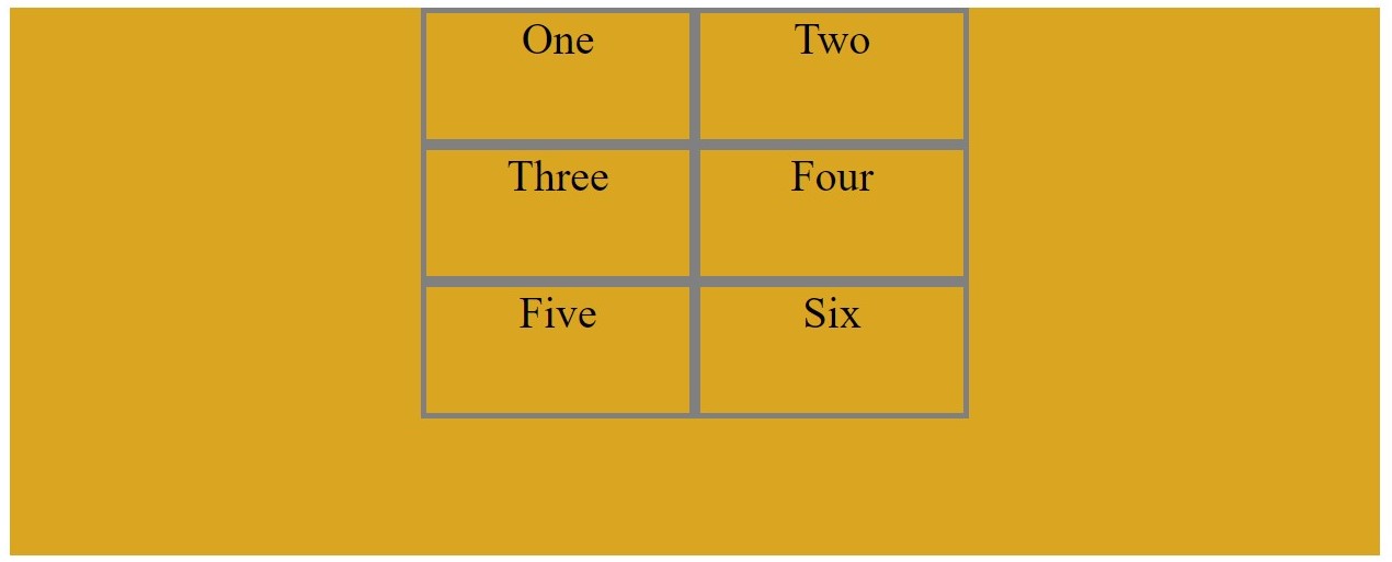
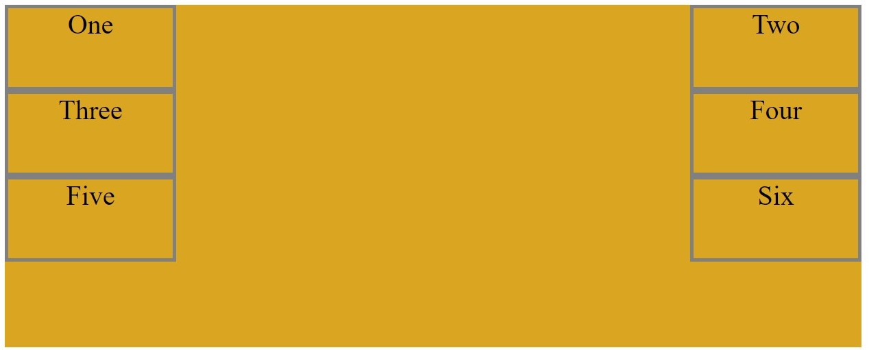
Grid containter is created by setting the display property as grid or inline grid. Inside this container all their child become grid item.
- display: grid;
HTML
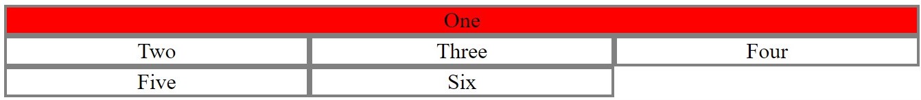
<div class="container">
<div class="item1">One</div>
<div class="item2">Two</div>
<div class="item3">Three</div>
<div class="item4">Four</div>
<div class="item5">Five</div>
<div class="item6">Six</div>
</div>
CSS
.container{
display: grid;
}
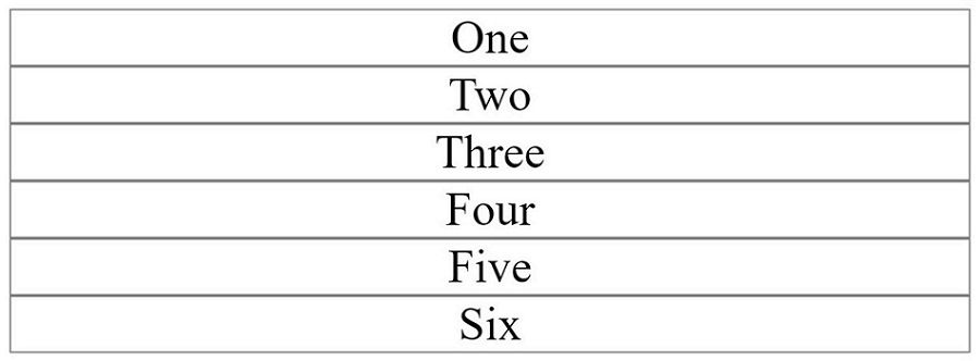
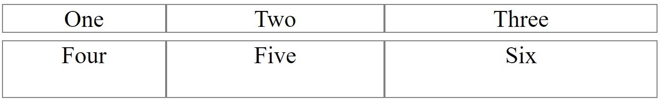
In this example all grid item placed in row and take full width of their parents container.
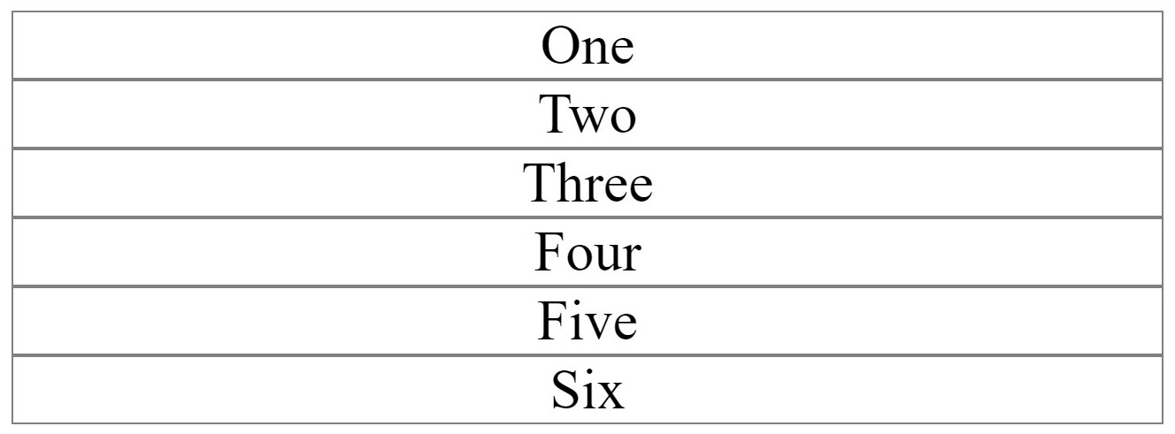
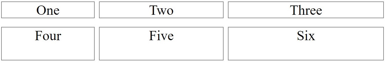
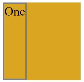
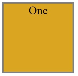
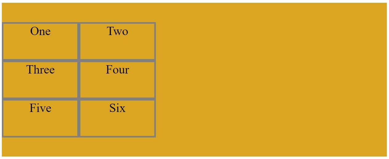
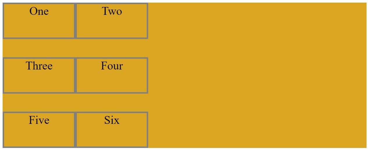
- display: inline-grid;
CSS
.container{
    display: inline-grid;
}
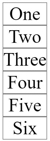
In this example item take width as width of its text.
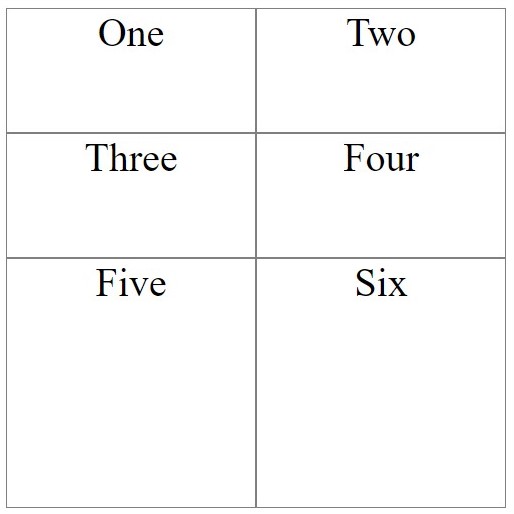
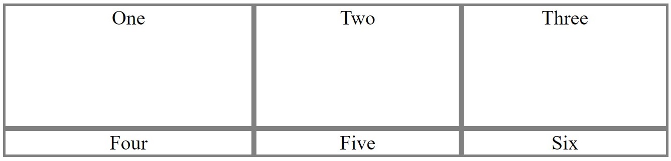
Explicit Grid
Explicit grid create row and columns using grid-template-rows and grid-template-columns properties.
-
grid-template-rows
We have to assume whole container as templete and how many rows you want inside it is defined by this properties
CSS
.container{
    display: grid;
    grid-template-rows: 100px 100px;
}
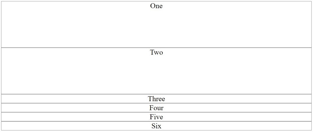
As you see we only pass two 100px value so that grid one and grid two take the height of 100px. Item one and two are called explicit grid. Remaining items are implicit grid because we haven't define it. Grid size values can be any non-negative, length value (px, %, em, etc.)
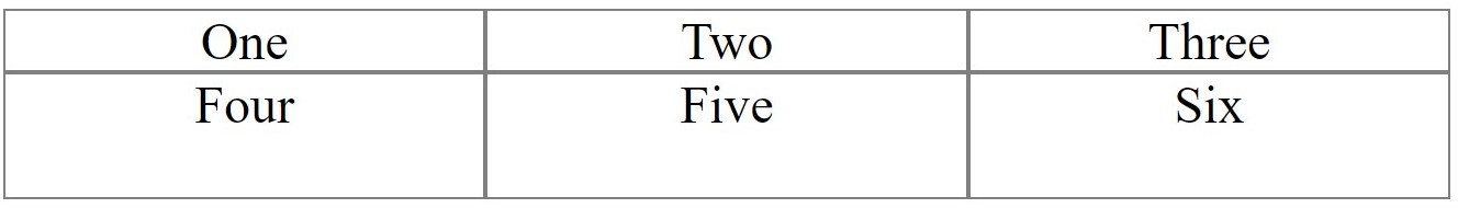
grid-template-columns
We have to assume whole container as templete and how many columns you want inside it is defined by this properties
CSS
.container{
    display: grid;
    grid-template-rows: 100px 100px;
    grid-template-columns: 100px 100px 100px;
}
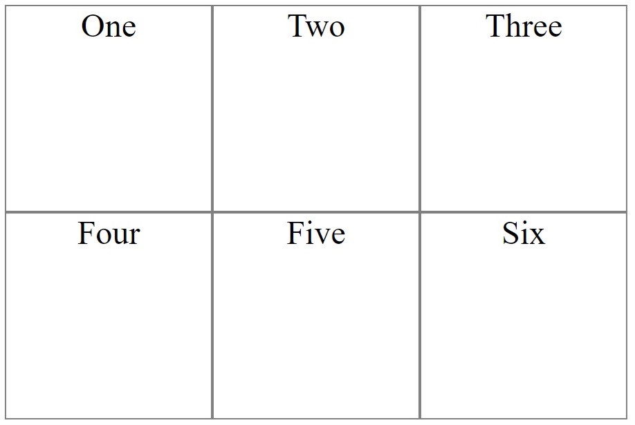
As passes three 100px value template creatded three columns of 100px.
Note
The fr is fractional unit helps create flexible grid tracks. It represents a fraction of the available space in the grid container.
CSS
.container{
    display: grid;
    grid-template-rows: 1fr 2fr;
    grid-template-columns: 3fr 4fr 5fr;
}
Implicit Grid
An implicit grid is created when a grid needs to position items outside of the explicit grid.
The implicit grid can be defined using the grid-auto-rows, grid-auto-columns, and grid-auto-flow properties.
grid-auto-rows
CSS
.container{
    display: grid;
    grid-template-rows: repeat(2,50px);
    grid-template-columns: repeat(2,100px);
    grid-auto-rows: 100px;
}
In this example we define 2 row with 50px and 2 columns with 100px. Third row are auto created to make room for item Five and Six with 100px height.
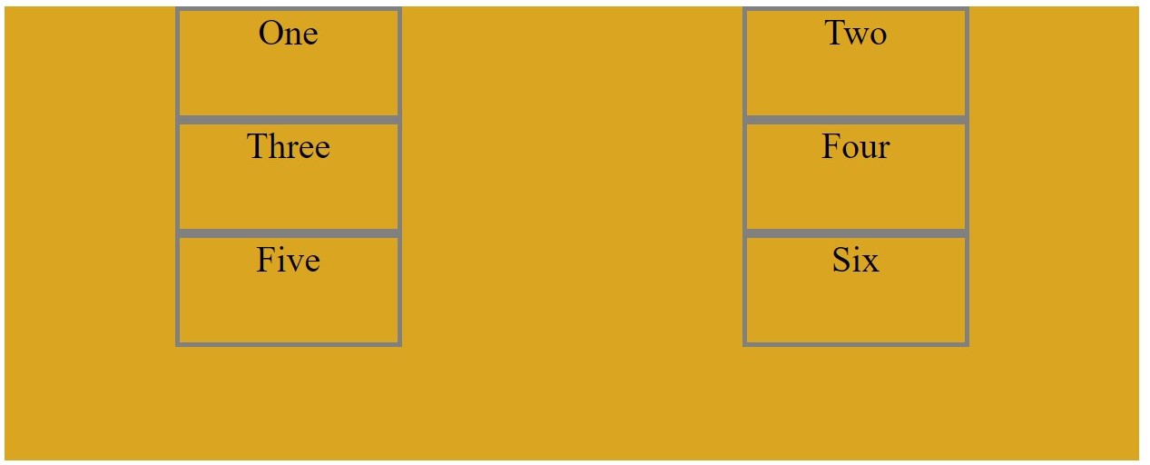
grid-auto-flow
CSS
.container{
    display: grid;
    grid-auto-flow: rows;
}
The default flow/direction of a grid is row.
grid-auto-flow
CSS
.container{
    display: grid;
    grid-auto-flow: column;
}
The default flow/direction of a grid is column.

grid-auto-columns
CSS
.container{
    display: grid;
    grid-auto-flow: column;
    grid-template-columns: repeat(4, 50px);
    grid-auto-columns: 100px;
}

In this example we define 4 columns with width 50px and last two columns are auto created to make room for item Five and Six with 100px width.
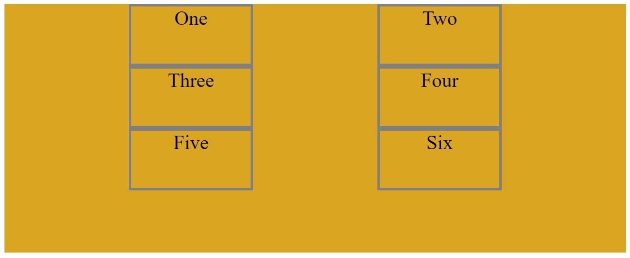
Grid Gaps
Gaps are creating between rows and columns grid-row-gap and grid-column-gap. Grid gaps are only created in between columns and rows, and not along the edge of the grid container.
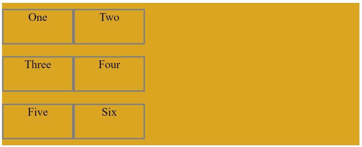
grid-row-gap
Gap between the rows.
CSS
.container{
    display: grid;
    grid-row-gap: 5px;
}
grid-colums-gap
Gap between the columns.
CSS
.container{
    display: grid;
    grid-column-gap: 5px;
}
-
grid-gap
grid-gap is shorthand for grid-row-gap and grid-column-gap.
CSS
.container{
    display: grid;
    grid-gap: 10px 5px;
}
If two values are specified, the first represents grid-row-gap and the second grid-column-gap.
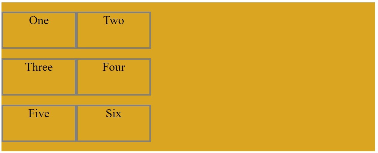
Repeating Grid
repeat() function is useful for grids with grid of equal sizes or many items.
CSS
.container{
    display: grid;
    grid-template-columns: repeat(3,2fr);
}
The repeat() function accepts 2 arguments: the first represents the number of times the grid should repeat, and the second is the grid dimension.
Minimum and Maximum Grid Sizes
minmax() function is defined as minimim and/or maximum size of grid item.
CSS
.container{
    display: grid;
    grid-template-rows: minmax(100px, auto);
    grid-template-columns: minmax(100px, 200px) 1fr 1fr;
}
The minmax() function accepts 2 arguments: the first is the minimum size of the item and the second the maximum size
In this example, row item is set to have a minimum height of 100px, but its maximum size of auto will allow the row track to grow it the content is taller than 100px.
First columns item is set to have a minimum width of 100px and maximum width of 200px and remaining two column have width of 1fr.
Positioning Items
Grid line are line representing the start, end and between the rows and columns in grid template.
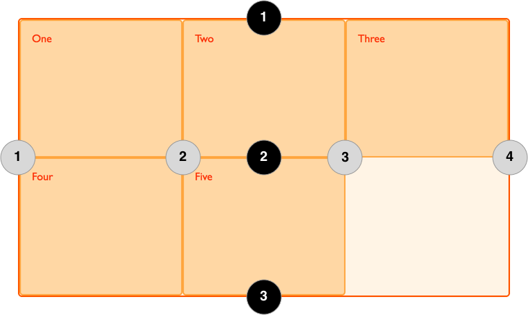
Number in black circle represent row grid line and number in grey circle represent column grid number.
This grid line number help us to positioning for the grid item within container.
grid-row-start, grid-row-end, grid-column-start, grid-column-end are the properties use in positioning.
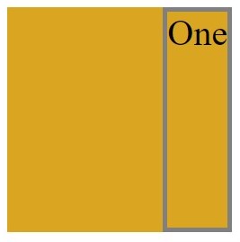
before applying properties item "Five" is at 2nd row 2nd column.

CSS
.item5{
    grid-row-start: 1;
    grid-row-end: 2;
    grid-column-start: 2;
    grid-column-end: 3;
}

after applying properties item "Five is at 1st row 2nd column, means rows start at 1st and end at 2nd grid line and columns start at 2nd and end at 3rd grid line.
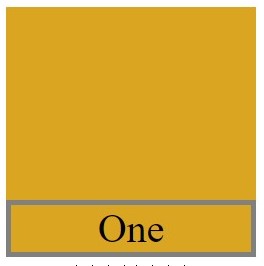
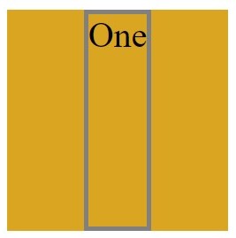
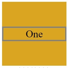
Spanning Items Across Rows and Columns
Grid items span only one column and row track by default, but can span multiple row and/or column tracks using the same properties to position them.
Before applying properties item "One" span only one fractional unit.

CSS
.item5{
    grid-row-start: 1;
    grid-row-end: 2;
    grid-column-start: 1;
    grid-column-end: 4;
}
After applying properties item "One" span through full width in first row, means item "One" column start at 1st and end at 4th grid line.
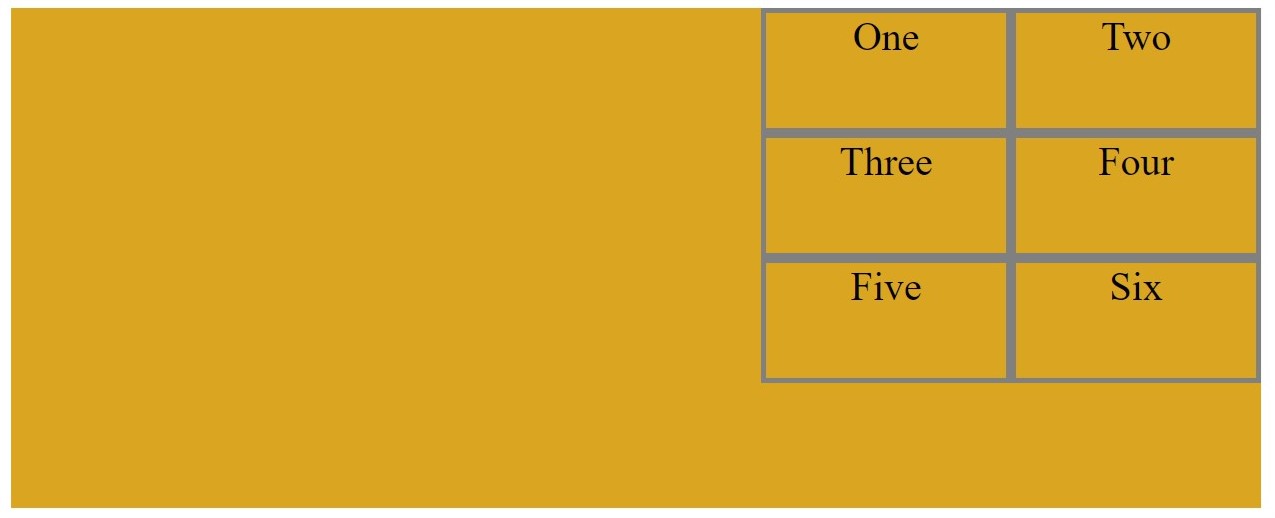
Box Alignment
Box Alignment in CSS Grid allow items to be aligned along the row of column axis.
justify-items align items along the row axis, and align-items align items along the column axis. These two support following value.
-
start
CSS
.container{
    display: grid;
    justify-items: start;
}
CSS
.container{
    display: grid;
    align-items: start;
}
-
end
CSS
.container{
    display: grid;
    justify-items: end;
}
CSS
.container{
    display: grid;
    align-items: end;
}
-
center
CSS
.container{
    display: grid;
    justify-items: center;
}
CSS
.container{
    display: grid;
    align-items: center;
}
-
stretch
CSS
.container{
    display: grid;
    justify-items: stretch;
}
Individual items can be self-aligned with the align-self and justify-self properties by same values as above.
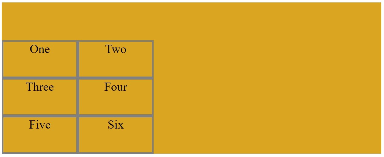
Aligning Grid Items
Grid items can be aligned relative to the grid container along the row and column axes.
align-content aligns tracks along the row axis and justify-content along the column axis.
-
start
CSS
.container{
    display: grid;
    justify-content: start;
}
-
end
CSS
.container{
    display: grid;
    justify-content: end;
}
CSS
.container{
    display: grid;
    align-content: end;
}
-
center
CSS
.container{
    display: grid;
    justify-content: center;
}
CSS
.container{
    display: grid;
    align-content: center;
}
-
space-around
CSS
.container{
    display: grid;
    justify-content: space-around;
}
The remaining space of the grid container is distributed and applied to the start and end of each column track.
CSS
.container{
    display: grid;
    align-content: space-around;
}
The remaining space of the grid container is distributed and applied to the start and end of each row track
-
space-between
CSS
.container{
    display: grid;
    justify-content: space-between;
}
The remaining space is distributed between the column tracks.
CSS
.container{
    display: grid;
    align-content: space-between;
}
The remaining space is distributed between the row tracks.
-
space-evenly
CSS
.container{
    display: grid;
    justify-content: space-evenly;
}
The remaining space is distributed where the space between the columns are equal to the space at the start and end of the row track.
CSS
.container{
    display: grid;
    align-content: space-evenly;
}
The remaining space is distributed where the space between the rows are equal to the space at the start and end of the column track.
With this article at OpenGenus, you must have a complete idea of Grid Position. Enjoy.