
Open-Source Internship opportunity by OpenGenus for programmers. Apply now.
Table of Contents
- Introduction
- Data Description and Data Cleaning
- Trees vs. Air Quality Choropleth Map
- Legend for Chloropleth Graph
- Scatterplots
- Conclusion
Introduction
Data visualization is a powerful tool for exploring and understanding complex datasets. In this tutorial at OpenGenus, we will explore how to create an interactive data visualization using D3.js, a popular JavaScript library for data visualization. We will build a visualization that showcases the relationship between trees, air quality, and poverty rates in different community districts of New York City (NYC). The visualization will consist of a choropleth map, scatter plots, and interactive features for exploring the data. Let's dive in!
Data Description and Data Cleaning
First, let's look at the raw data and how it is cleaned to fit the purpose of this project. There were multiple open source datasets were used to complete this interactive analytics web page:
Dataset 1: 2015 Tree Census from NYC Open Data
This dataset was very large, containing 684k rows and 45 columns and originally included variables from tree health, type, who sighted it, etc.
it was cleaned down to just over 87,000 rows and 8 columns
To clean the data, I subsetted to only trees that were alive, their health was considered good, and their diameter to be greater than 20 inches (as per the generic definition of a large tree)
Additionally, I dropped most of the descriptive columns to only give us tree_id, block_id, nta (neighborhood tabulation area), borough, and latitude and longitude.And to calculate the tree number per community district, I accumulated each row which shares the same community district code and then averaged it.
Dataset 2: NYC Air Quality from NYC Open Data
This dataset contains 16,122 rows and 12 columns on different measures of air quality. For the purpose of this project, I decided to use the measure for particulate matter (PM2.5). I also only include rows that included air quality measurements by community district to fit our other datasets. To allow this dataset to be more easily used with our geojson file, we added the air quality data as a feature in our geojson file using an online tool.
Dataset 3: NYC poverty data from NYC open data
This dataset contains 385 rows and 52 columns on the poverty rate in each neighborhood. I averaged the poverty rate in each community district (community districts are areas governed by separate community boards created in 1975) and found the mapping between the community district in this dataset and the other datasets. Each data point from this dataset is a neighborhood area instead of a community district, so we accumulated each row which shared the same community district. After processing the data, we found the average poverty rate based on the community district. The community district in each dataset has different forms. In the poverty dataset, the community district is formed by a borough code followed by a number. I mapped this to a three digit number. For example, 102 means Manhattan community district 02.
Some of the rows contain more than 1 community district (for example, MN
Community district 1 & 2). In these cases, I split the string and processed them separately.
Additional Files:
File 1: Boundaries of NYC Community Districts from NYC Open Data
This file tells the boundary of each different community districts. And I have obtained it from the NYC Open Data source.
After having a good idea of the datasets that we have created, let's look at how we can use the data to create interactive web pages.
Trees vs. Air Quality Choropleth Map
First, we will create the Trees vs. Air Quality Choropleth Map using D3.js.
We will first create a file called index.html and include all our code in the file. Let's import the code first
<script src="https://d3js.org/d3.v7.min.js"></script>
<script src="https://d3js.org/topojson.v3.min.js"></script>
<script src="legend.js"></script>
<link
    href="https://fonts.googleapis.com/css?family=Aldrich|Arima+Madurai|Open Sans|Libre+Baskerville|Pirata+One|Poiret+One|Sancreek|Satisfy|Share+Tech+Mono|Smokum|Snowburst+One|Special+Elite"
    rel="stylesheet">
Next, we will set up the basic HTML structure for the project
<h2 style="text-align: center;">Trees, Air Quality, & Poverty in NYC</h2>
  <div class="flex-row">
    <div style="padding-right: 30px">
      <div class="plot">
        <svg id="nyc-choropleth" height="600" width="800" ></svg>
        <div class="flex-row">
          <div>
            <h5> Air Quality Scale (Particle Concentration - PM2.5) </h5>
            <svg id="colorLegend" height="75" width="400" style="background: #fff" ></svg>
          </div>

        </div>
      </div>
    </div>
    <div>
The main parts here are the svgs. We will be working on the svgs in the next parts to draw the graphs.
We first set up the svg by defining its width, length and its margin. Note that the mapWidth, length and margin is different from the svg's width,length and margin.
  const svg = d3.select("#nyc-choropleth");
  const width = svg.attr("width");
  const height = svg.attr("height");
  const margin = { top: 20, right: 20, bottom: 20, left:20};
  const mapWidth = width - margin.left - margin.right;
  const mapHeight = height - margin.top - margin.bottom;
  const map = svg.append("g").attr("transform","translate("+margin.left+","+margin.top+")");
Now, we will make the requestData variable where we call it at the end to draw all the canvas.
const requestData = async function() {

}

requestData();
The requestData variable will have to be an async function since the the d3 data will return a promise. We will first unwrap the promises.
const nyc = await d3.json("data/map.geojson");
const trees = await d3.csv("data/trees.csv");
const air = await d3.csv("data/air.csv");
const income = await d3.csv("data/neighborhood_income.csv");
Now, we will set the basic data structure that is needed for the interactive map
var AirDict = {};
    air.forEach(d => {
        AirDict[d['community_district'] ] = d['particle_concentration']
    });

    let CD_to_num = {"BX":"2","BK":"3","MN":"1","QN":"4","SI":"5"}
    let blockTreeNum = {};
    let blockPoverty = {};
    function boroMap(d){
      if(d<=112 && d>=101)
      {
        return "#46A716" // "Manhattan"
      }
      if(d<=503 && d>=501){
        return "#175978" // "Staten Island"
      }
      if(d<=212 && d>=201){
        return "#995D81" // "The Bronx"
      }
      if(d<=318 && d>=301){
        return "#F7C548"// "Brooklyn"
      }
      if(d<=414 && d>=401){
        return "#EB6534"// "Queens"
      }
       else return "Undefined"
    };

    for(let i=0; i<trees.length;i++)
    {
      let CD_num = trees[i]['community board']
      if (!blockTreeNum[CD_num]){
        blockTreeNum[CD_num] = 0;
      }
      blockTreeNum[CD_num]+=1; // Accumulate tree
    }

    let CDCode = "";
    let CDOriginal = "";

    // Translate
    for(let i=0; i<income.length;i++)
    {
      CDOriginal = income[i].CD.split(' ');

      // Add the first CD data
      if ((CDOriginal[3].length)==1)//add 0: BX community district 1 => BX01
      {
        CDCode = CD_to_num[CDOriginal[0]]+"0"+CDOriginal[3];
      }
      else CDCode = CD_to_num[CDOriginal[0]]+CDOriginal[3];// BX community district 11 => BX11
      if(blockPoverty[CDCode]==undefined) blockPoverty[CDCode] = []
      blockPoverty[CDCode].push(Number(income[i].NYC_Poverty_Rate));//add the first CD data

      // If there is more than one CD data in this row
      if ((CDOriginal.length)==6)  // BX community district 1 & 2 => need to add BX02
      {
        if ((CDOriginal[5].length)==1) // BX community district 1 & 2 => add BX02
        {
          CDCode = CD_to_num[CDOriginal[0]]+"0"+CDOriginal[5];
        }
        else CDCode = CD_to_num[CDOriginal[0]]+CDOriginal[5]; // BX community district 1 & 11 => add BX11
        if(blockPoverty[CDCode]==undefined) blockPoverty[CDCode] = []
        blockPoverty[CDCode].push(Number(income[i].NYC_Poverty_Rate)); // Add the second CD data
      }
    }

    // Calculate block poeverty mean
    blockPovertyMean = {}
    Object.keys(blockPoverty).forEach((d,i)=>
    {
      blockPovertyMean[d] = d3.mean(blockPoverty[d]);
    });
We just compiled each column in the dataset and set it accordingly so that it fits our purpose for the project. We compiled the air quality information, mapped different positions to different kinds of colors and then translated the code provided in the dataset into a form that can be more easily be used by us. Finally, we calculated the block poverty mean.
Now, we create the axis and scales for each column.
// Set up scales
    const treeExtent = d3.extent(Object.values(blockTreeNum));
    const treeScale = d3.scaleLinear().domain(treeExtent).range([0, scatterWidth2]); // Tree X scale

    pov_data = (d3.map(income,d=>d.NYC_Poverty_Rate)).map(Number)
    const povExtent = d3.extent(pov_data);
    const povScale = d3.scaleLinear().domain(povExtent).range([scatterHeight2, 0]); // Poverty Y scale

    const airExtent = d3.extent(air, d => Number(d['particle_concentration']));
    const airXScale = d3.scaleLinear().domain(airExtent).range([0,scatterWidth3]); // Air X scale
    const airYScale = d3.scaleLinear().domain(airExtent).range([scatterHeight4, 0]); // Air Y scale

    // Create scatterplot axes
    let treeBottomAxis = d3.axisBottom(treeScale).ticks(6)
    let airBottomAxis = d3.axisBottom(airXScale).ticks(6)
    let povLeftAxis = d3.axisLeft(povScale).ticks(4);
    let airLeftAxis = d3.axisLeft(airYScale).ticks(4);
After setting up the axis using its extents(its maximum and minimum), specifying its range. We can finally start working on creating the graph it self.
var projection = d3.geoAlbers().fitSize([mapWidth, mapHeight], nyc)
    const path = d3.geoPath(projection);

var viewport = map.append("g");

// Diagonal patch pattern for undefined
svg.append('defs')
        .append('pattern')
          .attr('id', 'diagonalHatch')
          .attr('patternUnits', 'userSpaceOnUse')
          .attr('width', 4)
          .attr('height', 4)
        .append('path')
          .attr('d', 'M-1,1 l2,-2 M0,4 l4,-4 M3,5 l2,-2')
          .attr('stroke', 'black')
          .attr('stroke-width', 1);

var communities = viewport.selectAll("path.community")
      .data( nyc.features )
      .join("path")
      .attr("class", "community")
      .attr("stroke", "black")
      .style("stroke-width", 1)
      .attr("d", path)
      .attr("fill", function (d) {
          if(parseInt(d.properties.boro_cd)<=112 && parseInt(d.properties.boro_cd)>=101 || // Manhattan: 101-112
            parseInt(d.properties.boro_cd)<=503 && parseInt(d.properties.boro_cd)>=501 || // Staten Island: 501-503
            parseInt(d.properties.boro_cd)<=212 && parseInt(d.properties.boro_cd)>=201 || // Bronx: 201-212
            parseInt(d.properties.boro_cd)<=318 && parseInt(d.properties.boro_cd)>=301 || // Brooklyn: 301-318
            parseInt(d.properties.boro_cd)<=414 && parseInt(d.properties.boro_cd)>=401) // Queens: 401-414
              return airColorScale(AirDict[d.properties.boro_cd])

          else return "url(#diagonalHatch)"
      })
      .on('mouseover',  mouseEntersCommunity )
      .on('mouseout',  mouseLeavesCommunity );

viewport.selectAll("circle.tree")
            .data(trees)
            .join("circle")
            .attr("class", "tree")
            .attr("r", 0.5)
            .attr("fill", "green")
            .attr("cx", d => projection([d["longitude"], d["latitude"]])[0])
            .attr("cy", d => projection([d["longitude"], d["latitude"]])[1]);
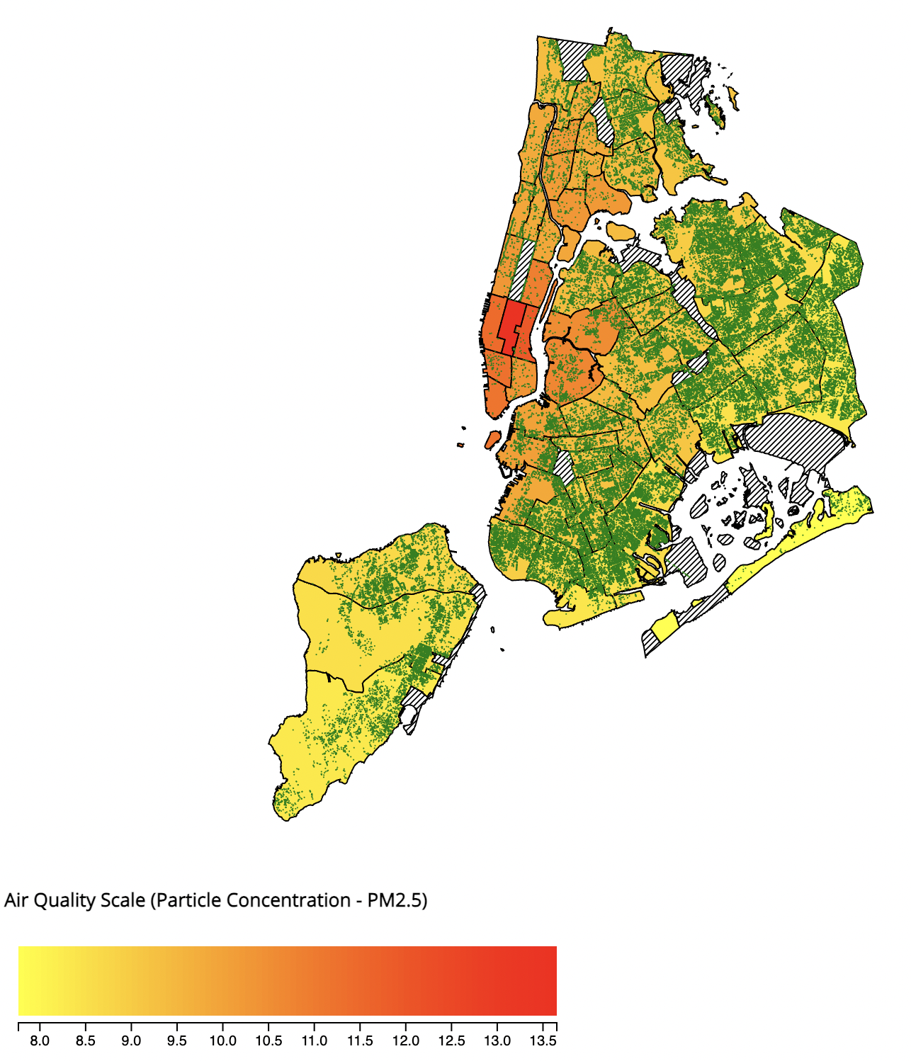
We should see the finished product like below
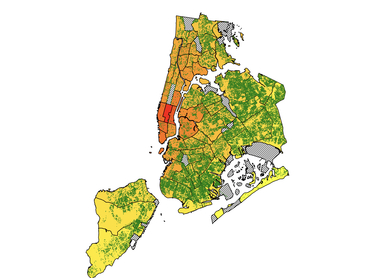
We have created the base picture of the map using the datapoints from the location. We colored each section of the map based on the the air quality using the scales that we have created. We also colored each points as green dots for the trees. We also will use the feature of mouseover and mouseout to showcase the information on different communities. We will implment that in the next part of the tutorial.
First, we will create a toolbox for the map. So, when we put our mouse on a community, the relevant information will show up.
let tooltip = map.append("g")
                      .attr("class","tooltip")
                      .attr("visibility","hidden");
    tooltip.append("rect")
            .attr("fill", "darkgreen")
            .attr("opacity", 1)
            .attr("x", -20)
            .attr("y", 0)
            .attr("width", 180)
            .attr("height", 70)
    let textbox = tooltip.append("text")
                      .text('halo')
                      .attr("fill", "white")
                      .attr("text-anchor","middle")
                      .attr("alignment-baseline","hanging")
                      .attr("x", 60)
                      .attr("y", 7);
    let textbox2 = tooltip.append("text")
                      .attr("fill", "white")
                      .attr("text-anchor","middle")
                      .attr("alignment-baseline","hanging")
                      .attr("x", 60)
                      .attr("y", 27);

    let textbox3 = tooltip.append("text")
                      .attr("fill", "white")
                      .attr("text-anchor","middle")
                      .attr("alignment-baseline","hanging")
                      .attr("x", 60)
                      .attr("y", 47);

    function mouseEntersCommunity() {
      tooltip.style("visibility","visible")

      current = d3.select(this);
      current.style("stroke-width", 2)

      let title = d3.select(this).datum().properties.boro_cd;
      textbox.text("Community: " + title).attr("font-size","15px");
      textbox2.text("Air Particles: " + String(AirDict[title]).slice(0, 5)).attr("font-size","15px");

      let boro = boroMap2(d3.select(this).datum())
      textbox3.text("Borough: " + boro).attr("font-size","15px")

      let bounds = path.bounds( current.datum() )
      let xPos = (bounds[0][0]+bounds[1][0])/2.0 + 50;
      let yPos = (bounds[1][1] - 50);
      tooltip.attr("transform",`translate(${xPos},${yPos})`);

  function mouseLeavesCommunity() {
      tooltip.style("visibility","hidden")
      textbox.html('');
      textbox2.html('');

      current = d3.select(this);
      current.style("stroke-width", 1)
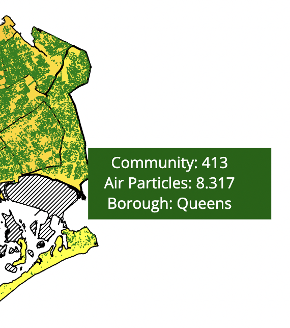
We have added a toolbox wich shows the information for each community. We also added 3 different textbox in the toolbox to display the 3 different kinds of information displayed. Notice that the toolbox's position is based on the community position and the textbox position is based on the toolbox's position. Now, we have completed the chloropleth graph and let's work on a legend so that the users can see what the different colors on the map is mapped to and understand the air particle difference in the different communities.
Legend for Chloropleth Graph
function drawLegend(legendSelector, legendColorScale) {
    // This code should adapt to a variety of different kinds of color scales
    // Credit Prof. Rz if you are basing a legend on this structure, and note PERFORMANCE CONSIDERATIONS

    // Shrink legend bar by 5 px inwards from sides of SVG
    const offsets = { width: 10,
                      top: 2,
                      bottom: 24 };

    // Number of integer 'pixel steps' to draw when showing continuous scales
    // Warning, not using a canvas element so lots of rect tags will be created for low stepSize, causing issues with performance -- keep this large
    const stepSize = 4;
    // Extend the minmax by 0% in either direction to expose more features by default
    const minMaxExtendPercent = 0;


    const legend = d3.select(legendSelector);
    const legendHeight = legend.attr("height");
    const legendBarWidth = legend.attr("width") - (offsets.width * 2);
    const legendMinMax = d3.extent(legendColorScale.domain());
    // Recover the min and max values from most kinds of numeric scales
    const minMaxExtension = (legendMinMax[1] - legendMinMax[0]) * minMaxExtendPercent;
    const barHeight = legendHeight - offsets.top - offsets.bottom;

    // In this case the "data" are pixels, and we get numbers to use in colorScale
    // Use this to make axis labels
    let barScale = d3.scaleLinear().domain([legendMinMax[0]-minMaxExtension,
                                              legendMinMax[1]+minMaxExtension])
                                  .range([0,legendBarWidth]);
    let barAxis = d3.axisBottom(barScale);

    // Place for bar slices to live
    let bar = legend.append("g")
                    .attr("class", "legend colorbar")
                    .attr("transform", `translate(${offsets.width},${offsets.top})`)

    // Check if we're using a binning scale - if so, we make blocks of color
    if (legendColorScale.hasOwnProperty('thresholds') || legendColorScale.hasOwnProperty('quantiles')) {
      // Get the thresholds
      let thresholds = [];
      if (legendColorScale.hasOwnProperty('thresholds')) { thresholds = legendColorScale.thresholds() }
      else { thresholds = legendColorScale.quantiles() }

      const barThresholds = [legendMinMax[0], ...thresholds, legendMinMax[1]];

      // Use the quantile breakpoints plus the min and max of the scale as tick values
      barAxis.tickValues(barThresholds);

      // Draw rectangles between the threshold segments
      for (let i=0; i<barThresholds.length-1; i++) {
        let dataStart = barThresholds[i];
        let dataEnd = barThresholds[i+1];
        let pixelStart = barAxis.scale()(dataStart);
        let pixelEnd = barAxis.scale()(dataEnd);

        bar.append("rect")
          .attr("x", pixelStart)
          .attr("y", 0)
          .attr("width", pixelEnd - pixelStart )
          .attr("height", barHeight)
          .style("fill", legendColorScale( (dataStart + dataEnd) / 2.0 ) );
      }
    }
    // Else if we have a continuous / roundable scale
    else if (legendColorScale.hasOwnProperty('rangeRound')) {
      for (let i=0; i<legendBarWidth; i=i+stepSize) {

        let center = i+(stepSize/2);
        let dataCenter = barAxis.scale().invert( center );

        // below normal scale bounds
        if ( dataCenter < legendMinMax[0] ) {
          bar.append("rect")
            .attr("x", i)
            .attr("y", 0)
            .attr("width", stepSize)
            .attr("height",barHeight)
            .style("fill", legendColorScale( legendMinMax[0] ) );
        }
        // within normal scale bounds
        else if ( dataCenter < legendMinMax[1] ) {
          bar.append("rect")
              .attr("x", i)
              .attr("y", 0)
              .attr("width", stepSize)
              .attr("height",barHeight)
              .style("fill", legendColorScale( dataCenter ) );
        }
        // above normal scale bounds
        else {
          bar.append("rect")
              .attr("x", i)
              .attr("y", 0)
              .attr("width", stepSize)
              .attr("height",barHeight)
              .style("fill", legendColorScale( legendMinMax[1] ) );
        }

      }
    }
    // Otherwise we have a nominal scale
    else {
      let nomVals = legendColorScale.domain().sort();

      // Use a scaleBand to make blocks of color and simple labels
      let barScale = d3.scaleBand().domain(nomVals)
                                  .range([0,legendBarWidth])
                                  .padding(0.05);
      barAxis.scale(barScale);

      // Draw rectangles for each nominal entry
      nomVals.forEach( d => {
        bar.append("rect")
          .attr("x", barScale(d) )
          .attr("y", 0)
          .attr("width", barScale.bandwidth() )
          .attr("height", barHeight)
          .style("fill", legendColorScale( d ) );
      });
    }

    // Finally, draw legend labels
    legend.append("g")
          .attr("class", "legend axis")
          .attr("transform",`translate(${offsets.width},${offsets.top+barHeight+5})`)
          .call(barAxis);

}
For the legend, we first create a vertical bar and separate it into different species. The legend function also takes in the color scale which is curcial to the drawing of the legend. For drawing a horizontal legend, we need to first figure out how many vertical bars which contains the different colors. Once we figure that out, we draw the vertial bars and give then colors accordingly. Finally, we put on the annotations for the numbers at the bottom so that the users can match the color with the legend scale.
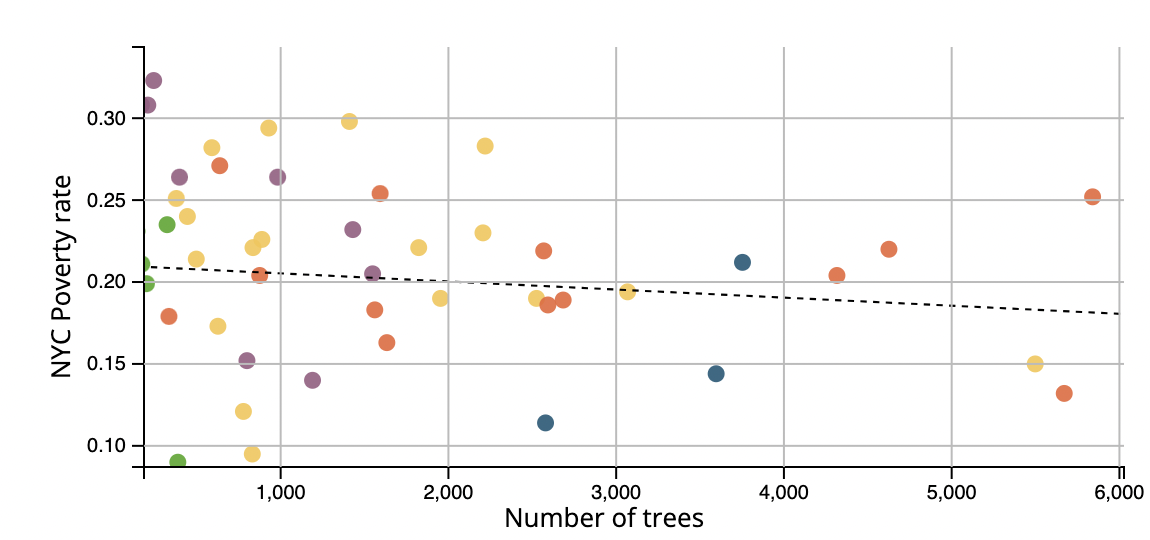
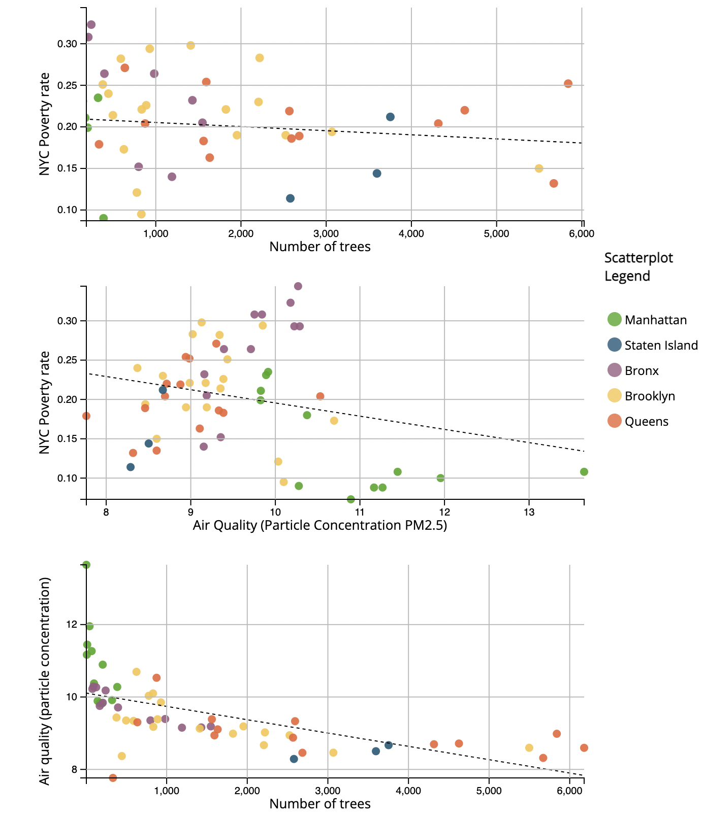
Now that we have finished the legend and the chloropleth map, we will start working on three different scatterplots which displays data between the three variables: Trees vs. Poverty Rate vs. Air Quality Scatter.
In this tutorial, we will go over only one scatterplot in detail since the method for creating the scatterplots are similar and I will provide the code for generating the other two plots at the end.
Similar to the previous chloropleth graph, we also need to initiate the graph and specify its width and heights.
// Scatterplot svgs
  const scatterMargin = { top: 20, right: 20, bottom: 40, left:50};

  // Scatterplot of Poverty vs Trees
  const svg2 = d3.select("#scatterplot-poverty-trees");
  const width2 = svg2.attr("width");
  const height2 = svg2.attr("height");
  const scatterWidth2 = width2 - scatterMargin.left - scatterMargin.right;
  const scatterHeight2 = height2 - scatterMargin.top - scatterMargin.bottom;

  const scatterPlot2 = svg2.append("g")
                  .attr("transform","translate("+scatterMargin.left+","+scatterMargin.top+")");
  let viewport2 = scatterPlot2.append("g");
We will also use the same scales and extents from above since they all share the same datasets. We will apend the different g svg elements to the svg, We will first create the overall graph before we plot in the different points.
svg2.append('g')
        .attr('class', 'x axis two')
        .attr('transform',`translate(${scatterMargin.left},${scatterHeight2+scatterMargin.top})`)
        .call(treeBottomAxis);
    let bottomGridlines2 = d3.axisBottom(treeScale)
                            .tickSize(-scatterHeight2)
                            .tickFormat('')
                            .ticks(6);
    svg2.append('g').attr('class', 'x gridlines two')
                    .attr('transform',`translate(${scatterMargin.left},${scatterHeight2+scatterMargin.top})`)
                    .call(bottomGridlines2);

    svg2.append('g')
        .attr('class', 'y axis two')
        .attr('transform',`translate(${scatterMargin.left},${scatterMargin.top})`)
        .call(povLeftAxis);
    let leftGridlines2 = d3.axisLeft(povScale)
                        .tickSize(-scatterWidth2)
                        .tickFormat('')
                        .ticks(4);
    svg2.append('g').attr('class', 'y gridlines two')
              .attr('transform',`translate(${scatterMargin.left},${scatterMargin.top})`)
              .call(leftGridlines2);

    svg2.append("text")
      .attr("class", "x label")
      .attr("text-anchor", "middle")
      .attr("x", width2/2)
      .attr("y", height2-10)
      .style("font-size", "13")
      .text("Number of trees");
    svg2.append("text")
        .attr("transform", "rotate(-90)")
        .attr("y", 0)
        .attr("x", 0 - (height2 / 2))
        .attr("dy", "1em")
        .style("text-anchor", "middle")
        .style("font-size", "13")
        .text("NYC Poverty rate");
In the above code, we have appended different elements for the different parts of our scatterplot. We appended the different axis and then gridlines for our graph. We have also added text to show the scale for the axis.
Now, we will simply plot the different points on our scatterplot which is easy.
Object.keys(blockPoverty).forEach((d,i) =>
    {
      if(blockTreeNum[d]!=undefined){
        viewport2.append('circle')
                  .attr('cx', treeScale(blockTreeNum[d.toString()]))
                  .attr('cy', povScale(blockPovertyMean[d.toString()]))
                  .attr('r', 4)
                  .attr('opacity', 0.9)
                  .attr('index', i)
                  .style('fill', boroMap(d));
      }
    });
We plot those points one by one as circles using their x and y scale in a foreach loop.
Now, we will work on plotting a best fit line for the scatterplot.
function linearRegression(y,x){
      var lr = {};
      var n = y.length;
      var sum_x = 0;
      var sum_y = 0;
      var sum_xy = 0;
      var sum_xx = 0;
      var sum_yy = 0;

      for (var i = 0; i < y.length; i++) {

          sum_x += x[i];
          sum_y += y[i];
          sum_xy += (x[i]*y[i]);
          sum_xx += (x[i]*x[i]);
          sum_yy += (y[i]*y[i]);
      }

      lr['slope'] = (n * sum_xy - sum_x * sum_y) / (n*sum_xx - sum_x * sum_x);
      lr['intercept'] = (sum_y - lr.slope * sum_x)/n;
      lr['r2'] = Math.pow((n*sum_xy - sum_x*sum_y)/Math.sqrt((n*sum_xx-sum_x*sum_x)*(n*sum_yy-sum_y*sum_y)),2);

      return lr;

    };

    var yval1 =  Object.keys(blockPoverty).map(function (d) { return parseFloat((blockPovertyMean[d.toString()])); });
    var xval1 =  Object.keys(blockPoverty).map(function (d) { return parseFloat(blockTreeNum[d.toString()]); });

    var lr1 = linearRegression(yval1,xval1);

    var max1 = d3.max( Object.keys(blockPoverty), function (d) { return parseFloat(blockTreeNum[d.toString()]); });
    var myLine1= viewport2.append("line")
        .attr("x1", treeScale(0))
        .attr("y1", povScale(lr1.intercept))
        .attr("x2", treeScale(max1))
        .attr("y2", povScale( (max1 * lr1.slope) + lr1.intercept ))
        .style("stroke-dasharray", ("3, 3"))
        .attr("class", "r-3")
        .style("stroke", "black");
We first define a function called LinearRregression which takes in two arrays of x and y values, and then the function will return 3 variables including its slope, its intercept and its r^2 value. The slope tells you how the y value changes per one unit change of the x value. The intercept tells you the point when the x value is 0, what the output would be. And finally the r^2 value tells you the percent of variance that is explained by our simple linear model.
When we are plotting the linear line, we are only interested in the intercept value and the slope for the function. We simply plot a linear line on the graph.
Now, we have finished our static scatterplot, we will now add some interactions to the graph.
let tooltip_scatter2 = viewport2.append("g")
                      .attr("class","circle")
                      .attr("visibility","hidden");
    let scatterplotCircle2 = tooltip_scatter2.append("circle")
                                              .attr('cx', 0)
                                              .attr('cy', 0)
                                              .attr('r', 5)
                                              .attr("stroke-width",3)
                                              .attr("stroke","black")
                                              .attr('fill-opacity', 0)
    // Tooltip of Poverty vs air qulaity
First we will add a circle outside of the datapoint when we put our mouse on the datapoint.
let treePos = treeScale(blockTreeNum[title.toString()]);
      let povertyPos = povScale(blockPovertyMean[title.toString()]);
      let airPosX = airXScale(Number(AirDict[title.toString()]));
      let airPosY = airYScale(Number(AirDict[title.toString()]));
      if (treePos!=undefined && povertyPos !=undefined)
      {
        scatterplotCircle2.style("visibility","visible")
        tooltip_scatter2.attr("transform",`translate(${treePos},${povertyPos})`);
      }
      if (airPosX!=undefined && povertyPos !=undefined){
        scatterplotCircle3.style("visibility","visible")
      }
We will also add this code to the mouseenterCommunity function that we have implemented earlier in the tutorial. When we put our mouse on the community or the datapoint on the scatterplot. The corresponding datapoint on the other map will show now.
Finally, we will add the zoom in and out interaction.
var plotZoom2 = d3.zoom().scaleExtent([1,3]).on("zoom", plotZoomed2);
svg2.call(plotZoom2);
function plotZoomed2(event) {
      viewport2.attr("transform", event.transform);

      // Update gridlines/axes
      povLeftAxis.scale(event.transform.rescaleY(povScale))
      treeBottomAxis.scale(event.transform.rescaleX(treeScale))
      leftGridlines2.scale(event.transform.rescaleY(povScale))
      bottomGridlines2.scale(event.transform.rescaleX(treeScale))

      d3.select("g.y.axis.two").call(povLeftAxis);
      d3.select("g.x.axis.two").call(treeBottomAxis);
      d3.select("g.y.gridlines.two").call(leftGridlines2);
      d3.select("g.x.gridlines.two").call(bottomGridlines2);

      // Hide stuff that's out of bounds
      svg2.append("defs").append("clipPath")
                    .attr("id","chartClip2")
                    .append("rect").attr("x",0)
                                   .attr("y",0)
                                   .attr("width", scatterWidth2)
                                   .attr("height", scatterHeight2);

      scatterPlot2.attr("clip-path","url(#chartClip2)");
    }
It is simple to zoom in and out of the graph, but we also need to adjust the scale and the gridlines when we zoom in and out which will be the hard part. We will update the scale and the gridlines proportionally when we zoom and we will also hid the stuff that is out of the graph's bound when we zoom in.
Now that we have finished one scatterplot, we will leave the implementation of the other scatterplots for you. Let's take a look at our finished product.
Conclusion
With the help of d3.js, we can easily create maps and scatterplots with different interactivies. We can also utilize those features from the d3.js api to help us make effective analysis on the maps. We can see a clear pattern in our dataset for the relationship between poverty and the different air particle molecules in different communities.