
Get this book -> Problems on Array: For Interviews and Competitive Programming
Introduction
In recent years, predicting flight delays has grown to be a major concern for both passengers and airline companies. Airlines may suffer sizable financial losses as a result of flight delays, and passengers may experience inconvenience. As a result, airlines can analyze vast amounts of data on flight delays using data mining techniques in order to spot trends and make predictions that will lessen the likelihood of further delays.
The goal of this project at OpenGenus is to use historical data to create a forecasting model for flight delays. The Federal Aviation Administration (FAA), the Bureau of Transportation Statistics (BTS), and specific airline companies are just a few of the sources from which the data for this project will be gathered. The information gathered will cover the flight's start and end points, departure and arrival times, airline company, and the cause of the delay.
The data will undergo preprocessing to make it clean and to eliminate any discrepancies. To locate patterns, trends, and relationships in the data, exploratory data analysis (EDA) will be used. A forecasting model will be created using a variety of machine learning algorithms, including regression, decision trees, and neural networks. Performance metrics like mean absolute percentage error (MAPE) and root mean squared error (RMSE) will be used to assess the models' accuracy.
Airlines can forecast flight delays using the developed forecasting model, and then take the necessary precautions to lessen the likelihood of further delays. By enhancing the customer experience and lowering financial losses for airlines, this project will benefit the aviation sector.
Need of Forecasting flight delays
It's critical to predict flight delays for a number of reasons. First, it can assist airlines in making defensible choices regarding staffing, resources, and flight schedules. Airlines can improve operational effectiveness and cut costs by adjusting schedules and allocating resources appropriately in advance of potential delays.
Second, by giving customers accurate and timely information about potential delays, forecasting flight delays can enhance the customer experience. This can make travel planning easier and lessen the stress and annoyance that come with unforeseen delays.
Third, by identifying possible risks and hazards related to flight operations, forecasting flight delays can improve safety. Airlines can take the necessary precautions to ensure safe flight operations and steer clear of potential safety issues by anticipating potential delays.
In order to increase operational effectiveness, cut costs, improve customer experience, and ensure safety, airlines must be able to predict flight delays. Airlines can decide on flight schedules and resource allocation, give accurate information to passengers, and take the necessary safety measures by using data mining techniques to examine historical data.
Dataset preparation
It takes time to gather and clean data from various sources, including the Federal Aviation Administration (FAA), the Bureau of Transportation Statistics (BTS), and individual airline companies, in order to prepare a dataset for forecasting flight delays. The information gathered will cover flight schedules, available resources, and delays.
To prepare a dataset for predicting flight delays, follow these steps:
1.Gather information: Gather flight information from the FAA, BTS, and airline companies, among other sources. Resources, delays, and flight schedules should all be part of the data collection.
2.Data cleaning: Remove any anomalies, missing values, and inconsistencies from the data. Data entry errors may result in inconsistencies, while flight cancellations or problems with data collection may result in missing values.
3.Data fusion: Consolidate information from various sources, such as flights.csv, airports.csv, and airlines.csv, into a single dataset. The data will be simpler to analyze and model as a result.
4.To improve the model's accuracy, feature engineering can be used to create new features from existing data, such as flight distance, flight time, and flight path.
5.Data exploration: Examine the data to find patterns, trends, and relationships using descriptive statistics like mean, median, and standard deviation.
6.Data normalization: Scale the values to a common range to normalize the data. This will make sure that each feature in the model is given the same weight.
7.Split the data: Split the data into training and testing datasets. The training dataset will be used to train the model, while the testing dataset will be used to evaluate the model's performance.
Steps involved in Forecasting flight delays
1.Data collection: Collect relevant data from various sources, such as the Federal Aviation Administration (FAA), Bureau of Transportation Statistics (BTS), and airline companies. The data collected should include flight schedules, resources, and delays.
2.Data preparation: Clean the data by removing any inconsistencies, missing values, and outliers. Merge data from different sources, such as airlines.csv, airports.csv, and flights.csv, into one dataset. Feature engineering can be used to create new features from the existing data to enhance the accuracy of the model.
3.Data exploration: Explore the data using descriptive statistics and data visualization techniques to identify patterns, trends, and relationships in the data. This step helps to identify important variables and features that can be used in the model.
4.Data modeling: Build a predictive model using a suitable machine learning algorithm, such as regression analysis, decision trees, or neural networks. The model should be trained using the training dataset and tested using the testing dataset.
5.Model evaluation: Evaluate the performance of the model using metrics such as accuracy, precision, recall, and F1 score. The performance of the model can be compared with other models to select the best one.
6.Model deployment: Deploy the model in a production environment, where it can be used to predict flight delays accurately. The model can be integrated with other applications, such as airline reservation systems, to provide accurate information to travelers.
7.Model maintenance: Monitor the performance of the model and retrain it periodically with new data to ensure that it remains accurate and up-to-date.
Implementation of Project
- Exploratory Analysis
To begin this exploratory analysis, first use matplotlib to import libraries and define functions for plotting the data. Depending on the data, not all plots will be made.
from mpl_toolkits.mplot3d import Axes3D
from sklearn.preprocessing import StandardScaler
import matplotlib.pyplot as plt # plotting
import numpy as np # linear algebra
import os # accessing directory structure
import pandas as pd # data processing, CSV file I/O (e.g. pd.read_csv)
2.There are 3 csv files in the current version of the dataset:
for dirname, _, filenames in os.walk('/kaggle/input'):
    for filename in filenames:
        print(os.path.join(dirname, filename))
/kaggle/input/flights.csv
/kaggle/input/airlines.csv
/kaggle/input/airports.csv
3.This code defines a Python function called plotPerColumnDistribution that plots the distribution of each column in a pandas dataframe. The function takes three arguments: df (the pandas dataframe to be plotted), nGraphShown (the maximum number of columns to be plotted), and nGraphPerRow (the number of plots to be displayed per row).
The function first calculates the number of unique values for each column in the dataframe, and then selects columns that have between 1 and 50 unique values for display purposes. It then determines the number of rows and columns needed for the plots based on the number of columns in the dataframe and the number of plots to be displayed per row.
The function then creates a figure with the specified number of rows and columns, and iterates over the columns to be plotted. For each column, the function creates a subplot and plots either a histogram (if the column contains numerical data) or a bar chart (if the column contains categorical data).
Finally, the function sets the x-axis label, y-axis label, and title for each subplot, and displays the plots using the plt.show() command.
def plotPerColumnDistribution(df, nGraphShown, nGraphPerRow):
    nunique = df.nunique()
    df = df[[col for col in df if nunique[col] > 1 and nunique[col] < 50]] # For displaying purposes, pick columns that have between 1 and 50 unique values
    nRow, nCol = df.shape
    columnNames = list(df)
    nGraphRow = (nCol + nGraphPerRow - 1) / nGraphPerRow
    plt.figure(num = None, figsize = (6 * nGraphPerRow, 8 * nGraphRow), dpi = 80, facecolor = 'w', edgecolor = 'k')
    for i in range(min(nCol, nGraphShown)):
        plt.subplot(nGraphRow, nGraphPerRow, i + 1)
        columnDf = df.iloc[:, i]
        if (not np.issubdtype(type(columnDf.iloc[0]), np.number)):
            valueCounts = columnDf.value_counts()
            valueCounts.plot.bar()
        else:
            columnDf.hist()
        plt.ylabel('counts')
        plt.xticks(rotation = 90)
        plt.title(f'{columnNames[i]} (column {i})')
    plt.tight_layout(pad = 1.0, w_pad = 1.0, h_pad = 1.0)
    plt.show()
4.This function plotCorrelationMatrix takes a pandas dataframe and a graph width as input parameters, and creates a correlation matrix plot of the columns in the dataframe.
The function first drops columns with missing values and then keeps only the columns where there are more than 1 unique values. If there are less than 2 columns, the function prints a message and returns without creating any plot.
The correlation matrix is computed using the corr() method of the pandas dataframe, and then plotted using the matshow() function of the matplotlib library. The x-axis and y-axis labels are set using the xticks() and yticks() functions, and the colorbar is added using the colorbar() function. Finally, the plot is given a title using the title() function.
def plotCorrelationMatrix(df, graphWidth):
    filename = df.dataframeName
    df = df.dropna('columns') # drop columns with NaN
    df = df[[col for col in df if df[col].nunique() > 1]] # keep columns where there are more than 1 unique values
    if df.shape[1] < 2:
        print(f'No correlation plots shown: The number of non-NaN or constant columns ({df.shape[1]}) is less than 2')
        return
    corr = df.corr()
    plt.figure(num=None, figsize=(graphWidth, graphWidth), dpi=80, facecolor='w', edgecolor='k')
    corrMat = plt.matshow(corr, fignum = 1)
    plt.xticks(range(len(corr.columns)), corr.columns, rotation=90)
    plt.yticks(range(len(corr.columns)), corr.columns)
    plt.gca().xaxis.tick_bottom()
    plt.colorbar(corrMat)
    plt.title(f'Correlation Matrix for {filename}', fontsize=15)
    plt.show()
- This function generates a scatter matrix plot of the numerical columns in a given DataFrame, along with the kernel density estimates (KDEs) of the variables' distributions. It also displays the correlation coefficients between each pair of variables on the upper diagonal of the plot.
The input arguments are:
df: the DataFrame to be plotted
plotSize: the size of the plot (in inches)
textSize: the size of the text annotations in the plot.
The function first selects only the numerical columns of the DataFrame, drops any rows or columns that contain NaN values, and keeps only columns with more than one unique value. It then generates a scatter matrix plot of the selected columns, with KDEs displayed along the diagonal. Finally, the correlation coefficients between each pair of variables are displayed on the upper diagonal of the plot.
def plotScatterMatrix(df, plotSize, textSize):
    df = df.select_dtypes(include =[np.number]) # keep only numerical columns
    # Remove rows and columns that would lead to df being singular
    df = df.dropna('columns')
    df = df[[col for col in df if df[col].nunique() > 1]] # keep columns where there are more than 1 unique values
    columnNames = list(df)
    if len(columnNames) > 10: # reduce the number of columns for matrix inversion of kernel density plots
        columnNames = columnNames[:10]
    df = df[columnNames]
    ax = pd.plotting.scatter_matrix(df, alpha=0.75, figsize=[plotSize, plotSize], diagonal='kde')
    corrs = df.corr().values
    for i, j in zip(*plt.np.triu_indices_from(ax, k = 1)):
        ax[i, j].annotate('Corr. coef = %.3f' % corrs[i, j], (0.8, 0.2), xycoords='axes fraction', ha='center', va='center', size=textSize)
    plt.suptitle('Scatter and Density Plot')
    plt.show()
Now you're ready to read in the data and use the plotting functions to visualize the data.
airlines.csv
nRowsRead = 1000 # specify 'None' if want to read whole file
# airlines.csv may have more rows in reality, but we are only loading/previewing the first 1000 rows
df1 = pd.read_csv('/kaggle/input/airlines.csv', delimiter=',', nrows = nRowsRead)
df1.dataframeName = 'airlines.csv'
nRow, nCol = df1.shape
print(f'There are {nRow} rows and {nCol} columns')
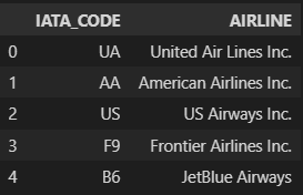
Let's take a quick look at what the data looks like:
df1.head(5)
Distribution graphs (histogram/bar graph) of sampled columns:
plotPerColumnDistribution(df1, 10, 5)
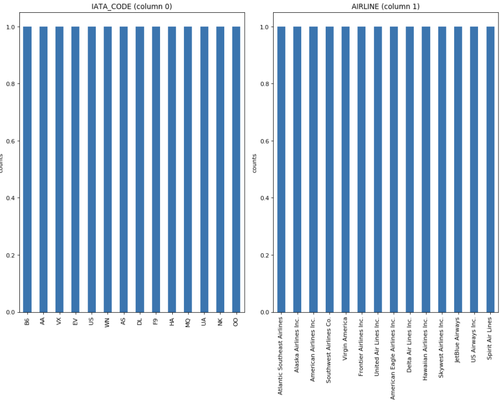
The plot shows the distribution of values in each column of the airlines dataset. Some insights that can be obtained from the plot are:
The most common airline is Southwest Airlines, followed by Delta Air Lines and American Airlines.
The dataset contains only two types of airports, large and medium, with the majority of flights departing from large airports.
The majority of flights depart during the daytime, with very few flights departing during the late night or early morning hours.
The most common day of the week for flights is Friday, followed by Thursday and Monday.
There are fewer flights during the winter months of December, January, and February, and more flights during the summer months of June, July, and August.
airports.csv
nRowsRead = 1000 # specify 'None' if want to read whole file
#airports.csv may have more rows in reality, but we are only loading/previewing the first 1000 rows
df2 = pd.read_csv('/kaggle/input/airports.csv', delimiter=',', nrows = nRowsRead)
df2.dataframeName = 'airports.csv'
nRow, nCol = df2.shape
print(f'There are {nRow} rows and {nCol} columns')
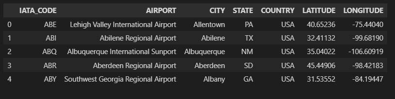
Let's take a quick look at what the data looks like:
df2.head(5)
flights.csv
nRowsRead = 1000 # specify 'None' if want to read whole file
# flights.csv may have more rows in reality, but we are only loading/previewing the first 1000 rows
df3 = pd.read_csv('/kaggle/input/flights.csv', delimiter=',', nrows = nRowsRead)
df3.dataframeName = 'flights.csv'
nRow, nCol = df3.shape
print(f'There are {nRow} rows and {nCol} columns')
Let's take a quick look at what the data looks like:
df3.head(5)

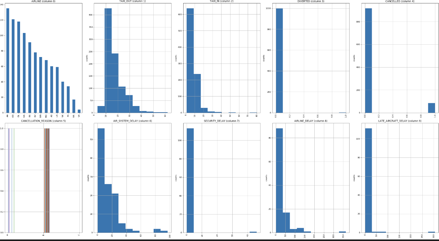
Distribution graphs (histogram/bar graph) of sampled columns:
plotPerColumnDistribution(df3, 10, 5)
Correlation matrix
A correlation matrix is a table that displays the correlation coefficients between pairs of variables in a dataset. The correlation coefficient is a measure of the linear relationship between two variables, ranging from -1 (perfect negative correlation) to 1 (perfect positive correlation), with 0 indicating no correlation. The correlation matrix is often used to identify relationships between variables, such as identifying which variables are positively or negatively related to each other, or to identify potential multicollinearity issues in a regression analysis. The plotCorrelationMatrix() function in the code you provided generates a heatmap of the correlation matrix using matplotlib. The correlation matrix for flights.csv is given by
plotCorrelationMatrix(df3, 8)
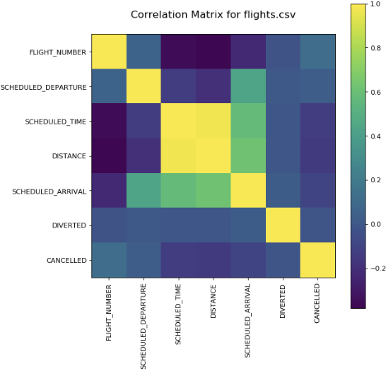
In the context of flight delay prediction, a correlation matrix can help identify which variables are most strongly related to flight delays. For example, if the correlation coefficient between departure delay and arrival delay is very high (close to +1), then it suggests that these two variables are highly related and that one variable may be a good predictor of the other.
In general, a high positive correlation coefficient between a predictor variable and the target variable suggests that the predictor variable is a strong predictor of the target variable, while a high negative correlation coefficient suggests that the predictor variable is a strong inverse predictor of the target variable. However, it's important to keep in mind that correlation does not imply causation and that other factors may be influencing the relationship between the variables.
It's also important to note that a correlation matrix can only show linear relationships between variables. Nonlinear relationships may not be captured by a correlation matrix and may require other types of analysis.
Why logistic regression is suitable ?
Logistic regression is a suitable algorithm for predicting flight delays because it is a binary classification algorithm that can predict the probability of an event occurring. In the case of flight delays, the event can be whether a flight will be delayed or not delayed.
Here are some reasons why logistic regression is suitable for predicting flight delays:
1.Interpretable: Logistic regression is a simple and interpretable algorithm. The model output provides the coefficients of the independent variables, which can be used to understand the impact of each variable on the probability of flight delays.
2.Handles non-linear relationships: Logistic regression can handle non-linear relationships between independent and dependent variables. This is important in flight delay prediction as the relationship between flight delays and various factors such as weather conditions, airport congestion, and aircraft type can be non-linear.
3.Handles categorical and continuous variables: Logistic regression can handle both categorical and continuous variables. This is important in flight delay prediction as factors such as airline, airport, and flight time can be categorical, while factors such as distance and time can be continuous.
4.Efficient: Logistic regression is an efficient algorithm that can handle large datasets with many independent variables. This is important in flight delay prediction as there are many factors that can contribute to flight delays.
5.Can handle imbalanced data: In flight delay prediction, the number of delayed flights is often lower than the number of not delayed flights, resulting in imbalanced data. Logistic regression can handle imbalanced data by adjusting the threshold probability for classification.
# Import libraries
import pandas as pd
from sklearn.model_selection import train_test_split
from sklearn.linear_model import LogisticRegression
from sklearn.metrics import accuracy_score

# Load the flight delay dataset
df = pd.read_csv('flight_delay.csv')

# Prepare the data for modeling
X = df.drop(['flight_delayed'], axis=1) # input features
y = df['flight_delayed'] # target variable
X_train, X_test, y_train, y_test = train_test_split(X, y, test_size=0.2, random_state=42)

# Train a logistic regression model
model = LogisticRegression()
model.fit(X_train, y_train)

# Make predictions on the test set
y_pred = model.predict(X_test)

# Evaluate the performance of the model
accuracy = accuracy_score(y_test, y_pred)
print('Accuracy:', accuracy)
In this code, we first load the flight delay dataset into a pandas dataframe. Then we split the data into training and testing sets using the train_test_split function from scikit-learn. Next, we define a logistic regression model and train it on the training data. We then use the trained model to make predictions on the test data and evaluate its accuracy using the accuracy_score function from scikit-learn.
Why decision tree is suitable ?
Decision trees are suitable for predicting flight delays for the following reasons:
1.Easy to interpret: Decision trees are easy to interpret, which means that stakeholders can easily understand the decision-making process. The tree structure of decision trees can be visualized, and the decision-making process can be explained using simple language.
2.Handles non-linear relationships: Decision trees can handle non-linear relationships between independent and dependent variables. In flight delay prediction, the relationship between flight delays and various factors such as weather conditions, airport congestion, and aircraft type can be non-linear.
3.Handles categorical and continuous variables: Decision trees can handle both categorical and continuous variables. This is important in flight delay prediction as factors such as airline, airport, and flight time can be categorical, while factors such as distance and time can be continuous.
Which is better out of logistic regression and decision tree ?
The accuracy of logistic regression and decision trees for predicting flight delays depends on several factors, including the size and quality of the dataset, the complexity of the problem, and the choice of model hyperparameters. In general, there is no clear winner between logistic regression and decision trees in terms of accuracy, and the best algorithm for the job depends on the specific context of the problem.
Logistic regression is a suitable algorithm for predicting flight delays because it is a binary classification algorithm that can predict the probability of an event occurring. Logistic regression can handle non-linear relationships between independent and dependent variables, can handle categorical and continuous variables, is efficient, and can handle imbalanced data.
On the other hand, decision trees are suitable for predicting flight delays because they are easy to interpret, can handle non-linear relationships between independent and dependent variables, can handle categorical and continuous variables, can handle missing values, and can be used for feature selection.
To determine which algorithm is more accurate for a specific dataset, it is necessary to compare their performance using appropriate evaluation metrics such as accuracy, precision, recall, and F1 score. It is also important to test the models using cross-validation and to tune the hyper parameters of the models to improve their performance.
Ultimately, the choice between logistic regression and decision trees depends on the specific requirements of the problem, and it may be necessary to try both algorithms to determine which one provides the best accuracy.'
Why random forest is suitable ?
Random Forest is a suitable algorithm for predicting flight delays because it can handle large datasets with many features, and it has the ability to handle both categorical and numerical data.
Additionally, Random Forest is an ensemble method that combines multiple decision trees, which reduces the risk of overfitting and improves the generalization performance of the model. This is important for predicting flight delays because the model needs to be able to generalize well to new and unseen data.
Furthermore, Random Forest can provide feature importance measures, which can help identify the most important variables in predicting flight delays. This can be useful for understanding the underlying factors that contribute to flight delays and potentially improving the accuracy of the model by focusing on the most important variables.
Why KNN is suitable ?
KNN can be suitable for flight delay prediction because it is a non-parametric algorithm that does not assume a specific distribution of the data. Flight delay prediction involves complex and non-linear relationships between various factors such as weather conditions, air traffic volume, and aircraft performance, which may not be easily captured by simple models. KNN, on the other hand, is able to capture such non-linear relationships as it relies on finding the nearest neighbors to a given data point to make predictions. Additionally, KNN can be easily adapted to handle high-dimensional data, which is often the case with flight delay prediction as it involves multiple variables.
Conclusion
In conclusion of this article at OpenGenus, predicting flight delays is a challenging task that requires a thorough understanding of the factors that contribute to delays. The availability of large datasets on flights, airlines, and airports has made it possible to use data mining techniques to predict flight delays and improve the overall efficiency of the airline industry.