Open-Source Internship opportunity by OpenGenus for programmers. Apply now.
What is Flexbox?
Flexbox is used to align items vertically and horizontally in a container of a webpage. It is a one-dimensional layout model. Meaning that it only deal with layout in one dimension at a time, either it can align vertically (column) or horizontally (row).
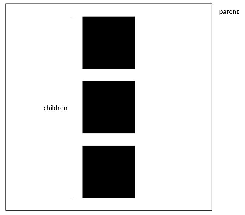
Parent, Child Relationship
In Flexbox, the aligning part is done in parent element also called as flex-container. The child elements are present inside the flex-container.
The parent element should contain the display: flex property inorder to aligin the child elements.
Axes
There are two axes in Flexbox, they are
- main axis or primary axis
- cross axis
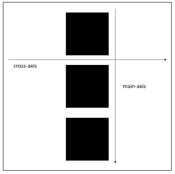
Main Axis
Main axis is denoted by the flex-direction property. By default the property is set to flex-direction: row.
Cross Axis
Cross axis runs perpendicular to the Main Axis. In other words, if the main axis is defined as column then the cross axis is row, vice versa.
The main axis defined by flex-direction has four values
- row
- column
- row-reverse
- column-reverse
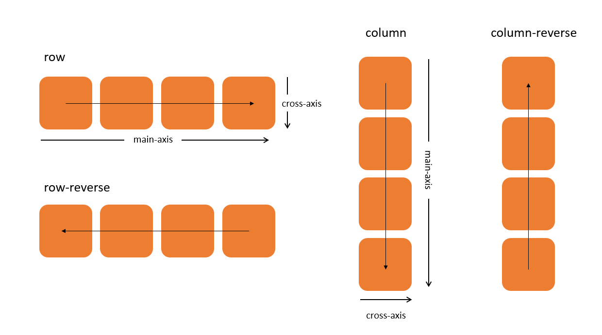
.container {
  display: flex;
  flex-direction: row | row-reverse | column | column-reverse;
}
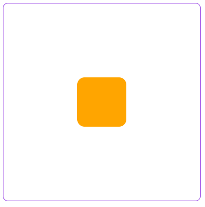
How to center a div using Flexbox
We use justify-content property to center an item in main axis. And align-items property to center an item in the cross axis.
<div class="parent">
  <div class="child"></div>
</div>
.parent {
  margin:10px;
  width:400px;
  height:400px;
  border:1px solid blueviolet;
  border-radius:10px;

  display: flex;
  justify-content: center;
  align-items: center;
}

.child {
  background-color:orange;
  border-radius:15px;

  width:100px;
  height:100px;
}
Aligning on the Main Axis
To align contents on the main axis we only have one property justify-content. To align items/contents in cross axis there are two properties which we will be describing later.
There is justify-items for grid, not to get confused and use it with Flexbox. Grid and Flexbox are two different properties.
The justify-content has the following values
- justify-content: flex-start
- justify-content: flex-end
- justify-content: center
- justify-content: space-between
- justify-content: space-around
- justify-content: space-evenly
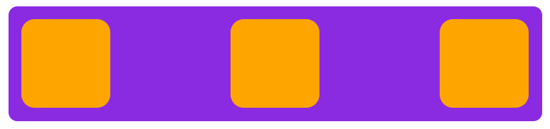
flex-start
When set justify-content to flex-start the content are aligned from left to right.
<div class="parent">
  <div class="child"></div>
  <div class="child"></div>
  <div class="child"></div>
</div>
.parent {
  margin:10px;
  width: 600px;
  height: 130px;
  background-color: blueviolet;
  border-radius: 10px;

  display: flex;
  justify-content: start;
}

.child {
  background-color:orange;
  border-radius:15px;
  margin:15px;

  width:100px;
  height:100px;
}

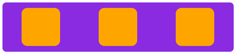
flex-end
It does the opposite of flex-start, it aligns the elements from right to the left.
Note: This does not alter the ordering of the elements, it only changes the start position from left to the right.
.parent {
  display: flex;
  justify-content: end;
}

center
Aligns the content to center of the container in the main axis.
.parent {
  display: flex;
  justify-content: center;
}

space-between
Adds space between the child elements. Using space-between an equal amount of space is added between each items.
.parent {
  display: flex;
  justify-content: space-between;
}
space-around
Adds space surrounding the child elements. This property is similar to space-between, additionally it adds some space at the start and end point of the container containing the flex-items. The space between the children and the start and of the container will not be same. The space between each items will be same and the space at the start and end will be same.
.parent {
  display: flex;
  justify-content: space-around;
}
space-evenly
Distributes space evenly for all the child elements in the container. Space at the start and in-between will be the same.
.parent {
  display: flex;
  justify-content: space-evenly;
}
Aligning on the Cross Axis
There are two properties for cross axis in Flexbox. One property is used to align items in cross axis and other for maintaining multiline items.
- align-items
- align-content
Align Items
These values function the same as justufy-content but in the perpendicular axis.
- align-items: flex-start
- align-items: flex-end
- align-items: center
- align-items: stretch
- align-items: baseline
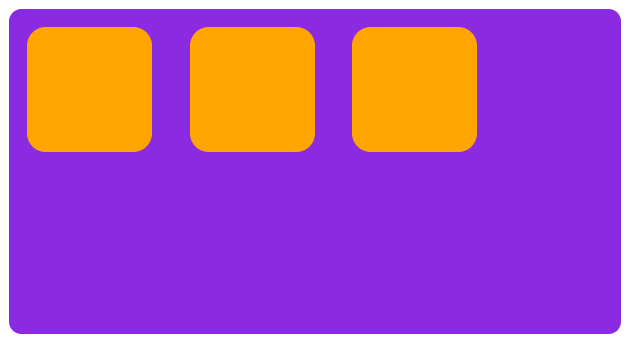
flex-start
All flex items will start from left to right or top to bottom depending on the flex-direction value, this is the default value for display: flex.
<div class="parent">
  <div class="child"></div>
  <div class="child"></div>
  <div class="child"></div>
</div>
.parent {
  margin:10px;
  width: 490px;
  height: 260px;
  background-color: blueviolet;
  border-radius: 10px;

  display: flex;
  align-items:start;
}

.child {
  background-color:orange;
  border-radius:15px;
  margin:15px;

  width:100px;
  height:100px;
}
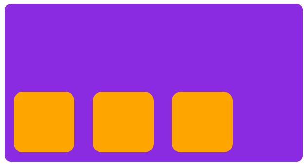
flex-end
This value starts align from the reverse. From bottom to up or right to left depends opon the flex-direction.
.parent {
  display: flex;
  align-items:start;
}
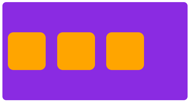
center
As the name suggests it aligns the items in center on the cross axis.
.parent {
  display: flex;
  align-items:center;
}
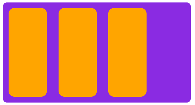
stretch
This value is quite different from the values we have seen so far, this one stretches the item's height or width depending on the flex-direction to the maximum size available in the container.
<div class="parent">
  <div class="child"></div>
  <div class="child"></div>
  <div class="child"></div>
</div>
.parent {
  margin:10px;
  width: 490px;
  height: 260px;
  background-color: blueviolet;
  border-radius: 10px;

  display: flex;
  align-items:stretch;
}

.child {
  background-color:orange;
  border-radius:15px;
  margin:15px;

  width:100px;
/*   height:100px; */
}
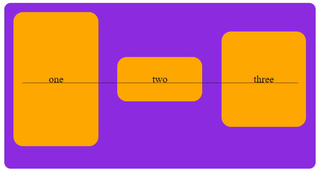
baseline
Items are aligned such as their baselines align.
<div class="parent">
  <div class="child one">one</div>
  <div class="child two">two</div>
  <div class="child three">three</div>
</div>
.parent {
  margin:10px;
  width: 490px;
  height: 260px;
  background-color: blueviolet;
  border-radius: 10px;

  display: flex;
  align-items:baseline;
}

.child {
  background-color:orange;
  border-radius:15px;
  margin:15px;
  display:flex;
  align-items:center;
  justify-content:center;

  width:200px;
}

.one {
  height:210px;
}

.two {
  height:70px;
}

.three {
  height:150px;
}
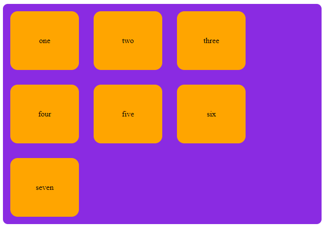
Align Content
We have been aligning individual item inside the area defined by the flex-container. If you have a wrapped multiple-line flex container then you might also want to use the align-content property to control the distribution of space between the rows.
What is wrap?
Using flex-wrap we can decide whether the items should fit in a single line or take multiple lines in the container. Can only use in parent container that has display: flex property.
There are three possible values for flex-wrap.
- no-wrap - items will overflow the parent container, this is the default implicit value.
- wrap - items shrink and try to fit into the parent container, can exceede more than two links if needed
- wrap-reverse - same as wrap but starts from the opposite side
flex-wrap: nowrap; /* Default value */
flex-wrap: wrap;
flex-wrap: wrap-reverse;
The align-content property takes the following values:
- align-content: flex-start
- align-content: flex-end
- align-content: center
- align-content: space-between
- align-content: space-around
- align-content: stretch
- align-content: space-evenly
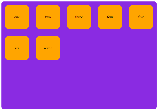
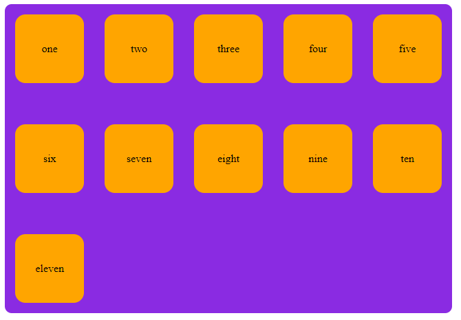
flex-start
Aligins the children from the start of the main axis which is left to right or top to bottom in vertical. In this property each line is treated as an element instead of child items.
<div class="parent">
  <div class="child one">one</div>
  <div class="child two">two</div>
  <div class="child three">three</div>
  <div class="child four">four</div>
  <div class="child five">five</div>
  <div class="child six">six</div>
  <div class="child seven">seven</div>
</div>
.parent {
  margin:10px;
  width: 650px;
  height: 450px;
  background-color: blueviolet;
  border-radius: 10px;

  display: flex;
  flex-wrap:wrap;
  align-content:flex-start;
}

.child {
  background-color:orange;
  border-radius:15px;
  margin:15px;
  display:flex;
  align-items:center;
  justify-content:center;
  height:100px;
  width:100px;
}
flex-end
Same as flex-start but from the opposite side. Items won't arrange from the bottom, they are pushed to bottom thats it. To arrange the items from bottom to up flex-direction: wrap-reverse can be used.
.parent {
  display: flex;
  flex-wrap:wrap;
  align-content:flex-end;
}
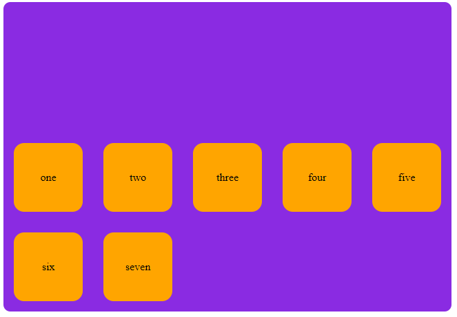
center
Aligns all the items to the center of the parent container with equal amount of space on the start and end of main axis.
.parent {
  display: flex;
  flex-wrap: wrap;
  align-content: center;
}
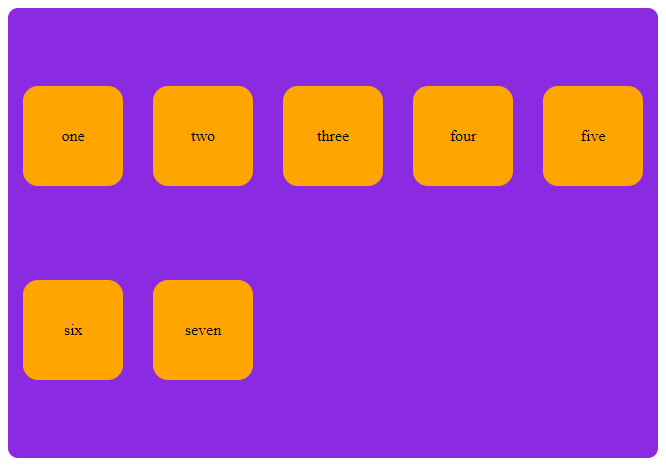
space-between
Creates equal space between each lines or splits the content into two halfs if only there is couple line.
.parent {
  display: flex;
  flex-wrap: wrap;
  align-content: space-between;
}
space-around
With this value a common space is placed between each lines in the primary axis.
.parent {
  display: flex;
  flex-wrap: wrap;
  align-content: space-around;
}
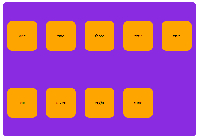
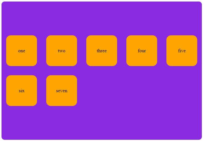
stretch
When the cross axis element's dimension isn't mentioned then the stretch increases the value itslef and obtains the empty space present in the container.
<div class="parent">
  <div class="child one">one</div>
  <div class="child two">two</div>
  <div class="child three">three</div>
  <div class="child four">four</div>
  <div class="child five">five</div>
  <div class="child six">six</div>
  <div class="child seven">seven</div>
</div>
.parent {
  margin:10px;
  width: 650px;
  height: 450px;
  background-color: blueviolet;
  border-radius: 10px;

  display: flex;
  flex-wrap:wrap;
  align-content:stretch;
}

.child {
  background-color:orange;
  border-radius:15px;
  margin:15px;
  display:flex;
  align-items:center;
  justify-content:center;
/*   height:100px; */
  width:140px;
}
space-evenly
Not to mix the space-evenly with space-around. space-evenly has exact space between each line at any point in the main axis, whereas space-around doesn't have same space between the lines and start/end of the lines.
.parent {
  display: flex;
  flex-wrap:wrap;
  align-content:space-evenly;
}