
Get this book -> Problems on Array: For Interviews and Competitive Programming
The border-radius property in CSS allows you to round the corners of the outer edge of an element. Through this property, it is possible to round all the corners or just selected corners according to the desired shape.
CSS Syntax:
border-radius: 1-4 length|% / 1-4 length|%|initial|inherit;
The syntax suggests that the border-radius property can either take specific measurements as input or the measurement could be inherited from the parent element. Initial is used to set the value to default.
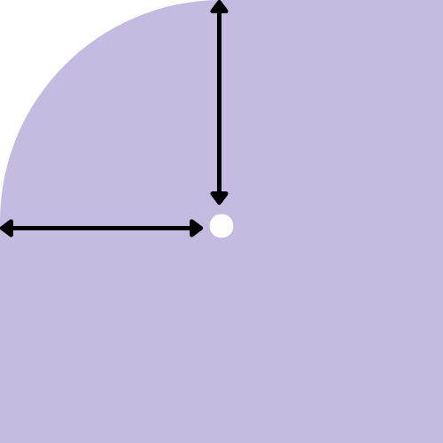
The specified measurements could be in length or percentage. It is the length from the corner to the sides. The center of the arc would lie at their intersection. If the desrired shape has an elliptical corner, the lengths are separated by a slash (/). This way the center will be the intersection point of the major axis and minor axis. By default, the radius is 0.
The shape of the element varies according to the number of values provided.
- One value would apply to each corner of the element. Every corner will have the same radius.
<html>
<head>
    <style>
        div{
            width: 200px;
            height: 200px;
            background-color: rgb(186, 186, 248);
            border-radius: 50px;
        }
    </style>
</head>
<body>
    <div></div>
</body>
</html>
Output:
- In case of two values, the first is applied to the top-left and bottom-right corner and second value is applied to the top right and bottom left corners.
<html>
<head>
    <style>
        div{
            width: 200px;
            height: 200px;
            background-color: rgb(186, 186, 248);
            border-radius: 50px 100px;
        }
    </style>
</head>
<body>
    <div></div>
</body>
</html>
Output:
- If three values are provided, the first value is set to the top-left corner, second value to the top-right and bottom left corners and the third value is applied to bottom right corner.
<html>
<head>
    <style>
        div{
            width: 200px;
            height: 200px;
            background-color: rgb(186, 186, 248);
            border-radius: 50px 100px 10px;
        }
    </style>
</head>
<body>
    <div></div>
</body>
</html>
Output:
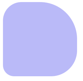
- Four values are provided to specify the radius for each corner separately. The first value is set to the top-left corner, the second to the top-right corner, the third to the bottom-right corner and the last one to the bottom-left corner.
<html>
<head>
    <style>
        div{
            width: 200px;
            height: 200px;
            background-color: rgb(186, 186, 248);
            border-radius: 50px 100px 70px 30px;
        }
    </style>
</head>
<body>
    <div></div>
</body>
</html>
Output:
Shorthand properties
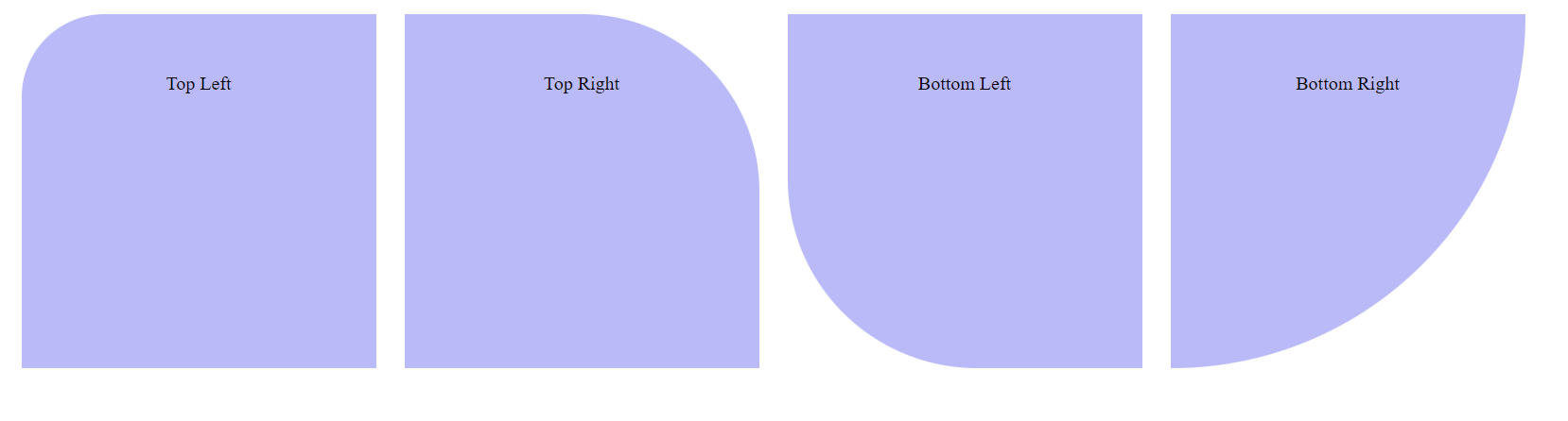
Given below are some variations of the border-radius property. These CSS properties could be used to style a particular corner of an element.
- border-top-left-radius
- border-top-right-radius
- border-bottom-right-radius
- border-bottom-left-radius
The value for each of these properties can take the form - length/percentage {1,2} | inherit | initial
Length could have one or two values. One radius would make it a circular arc whereas two radii would make it elliptical. Default radius is 0.
<html>
<head>
    <style>
        div{
            width: 200px;
            height: 200px;
            background-color: rgb(186, 186, 248);
            margin: 10px;
            padding: 50px;
            justify-content: center;
            display: inline-flex;
        }

        #top-left{
            border-top-left-radius: 70px;
        }

        #top-right{
            border-top-right-radius: 50%;
        }
        #bottom-right{
            border-bottom-right-radius: 20em;
        }
        #bottom-left{
            border-bottom-left-radius: 10rem;
        }
    </style>
</head>
<body>
    <div id = 'top-left'> Top Left </div>
    <div id = 'top-right'> Top Right </div>
    <div id = 'bottom-left'> Bottom Left </div>
    <div id = 'bottom-right'> Bottom Right </div>
</body>
</html>
Output:
Shapes created using border-radius property
The border-radius property can be used to create many shapes that are not directly available in html.
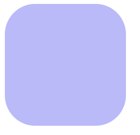
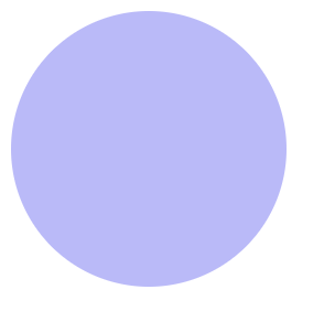
- Circle: a circle can be created if the radius of each corner is set to atleast 50% of the length of the element.
<html>
<head>
    <style>
        div{
            width: 400px;
            height: 200px;
            background-color: rgb(186, 186, 248);
            border-radius: 50%
        }
    </style>
</head>
<body>
    <div></div>
</body>
</html>
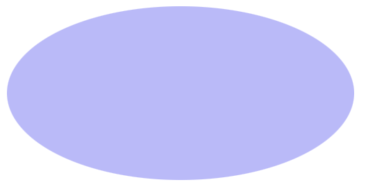
- Ellipse: ellipse can be created the same way a circle is provided the height and width of the element are unequal.
<html>
<head>
    <style>
        div{
            width: 400px;
            height: 200px;
            background-color: rgb(186, 186, 248);
            border-radius: 50%
        }
    </style>
</head>
<body>
    <div></div>
</body>
</html>
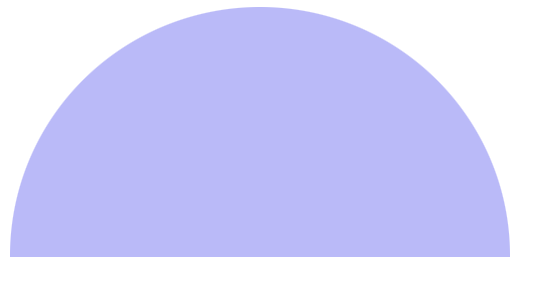
- Semi circle
<html>
<head>
    <style>
        div{
            width: 400px;
            height: 200px;
            background-color: rgb(186, 186, 248);
            border-radius: 50% / 100% 100% 0 0 ;
        }
    </style>
</head>
<body>
    <div></div>
</body>
</html>
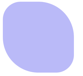
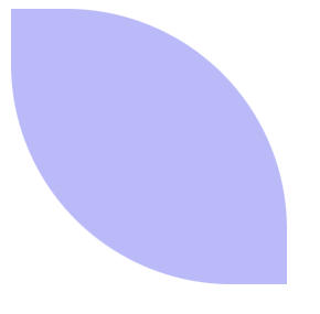
- Leaf
<html>
<head>
    <style>
        div{
            width: 200px;
            height: 200px;
            background-color: rgb(186, 186, 248);
            border-radius: 0 80% 0 80%;
        }
    </style>
</head>
<body>
    <div></div>
</body>
</html>
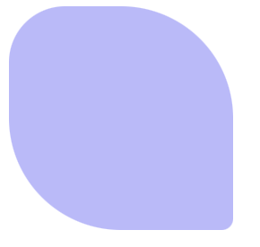
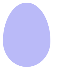
- Egg
<html>
<head>
    <style>
        div{
            width: 130px;
            height: 175px;
            background-color: rgb(186, 186, 248);
            border-radius: 50% 50% 50% 50% / 60% 60% 40% 40%
        }
    </style>
</head>
<body>
    <div></div>
</body>
</html>
With this article at OpenGenus, you must have the complete idea of Rounded corners/ Border radius in CSS.