
In this article, we will understand more about data visualization, different charts used and explore some Data Visualization tools.
Table of contents
- Data visualization
- Types of charts
- Tools used for data visualization
Data Visualization
Presenting our findings and insights from the data analysis in a graphical form is called data visualization. This is a part of the fifth step: the 'share' step of the data analysis process. This is where we communicate our results to our stakeholders. Making others understand the story that our data is telling would be more easier if we show them in the form of visualizations rather than just plain numbers.
According to David McCandless, a data visualization must contain:
- Information: the data we are working with. It must be accurate and consistent.
- Story: We must present our findings in a clear and compelling way.
- Goal: There must be a specific objective for every visual.
- Visual form: Effective use of visual forms. Our overall presentation must be visually pleasing.
This is called the "McCandless Method" and gives us a basic framework for a successful data visualization. Apart from all these, it is important to choose the correct visualization for the story our data is telling. Suppose if our data has a variable that changes with time, we can use area charts and line charts or if it deals with intensity or frequency, we can go with heatmaps and density maps.
Types of charts
As discussed above, it is important for us to choose the right visualization that will best represent our data's story and message. There are many types of visualizations available to choose from. Here, we will see some commonly used types.
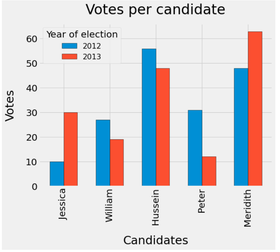
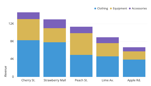
Bar chart
Bar charts are used to plot the individual data points for a categorically changing variable. The length of each bin is proportional to the respective values of their category. They can be vertical or horizontal. Vertical bar charts are known as column charts.
- A single bar chart is used when the variable plotted changes for a single category.
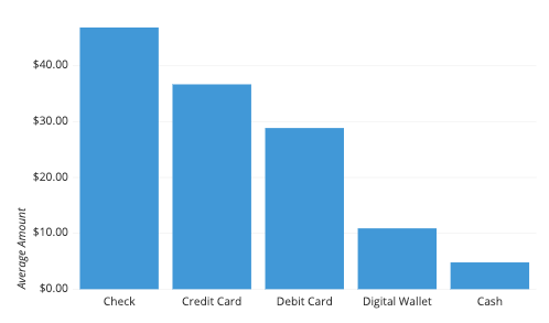
- We use a grouped bar chart when the variable changes are applicable to more than one category and we want to compare them.
- Stacked bar charts are used when the variable changes are applicable to more than one category and we want to compare them without the spread of groups.
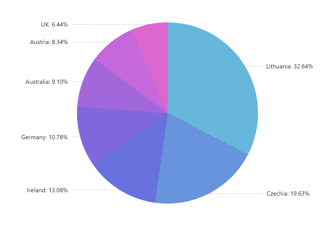
Pie chart
We use pie charts when our data has partial and whole results. The pie charts has either 2D or 3D slices that add up to a whole. Here, the arc length of the slice is proportional to the portion of value it represents.
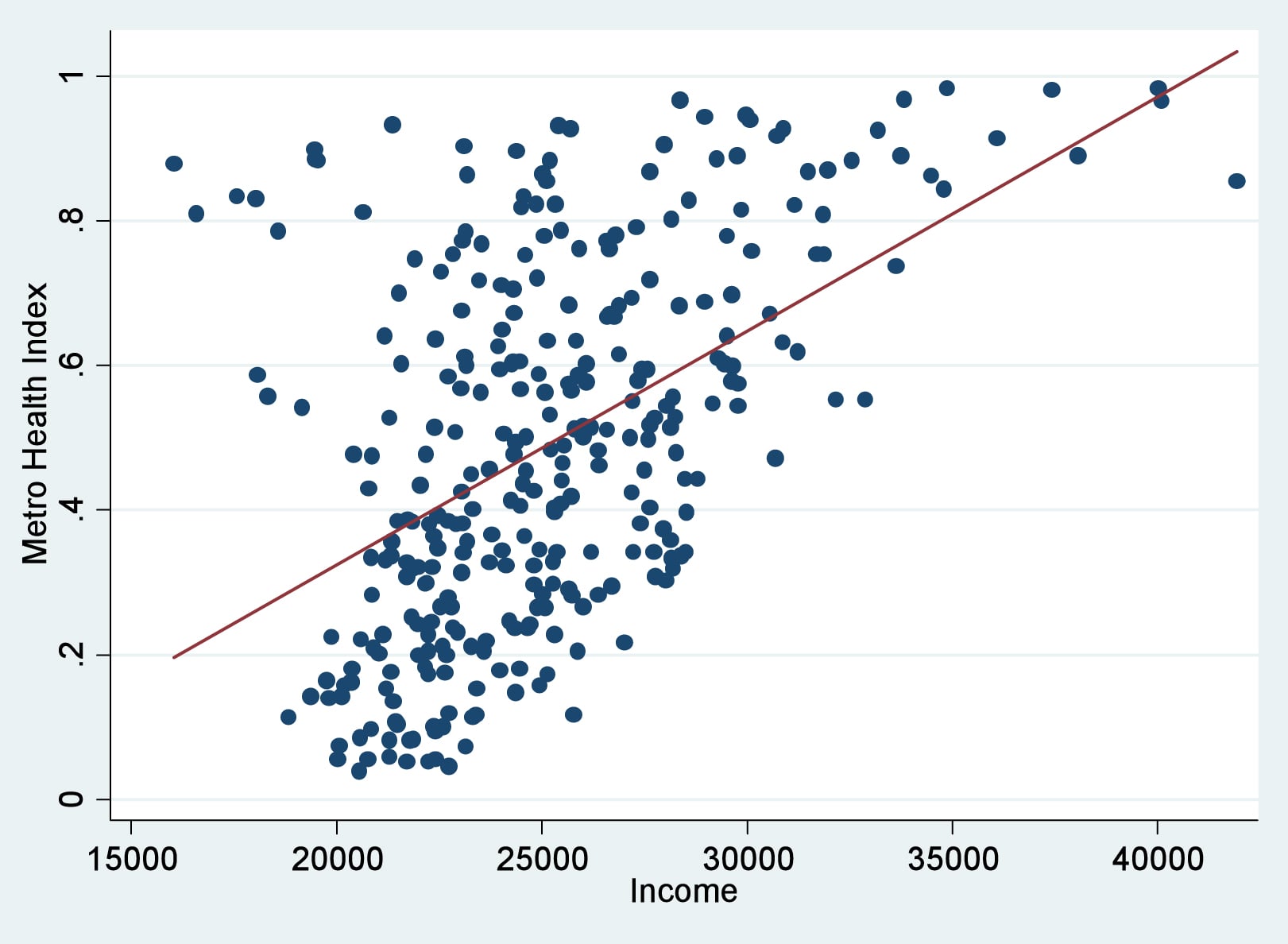
Scatter plot
A scatter plot is used to display the relationship between two numerical variables. It can also be used to display patterns or trends when the data are taken as a whole. Here, individual data points are displayed using dots, without any connectors between them.
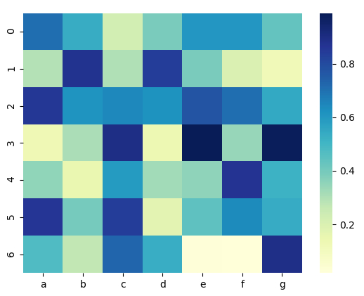
Heatmap
When our data contains intensity or frequency, we use a heatmap. It shows the strength or frequency or the magnitude of values as colors. Heatmaps use a gradation of colours to represent each frequency-the colour variation may be in hue or intensity. Higher or values with more frequency/strength have more intense colour.
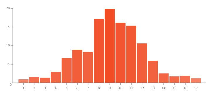
Histogram
Histograms are generally used when our data has numeric trends. It is similar to a bar chart visually, but in a histogram, the individual data points are grouped into columns or bins, each of which represents a different range of values. This gives us information about the distribution of the data.
Bubble chart
A bubble chart is a multi-variable visualization that displays atleast three dimensions of data. It can be used to determine the relationship shared by three numerical variables or even show trends over time. Similar to a scatter plot, individual data points are represented by dots in bubble charts too. But here, the numeric values are compared by the relative size of the dots. In a buble chart, two variables are plotted on the X and Y axes and the third variable is used to determine the size of each bubble.
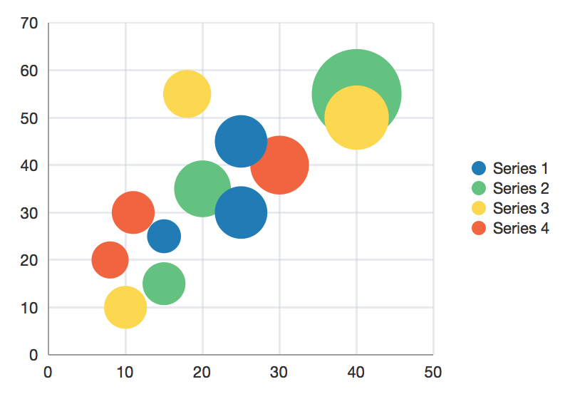
Here, a fourth variable is used as the bubbles are colour coded to represent different categories.
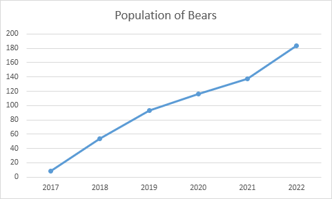
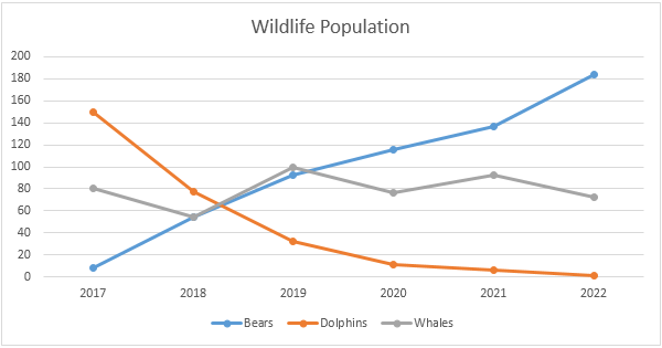
Line chart
A line graph is used when our data has a numerically changing variable. It is largely used to measure how a variable changes over time. The line plot consists of individual data points of the changing variable that are connected by a continuous line. When the change is measured over time, the X-axis shows the time.
-
A single line chart is used when the change is measured for a single variable.
-
A stacked line chart is used when the changing variable applies to more than one category and we want to compare them.
Tools used for data visualization
Now that we have understood what is data visualization, we will take a look at some of the tools used for data visualization.
Tableau
Tableau has been a market leader for quite some time when it comes to visualization tools. It has a very diverse collection of visualizations and can even create multi-dimension maps. It also can be connected to various data sources, has an ability to blend datasets and offers real-time collaboration. It has an informative and engaging community. This does not require any coding to create visualizations and can be created by just dragging and dropping the required measures and dimensions in the right places. The con is that its pricing is slightly on the higher side. This is a good option if one is looking for a scalable software solution for data visualization.
Microsoft Power BI
This is a visualization tool provided by Microsoft. It can be installed both on-premise and deployed on cloud. It enables users to access data from any device as it was originally created for business analysis. It guarantees us data security and comes with a wide range of applications that allows users to create personalized and interactive visualizations that can be shared real-time. It can access both non-relational and relational databases and can import data in any format. The mobile and desktop versions are totally free while there is a Pro version that requires monthly payment.
Sisense
Sisense is an agile data visualization tool that allows users to create interactive and informative dashboards anywhere and anytime. It also follows the drag-and-drop method to create graphs and comes with an embedded AI engine that allows us to easily discover patterns and trends in our data. It is ideal for mission-critical projects that uses massive datasets.
QlikView
This is one of the most used tools for data visualization. It is easy to use, cost effective and has a trouble-free maintenance. Along with highly customized visualizations, it also offers integrated BI platform which comes with analytics and enterprise reporting. It also comes with training tutorials which makes it easy to learn. It does not require any coding to create compelling dashboards. This is a good option for large enterprises as it is cheaper than tableau and also connects with various data sources like Amazon RedShift, MS SQL Server and many more.
Google charts
This is a powerful data visualization tool that is used especially for creating interactive charts to embed online. It is free and works with dynamic data and is coded with HTML5 and SVG which allows them to work in browsers. It offers a variety of charts and maps that can be customized with simple CSS editing. The major con is that it doesn't have adequate amount of demos and offers limited support
Data wrapper
Data wrapper is an online visualization tool that has an intuitive user interface. It does not require any installation for creating charts. It is quick to create charts and present statistics on Big Data in a graphical manner and is hence popular among the media companies. It is specifically designed for newsroom data visualization. The visualizations created in Data wrapper are responsive and can be viewed on any device by the user. However the free version of this tool comes with some limitations, one of it being that it lets us upload only 500 rows of data at a time.
With this article at OpenGenus, you must have a good overview of Data Visualization.