
Get this book -> Problems on Array: For Interviews and Competitive Programming
In this article, we have explored the differences between two important CSS layouts namely Flexbox and Grid in depth.
Table of contents:
- Grid
- Flexbox
- One Vs. Two Dimension
- Content-First Vs. Layout-First
- When to use Flexbox and Grid?
- Conclusion
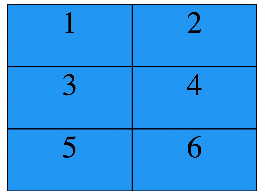
Grid
CSS grid is a two-dimensional layout system with rows and column, which means that it opens a lot of different possibilities to build more complex and organized design systems.
To get started, all you need to do is pass a css display: gridproperty to your block element.Now you have a grid, so you should define how many rows and columns do you want.
<!DOCTYPE html>
<html lang="en">
<head>
    <style>
    .grid-container {
    display: grid;
    grid-template-columns: 20px 20px ;
    grid-template-rows: 20px 20px 20px;
    padding: 10px;
     }
.grid-item{
    text-align: center;
    border: solid  black;
    background-color: #2196F3;
    }

    </style>
</head>
<body>
    <div class="grid-container">
        <div class="grid-item">1</div>
        <div class="grid-item">2</div>
        <div class="grid-item">3</div>
        <div class="grid-item">4</div>
        <div class="grid-item">5</div>
        <div class="grid-item">6</div>
    </div>
</body>
</html>
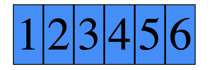
Flexbox
Flexbox is a one-dimensional layout system that we can use to create a row or a column axis layout. It makes our life easier to design and build responsive web pages without having to use a lot of float and position properties in our CSS code.
To start to use flexbox, all you need to do is create a flex container using the css display: flex. After that, every element that you have inside that flex container turns into a flex item.
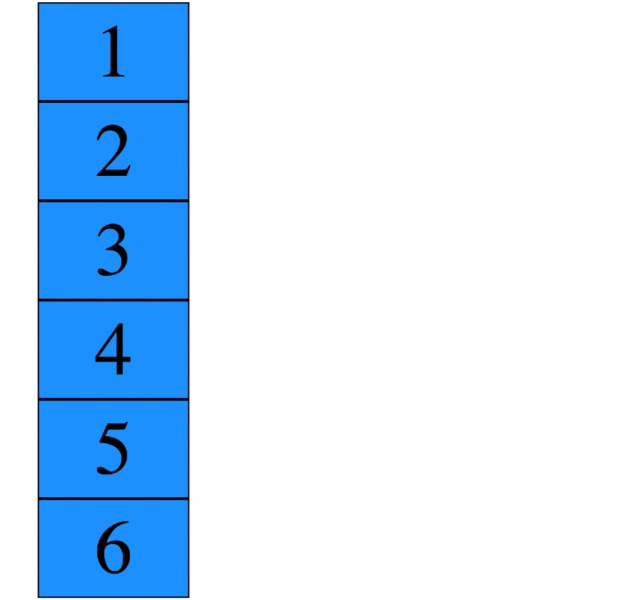
The main direction that our flex items take in our flex container is a row.We can change the direction of our flex items in our flex container very easily to a column, by passing a css flex-direction: column property to our flex container.
<!DOCTYPE html>
<html lang="en">
<head>
<style>
.flex-container {
  display: flex;
}

.flex-container > div {
  background-color: DodgerBlue;
  border: solid black;
}
</style>
</head>
<body>
<div class="flex-container">
    <div class="flex-item">1</div>
    <div class="flex-item">2</div>
    <div class="flex-item">3</div>
    <div class="flex-item">4</div>
    <div class="flex-item">5</div>
    <div class="flex-item">6</div>
</div>
</body>
</html>
After using column property.
One Vs. Two Dimension
Flexbox is made for one-dimensional layouts, and the Grid is made for two-dimensional layouts. It means Flexbox can work on either rows or columns at a time, but Grids can work on both.
Content-First Vs. Layout-First
Another major difference between the two is that Flexbox takes a basis in the content while Grid takes a basis in the layout.
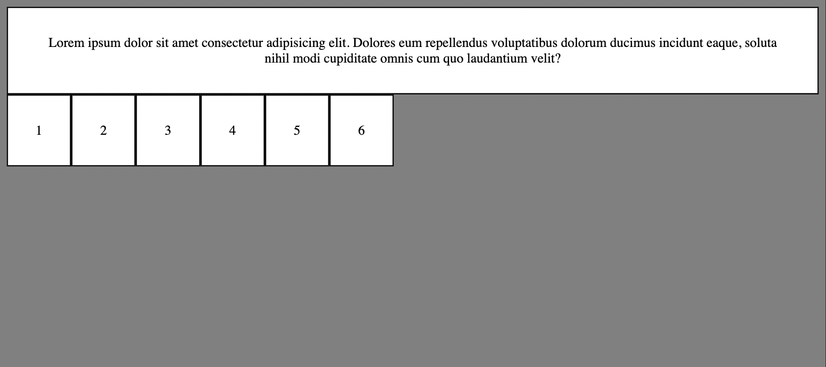
Let’s look at an example to understand it better.
<!DOCTYPE html>
<html lang="en">
<head>
    <link rel="stylesheet" href="style.css">
    <title>Document</title>
</head>
<body>
    <div class="container">
        <div class="item">Lorem ipsum dolor sit amet consectetur adipisicing elit. Dolores eum repellendus voluptatibus dolorum ducimus incidunt eaque, soluta nihil modi cupiditate omnis cum quo laudantium velit?</div>
        <div class="item">1</div>
        <div class="item">2</div>
        <div class="item">3</div>
        <div class="item">4</div>
        <div class="item">5</div>
        <div class="item">6</div>
    </div>
</body>
</html>
.container{
    display: grid;
    grid-template-columns: repeat(auto-fill, minmax(15em ,1fr));
    grid-gap: 5px;
}

.item{
    background-color: white;
    border: solid black;
    text-align: center;
}
Here the content inside the box does not stretch automatically according to the content.
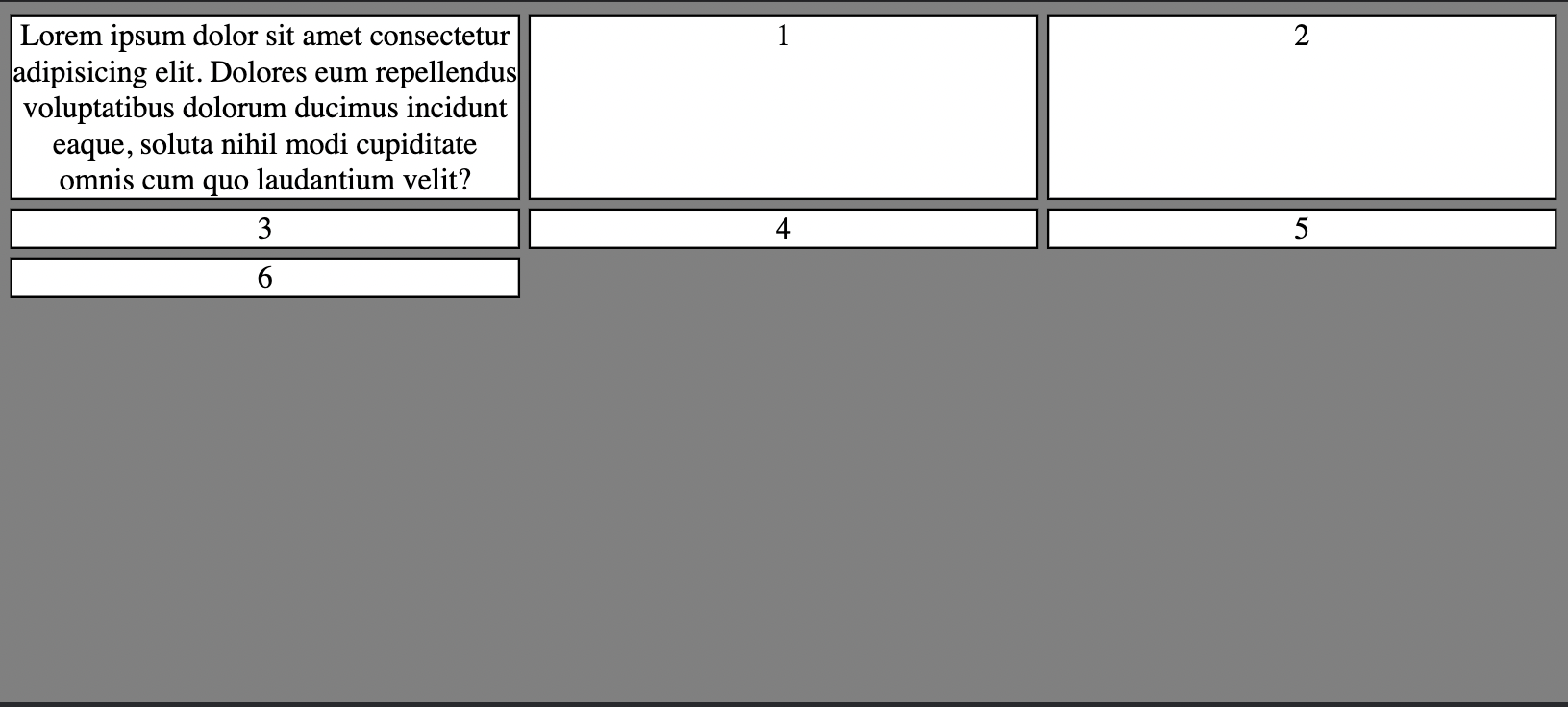
In the flex , the box stretches as far as the content goes.
When to use Flexbox and Grid?
You should consider using flexbox when:
- You have a small design to implement.
- You need to align elements.
- You need a content-first design.
- You don’t know how your content will look on the page, and you want everything to fit in.
You should consider using Grid when:
- You have a complex design to implement.
- You need to have a gap between block elements.
- You need to overlap elements.
- You need a layout-first design.
Conclusion
In this article at OpenGenus, we learned about the differences between flexbox and CSS grid, how they work in modern browsers, and how we can use each one of them to accomplish different results in our CSS.With the right amount of practice, you can master both the layouts and create impressive web pages.