
Get this book -> Problems on Array: For Interviews and Competitive Programming
In this article, we will learn how Python is used for Data Analysis and introduced Python libraries that are frequently used in Data Science such as Numpy, Pandas, Matplotlib, Seaborn and others.
Table of contents
- Some python libraries used for data analysis
- NumPy
- Pandas
- Matplotlib and Seaborn
Some python libraries used for data analysis
Python offers many packages/libraries that are curated for specific uses making python a computer programming language that is extremely diverse in its uses and also flexible. Since it is an open-source language, anyone can add to it by developing a library that meets a use case and make it available for all to use them. Further in this article, we will make use of two datasets. The first few rows are as shown:
- winequality-white.csv
"fixed acidity";"volatile acidity";"citric acid";"residual sugar";"chlorides";"free sulfur dioxide";"total sulfur dioxide";"density";"pH";"sulphates";"alcohol";"quality"
7;0.27;0.36;20.7;0.045;45;170;1.001;3;0.45;8.8;6
6.3;0.3;0.34;1.6;0.049;14;132;0.994;3.3;0.49;9.5;6
- movies.csv
"Director","Genre","Movie Title","Studio","Budget ($mill)","Gross ($mill)","IMDb Rating","MovieLens Rating","Overseas ($mill)","Overseas%","Profit ($mill)","US ($mill)","Gross % US"
Brad Bird,action,Tomorrowland,Buena Vista Studios,170,202.1,6.7,3.26,111.9,55.4,32.1,90.2,44.6
Scott Waugh,action,Need for Speed,Buena Vista Studios,66,203.3,6.6,2.97,159.7,78.6,137.3,43.6,21.4
The first dataset is in the semicolon separated values format and the second is in the comma separated values format.
NumPy
NumPy is the abbreviation for "Numerical Python". It provides an interface to work with multidimensional arrays effectively.
To use NumPy, we first install it and then import it into our environment.
import numpy as np #importing the package
We can create a basic array using NumPy as follows:
np.array([1,3,5,7])
The output will be an array that contains the elements 1,3,5 and 7.
array([1,3,5,7])
We can perform all operations on array such as indexing, slicing and even mathematical operations (+,-,*,/,^).
If all the elements in our dataset are of the same data type, then we can directly create an array from the dataset using NumPy.
wine = np.genfromtxt("winequality-white.csv", delimiter=";", skip_header=1) #skip header tells the function that there is a header row that needs to be skipped.
wine
#Output:
array([[ 7.  ,  0.27,  0.36, ...,  0.45,  8.8 ,  6.  ],
       [ 6.3 ,  0.3 ,  0.34, ...,  0.49,  9.5 ,  6.  ],
       [ 8.1 ,  0.28,  0.4 , ...,  0.44, 10.1 ,  6.  ],
       ...,
       [ 6.5 ,  0.24,  0.19, ...,  0.46,  9.4 ,  6.  ],
       [ 5.5 ,  0.29,  0.3 , ...,  0.38, 12.8 ,  7.  ],
       [ 6.  ,  0.21,  0.38, ...,  0.32, 11.8 ,  6.  ]])
We can even convert the data type of our array. Suppose, we want the above array that we generated from the dataset to contain integers. Then, we can use the following code.
wine.astype(int)
# Output:
array([[ 7,  0,  0, ...,  0,  8,  6],
       [ 6,  0,  0, ...,  0,  9,  6],
       [ 8,  0,  0, ...,  0, 10,  6],
       ...,
       [ 6,  0,  0, ...,  0,  9,  6],
       [ 5,  0,  0, ...,  0, 12,  7],
       [ 6,  0,  0, ...,  0, 11,  6]])
Now the array that initially contained elements of float data type, has integer values.
Random vectors can be easily generated using the random function in NumPy.
np.random.rand(4) # 4 elements are to be randomly generated
# Output
array([0.01477275, 0.3735554 , 0.91642665, 0.75887685])
This function generates a vector of random integers from 0-1.
Pandas
Pandas is another open-source library that is designed to facilitate data analysis, especially data manipulation.
Here too we first install the library and then import it into our environment.
import pandas as pd #importing the package
Let us understand some basic functions of Pandas by using them on the movies dataset.
First, we import the csv file as a dataframe.
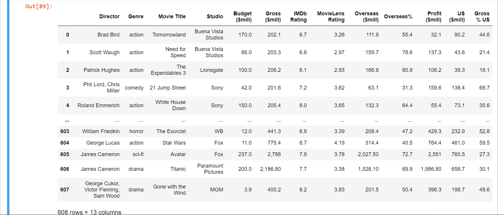
movie = pd.read_csv('movies.csv',encoding='unicode_escape')
movie
The output will look as follows:
We can get the summary of the dataset using the info() function.
movie.info()
# Output:
<class 'pandas.core.frame.DataFrame'>
RangeIndex: 608 entries, 0 to 607
Data columns (total 13 columns):
 #   Column            Non-Null Count  Dtype
---  ------            --------------  -----
 0   Director          608 non-null    object
 1   Genre             608 non-null    object
 2   Movie Title       608 non-null    object
 3   Studio            608 non-null    object
 4   Budget ($mill)    608 non-null    float64
 5   Gross ($mill)     608 non-null    object
 6   IMDb Rating       608 non-null    float64
 7   MovieLens Rating  608 non-null    float64
 8   Overseas ($mill)  608 non-null    object
 9   Overseas%         608 non-null    float64
 10  Profit ($mill)    608 non-null    object
 11  US ($mill)        608 non-null    float64
 12  Gross % US        608 non-null    float64
dtypes: float64(6), object(7)
memory usage: 61.9+ KB
To view just the title of the columns in the dataframe, we use the columns function.
movie.columns
#Output:
Index(['Director', 'Genre', 'Movie Title', 'Studio', 'Budget ($mill)',
       'Gross ($mill)', 'IMDb Rating', 'MovieLens Rating', 'Overseas ($mill)',
       'Overseas%', 'Profit ($mill)', 'US ($mill)', 'Gross % US'],
      dtype='object')
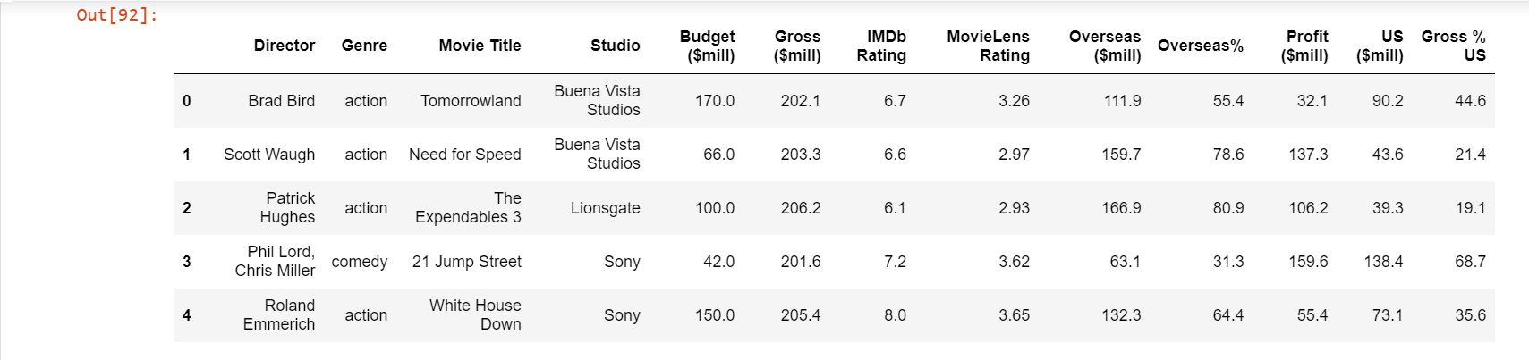
Similarly, if we want to see only the first few rows of the dataframe to better understand the data, we make use of the head() function.
movie.head()
We can also drop the columns that we feel is unnecessary for our analysis. The changes made here will not affect the original csv file.
movie=movie.drop(['Overseas ($mill)', 'Director','Gross ($mill)','MovieLens Rating','Overseas%','Budget ($mill)','Profit ($mill)','US ($mill)'],1)

# We mention the column names to be dropped as a list
# the '1' tells us the axis from where data is to be dropped
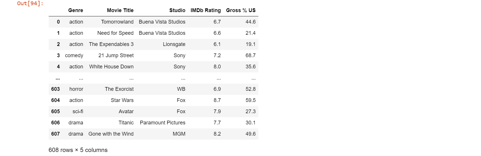
Now we have a relatively smaller dataframe to work with. If we want to further filter out only the data that meets a certain condition, we can get the data to be stored as a separate dataframe. Now if we only want the movies of genre action, comedy, drama, animation and adventure produced by either Buena Vista Studios, Fox, Paramount Pictures, Sony, Universal or WB; we can do it as follows.
movie2 = movie[(movie.Genre== 'action') | (movie.Genre == 'adventure') | (movie.Genre == 'animation') | (movie.Genre== 'comedy')| (movie.Genre == 'drama')] # Keeping the selected genre
movie3=movie2[(movie2.Studio == 'Buena Vista Studios') | (movie2.Studio == 'Fox') | (movie2.Studio == 'Paramount Pictures') | (movie2.Studio == 'Sony') | (movie2.Studio == 'Universal') | (movie2.Studio== 'WB')] # Further filtering data that meets the "Studio" condition.
movie3 # displaying final dataframe
Now, our final dataframe looks like:
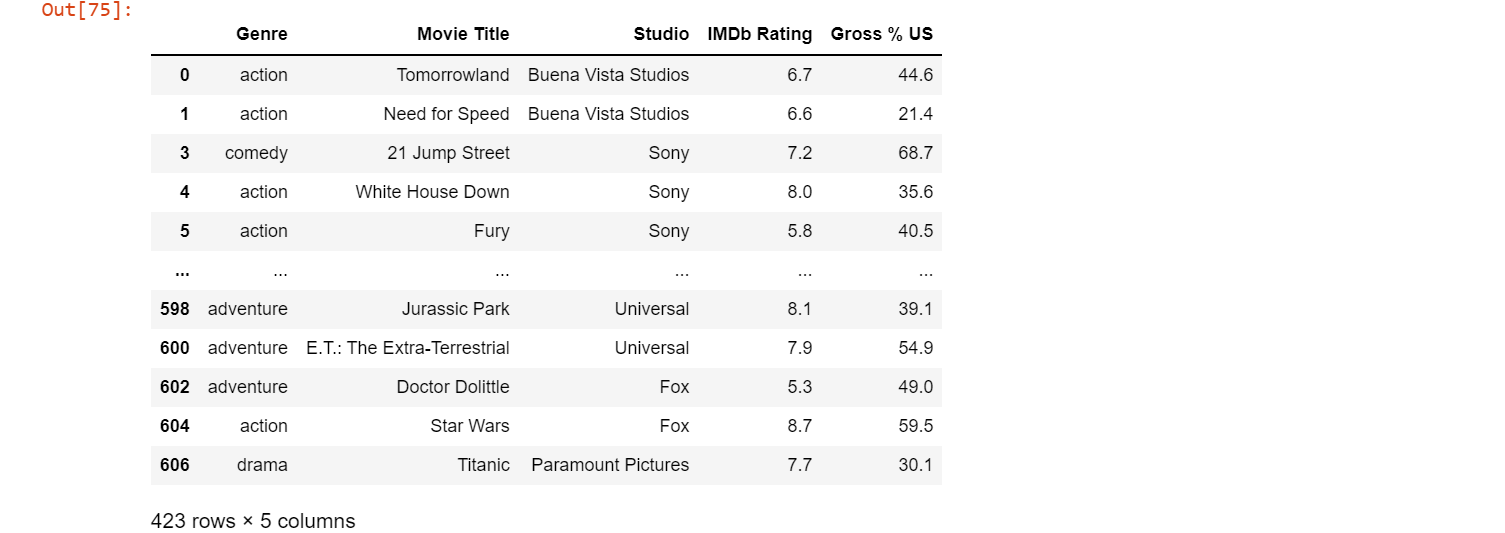
Note that the number of rows and columns have gone from 608 x 13 in the original dataframe to 423 x 5 to our cleaned dataframe.
Matplotlib and Seaborn
Matplotlib and Seaborn are two libraries that are used for visualizing the data. They contain functions that allows us to customize even the minute part of the visualization such as the color palette and shadow. We generally use pyplot in matplotlib. It is an interactive way to use matplotlib. The magic function in matplotlib is used to specify where the output needs to be displayed. Usually, %matplotlib inline is used which allows the plots to be displayed within the workbook.
%matplotlib inline
import seaborn as sns #importing the package
import matplotlib.pyplot as plt #importing the package
There are a number of graphs and charts available in these libraries. Let us look into some plots by visualizing data from our previously cleaned dataframe movie3. The general way to create a plot is to assign the respective function of the graph to a name.
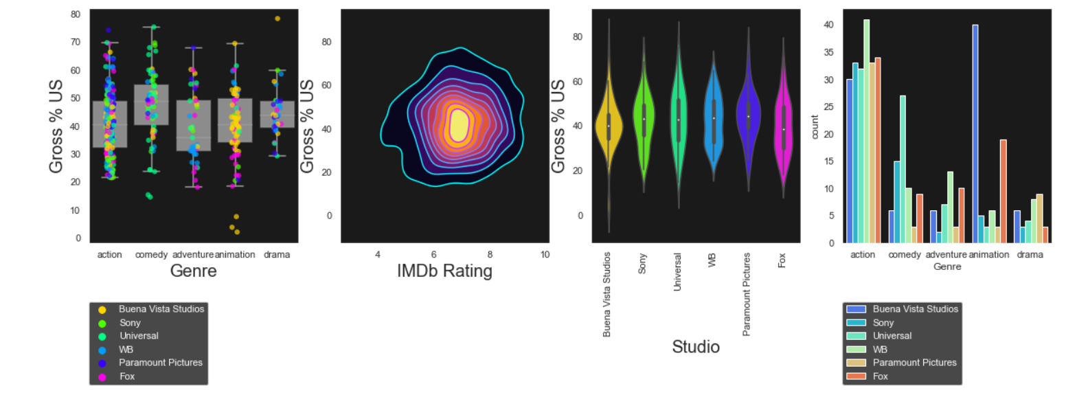
Combining two plots
sns.set(style="white",palette="rainbow",color_codes=True)
vis1=sns.boxplot(data=movie3,x='Genre',y='Gross % US',orient='v',color='white',showfliers=False) # creating a boxplot
plt.setp(vis1.artists,alpha=0.5)
sns.stripplot(data=movie3,x='Genre',y='Gross % US',hue='Studio',jitter=True,size=6,linewidth=0,alpha=0.7,palette="hsv") #creating a stripplot

# Customizing labels and legend
vis1.set_xlabel('Genre',fontsize=20)
vis1.set_ylabel('Gross % US',fontsize=20)
vis1.legend(bbox_to_anchor=(1.05, 1), loc=2, borderaxespad=0,labelcolor='black')
plt.show()
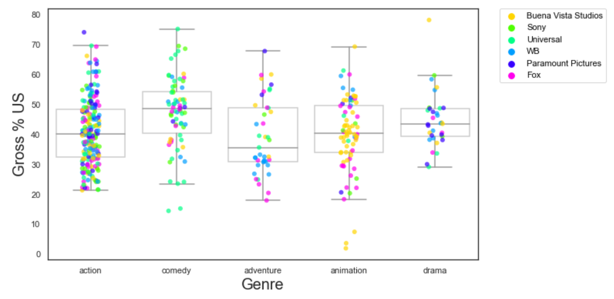
When ever we create two plots without mentioning them as subplots, they get overlayed and are plotted in the same graph. In the above code, we have combined a boxplot and a stripplot so that we can easily tell the data that falls between the quartiles and the outliers.
Violin plot
sns.set_style("white")
vis2=sns.violinplot(data=movie3,x='Studio',y='Gross % US',palette='hsv') #creating a violin plot

#setting labels
vis2.set_xlabel('Studio',fontsize=20)
vis2.set_ylabel('Gross % US',fontsize=20)
plt.show()
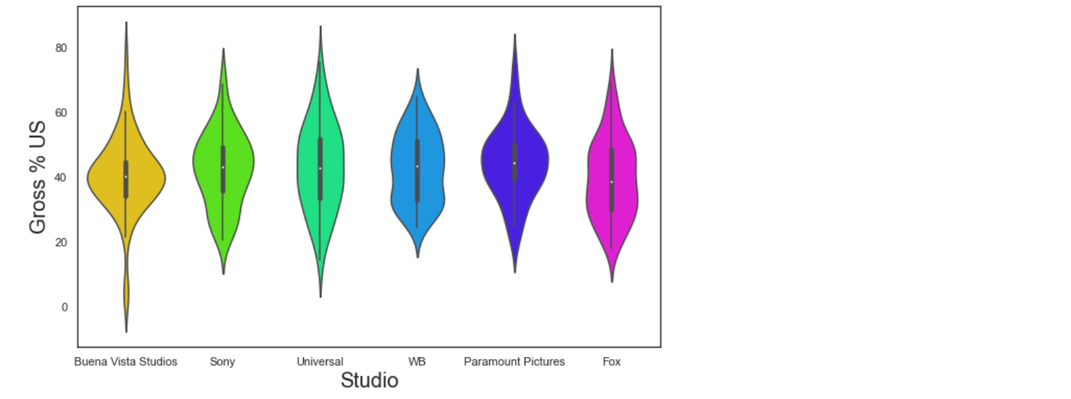
A violin plot is used when we want the distribution of various groups of data in the form of density curves. The width of curve at a given point corresponds to the frequency of data in that region.
KDE plot
sns.set_style("white")
vis3=sns.kdeplot(data=movie,x='IMDb Rating',y='Gross % US',shade=True,shade_lowest=False,cmap='inferno') # creating a kde plot with color fill
vis3a=sns.kdeplot(data=movie,x='IMDb Rating',y='Gross % US',cmap='inferno') # creating a kde plot with just outline of regions
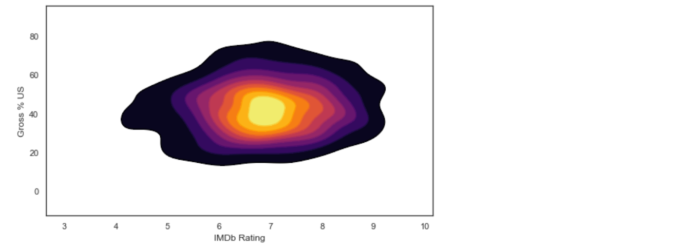
While creating KDE plots, we generally overlay two KDE plots: One with the color fill and one with just the outline, so that the boundaries of different regions are well defined.
Pie chart
my_palette=['#ff9999','#66b3ff','#99ff99','#ffcc99','#ff99fc','#fdff99','#abf7f6','#abc3f7'] #defining a color palette
sns.set_style('white')
plt.rcParams['figure.figsize']=9,5 # setting the size of the chart
vis4=plt.pie(movie3[movie3["IMDb Rating"]>7.0]["Genre"].value_counts(),explode=[0.2,0.2,0.2,0.2,0.2],shadow=True,startangle=90,autopct='%1.1f%%', colors=my_palette) # creating a pie chart
plt.title("Distribution of movie genres with rating higher than 7") #Assigning a title
plt.legend(movie3["Genre"].unique(),bbox_to_anchor=(1,1), loc=2, borderaxespad=0,labelcolor='black') # customizing the legend
plt.show()
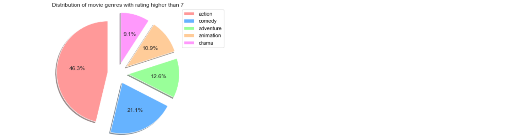
Since a pie chart function is not available in seaborn, we use the piechart function in pyplot. Instead of defining the color palette separately, we can also use the palettes available in matplotlib.
Count plot
vis5=sns.countplot(data=movie3,x=movie3["Genre"],hue=movie3["Studio"],palette="rainbow") #creating the graph
vis5.legend(bbox_to_anchor=(1.05, 1), loc=2, borderaxespad=0,labelcolor='white') #customizing the legend
plt.title('Distribution of movie genres by Studios') #Assigning a title
plt.show() #displaying the graph
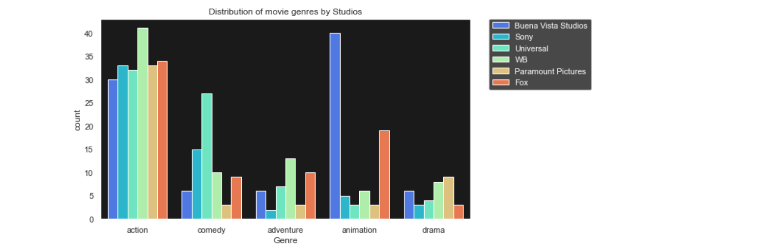
A countplot simply shows the number of observations in each category. The height of each bin represent the number of observations in that category. Shown above is a countplot which tells us how many movies are there of each genre and also the bins are color coded to represent the Studio that produced the movie.
Subplots
We can also put all the plots we have created together in a single output without overlaying them so that we can compare the results, by creating subplots. We write the code for each plot and at the end, we specify the index in which they need to be placed.
sns.set(style="dark")
sns.set_style({"axes.facecolor":"k"})
f,axes=plt.subplots(1,4,figsize=(20,5)) # creating a subplot with 1 row and 4 columns

# boxplot and stripplot in the first position
vis1=sns.boxplot(data=movie3,x='Genre',y='Gross % US',orient='v',color='white',showfliers=False,ax=axes[0])
plt.setp(vis1.artists,alpha=0.5)
sns.stripplot(data=movie3,x='Genre',y='Gross % US',hue='Studio',jitter=True,size=6,linewidth=0,alpha=0.7,palette="hsv",ax=axes[0])
vis1.set_xlabel('Genre',fontsize=20)
vis1.set_ylabel('Gross % US',fontsize=20)
vis1.legend(bbox_to_anchor=(0, -0.25), loc=2, borderaxespad=0,labelcolor='white')

#violin plot in position 3
vis2=sns.violinplot(data=movie3,x='Studio',y='Gross % US',palette='hsv',ax=axes[2])
vis2.set_xlabel('Studio',fontsize=20)
for tick in vis2.get_xticklabels():
    tick.set_rotation(90)
vis2.set_ylabel('Gross % US',fontsize=20)

#kde plot in position 2
vis3=sns.kdeplot(data=movie,x='IMDb Rating',y='Gross % US',shade=True,shade_lowest=False,cmap='inferno',ax=axes[1])
vis3a=sns.kdeplot(data=movie,x='IMDb Rating',y='Gross % US',cmap='cool',ax=axes[1])
vis3.set_xlabel('IMDb Rating',fontsize=20)
vis3.set_ylabel('Gross % US',fontsize=20)

#count plot in position 4
vis5=sns.countplot(data=movie3,x=movie3["Genre"],hue=movie3["Studio"],palette="rainbow",ax=axes[3])
vis5.legend(bbox_to_anchor=(0, -0.25), loc=2, borderaxespad=0,labelcolor='white')
plt.show()
With this article at OpenGenus, you must have the complete idea of how to use Python for Data Analysis.