
Get this book -> Problems on Array: For Interviews and Competitive Programming
CSS (Cascading Style Sheets) is a styling language used for describing the presentation of HTML documents. CSS has several units for specifying different types of measurements and values. In this essay, we will look at all the units available in CSS.
List of Units in CSS:
Absolute Units:
- cm (Centimeter)
- mm (Millimeter)
- inches
- pixel (px)
- points (pt)
- picas (pc)
Relative Units:
- em
- ex
- ch
- rem
- vw (Viewport width)
- vh (Viewport height)
- vmin (Viewport minimum)
- vmax (Viewport maximum)
- % (Percentage)
Absolute Units:
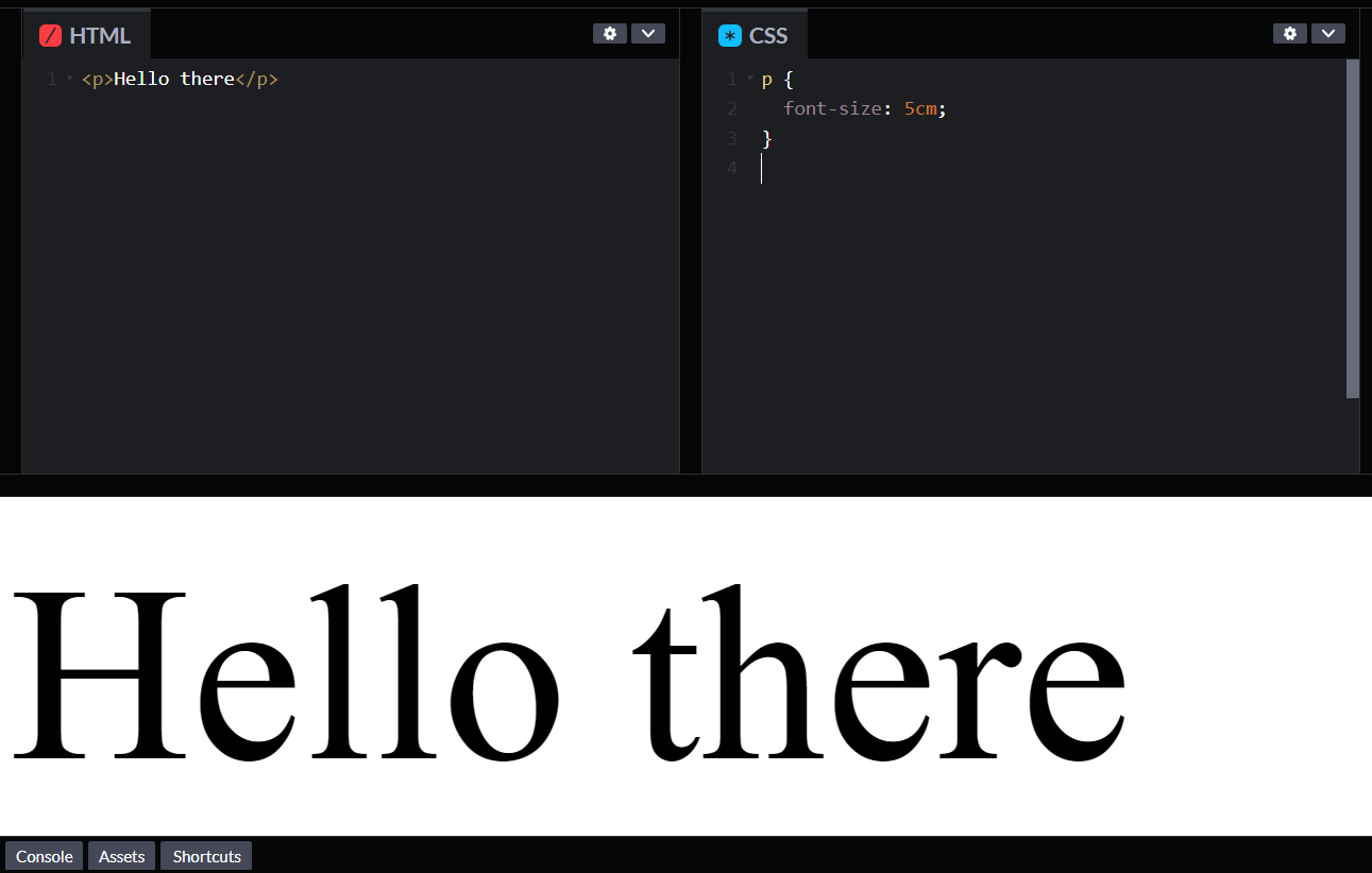
- cm (Centimeter): The centimeter (cm) is a metric unit of length. One centimeter is equal to one-hundredth of a meter. In CSS, the cm unit is used to specify absolute lengths. For example, if we want to set the font size of paragraph tag to 5 centimeters, we can use the following CSS code:
p {
  font-size: 5cm;
}
Have a look at the output:
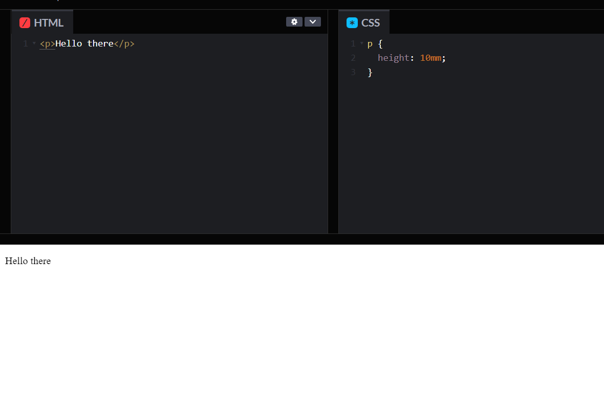
- mm (Millimeter): The millimeter (mm) is another metric unit of length. One millimeter is equal to one-thousandth of a meter. In CSS, the mm unit is used to specify absolute lengths. For example, if we want to set the height of a paragraph to 10 millimeters, we can use the following CSS code:
p {
  height: 10mm;
}
Have a look at the output:
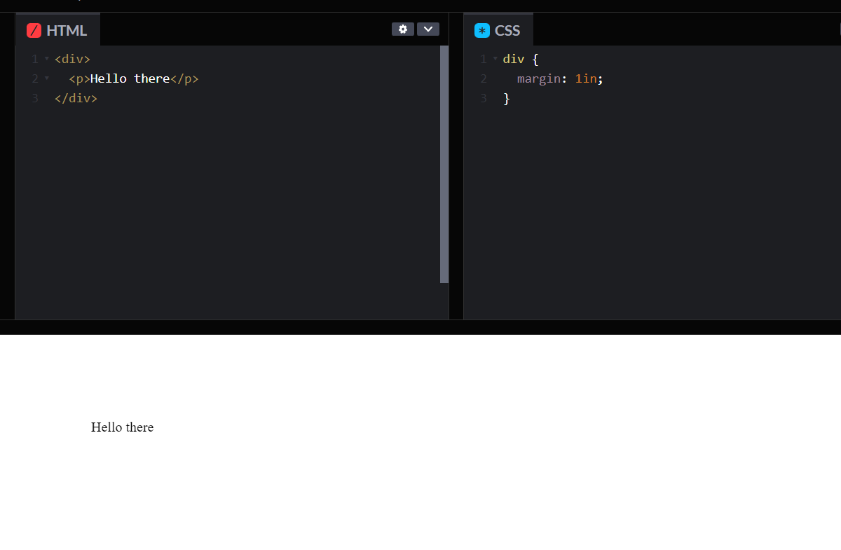
- in(inches) : The inch is a unit of length commonly used in the United States and other countries that use the imperial system. One inch is equal to 2.54 centimeters. In CSS, the inch unit is used to specify absolute lengths. For example, if we want to set the margin of a div to 1 inch, we can use the following CSS code:
div {
  margin: 1in;
}
Have a look at the output:
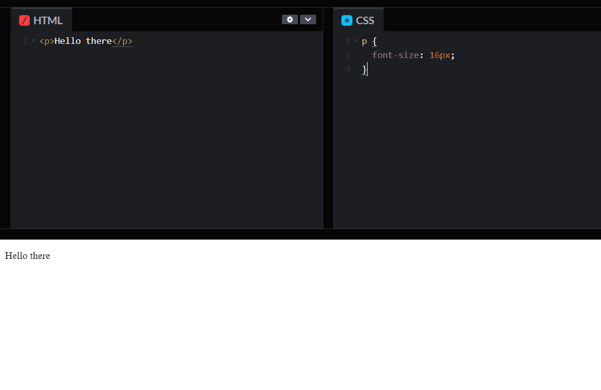
- pixel (px) : The pixel (px) is a unit of length commonly used in digital media. One pixel is equal to one dot on a screen. In CSS, the px unit is used to specify absolute lengths. For example, if we want to set the font size of a paragraph to 16 pixels, we can use the following CSS code:
p {
  font-size: 16px;
}
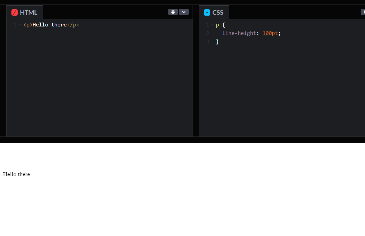
- points (pt) : The point (pt) is a unit of length commonly used in print media. One point is equal to 1/72 of an inch. In CSS, the pt unit is used to specify absolute lengths. For example, if we want to set the line-height of a paragraph to 12 points, we can use the following CSS code:
p {
  line-height: 100pt;
}
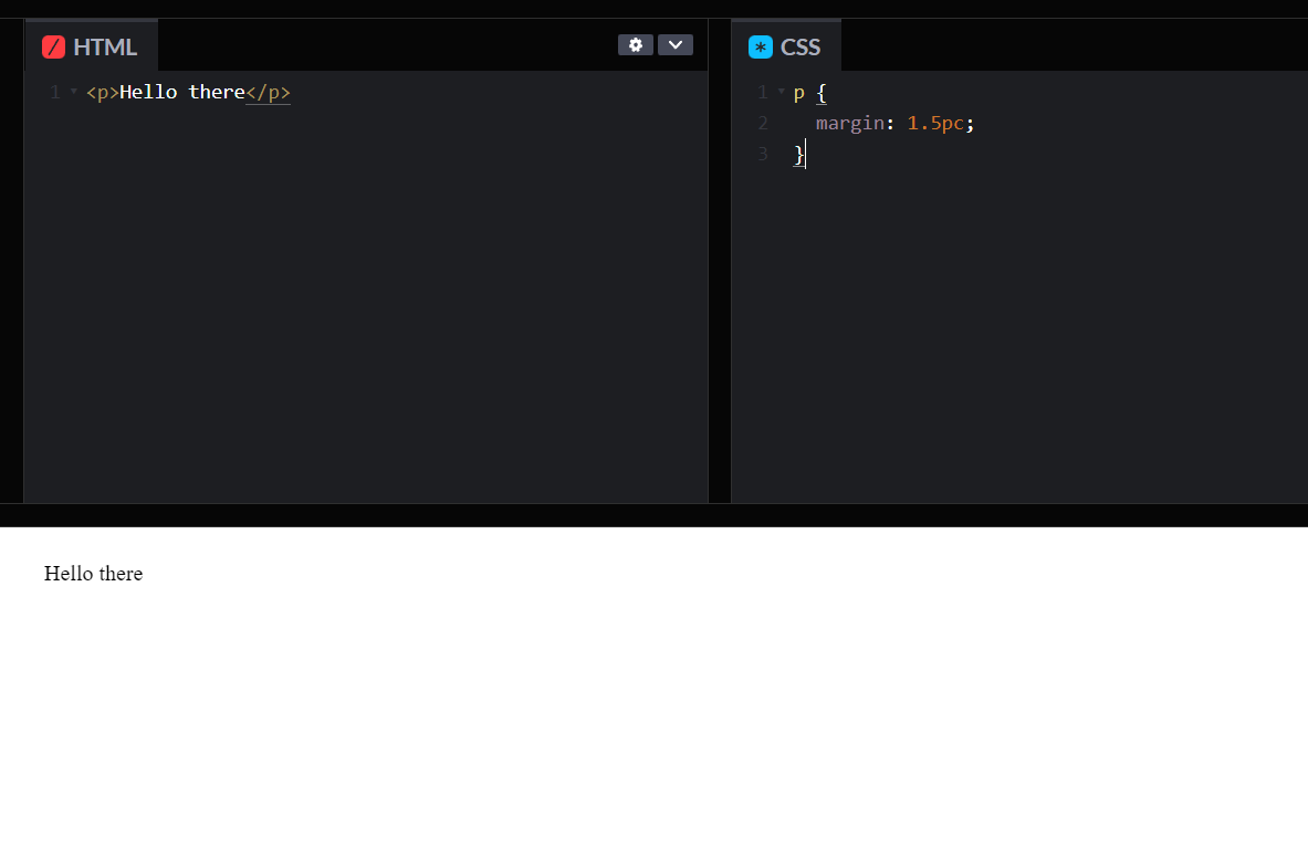
- picas (pc) : The pica (pc) is a unit of length commonly used in print media. One pica is equal to 12 points or 1/6 of an inch. In CSS, the pc unit is used to specify absolute lengths. For example, if we want to set the margin of a paragraph to 1.5 picas, we can use the following CSS code:
p {
  margin: 1.5pc;
}
Relative Units:
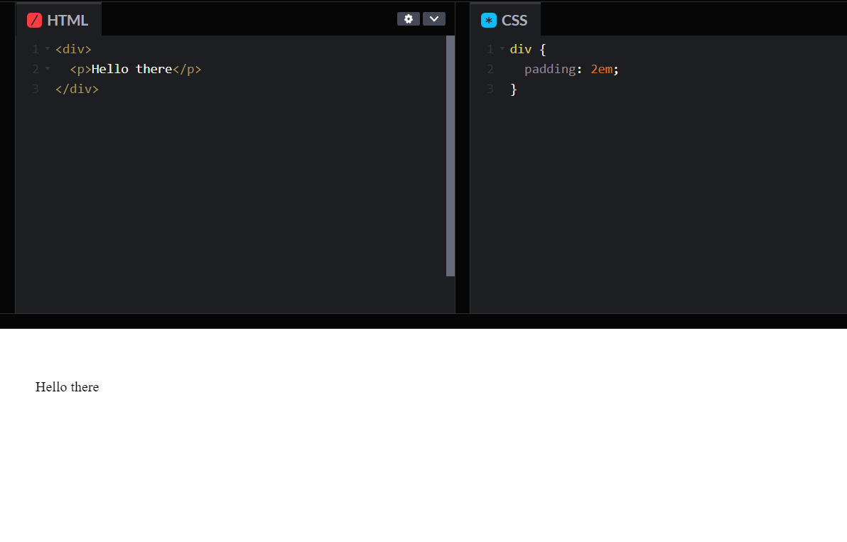
- em : The em is a relative unit of length. One em is equal to the font size of the current element. In CSS, the em unit is used to specify relative lengths. For example, if we want to set the padding of a div to 2 em, we can use the following CSS code:
div {
  padding: 2em;
}
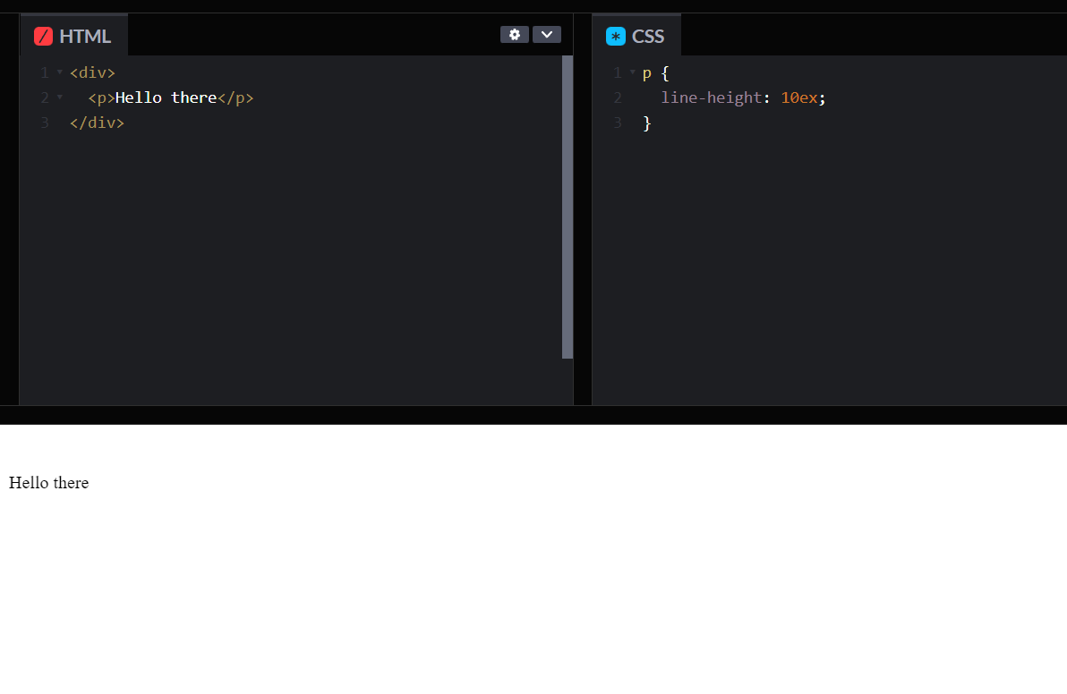
- ex : The ex is another relative unit of length. One ex is equal to the x-height of the current font. The x-height is the height of the lowercase letter x in a font. In CSS, the ex unit is used to specify relative lengths. For example, if we want to set the line-height of a paragraph to 1.5 ex, we can use the following CSS code:
p {
  line-height: 1.5ex;
}
- ch : The ch is a relative unit of length. One ch is equal to the width of the character "0" in the current font. In CSS, the ch unit is used to specify relative lengths. For example, if we want to set the width of an input field to 20 characters, we can use the following CSS code:
input[type=text] {
  width: 20ch;
}
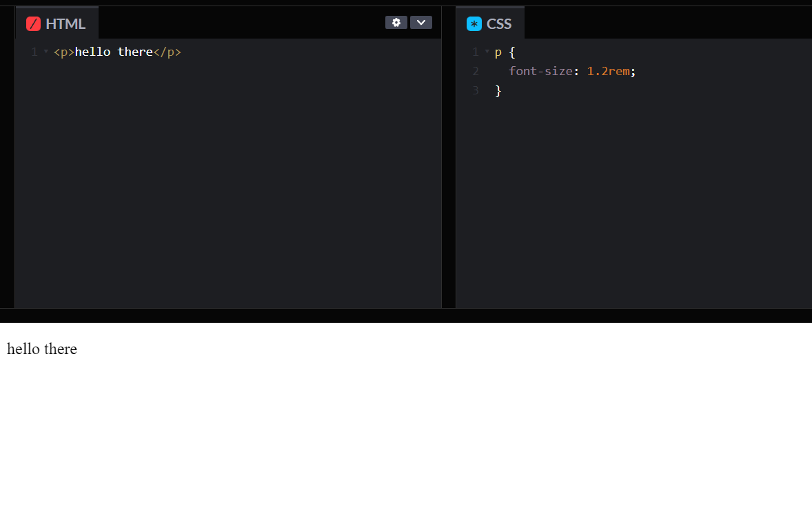
- rem : The rem is a relative unit of length. One rem is equal to the font size of the root element. The root element is usually the html element. In CSS, the rem unit is used to specify relative lengths. For example, if we want to set the font size of all paragraphs to 1.2 times the font size of the root element, we can use the following CSS code:
p {
  font-size: 1.2rem;
}
- vw (Viewport width) : The vw unit is a relative unit of length that represents a percentage of the viewport width. One vw is equal to 1/100th of the viewport width. In CSS, the vw unit is used to specify relative lengths. For example, if we want to set the width of an image to 50% of the viewport width, we can use the following CSS code:
img {
  width: 50vw;
}
- vh (Viewport height) : The vh unit is another relative unit of length that represents a percentage of the viewport height. One vh is equal to 1/100th of the viewport height. In CSS, the vh unit is used to specify relative lengths. For example, if we want to set the height of a div to 75% of the viewport height, we can use the following CSS code:
div {
  height: 75vh;
}
- vmin (Viewport minimum) : The vmin unit is a relative unit of length that represents the smaller of the viewport width and height. One vmin is equal to 1/100th of the smaller of the viewport width and height. In CSS, the vmin unit is used to specify relative lengths. For example, if we want to set the font size of a paragraph to 2 vmin, we can use the following CSS code:
p {
  font-size: 2vmin;
}
- vmax (Viewport maximum) : The vmax unit is a relative unit of length that represents the larger of the viewport width and height. One vmax is equal to 1/100th of the larger of the viewport width and height. In CSS, the vmax unit is used to specify relative lengths. For example, if we want to set the width of a div to 50% of the larger of the viewport width and height, we can use the following CSS code:
div {
  width: 50vmax;
}
- % (Percentage) : The percent (%) unit is a relative unit of length that represents a percentage of the parent element's size. In CSS, the % unit is used to specify relative lengths. For example, if we want to set the font size of a div to 50% of its parent element's font size, we can use the following CSS code:
div {
  font-size: 50%;
}
Now, let's summarize the different units together in a table:
| Unit | Description | Type |
|---|---|---|
| cm | Centimeter | Absolute |
| mm | Millimeter | Absolute |
| inches | Inches | Absolute |
| pixel | Pixel (1/96th of an inch) | Absolute |
| points | Point (1/72nd of an inch) | Absolute |
| picas | Pica (1/6th of an inch) | Absolute |
| em | The height of the element's font | Relative |
| ex | The x-height of the current font | Relative |
| ch | The width of the character '0' in the current font | Relative |
| rem | The font size of the root element | Relative |
| vw | The font size of the root element | Relative |
| vh | A percentage of the viewport height | Relative |
| vmin | A percentage of the smaller dimension of the viewport | Relative |
| vmax | A percentage of the larger dimension of the viewport | Relative |
| % | A percentage of the parent element's size | Relative |
In conclusion of this article at OpenGenus, CSS offers a wide range of units for specifying length and size. The choice of unit depends on the specific requirements of the project and the context in which the length or size is being used. Absolute units are fixed and do not change based on the context, whereas relative units are flexible and change based on the context. By understanding the different units and their properties, developers can create responsive and scalable designs that work well across a range of devices and screen sizes.