
Get this book -> Problems on Array: For Interviews and Competitive Programming
A color gradient is a smooth transition of different colors in a region. A CSS gradient displays a smooth transition of two or more specified colors and the direction, number of colors, positioning of color stops, can be controlled. This article explores gradients in CSS.
Table of Contents
- Introduction
- Linear gradients
- Radial gradients
- Conic gradients
- Repeating gradients
Introduction
The gradient is a type of <image> datatype in CSS. A CSS gradient doesn't have intrinsic dimensions, the instrinsic dimensions of an image are the dimensions that would be rendered if no CSS was applied to change the size of the image.
Gradients are images in CSS and hence gradients are to be set as "background-image". There are three different types of gradients - linear, radial and conic. Each of these gradients has a CSS function that takes colors, direction, angles and color stops as parameters.
Linear gradients
Linear gradients are generated using the linear-gradient() function. The color progression in linear gradient is in a straight line. At least two colors are to be passed at a minimum to generate a gradient, these are called color stops, we can also mention where to put them optionally.
div {
height: 200px;
width: 200px;
/*fallback*/
background-color: red;
/*gradient*/
background-image:
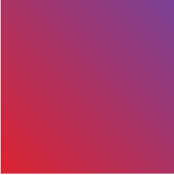
linear-gradient(#7b4397, #dc2430);
}

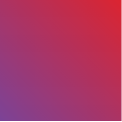
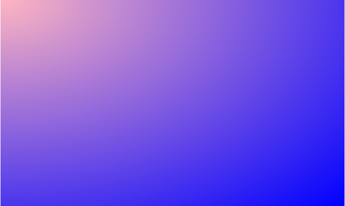
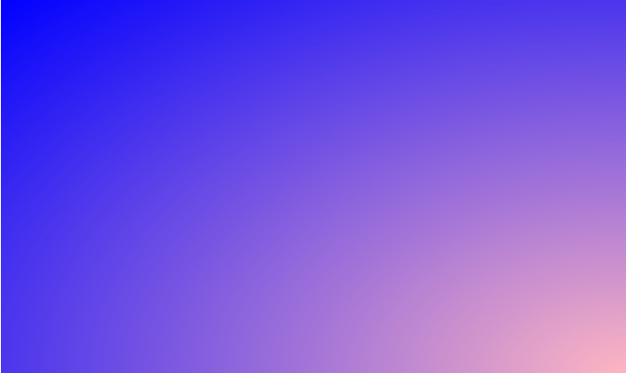
Here we created a linear gradient with 2 colors, a gradient can be generated using as many colors as needed and the colors can be specified as names, hex, hsla or in rgba formats. By default a gradient goes from top to bottom or the color stops are rendered horizontally.
Syntax
background-image: linear-gradient(direction, start-color,., end-color)
Direction
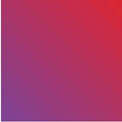
To rotate the angle of the gradient, angles can be specified in the first argument of the linear-gradient function. 0 degrees means horizontal rendering of the gradient colors, positive angles will rotate the gradient clockwise and negative angles will rotate the gradient anti-clockwise.
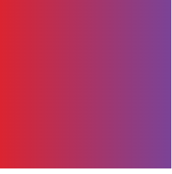
background-image: linear-gradient(45deg, #7b4397, #dc2430);
Instead of passing angles, the word "to " can be passed along with the directions - top, bottom, left and right to rotate the gradient.
To create a gradient from one corner to the other corner, use "to top right", "to bottom right", "to top left" and "to bottom left".
-
To top = 0 degrees
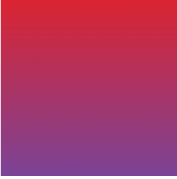
background-image: linear-gradient(to top, #7b4397, #dc2430);
-
To top right = 45 degrees
background-image: linear-gradient(to top right, #7b4397, #dc2430);
-
To right = 90 degrees
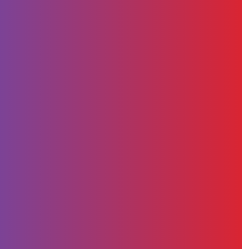
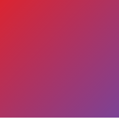
background-image: linear-gradient(to right, #7b4397, #dc2430);
-
To bottom right = 135 degrees

background-image: linear-gradient(to bottom right, #7b4397, #dc2430);
-
To bottom = 180 degrees

background-image: linear-gradient(to bottom, #7b4397, #dc2430);
-
To bottom left = 225 degrees
background-image: linear-gradient(to bottom left, #7b4397, #dc2430);
-
To left = 270 degrees
background-image: linear-gradient(to left, #7b4397, #dc2430);
-
To top left = 315 degrees
background-image: linear-gradient(to top left, #7b4397, #dc2430);
Color stops
Colors in the gradient are spaced evenly by default. The location of the colors can be changed using color stop parameter of the CSS linear-gradient function. The location can be specified as a percentage with 0% representing the starting point and 100% representing the end point.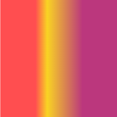
background-image:
    linear-gradient(to right, #FF4E50 30%, #F9D423 40%, #BB377D 70%)
- Setting an ending position for colors

background-image:
    linear-gradient(to right, #FF4E50 0% 25%, #F9D423 35% 70%, #BB377D 80% 100%)
- Hard lines can be created instead of smooth transition between colors by setting the color stop values to same location.
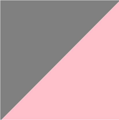
background-image: linear-gradient(to top left, pink 50%, grey 50%);
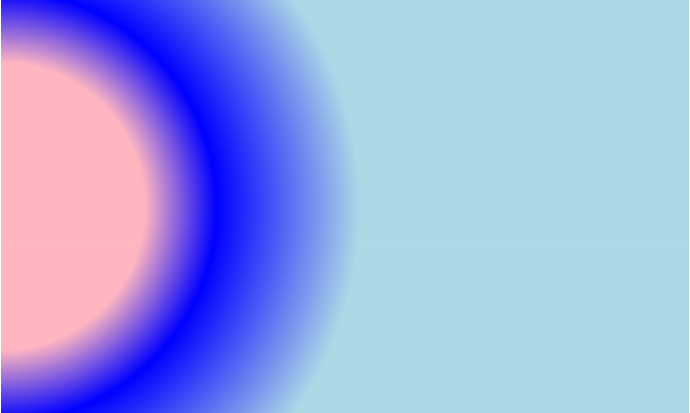
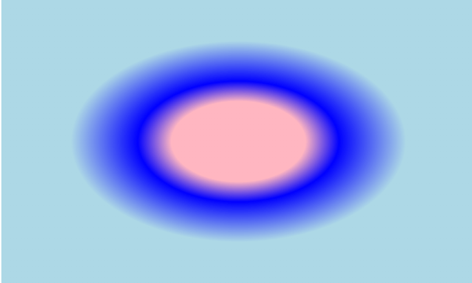
Radial gradient
This gradient starts at the center and radiates outwards. The starting point is the center of the element and the shape is elliptical or circular according to the aspect ratio of the element. If the element is not a square, the gradient will stretch to become an ellipse.div {
height: 300px;
width: 300px;
/*fallback*/
background-color: red;
/*gradient*/
background-image:
radial-gradient(pink, blue)
}
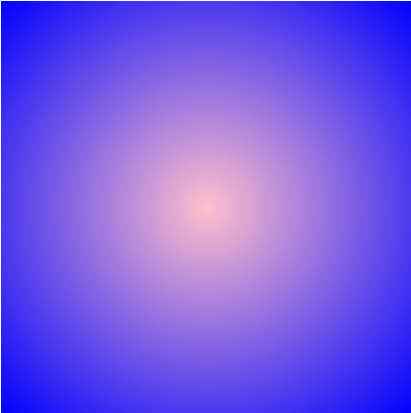
- Here the shape formed in the gradient is an ellipse because the element (div) is not a square.
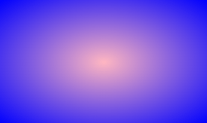
div {
  height: 300px;
  width: 500px;

  /*fallback*/
  background-color: red;

  /*gradient*/
  background-image:
     radial-gradient(lightpink, blue)}
Syntax
background-image: radial-gradient(shape, size, position of center, start-color,., end-color)
Shape
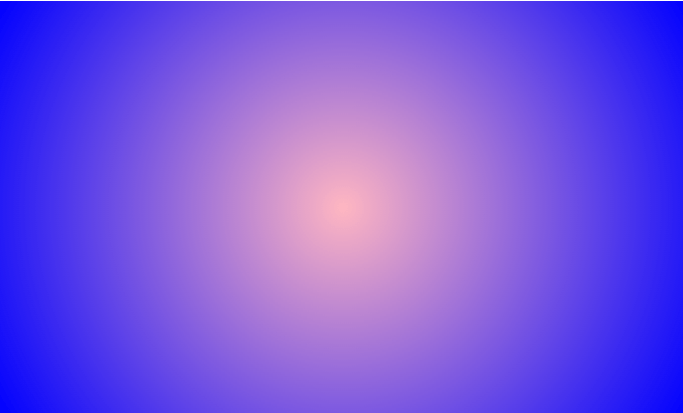
If we want a circular gradient irrespective of the element's dimensions, we set the gradient's shape to "circle"
div {
  height: 300px;
  width: 500px;

  /*fallback*/
  background-color: red;

  /*gradient*/
  background-image:
     radial-gradient(circle, lightpink, blue)
}
Position of center
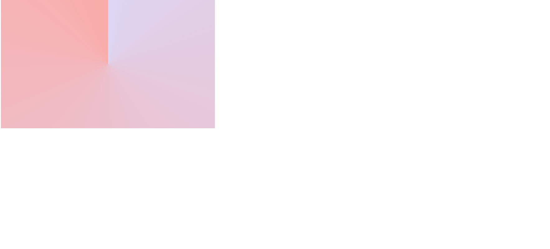
The position of the center can be changed by using percentages, keywords - "at * " where * refers to length or absolute lengths.- At "percentages"
background-image: radial-gradient(at 0% 0%, lightpink, blue)
- At "keyword"
background-image: radial-gradient(at bottom right, lightpink, blue)
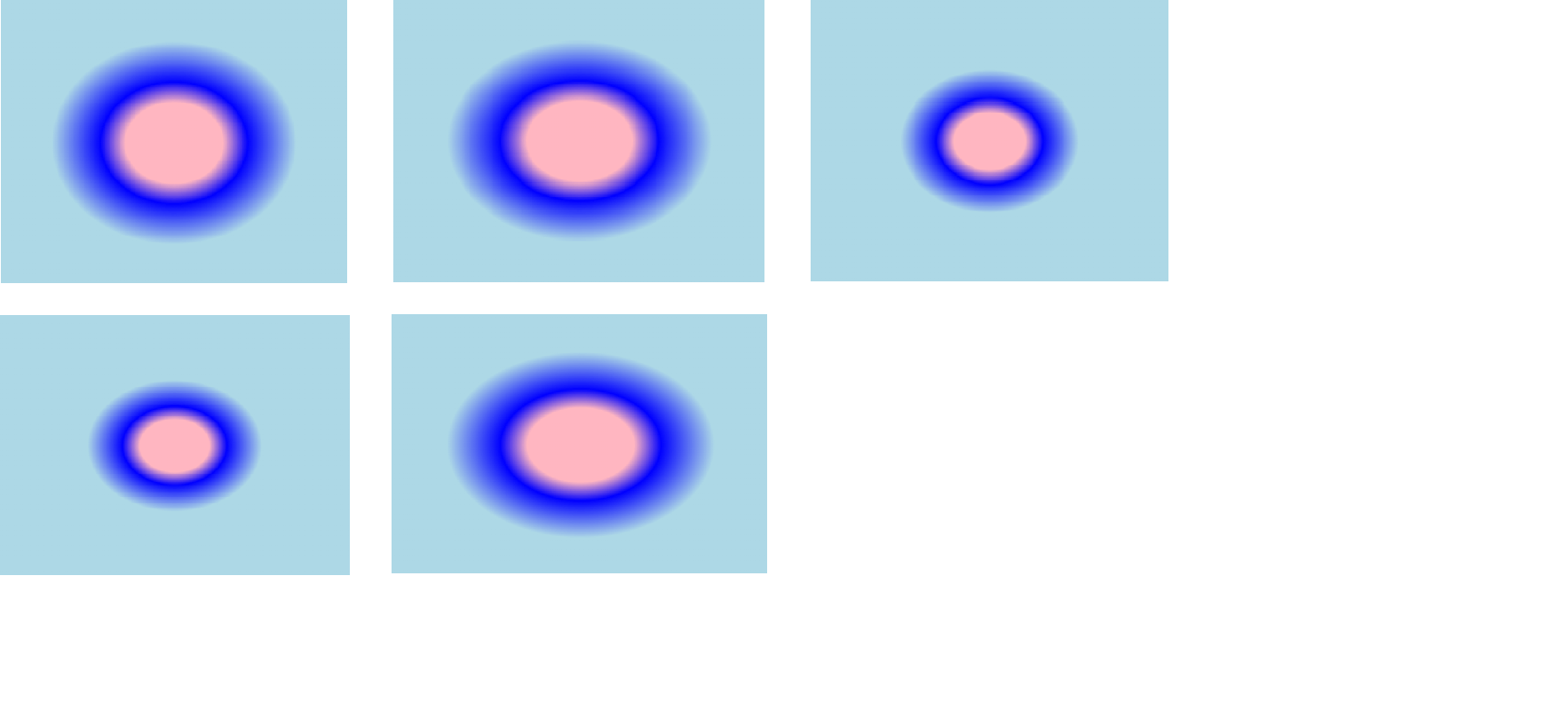
- Circle centered at bottom right :
background-image: radial-gradient(circle at 0% 50%, lightpink 20%, blue 30%, lightblue 50% )
Sizing
Size of the radial gradient can be specified using values - closest-corner, closest-side, farthest-corner, farthest-side, farthest-corner. By default the size is farthest-corner.For "closest-side" value, the size is the distance between the center point of the gradient to the closest side of the element.
background-image: radial-gradient(ellipse closest-corner, lightpink 20%, blue 30%, lightblue 50% )
In order, left to right: closest-corner, farthest-corner, closest-side, farthest-side, farthest-corner.
Conic gradients
A conic gradient is formed by rotating the color stops around the center. By default the center of the conic gradient starts at 50% 50% point of the element and the color stops are spread out evenly. The position of the gradient and the color stop proportions can be changed.
Here the color stops are placed around the circumference of the circle rather than around a gradient line from the center.
Conic gradients can be used to create pie charts, color wheels and so on.
Syntax
background-image: conic-gradient(angle, position of center, start-color,., end-color)
div {
  height: 300px;
  width: 300px;

  /*fallback*/
  background-color: red;

  /*gradient*/
  background-image:conic-gradient(#ddd6f3, #faaca8) }
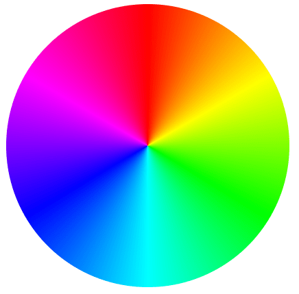
- Color wheel
background-image: conic-gradient(conic-gradient(red, yellow, lime, aqua, blue, magenta, red);
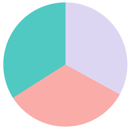
- Pie chart
A pie chart with 3 colors can be created using hard stops between the colors.
background-image: conic-gradient(#ddd6f3 0% 33%, #faaca8 0% 66%, #50C9C3 0% 100%)
Repeating gradients
Repeating gradients can be linear and radial. repeating-linear-gradient() function and repeating-radial-gradient() generate repeated color stops automatically.
Repeating linear gradient
The size of the gradient line that repeats is determined by the length between the first color stop length value and the last color stop length value.
If the first color has no color stop length value, the value will be 0 by default. If the last color has no color stop length value, the value will be 100%.
If both are not declared, the gradient line size will be 100% which means the linear gradient will not repeat.
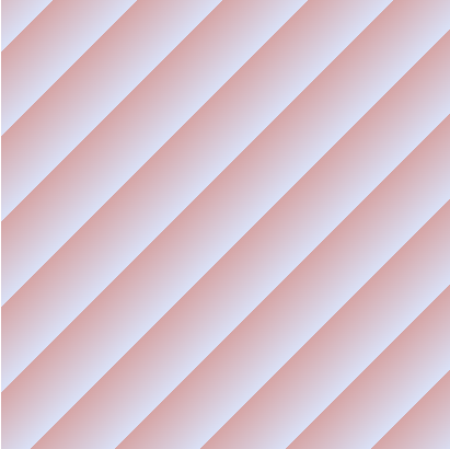
The gradient line size is 40px in the following repeating linear gradient.
background-image: repeating-linear-gradient(to top left, #DAE2F8, #D6A4A4 40px)
Repeating radial gradient
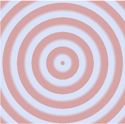
The repeating-radial-gradient() CSS function generates radiating gradients that radiate outwards from the center point.In the following image we repeated the first color again as the last color to generate a sharp color change in the gradient.
background-image: repeating-radial-gradient(#DAE2F8 5px, #DAE2F8 10px, #D6A4A4 15px, #D6A4A4 25px)
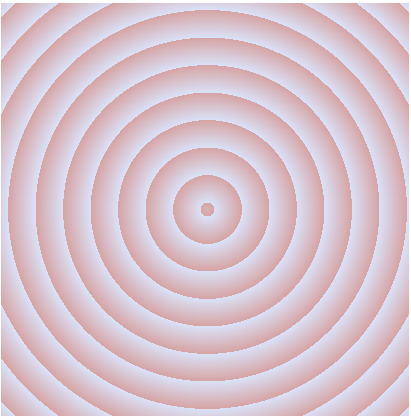
In the following image, the first color is not repeated as the last.
background-image: repeating-radial-gradient(#DAE2F8 5px, #D6A4A4 25px)
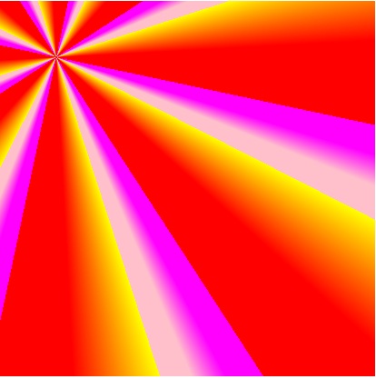
Repeating conic gradient
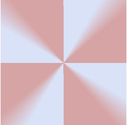
The repeating-conic-gradient() CSS function generates repeated gradients rotated around a center point. The color stops are placed around a gradient arc- the circumference of the circle.The gradient will repeat if the first and last color stops length values are declared.
background-image: repeating-conic-gradient(#DAE2F8 0deg 30deg, #D6A4A4 50deg 90deg);
- Another example
background-image: repeating-conic-gradient(from 12deg at 15% 15%, magenta 45deg 50deg, pink 55deg 60deg, yellow 5deg 30deg, red 75deg 90deg)