
The Bootstrap Grid System is used for layout, specifically responsive layouts. Understanding how it works is essential to understand Bootstrap. The grid is made from groupings of rows & columns inside one or more containers.
Table of contents:
- Basics of Bootstrap Grid
- Container
- Rows and Columns
- All the things Bootstrap Columns can do
- How to Responsive Design with Bootstrap?
- Key points on responsive design using the grid
Let us get started with Grid System in Bootstrap.
Basics of Bootstrap Grid
The bootstrap grid can be used on its own, without the Bootstrap JavaScript and other CSS Components. You simply need to download and reference the "bootstrap-grid.css" which includes the grid and flexbox classes.
Basic example of using the Grid:
<div class="container">
    <div class="row">
        <div class="col">
            Content inside the grid.
        </div>
    </div>
</div>
This gives us one big “column” horizontally across the viewport.
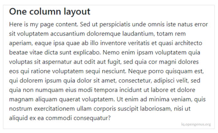
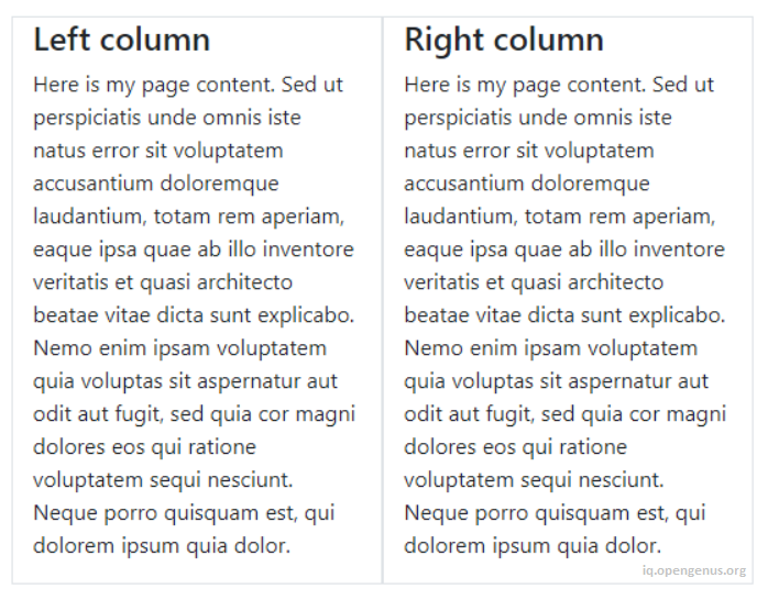
Two columns layout
<div class="container">
    <div class="row">
        <div class="col">Left column</div>
        <div class="col">Right column</div>
    </div>
</div>
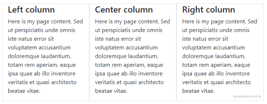
Three columns layout
<div class="container">
    <div class="row">
        <div class="col">Left column</div>
        <div class="col">Middle column</div>
        <div class="col">Right column</div>
    </div>
</div>
Basic grid concepts are easy to understand, but some might wonder why all of this HTML markup is necessary. You may have a few questions like:
- Why do I need a Container?
- Can I make one column wider than the others?
- Do I need to use the Row?
Grid questions like these will be addressed a little further down. But first we will take a step back to learn about something very important about using the grid. Understanding the “Rules of the Grid” will save you a lot of time and frustration.
The Rules of the Grid System
- Columns must be the immediate child of a row.
- Rows are only used to contain columns.
- Rows should be placed inside a container.
These rules are of utmost importance. The rows and columns always work together, and should never be used without one another.
Container
In the examples before you may have noticed that the .container class is used to wrap the .row. The container is the root element of the Bootstrap Grid.
<div class="container">
    <div class="row">
        <div class="col">Content inside the grid.</div>
    </div>
</div>
The container is not only used for the grid rows and columns. It can be used to hold any element and content. For example, this is perfectly valid bootstrap markup:
<div class="container">
    <h2> My Heading</h2>
    <div class="row">
        <div class="col">Content inside the grid.</div>
    </div>
</div>
The container may seem trivial or unnecessary, but it is very important to control width of the layout. The container is also used to evenly align the left and right edges of the layout within the browser’s viewport.
Bootstrap has 2 types of containers, .container and the full-width .container-fluid. We can use either of the two.
- Fixed-width container to center your layout in the middle:
<div class="container"> </div>
- Full-width container for a layout the spans the entire width:
<div class="container-fluid"> </div>
The .container scales down in width responsively (as the screen width narrows) so that eventually it becomes full-width like the .container-fluid on smaller devices.
When using the grid, one more rows can be placed inside the container. We can have multiple rows in a container, and multiple containers on a page. It all depends on what layout we’re trying to accomplish.
Rows have a negative left/right margin of -15px. The container padding of 15px is used to counteract the negative margins of the row. This is to keep content evenly aligned on the edges of the layout. If we don’t put a row in a container, the row will overflow it’s container, causing an undesirable horizontal scroll.
Rows and Columns
Notice that we've grouped "Rows and Columns" together in a single section. This is because we can't have one without the other as explained earlier in the "Rules of the Grid".
When we think "row", we probably think horizontal line, which is okay, BUT, it is better to think of the .row simply as a parent of columns. A row is a group of columns because columns inside the .row aren't always laid-out horizontally across the viewport. Some times we want the column layout to be horizontal, while other times we want the columns to layout vertically down the viewport. The concept of horizontal vs. vertical layout is the essence of responsive design. The sole purpose of the "row" is to contain 1 or more "columns".
DON'T PUT CONTENT DIRECTLY INSIDE THE ROW!
Wrong way:
<div class="row">Row content.</div>
<div class="row">
    <p>Row content.</p>
</div>
<div class="row">
    <h2>Row content.</h2>
</div>
Right way:
<div class="row">
    <div class="col">Column content.</div>
</div>
It is also important to mention that the .row is display: flex. As flexbox children, the columns in each row are the same height. Because of flexbox, horizontal and vertical alignment is easily accomplished using bootstrap's flex and auto-margin utility classes. Now it's time to look deeper at rows and columns, and exactly how they work together. There are different types of columns, and different ways to use them in our layout.
All the things Bootstrap Columns can do
- Create horizontal divisions across the viewport.
- Can have different defined widths.
- Can change in width at different screen widths.
- Layout horizontally left-to-right, then vertically up-and-down.
- Can change position relative to siblings in the same row.
- Are the same height as their siblings in the same row.
- Can grow or shrink in width.
- Can automatically wrap or stack vertically as needed, or at different widths.
- Can contain more rows and columns. This is called nesting.
Columns create horizontal divisions across the viewport. The space between the columns is called the "gutter".
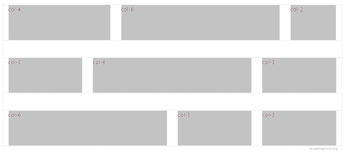
The classic Bootstrap grid has 12 column units:
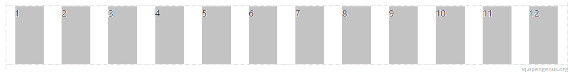
The columns can be evenly divided up into factors of 12.
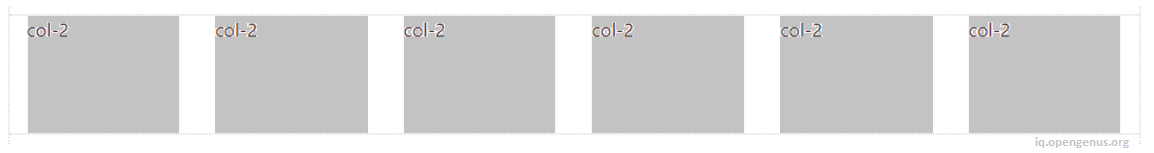
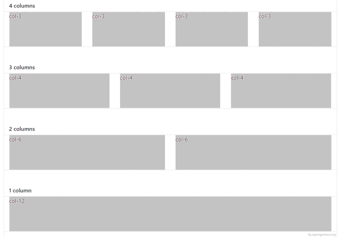
The columns can be split-up using any part of the 12 units. It is okay to use less than 12. It is also okay to use more than 12 which we'll see later.
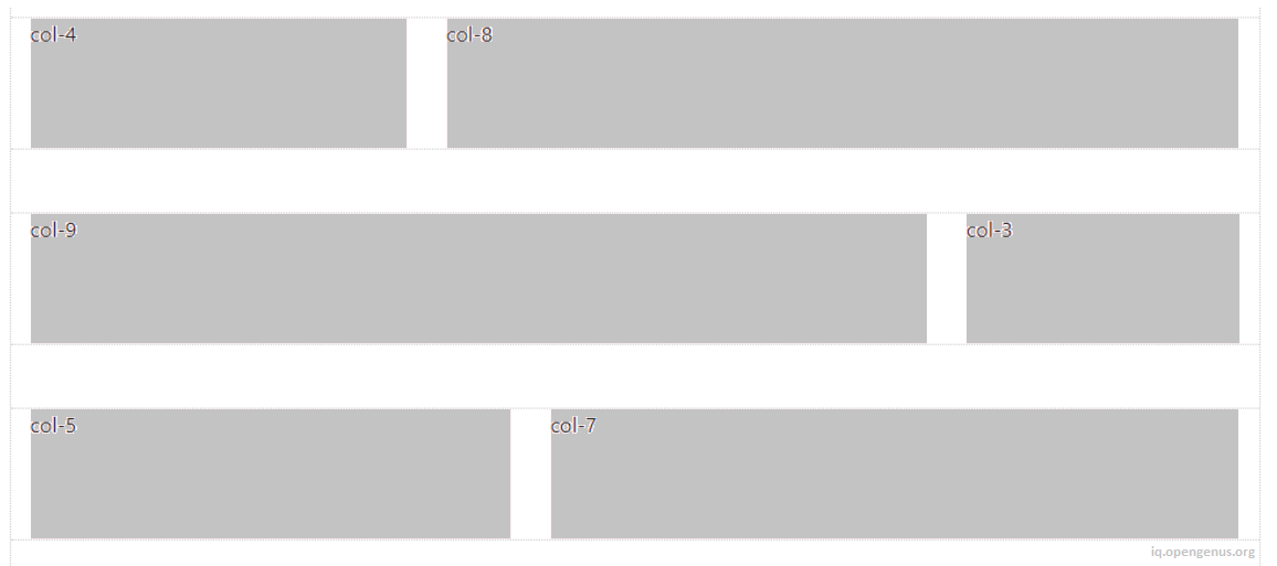
With all of this flexibility, the layout possibilities are seemingly endless.
But, the grid is not always about 12. Thanks to Flexbox, Bootstrap has new "Auto-layout" columns. These unit-less columns give you even more flexibility when it comes to designing layouts.
How to Responsive Design with Bootstrap?
The rows and columns of the Bootstrap Grid are the "star of the show" when it comes to Responsive Design.
Bootstrap Responsive Breakpoints (based on screen width):
- xs — screen width < 576px (This is the “default” tier)
- sm — screen width ≥ 576px
- md — screen width ≥ 768px
- lg — screen width ≥ 992px
- xl — screen width ≥ 1200px
Bootstrap uses CSS media queries to establish these responsive breakpoints. They enable you to control column behavior at different screen widths.
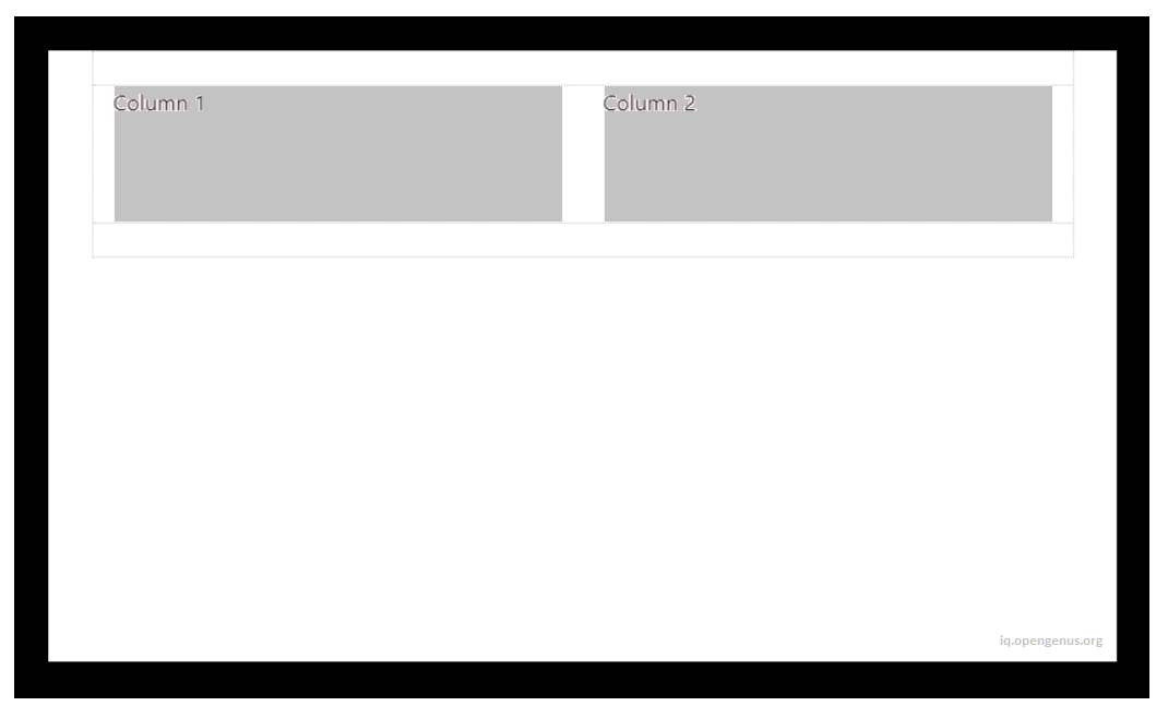
For example: here are 2 columns, each 50% width:
<div class="container">
    <div class="row">
        <div class="col-sm-6">Column 1</div>
        <div class="col-sm-6">Column 2</div>
    </div>
</div>
The col-sm-6 means use 6 of 12 columns wide (50%), on a typical small device width (greater than or equal to 768 px):
On less than 768px, the 2 columns become 100% width and stack vertically:
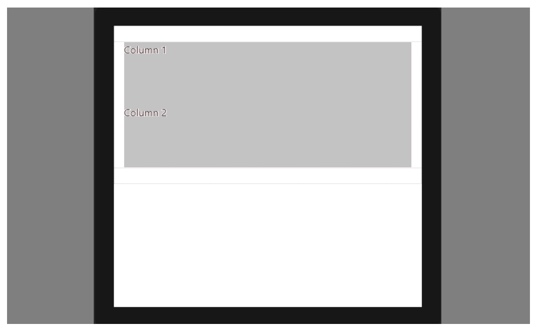
This is because xs is the default or implied breakpoint. Since we didn’t specify a default column width, the 50% width was only applied on 768px and wider for the sm breakpoint.
Since (xs) is the default breakpoint, the col-12 is implied. So, this:
<div class="col-12 col-sm-6">Column</div>
Is effectively the same as this:
<div class="col-sm-6">Column</div>
Key points on responsive design using the grid
Columns will stack vertically (and become full-width) at the smaller screen widths unless we use a specific col-* class in our HTML markup. Use a specific col-* to prevent that vertical stacking.
The smaller grid classes also apply to larger screens unless overridden specifically for larger screen width. So, <div class="col-md-6"></div> is effectively the same as <div class="col-md-6 col-lg-6"></div>. Therefore, we only need to use the class for the smallest width we want to support.
Rows are display:flex, and therefore columns are equal height in the same row. Use auto-margins or flexbox align-items and justify-content for horizontal or vertical alignment.
With this article at OpenGenus, you must have the complete idea of Grid System in Bootstrap.