
Get this book -> Problems on Array: For Interviews and Competitive Programming
In this article , we going to discuss about the Image Slider vs Gallery vs Carousel in Web Design. First we will see in brief how we can make beautiful Slider with just HTML and CSS with the help of BOOTSTRAP-4 we can easily design Image Slider vs Image Gallery vs Carousel.
Basically a Slider or an Image Crousel is a set of row align horizontally that you can navigate in between. Designing Sliders could be complicated enough with the use of JAVASCRIPT, But you can totally design a slider with pure HTML and CSS.
In this article I will show you how you can make an efficient and beautiful Slider using HTML and CSS only.
Let's see some Basic HTML first to create different divs.
We are creating divs for our slider , you can create it normally but we are using anchor tag so we can jump on a specific slide cause here anchor tag works as a link. We going to add buttons in our slider and if we want to move from slide 1 to slide 4 we just have to click the buttons above the slider , Anchor actually behave as a link to related slide , so with help of it we will jump to the correct slide.
<div class="slider">

  <a href="#slide-1">1</a>
  <a href="#slide-2">2</a>
  <a href="#slide-3">3</a>
  <a href="#slide-4">4</a>
  <a href="#slide-5">5</a>

  <div class="slides">
    <div id="slide-1">
      1
    </div>
    <div id="slide-2">
      2
    </div>
    <div id="slide-3">
      3
    </div>
    <div id="slide-4">
      4
    </div>
    <div id="slide-5">
      5
    </div>
  </div>
</div>
Add some CSS we can set them next to each other and scroll.
With handful of CSS we can set our slides hortizontally to one other and let them scroll.
This all explanation below is apply on individual slides.
In this code snippet we are using scroll-snap-type , it is an in-built property of Scroll Snap module in CSS , before that this effect is achieved by JS but now with the help of scroll-snap-property we have a full control over our gallery.
We have different property values , but in our slider we are using scroll-snap-type: x mandatory
x: This property enables the scroll snapping along with the x-axis that works on snap position of horizontal axis or we have to move our slides horizontally in x axis thats why we using x mandatory its one of property of scroll-snap-type.
mandatory: This property enables specific strict value that go to the specific scroll position when there is no scrolling.
Next we are using , scroll-behavior property and we giving it a property smooth there are other values also like auto(this is default value) , initial and inhert.
The scroll-behavior property specifies whether to smoothly animate the scroll position.
Note that any other scrolls, such as those performed by the user, are not affected by this property. When this property is specified on the root element, it applies to the viewport instead. This property specified on the body element will not propagate to the viewport.
-webkit-overflow-scrolling: touch ( This will give our slider touch behaviour and the slides will slide with our touch also), meaning when we click on the slide it scrolls to the next slide.
Last thing we have is overflow-x: auto and it specifies whether to clip the content, add a scroll bar, or display overflow content of a block-level element, when it overflows at the left and right edges.
* {
  box-sizing: border-box;
}

.slider {
  width: 300px;
  text-align: center;
  overflow: hidden;
}

.slides {
  display: flex;
  overflow-x: auto;
  scroll-snap-type: x mandatory;
  scroll-behavior: smooth;
  -webkit-overflow-scrolling: touch;

}
.slides::-webkit-scrollbar {
  width: 10px;
  height: 10px;
}
.slides::-webkit-scrollbar-thumb {
  background: black;
  border-radius: 10px;
}
.slides::-webkit-scrollbar-track {
  background: transparent;
}
CSS Implementation.
We are using ::-webkit-scrollbar and its a pseudo-element in CSS which is used to modify and style scrollbars in our Image Slider.
::-webkit-scrollbar-thumb : the scrolling handle that can be dragged
::-webkit-scrollbar-track : progress bar
.slides > div
It will target elements which are DIRECT children of a particular element.
is a selector used in css and in slides class we have many div children, and Selects all
elements where the parent is aelement .slider > a:active
The :active selector is used to select and style the active link and here in this slider we made our Slides a link if we remember.
We gave our slides anchor tag so it just active that property..slider > a:focus
The :focus selector is used to select the element that has focus..slides > div { scroll-snap-align: start; flex-shrink: 0; width: 300px; height: 300px; margin-right: 50px; border-radius: 10px; background: #eee; transform-origin: center center; transform: scale(1); transition: transform 0.5s; position: relative; display: flex; justify-content: center; align-items: center; font-size: 100px; }.slider > a { display: inline-flex; width: 1.5rem; height: 1.5rem; background: white; text-decoration: none; align-items: center; justify-content: center; border-radius: 50%; margin: 0 0 0.5rem 0; position: relative; } .slider > a:active { top: 1px; } .slider > a:focus { background: #000; } /* Don't need button navigation */ @supports (scroll-snap-type) { .slider > a { display: none; } } html, body { height: 100%; overflow: hidden; } body { display: flex; align-items: center; justify-content: center; background: linear-gradient(to bottom, #74ABE2, #5563DE); font-family: 'Ropa Sans', sans-serif; }html and body styling
With some basic CSS properties we style out html and body tag according to our slider.
Like in body we using flex property to distribute our image in our body with equal spacing and justify-content property to get our items at the center of our body.We also styling our buttons and image in our Slider.
.author-info {
  background: rgba(0, 0, 0, 0.75);
  color: white;
  padding: 0.75rem;
  text-align: center;
  position: absolute;
  bottom: 0;
  left: 0;
  width: 100%;
  margin: 0;
}
.author-info a {
  color: white;
}
img {
  object-fit: cover;
  position: absolute;
  top: 0;
  left: 0;
  width: 100%;
  height: 100%;
}
In image we using object-fit property and, the object-fit property specifies how the contents of a replaced element should be fitted to the box established by its used height and width.
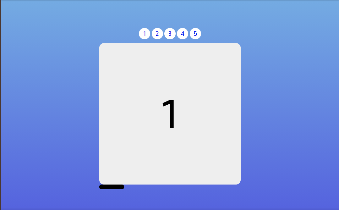
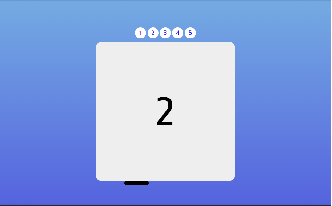
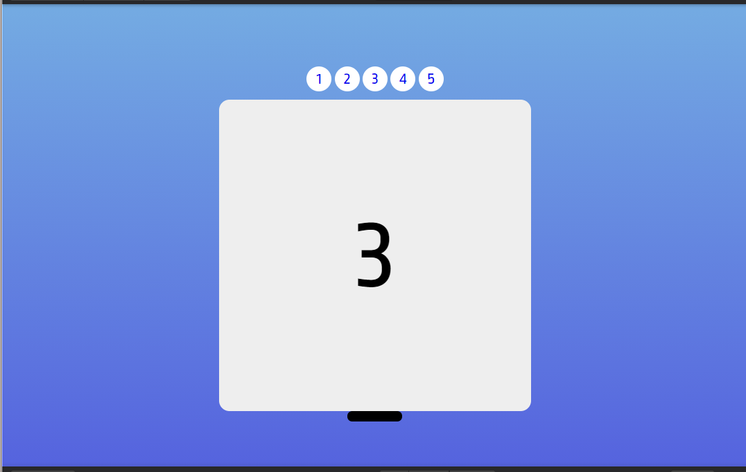
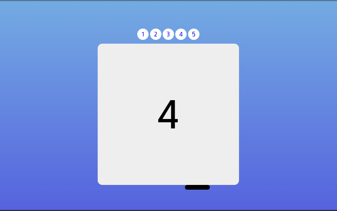
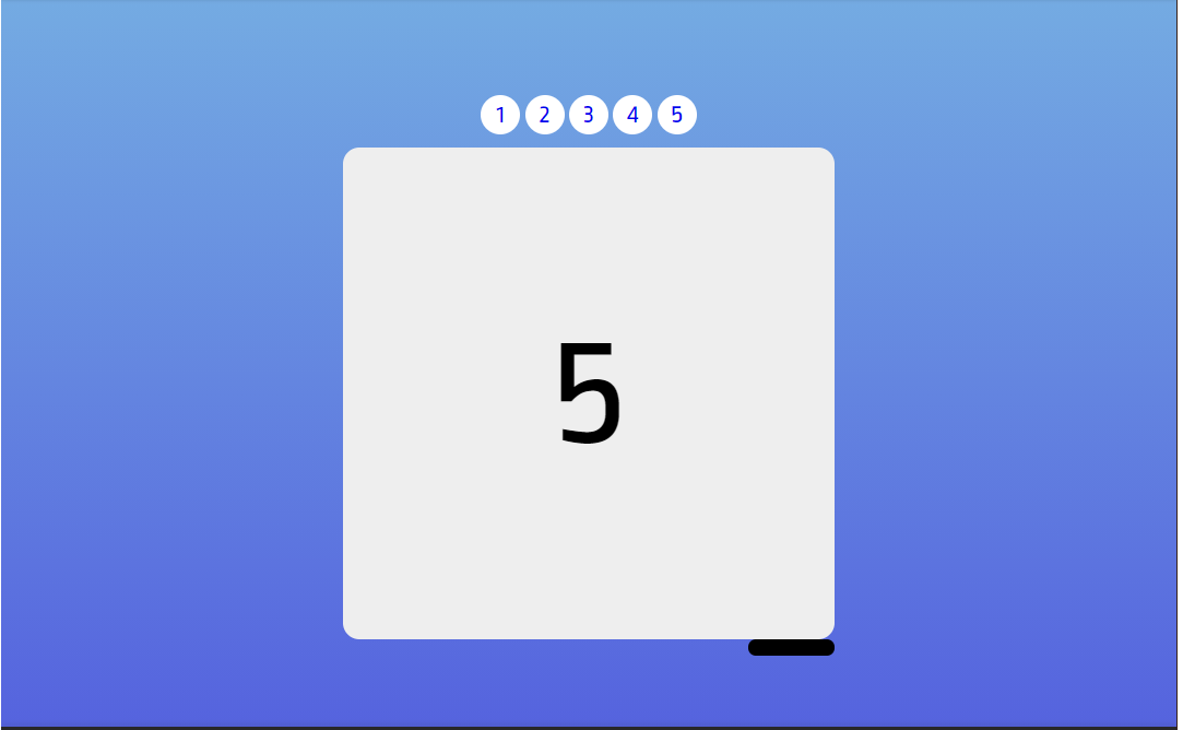
Final Output of our Slider.
Here are the screenshots of final output and , we have our Image Slider vs Crousel with pure HTML and CSS.
Adding buttons on the top is up to you.With BOOTSTRAP-4
Above we have seen beautiful Image Slider with HTML and CSS, but with the help of BOOTSTRAP-4 we can also make Image Crousel.
Here I will just give you brief how we can use BOOTSTRAP to make the Image Slider vs Crousel.
Firstly, we have to give required links to use BOOTSTRAP in our project.
With BOOTSTRAP we can make different types of Slider according to our need.SLIDES ONLY
With just few lines of code we can make Slider with just slides only means we dont have controls we will get different slides one by one.
Below is the source code.
<div id="carouselExampleSlidesOnly" class="carousel slide" data-bs-ride="carousel">
  <div class="carousel-inner">
    <div class="carousel-item active">
      <img src="..." class="d-block w-100" alt="...">
    </div>
    <div class="carousel-item">
      <img src="..." class="d-block w-100" alt="...">
    </div>
    <div class="carousel-item">
      <img src="..." class="d-block w-100" alt="...">
    </div>
  </div>
</div>
Here in this code you can give any image src and remember the presence of the .d-block and .img-fluid on carousel images to prevent browser default image alignment.
SLIDES WITH CONTROL
This one is same as above just we adding previous and next control to make our carousel more attractive.
<div id="carouselExampleControls" class="carousel slide" data-bs-ride="carousel">
  <div class="carousel-inner">
    <div class="carousel-item active">
      <img src="..." class="d-block w-100" alt="...">
    </div>
    <div class="carousel-item">
      <img src="..." class="d-block w-100" alt="...">
    </div>
    <div class="carousel-item">
      <img src="..." class="d-block w-100" alt="...">
    </div>
  </div>
  <a class="carousel-control-prev" href="#carouselExampleControls" role="button" data-bs-slide="prev">
    <span class="carousel-control-prev-icon" aria-hidden="true"></span>
    <span class="visually-hidden">Previous</span>
  </a>
  <a class="carousel-control-next" href="#carouselExampleControls" role="button" data-bs-slide="next">
    <span class="carousel-control-next-icon" aria-hidden="true"></span>
    <span class="visually-hidden">Next</span>
  </a>
</div>
By given class carousel-control-prev and carousel-control-next we are adding controls in our Crousel or Image SLider.
You can use JAVASCRIPT also to make this Image SLider , these two examples one with HTML/CSS and other with the help of BOOTSTRAP-4 are the easiest way to design beautiful SLiders for your web pages.
Hope this helps you understand Slider vs Gallery vs Crousel topic.