Open-Source Internship opportunity by OpenGenus for programmers. Apply now.

Pseudo Classes in CSS
Before getting started with pseudo classes, let us first understand what the word pseudo means,
a simple google search gives you:
Pseudo: not genuine; spurious or sham.
A pseudo class is basically a pseudo state of element which can be later targeted with CSS.
They can be used to target and style those elements which cannot be targeted with normal CSS classes or Id.
They are always preceded by a :. Some examples could be :visited, :hover etc.
Why do we need them, afterall?
Consider the following codeblock:
h1:hover {
color:blue;
}
Let us discuss what this codeblock does, on hovering over the h1, the color of
h1 changes to blue.
And this happens because we have applied a pseudo class to it.
So what the pseudo class essentially does is that it let's us apply styles to a particular element
not only in relation to the content of the document tree, but also in relation to external factors.
These external factors could be hovering of a mouse, when a link is clicked or visited,
A form element is checked, etc.
How do they look like?
A basic pseudo class can be defined as follows:
selector:pseudo class {
property:value;
}
It means that the pseudo class helps in selecting certain elements when they are in a particular condition,
example, when they are hovered upon.
Some Selectors please
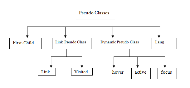
Pseudo classes can be divided into two categories:
- Structural Pseudo Classes
- Dynamic Pseudo Classes
Let's study each one of them in detail with examples.
Dynamic Pseudo Classes
Dynamic pseudo classes include examples such as :hover, :visited, :active etc.
active
Consider a link element:
<a href = "https://github.com/Harshita-Kanal">My GitHub</a>
This will give you a link.
Now consider the following CSS block:
a:active{
color: yellow;
}
This pseudo class selector will select the link while it is being activated.This means when it is being clicked on
or otherwise activated.
For example, for the “pressed” state of a button-style link.
And change its color to yellow by applying the corresponding CSS styles to the selected item.
disabled
An element is disabled if it cannot be activated, i.e. it cannot be clicked upon or typed into, selected etc.
A disabled pseudo class would help in selecting elements in that state.
Consider this as an example:
input[type = "text"]:disabled{
color: red;
}
Here all disabled input fields in the form would turn red.
visited
Whenever a link is already clicked or visited, it can be indicated by the :visited
pseudo class.
Consider this as an example:
a:visited{
color: yellow;
}
Here all visited links would turn yellow.
hover
Whenever something is hovered upon, it is indicated by this pseudo class.
It could be interpreted as mouse over.
Consider the following CSS block:
p: hover{
color: yellow;
}
This will change the color of a p element when it is hovered upon, i.e the
mouse is moved over it
required
This pseudo class is used to represent any input item or form item that is marked as required, i.e. has the required attribute set.
Consider this example:
<input type = "text" required >
Consider the following CSS block:
input:required{
color: red;
}
This would make all inputs which have required attribute set as red.
Structural Pseudo Classes
Structural pseudo classes include examples such as first-child,
nth-of-type, last-child etc.
first-child class
It represents the first child among a series of siblings.
Consider the following example:
<ul>
 <li>This is selected<li>
 <li>This is not selected<li>
 <li>This is not selected<li>
</ul>
If we consider the following CSS block:
ul li:first-child{
color: red;
}
This will select the first li under the ul tag and apply the
required styles on it.
last-child class
It represents the last child among a series of siblings.
Consider the same example:
<ul>
 <li>This is not selected<li>
 <li>This is not selected<li>
 <li>This is selected<li>
</ul>
If we consider the following CSS block:
ul li:last-child{
color: red;
}
This will select the last li under the ul tag and apply the
required styles on it.
nth-of-type
It represents elements of a given type, based on their position among a group of siblings.
Let's take an example:
<ul>
 <li>This is not selected<li>
 <li>This is not selected<li>
 <li>This is not selected<li>
 <li>This is selected<li>
 <li>This is not selected<li>
 <li>This is not selected<li>
 <li>This is not selected<li>
 <li>This is selected<li>
</ul>
Now let's consider a CSS block:
ul li:nth-of-type(4n){
color: red;
}
This will select every 4th li inside a ul and changes it to red.
Now let's see how can this be used in a variety of ways:
/* Odd list items */
ul li:nth-of-type(2n+1) {
  color: red;
}

/* Even list items */
ul li:nth-of-type(2n) {
  color: blue;
}

/* First list item */
ul li:nth-of-type(1) {
  font-weight: bold;
}
only-of-type
This represents any child element which is the unique child of the parent element.
child of it's parent.
Consider an example:
<p>
 <h1>Opengenus Foundation </h1>
 <p>Hello all</p>
 <p>This is Opengenus Foundation</p>
</p>
Consider the following CSS block:
h1:only-of-type{
color: red;
}
This will select the first h1, which is the only h1 child inside the p tag and turn it red.
Pseudo Elements: A primer
We discussed in detail about pseudo Classes, let's make a mention about pseudo elements and their difference.
Pseudo Elements help in creating markup elements not originally present in the HTML markup and help you in creating cool effects with minimal markup.
Some examples are: ::after, ::before etc.
A pseudo class as discussed help us in selecting certain elements based on its state or condition. A pseudo element helps us in creating elements not originally a part of the document tree.
