
In this article, we are going to deep dive into the CSS layouts. CSS layouts are mainly used to enhance the beauty of the website, make the website responsive,etc.
The various CSS layouts are:-
- Normal flow
- Flexbox
- Grids
- Floats
- Positioning
- Multiple-column layout.
Normal Flow
Normal flow is the default layout.In this the elements will layout themselves in a normal manner and properties like float,positioning,etc are not applied to it.
For simple use cases this generally serves the purpose,but for complicated layout this behavior needs to be altered by using other layouts.
A solid, well-structured document that is readable in normal flow is the best way to begin any webpage.This helps to make the content readable in any browser.
How are elements laid out by default?
A block level element's content is 100% of the width of its parent element, and as tall as its content.
Inline elements have height and width as auto with respect to their content.Width or height of inline elements cannot be set as they just sit inside the content of block level elements. If you want to control the size of an inline element,we have to set the display as inline-block; which mixes characteristics from both.)
HTML Code
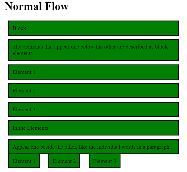
<h1>Normal Flow</h1>

<div >
<p>Block</p>
<p>The elements that appear one below the other are described as block elements</p>
<p class="block">Element 1</p>
<p class="block">Element 2</p>
<p class="block">Element 3</p>
</div>

<div class="inline">
<p>Inline Elements</p>
<p>Appear one beside the other, like the individual words in a paragraph.</p>
<p class="inline">Element 1</p>
<p class="inline">Element 2</p>
<p class="inline">Element 3</p>
</div>
CSS Code
body {
  width: 500px;
  margin:15px;
  padding:10px;
}

p {
  background: green;
  border: 2px solid black;
  padding: 10px;
  margin: 10px;
}

.block{
  display: block;
}

.inline{
  display: inline;
}
Output
Flexbox
Flexbox is a one-dimensional layout method for laying out items in rows or columns. Items flex to fill additional space and shrink to fit into smaller spaces.
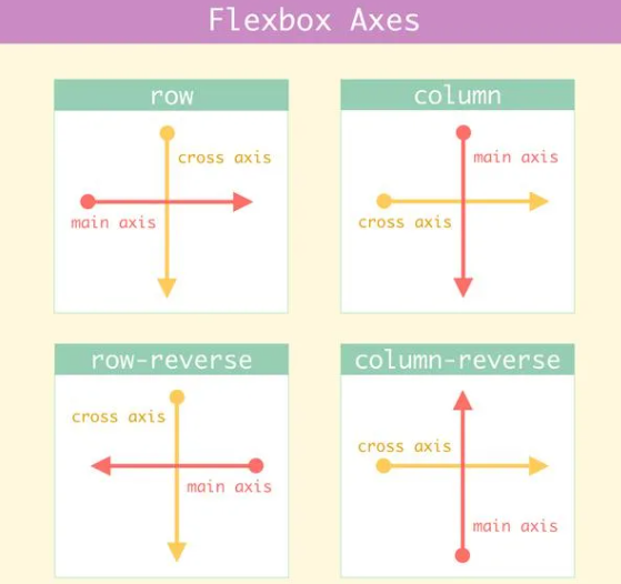
Flexbox Axis
To start using the Flexbox model, we need to first define a flex container.
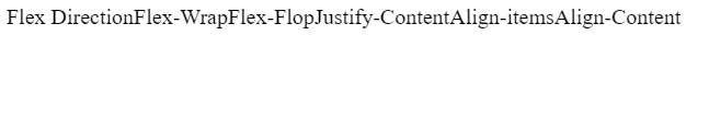
<div class="flex-container">
  <div>Flex Direction</div>
  <div>Flex-Wrap</div>
  <div>Flex-Flop</div>
  <div>Justify-Content</div>
  <div>Align-items</div>
  <div>Align-Content</div>
</div>
The flex container becomes flexible by setting the display property to flex:
.flex-container {
  display: flex;
}
In this case all the elements arrange themselves into columns due to some initial default values.
Output
Flex Direction - The flex-direction property defines in which direction the container wants to stack the flex items.The options available for flex direction are:-
1.column
2.column-reverse
3.row
4.row-reverse
Flex-Wrap - The flex-wrap property specifies whether the flex items should wrap or not.The options available for flex wrap are:-
- wrap
- nowrap
Flex-Flow - The flex-flow property is a shorthand property for setting both the flex-direction and flex-wrap properties.
Syntax for flex-flow,
flex-flow: {flex-direction} {flex wrap};
Justify-Content - The justify-content property is used to align the flex items in the horizontal direction.The options available for justify content are:-
- flex-start
- flex-end
- center
- space-around
- space-between
Align-Items - The align-items property is used to align the flex items in the vertical direction.The options available for align items are:-
- flex-start
- flex-end
- stretch
- center
- baseline
Align-Content - The align-content property is used to align the flex lines.The options available for align content are:-
- flex-start
- flex-end
- stretch
- space-around
- space-between
Grids
Grid layout is used for manipulation in two dimensions.It uses rows and colums to acheive this.It makes it easier to design web pages by limiting the use of float and positioning.
They help us to create designs where elements don’t overflow as we move from page to page, providing greater consistency on our websites and making it responsive.
A grid will typically have columns, rows, and the gaps between each row and column is called gutters.

Grid Elements- A grid layout consists of a parent element, with one or more child elements.
To start using the grid model, we need to first define a grid container.All direct children of the grid container automatically become grid items.
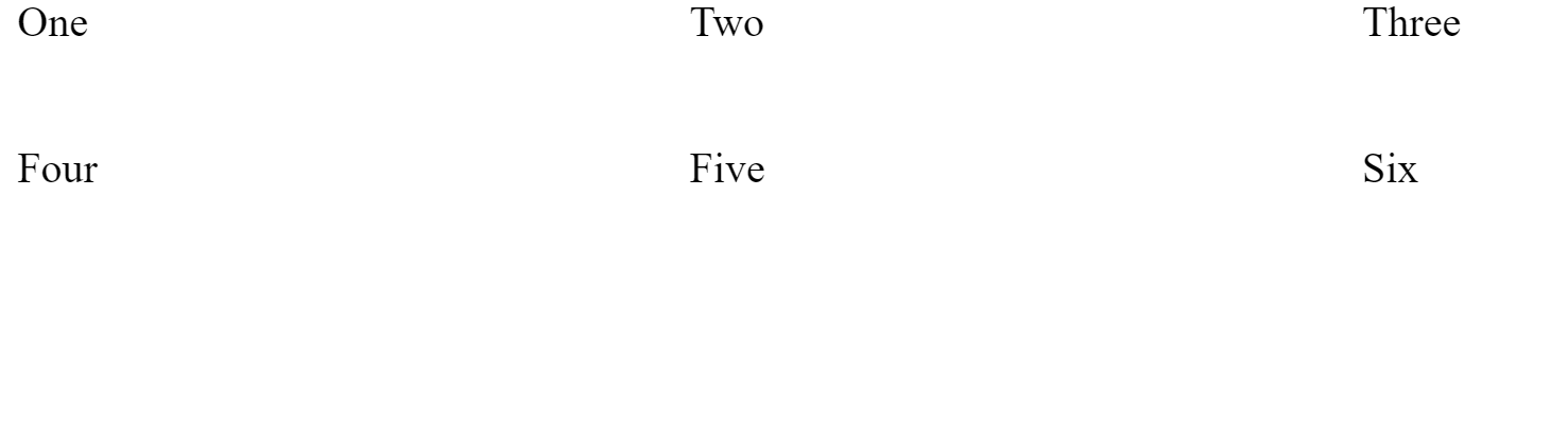
<div class="grid-container">
    <div class="Element 1">One</div>
    <div class="Element 2">Two</div>
    <div class="Element 3">Three</div>
    <div class="Element 4">Four</div>
    <div class="Element 5">Five</div>
    <div class="Element 6">Six</div>
</div>
An HTML element becomes a grid container when its display property is set to grid or inline-grid.
.grid-container{
    display: grid;
    grid-template-columns: 1fr 1fr 1fr;
    grid-template-rows: 100px 100px;
    grid-gap: 10px;
    font-size: 2rem;
}
Here,three columns and two rows are created,and the elements are placed in that particular position.
Output
Let's look into the grind elements
Grid column - The vertical lines of grid items are called columns.
Grid rows - The horizontal lines of grid items are called rows.
Grid gaps - The spaces between each column/row are called gaps.
Grid Lines - The lines between columns are called column lines and the lines between rows are called row lines.
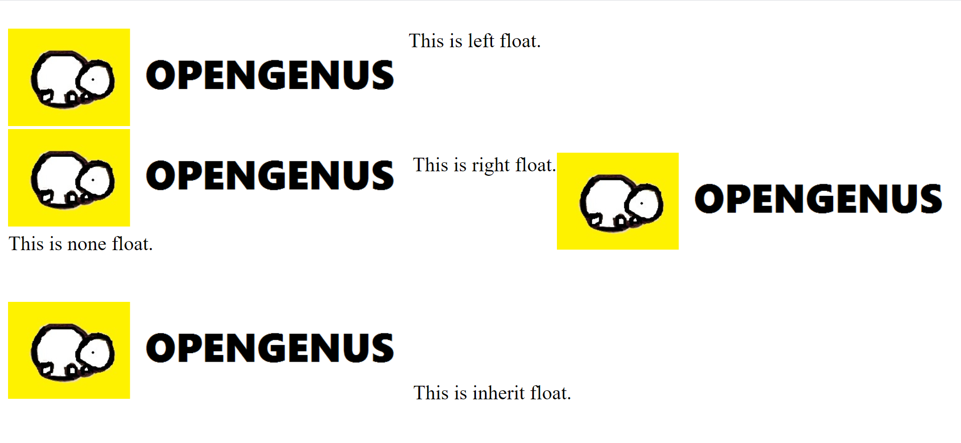
Floats
The float property allowes web developers to implement simple layouts involving an image floating inside a column of text, with the text wrapping around the left or right of it.
Float is commonly used to create entire web site layouts featuring multiple columns of information floated so they sit alongside one another.
The float property has four possible values:-
-
left — Floats the element to the left.
-
Right — Floats the element to the right.
-
None — Specifies no floating at all. This is the default value.
-
Inherit — Specifies that the value of the float property should be inherited from the element's parent element.
HTML Code
<div class="left">
  <p>
  <img class="left" src="https://user-images.githubusercontent.com/56690856/83184553-3dcfcd00-a147-11ea-985e-16403f28d631.png"  alt="Left float">
    This is left float.
 </p>
</div>
<div class="right">
  <p>
   <img class="right" src="https://user-images.githubusercontent.com/56690856/83184553-3dcfcd00-a147-11ea-985e-16403f28d631.png"  alt="Right float">
   <p>
     This is right float.
  </p>
</div>
<div class="none">
   <p>
   <img class="none" src="https://user-images.githubusercontent.com/56690856/83184553-3dcfcd00-a147-11ea-985e-16403f28d631.png"  alt="None Float">
    <p>
      This is none float.
  </p>
</div>
<div class="inherit">
   <p>
   <img class="inherit" src="https://user-images.githubusercontent.com/56690856/83184553-3dcfcd00-a147-11ea-985e-16403f28d631.png"  alt="Inherit Float">
  <p>
    This is inherit float.
  </p>
</div>
CSS Code
div{
  marin:10px;
  padding:5px;
  font-size:2rem;
}

.left{
  float:left;
}
.right{
  float:right;
}
.none{
  float:none;
}
.inherit{
  float:inherit;
}
Output
Positioning
Positioning allows us to take elements out of the normal document layout flow, and make them behave differently.It helps us to set the position of the elements in the screen.For example fixed navbars, it remains fixed at the top even when we scroll down the page.
There are five types of positioning:-
-
Static positioning - In this elements are positioned static by default i.e it is always positioned according to the normal flow of the page.
-
Relative positioning - In this the element is positioned relative to its normal position.
-
Absolute positioning - In this the element is positioned relative to the nearest positioned element.If an absolute positioned element has no nearest positioned element, it uses the document body, and moves along with page scrolling.
-
Fixed positioning - In this the element is positioned relative to the viewport, which means it always stays in the same place even if the page is scrolled.
-
Sticky positioning - In this the element is positioned based on the user's scroll position.A sticky element toggles between relative and fixed, depending on the scroll position.It behaves like relative positioning and when the given offset position is met, it becomes fixed as in the case of fixed positioning.
HTML Code:
<div class="static">
  <p>I am static</p>
</div>

<div class="relative">
  <p>I am relative</p>
</div>

<div class="absolute">
  <p>I am absolute</p>
</div>

<div class="fixed">
  <p>I am fixed</p>
</div>

<div class="sticky">
  <p>I am sticky</p>
</div>
CSS Code:
div{
  border:2px solid black;
  margin:5px;
  width:100px;
  padding:5px;
}
.static{
  position: static;
}
.relative{
  position: relative;
}
.absolute{
  position: absolute;
}
.fixed{
  position: fixed;
}
.sticky{
  position: sticky;
}
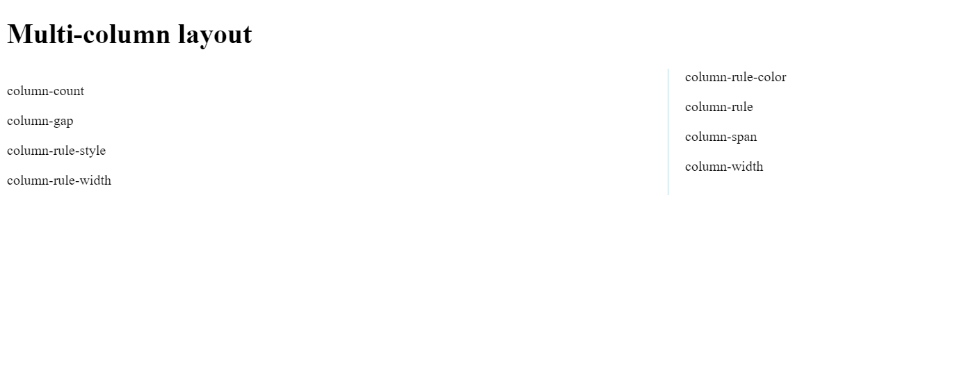
Multiple Column Layout
The multi-column layout module gives us a way to layout content in columns.
The CSS Multiple column properties are:-
-
Column-count:It specifies the number of columns an element should be divided into.
-
Column-gap:It specifies the gap between the columns.
-
Column-rule-style:It specifies the style of the rule between columns.
-
Column-rule-width:It specifies the width of the rule between columns.
-
Column-rule-color:It specifies the color of the rule between columns.
-
Column-rule:It specifies the column rule property.
-
Column-span:It specifies how many columns an element should span across.
-
Column-width:It specifies a suggested, optimal width for the columns.
HTML Code:
<div class="container">
  <h1>Multi-column layout</h1>
  <p>column-count</p>
  <p>column-gap</p>
  <p>column-rule-style</p>
  <p>column-rule-width</p>
  <p>column-rule-color</p>
  <p>column-rule</p>
  <p>column-span</p>
  <p>column-width</p>
</div>
CSS Code:
.container {
         column-count: 2;
         column-gap: 40px;
         column-rule-style: solid;
         column-rule-width: 1px;
         column-rule-color: lightblue;
         column-rule: 1px solid lightblue;
         column-width: 100px;
    }
h1{
  column-span: all;
}
Output
Let's answer some questions
1.Is there any difference between Fixed and static positioning?
Answer:- Yes
2.Which is the default layout?
Answer:- Normal Flow
3.Which flex item is used to align the flex items at the center of the screen?
Answer:-
{
display:flex;
align-content: center;
justify-content: center;
}
4.Which css positioning property toggles between relative and fixed position?
Answer:- Sticky.
5.What is the gaps between each row and column called in grid?
Answer:- Gutter
With this article at OpenGenus, you must have the complete idea of different layouts in CSS. Enjoy.