
Buttons are like the ears of the websites we create.When they are clicked, they listen to our options or choices and subsequently required actions take place.Be it navigating to other webpages,alerting,bringing changes like changing background color and so on,buttons are powerpunches of the webpage which respond to our punch.Buttons also give an aesthetic look to the webpages and make them pretty. Buttons can be formatted and styled using CSS. We can add javascript codes too to make the buttons interactive!
Let us learn more about buttons!
Syntax
<button>text-inside</button>
Features of a button
- Clickable
- Is usually a box-type but shape can be changed.
- Can add other HTML tags inside it.
- Is compatible with all browsers.
- It's style can be changed using CSS.
Complexity
Using Buttons is very easy.They are also very quick to respond.
Applications of button
- For navigation to required page.
- Improving the display of webpage.
- For submission.
- Reset purpose.
- Changing the view of something.
Attributes of a button
Attributes help us to add more information to improve tag's performance.
Few attributes which can be helpful for enhancing the button tag.
| Attributes | Value | Function |
|---|---|---|
| name | name | gives button a name |
| type | submit,reset,button | gives button a type. |
| value | text | gives button a value |
| Here is an example: |
<button name="button" type="button" value="Hi there!">click me!</button>
It will look like this..
A button performs multiple actions.You just have to be a guide.We can play with different attributes CSS has to offer and make our buttons interactive and a pretty sight.We can add background images,color,text,change the font-size,animate them and so on.
       <button>1</button>
       <!--Declaration for 1st button of our embedded webpage-->
       <!---skeleton of a button-->
DEFAULT BUTTON
Now let us add css and additional html features to make our button look beautiful
We add classes to the button tag .Classes form intermediary or messenger between html and css.Inside class we define all the elements we want ,that would bring desired appearances to a button.
We have declared class b1 for this purpose.
   <button class="b1"><a href="iq.opengenus.org/button/">2</a></button>
   <style>
    .b1{

    background-color: royalblue;
    height: 400px;<!--buttons can be given height and width-->
    width: 400px;<!--you can increase or decrease their height or width by pixels(px) or % too-->
    border: none;<!--border comes in all colors,i chose none-->
    font-size: xx-large;<!--font-size comes in all sizes--xx large,xx small,10px..-->
    box-shadow: 0 8px 16px 0 rebeccapurple,0 17px 50px 0 yellow;
    background-image: url("https://spectacularnwt.com/sites/default/files/styles/hero_desktop/public/hero/2019-03/Aurora%20Activity%20-%20hero.jpg?itok=IGAyaC1C");
    }<!--I chose Aurora as my bg image, you can chose different ones-->
   .b1:active{
    background: fuchsia;
    border: none;
        }   </style>
<!---this code is for button 2-->
BUTTON WITH BACKGROUND IMAGE
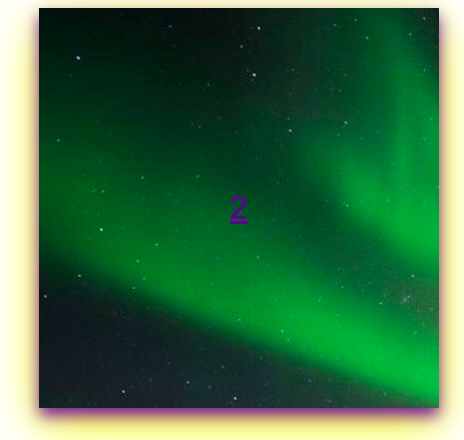
The button in its natural state has a background image which has been added through CSS.
.b1{
    :
   background-image: url("https://spectacularnwt.com/sites/default/files/styles/hero_desktop/public/hero/2019-03/Aurora%20Activity%20-%20hero.jpg?itok=IGAyaC1C");
   }
This code inserts background image to the button.
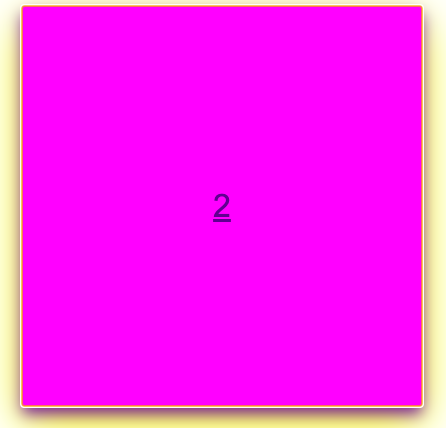
BUTTON CHANGING ITS COLOR WHEN CLICKED
This code given below is quite unfamiliar,isn't it?
When the button is clicked it is activated or ready to respond, so we have used a pseudoclass i.e. a class within a class(or child class) to define its actions when the button is clicked.These actions are enabled only when the button is clicked.
That is how pseudoclass works.
   .b1:active{
    background: fuchsia;
    border: none;
        }
So that is why when the button is clicked it's color changes to fuchsia.
Click on "2".You'll be navigated to our article page.
<a href="iq.opengenus.org/button/">2</a></button>
It's because of this link attached.
box-shadow: 0 8px 16px 0 rebeccapurple,0 17px 50px 0 yellow;
Observe the images once.You see that there is a shadow of not one,but two different colors spread like a foam ! It is possible only due to box-shadow element.We can add number of color shadows bordering the button.
Analyse the code carefully.
Question❓
In the code,you observe that there are 4 different values set for each box shadow.Why?
vertical offsetPositive value means that the shadow will be on top of the image else the opposite.
Blur radius The higher the number ,the blurry shadow will be.
Spread radiusThe positive values increase the size whereas the negative ones commit the opposite
Still we have a long way to go! We can perform many interesting operations on buttons! We'll create another button and learn about how we can decrease their size,rotate them and fade their background.
Below is the snippet for the same.
 <!--button 3-->
 <button class="b2">3</button>
 .b2{
   height: 350px;
   width: 300px;
   border-radius: 25px;
   font-size: xx-large;
   background-color: hotpink;
   border: lawngreen;
}
.b2:hover{
   opacity: 0.5;
   background-color: lawngreen;

}
.b2:active{
  height: 200px;
  width: 200px;
   transform: rotate(60deg);

}
BUTTON WITH BORDER-RADIUS
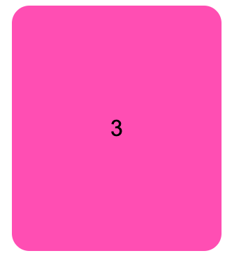
Box-radius element changes the shape of the button by making corners round.
  <!--button 3-->
  <button class="b2">3</button>
  .b2{:
    border-radius: 25px;
      :
It depends on the pixels you assign.The more the pixels, More the curve . Eventually, the button turns into circle.
HOVERED BUTTON FADING AND CHANGING ITS COLOR TOO
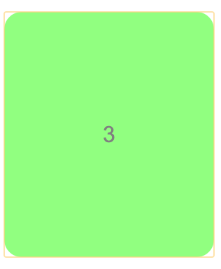
Try hovering on the button.You see that the color of button changes and it fades too, just like the above display.
It is due to another pseudoclass called b2:hover .What Hover does is that when you move your cursor over the button, it reacts. opacity in the pseudoclass causes fading.
.b2:hover{
    opacity: 0.5;
    background-color: lawngreen;

}
OPACITY
- No units like px,dm,dp required.
- 0-1 is the range.
BUTTON ROTATED AND ITS SIZE DECREASED
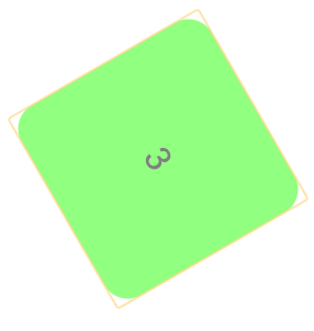
Now on clicking, the button rotates by 60 degrees and also decreases in size.It's possible due to :active pseudoclass we had discussed earlier.You can generally change the size of the button when it's clicked or is hovered on.
.b2:active{
   height: 200px;
   width: 200px;
       }
But what about it rotating? It's completely new!
Through transform It is possible.You can choose animations you would like to add.
TRANSFORM
- Rotation is one such animation you can perform using transform.
- Rotation is usually is in degrees hence it's from 0-360 degrees.
- You can do many different animations using transform.
We have seen in how many different ways a button could be styled.
Suppose,There is a horizontal group of 4 buttons with emojis of animals inside.Defining and styling them is left as a small exercise for you all.
After going through so many examples, this would be definitely easy .
HINT:Use div tags
We can declare buttons using input tag too.Button is one of the several types of input.
<input type="button" value="text-inside">
But input button is slightly different.What is the difference between them?🧐
The input type doesnt permit content.For purposes like directing to other webpages, if you want to add some description then button is suited.For submission,reset,input purpose input tag of button type is preferrable.You can choose to insert other tags like link , img which is not possible with input tag.
<input type="button" value="input-type" class="input1">
<style>
.input1{
    height: 300px;
    width: 300px;
    background-color: sandybrown;
    color: seagreen;
    box-shadow: 0 8px 16px 0 rebeccapurple,0 17px 50px 0 yellow,0 18px 70px 0 orangered;
}
INPUT BUTTON
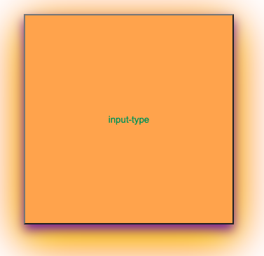
You can notice in the syntax and the code that content is not permitted. We use value instead.
.input1:hover{
    height: 200px;
    width: 200px;
    box-shadow: 0 8px 16px 0 yellow,0 17px 50px 0 cyan,0 18px 70px 0 orangered;
    background-color: darkturquoise;
</style>
<script>
                const button=document.querySelector('.input1');
                button.addEventListener("click",function(){
                    alert('hi there!');
                })
            </script>


<!--input button-->
<!-- on embedded webpage as "input-type"-->
}
Javascript has been used for producing pop-up message you see on clicking the input-type button.
CLICKED INPUT BUTTON TRIGGERS AN ALERT ALONG WITH COLOR CHANGE
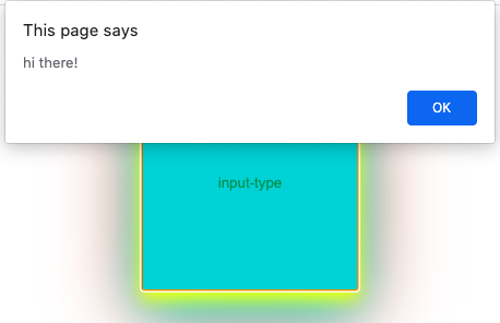
Javascript listens to event occurring and performs required actions.In this case it releases Alert-message called hi-there.
Run the code and see to understand what exactly goes on.
Well We have seen in this article at OpenGenus, in buttons, you can do so many things in so many ways! That is how interesting styling buttons can be.
ThankYou!Happy Coding!