
Get this book -> Problems on Array: For Interviews and Competitive Programming
Reading time: 20 minutes | Coding time: 10 minutes
The viewport is the area of a web page which is visible to the user. It is not fixed in size, and varies with the size of the screen of different devices. The viewport of smartphones will be smaller than that of laptops.
Earlier, web pages were visited only on computer/laptop, so it was common for web pages to have static design and fixed size. However, once we started using smaller sized screens, these web pages were too big to be shown on them. Thus, the web pages were scaled down to the size of the device. This was not a perfect solution, but a quick fix.
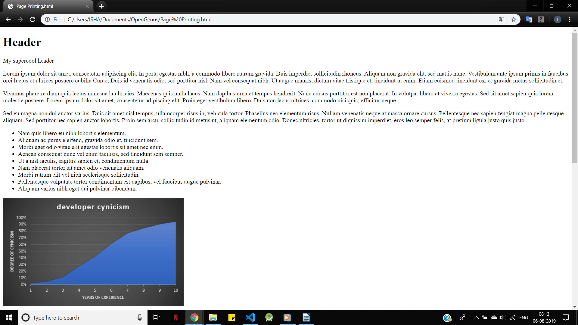
A webpage on a laptop:
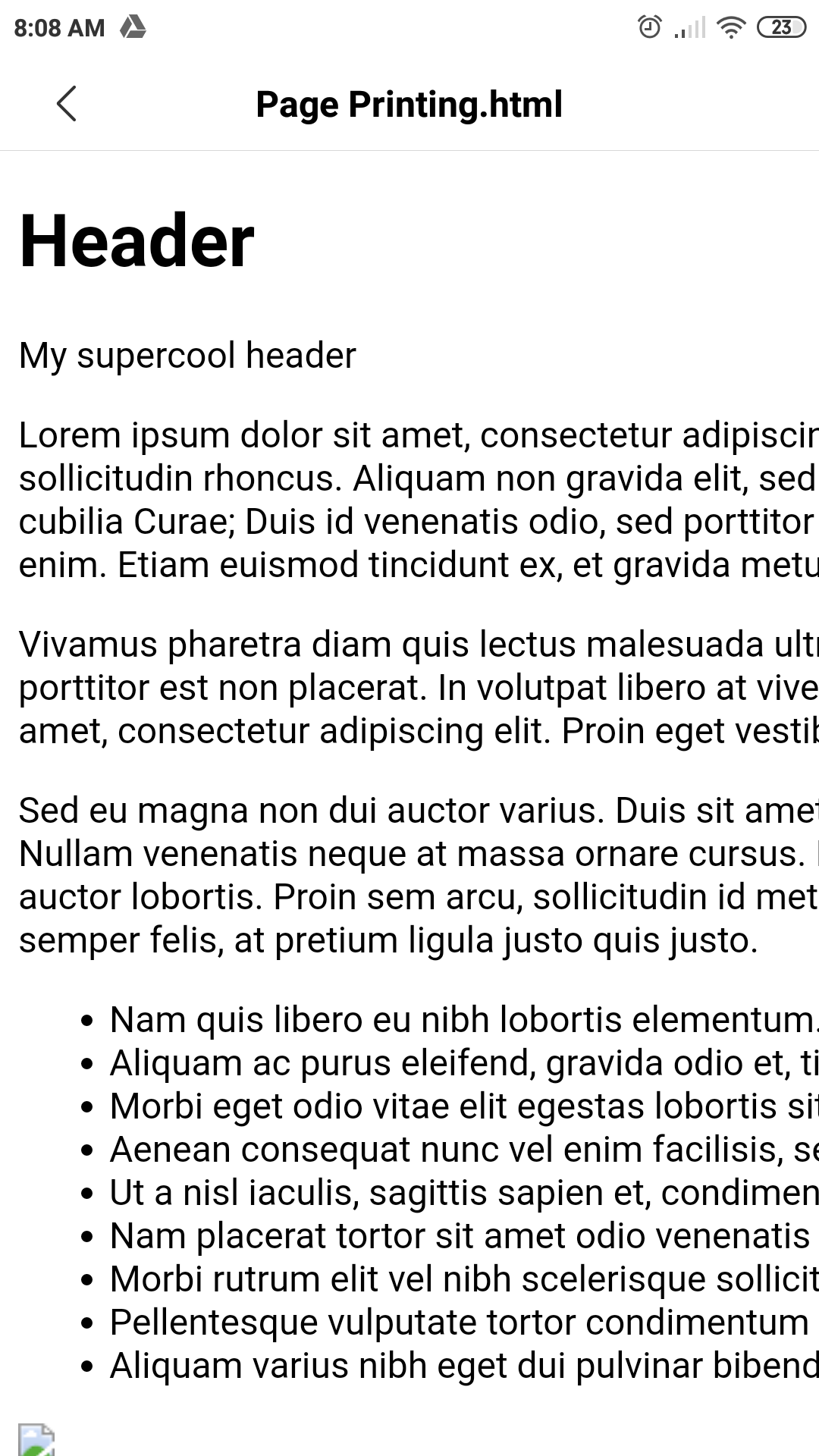
The webpage on a smartphone without meta tag:
See how the sentences are cut in-between and hence, reading is difficult
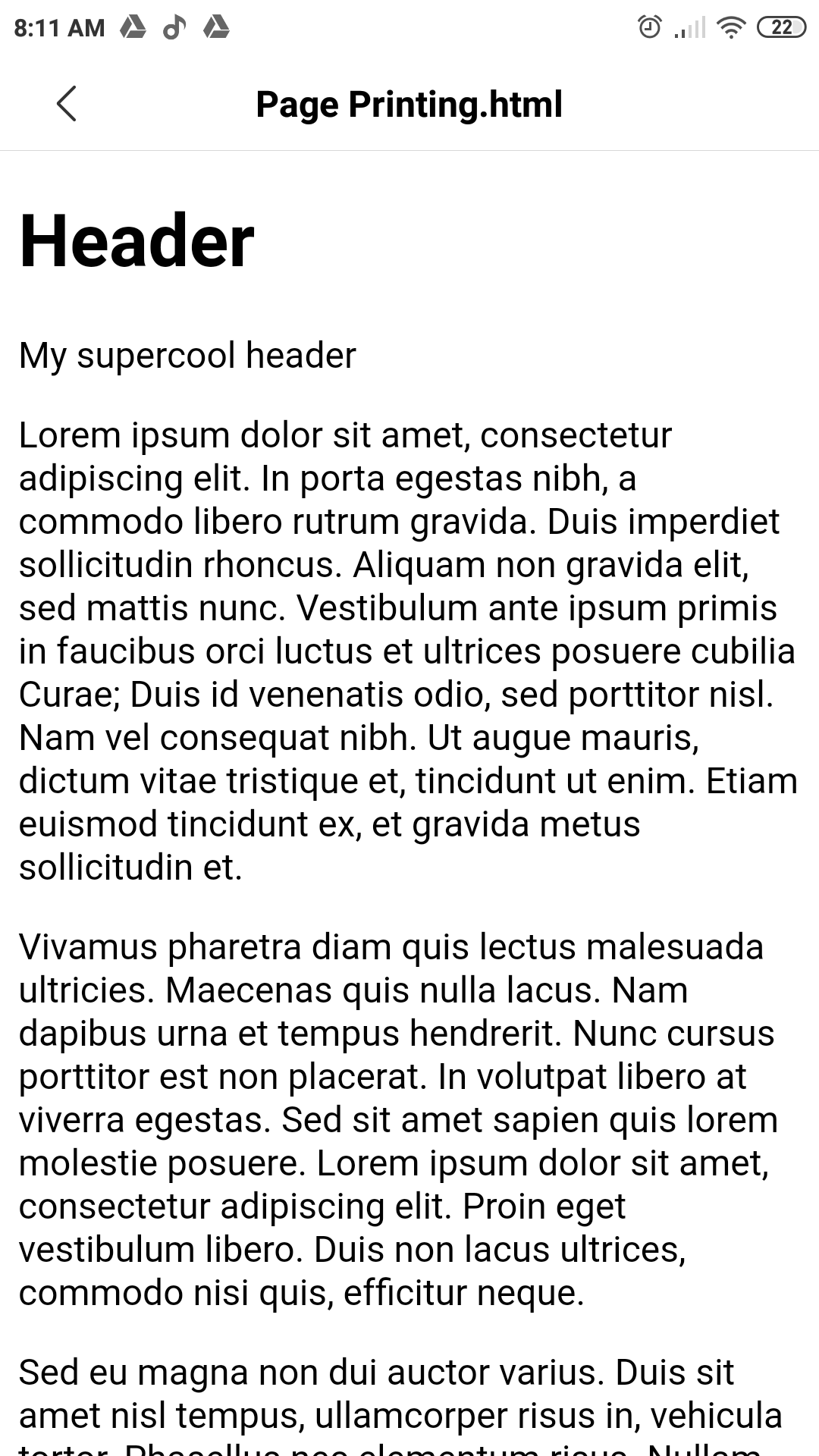
The same webpage on a smartphone with a meta tag:
How to Set the Viewport?
HTML5 introduced the <meta> viewport element should be added to all web pages, in the <head> section of the HTML code:
<!DOCTYPE html>
<head>
    <meta name="viewport" content="width=device-width, initial-scale=1.0">
</head>
The width=device-width part sets the width of the web page to follow the screen-width of the device.
The initial-scale=1.0 part sets the initial zoom of the web page to 1.0.
This tag has the following attributes:
- width: width of the viewport of the device.
- height: height of the viewport of the device.
- initial-scale: Zoom-level when the page is first visited.
- minimum-scale: Minimum zoom-level to which a user can zoom.
- maximum-scale: maximum zoom level to which a user can zoom
- user-scalable: flag which allows the device to zoom in or out.(value= yes/no).
Additional Rules
Let's take the example of the following piece of code:
<!DOCTYPE html>
<head>
<meta name="viewport" content="width=device-width, initial-scale=1.0">
</head>
<body>
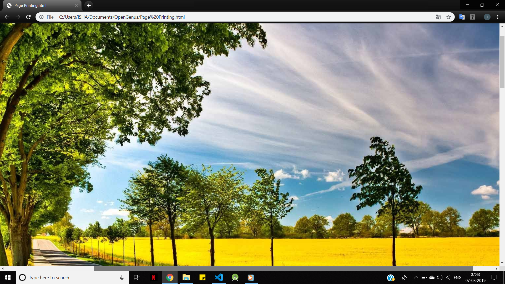
<img src="https://wallpaperplay.com/walls/full/e/8/5/205607.jpg">
</body>
</html>
Users are used to scroll the web-pages vertically and not horizontally. So if the user has to scroll horizontally, it leads to poor user experience.
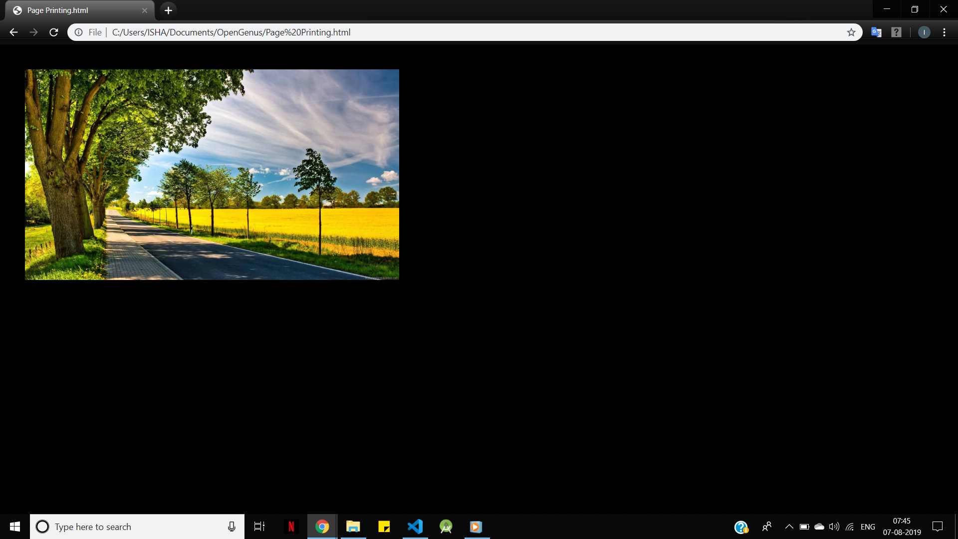
- Do not use large elements with fixed width, as the user would need to scroll horizontally to see them. In the above example, this is exactly what is happening, since the image is large, and has not been adjusted to fit the viewport:
- Do not let the content rely on a particular view. Instead of using absolute values like
width=60for properties like width and height, use relative values likewidth=100%.
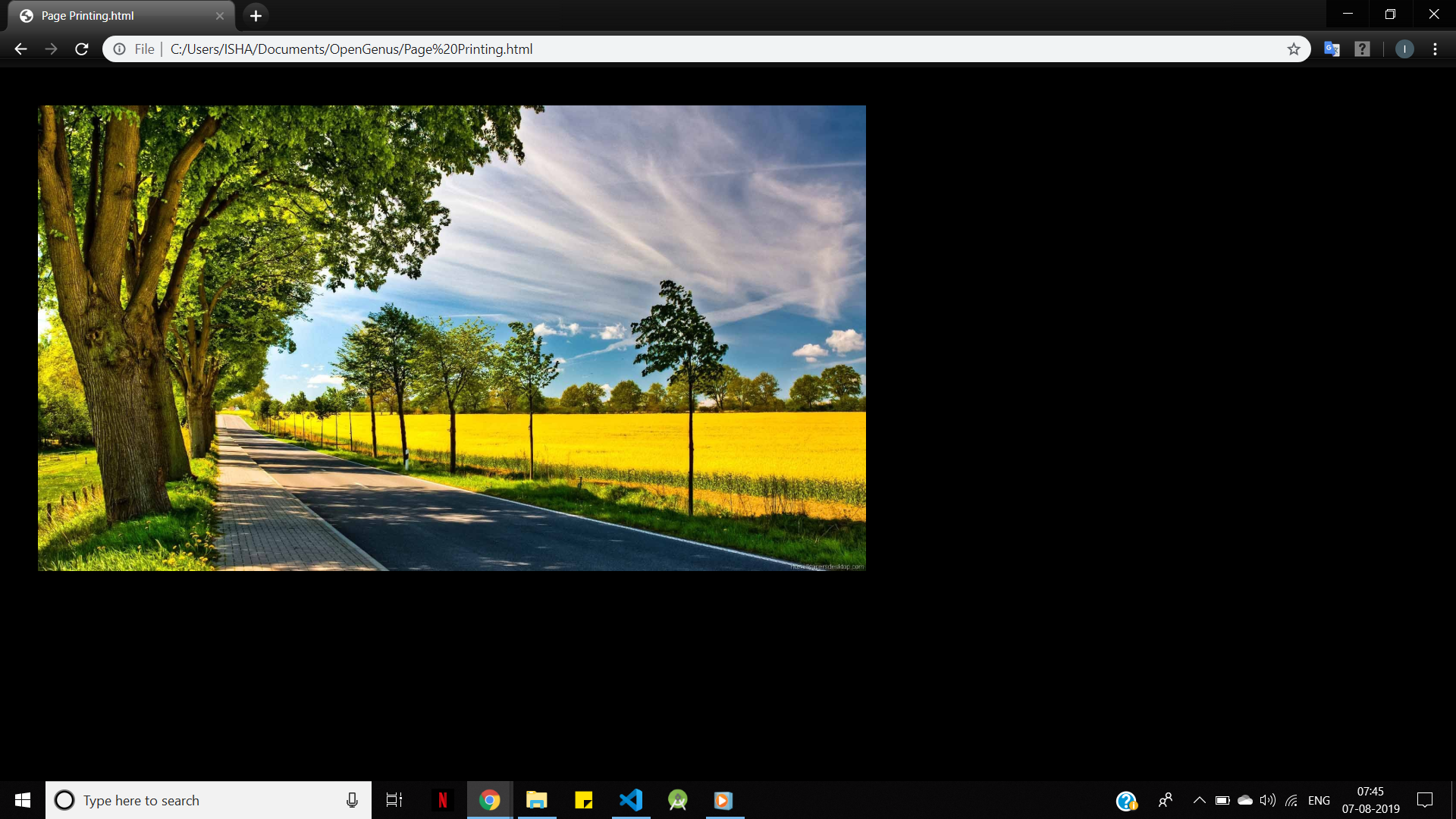
After addingwidth="600"in the<img>tag in the above piece of code:
After adding width="60%" in the <img> tag in the above piece of code: