
In this article, we have covered Clearfix in Bootstrap in depth. It is an alternative to Canvas. Clearfix is a straightforward way for removing the floating of an element in a container that is linked to its child element without the need of any additional markup.
Table of contents:
- Introduction to Bootstrap + Clearfix
- Is Clearfix on its way out?
- Compatibility with Browsers
Introduction to Bootstrap + Clearfix
When we're drawing the next layout for our new project, we never have enough power in our expressive means and more flexibility, because there's always a bold appearance notion or two we leave behind to try to adopt. However, until we find a means to truly implement this wonderful idea we had while the project was still drawn on a sheet of paper, we'll have the impression that something isn't quite finished. That's how ingenious workarounds like the Clearfix plugin come to life, providing perhaps not the ideal answers all of the time, but nevertheless functional solutions that enable us achieve what we had in mind.
One of the most popular frameworks for creating websites and applications is Bootstrap. It allows you to apply the same layout settings throughout your design thanks to the framework's preset classes and themes. You can speed up your work with bootstrap while keeping the coherence of the elements used.
Bootstrap comes with a number of auxiliary classes that each serve a specific purpose. Helpers are a type of bootstrap class that allows for rapid modification. These classes are designed to serve a single purpose and reduce the number of CSS rules that are repeated. The framework was created to promote optimal coding practices with the concept of DRY (Don't Repeat Yourself) and naming conventions or methodologies that are in principle comparable to BEM (Block Element Modifier) and OOCSS (Object Oriented CSS), making your CSS code more maintainable. The ultimate purpose of bootstrap is to accelerate development as much as possible while avoiding total re-invention.
Bootstrap 5 has built-in classes for making an element float. You can make your components float left (start) or right (end) by simply adding the.float-start or.float-end classes to a div. Of course, you may use alternative responsive floats for each value dependent on the current viewport size. Keep in mind, however, that both classes use the!important modifier to avoid issues with specificity.
The following are all of the float support classes:
<ul>
    <li>.float-start</li>
    <li>.float-end</li>
    <li>.float-none</li>
    <li>.float-sm-start</li>
    <li>.float-sm-end</li>
    <li>.float-sm-none</li>
    <li>.float-md-start</li>
    <li>.float-md-end</li>
    <li>.float-md-none</li>
    <li>.float-lg-start</li>
    <li>.float-lg-end</li>
    <li>.float-lg-none</li>
    <li>.float-xl-start</li>
    <li>.float-xl-end</li>
    <li>.float-xl-none</li>
    <li>.float-xxl-start</li>
    <li>.float-xxl-end</li>
    <li>.float-xxl-none</li>
</ul>
Example:
Let's look at a simple example of floating components to better grasp what a clearfix is for.
<div class="wrapper">
    <div class="float-start">
        FLOATED LEFT ELEMENT
    </div>
    <div class="float-end">
        FLOATED RIGHT ELEMENT
    </div>
</div>
We have a div tag with the class .wrapper and two div tags with the class within it, as you can see in the markup above. Float-start and .float-end will float the items on the left (start) and right (end) sides, respectively.
The output in the browser should look like this, with some custom CSS applied for demonstrative purposes:
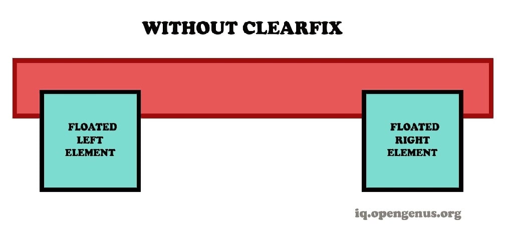
The wrapping div element would not span over the two div tags without the clearfix, resulting in a broken layout.
Let's try adding a .clearfix class to our .wrapper div tag using the same syntax as before:
 <div class="wrapper clearfix">
 <div class="float-start">
     FLOATED LEFT ELEMENT
 </div>
 <div class="float-end">
     FLOATED RIGHT ELEMENT
 </div>
</div>
The outcome in the browser should appear like this after adding the .clearfix class:
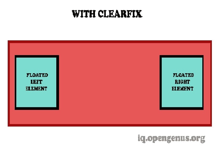
Clearfix is a straightforward way for removing the floating of an element in a container that is linked to its child element without the need of any additional markup. The parent row is clearfixed, and all of the Bootstrap 5 columns are floated to the left. As a result, each column follows the next, and the row does not overlap neighboring rows.
Helper classes and vendor's mixins in Bootstrap 5 provide cross-browser compatibility. Helpers are Bootstrap classes that allow developers to achieve certain modifications without having to add additional markup or CSS rules. Furthermore, these classes are designed to serve a specific purpose in a certain context while reducing the number of CSS rules that are repeated.
Depending on the browser and use case, there are several ways to perform clearfix. To achieve a perfect cross-browser clear-fix, one only needs to understand how to use the clear property in CSS and how floats render in each browser.
Is Clearfix on its way out?
The clearfix is losing some significance these days, over 15 years after it was initially presented. CSS Grid and Flexbox are bridging the gap for sophisticated web layout. Rachel Andrew published a post on her blog in January 2017 titled "The End of the Clearfix Hack?" She explains how to use a new display mode rule called flow-root to replace the clearfix hack with a single line of code.
When we use display: flow-root on the container element, we create a new block formatting context for the element with flow layout formatting, which solves our overflowing problems much more cleanly.
Example:
.box {
    display: flow-root;
    padding: 1rem;
    background: rgba(255, 213, 70, 0.1);
    border-bottom: 2px solid rgba(236, 198, 48, 0.2);
}
<div class="box">
<img class="corky" src="Corky.svg" width="210"
height="130" alt="Corky!">
Lorem ipsum dolor sit amet, consectetur adipiscing elit...
</div>
We're getting close to the point when clearfix won't be needed at all.
There are many ways to construct a grid these days, even if you don't have flow-root. There would be no incentive to learn about it if you were just getting started on the internet. That's excellent news! It was always intended to be a workaround to make the best of what was available. The irony is that we wouldn't have the tools today to never have to rely on the clearfix if it hadn't been for the developers' devotion and effort over many years.
Compatibility with Browsers
- Google Chrome
Flow-root is incompatible with Chrome browsers 4 to 57. This browser property is supported in Chrome versions 58 to 67.
- Mozilla Firefox
From Mozilla Firefox 2 to Mozilla Firefox 52, this browser property is incompatible. This web element is compatible with Mozilla Firefox versions 53 to 60.
- Internet Explorer
This browser element is not supported by the Internet Explorer browser.
- Safari
Display: flow-root is supported in Safari versions 3.1 through 6.
- Microsoft Edge
Microsoft Edge browser does not support the flow-root element.
- Opera
This property is not supported by the Opera browser from version 10.1 to version 44. Display:flow-root is compatible with Opera browser versions 45 through 53.
With this article at OpenGenus, you must have the complete idea of Clearfix in Bootstrap.