
Reading time: 40 minutes
Fonts are very important as it gives a different learning experience. Today, Computers have different fonts due to the contribution of Steve Jobs which gave Apple its first advantage over competitors like Microsoft. When building a web page in HTML, we need to consider various factors such as screen size to provide the best fonts in the perfect format.
To do so, we have a CSS property named font-family. It is used to specify the font type. In HTML, we have the font tag to handle several basic property like size and color.
A basic syntax to use the font tag is:
<font size="3" color="red">This is some text!</font>
<font size="2" color="blue">This is some text!</font>
<font face="verdana" color="green">This is some text!</font>
And the above 3 lines will look like this:
This is some text!
This is some text!
This is some text!
Another way to do it is by using the font-family CSS property as shown below:
<p style="font-family: times, serif; font-size:14pt; font-style:italic">
Sample text formatted with inline CSS.
</p>
Sample text formatted with inline CSS.
In CSS, we can use font as:
p.b {
  font: italic bold 12px/30px Georgia, serif;
}
Properties
Here are some properties in relation with CSS-
- font-style: Specifies the style. Examples are normal, italic, oblique.
<html>
    <head>
        <style>
        p {
          font-style: oblique
        }
        </style>
    </head>
    <body>
        <p>This line is in oblique.</p>
    </body>
</html>

- font-variant: Specifies the type of variant. It can be normal or small caps.
<html>
    <head>
        <style>
            p {
              font-variant: small-caps
            }
        </style>
    </head>
    <body>
        <p>This line is has font variant in small caps.</p>
    </body>
</html>

- font-weight: Specifies the weight of the font. It can be normal, bold, light. Multiples of 100 can also be used to set the weight, with 100 being the lightest and 900 being the most bold.
<html>
    <head>
        <style>
            p {
              font-weight: 800
            }
        </style>
    </head>
    <body>
        <p>This line has font weight of 800.</p>
    </body>
</html>

- font-size/line-height: Specifies the font size and the line-height. Multiple sizes like small, medium, large and its variants can be used to define the size.
<html>
    <head>
        <style>
            p {
              font-size: x-large
            }
        </style>
    </head>
    <body>
        <p>This line has size of x-large.</p>
    </body>
</html>

- font-family: Specifies the font design to be used. Examples are serif, arial, helvetica, etc.
<html>
    <head>
        <style>
            p {
              font-family: arial
            }
        </style>
    </head>
    <body>
        <p>This line is in Arial.</p>
    </body>
</html>

Font Size should be responsive
Having the same font size on screens of different size like a desktop screen and mobile screen can result in an unsmooth experience in one of the platforms. To tackle this, font size should be responsive as well.
For example, text on smaller devices like mobiles have larger font size compared to desktops.
This can be done using media query or setting viewport width to VW unit. VW unit changes the font size for every screen size while media query changes font size for particular limits.
- Media Query
The different parameters for setting media query are:
- width and height of the viewport
- width and height of the device
- orientation (is the tablet/phone in landscape or portrait mode?)
- resolution
Syntax-
@media only screen and (max-width: 600px) {
.font {
    font-size: 16px;
    }
}
@media only screen and (max-width: 900px) {
.font {
    font-size: 12px;
    }
}
- Viewport
The viewport is the window size of the browser.
1VW = 1% of viewport width. We have to define the value of VW unit using trial and error.
Syntax-
font-size: 12vw;
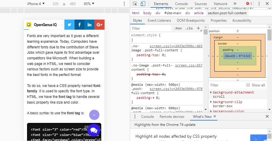
A major application of responsive font size is when resizing the text of the web page for a mobile browser. This can be achieved by using devtools provided by Google Web. Here's the steps:
- Open DevTools and then turn on Device Mode.
- Use the viewport controls to select Responsive, which puts DevTools into responsive mode.
- Open the Device Mode menu and select Show media queries to display your breakpoints as colored bars above your page.
- Click a breakpoint to change the viewport's width so that the breakpoint gets triggered.
- Use the Device Type list to simulate a mobile device or desktop device.
In this screenshot, we are viewing this article in mobile screen using devtools:
How to use Custom Fonts in an HTML page?
The default font depends on the browser and system being used. For Firefox and Chrome in Windows:
- Arial
- Times New Roman
- Courier New
are used. For Microsoft Edge in Windows, Arial, Times New Roman, Consolas are used. For Firefox and Chrome in Mac OS, Helvetica, Times Roman, Courier are used. For Safari in Mac OS, Times and Courier are used. Sometimes a font may not be supported as well. In that case we must use custom fonts which can be found on the internet.
To add a custom font, the special fonts must be downloaded in order to use them. One way to do this is through Google fonts which has a library of approximately 1000 licensed fonts that can be browsed via their interactive web directory. Because of their Developer API, Google Fonts are the easiest fonts to add to your site.
Another common way is to use font-face tag in CSS. First find the custom font you want to use on your website, and then download its TrueType Font file format (.ttf) or OpenType Font format (.otf). Then, upload your .ttf or .otf file to the Webfont Generator and then download your Web Font Kit. Next, using your FTP or file manager, upload all the font files found within your Web Font Kit to your website. Open the CSS file in a text editor and replace the existing source URL with the new URL you made by uploading each file.
Here's an example of how font-face would look in a CSS file-
@font-face {
    font-family: "CustomFont";
    src: url("CustomFont.eot");
    src: url("CustomFont.woff") format("woff"),
    url("CustomFont.otf") format("opentype"),
    url("CustomFont.svg#filename") format("svg");
}
With this, you will have the complete knowledge of using different fonts and customizing it in an HTML page. Enjoy your new knowledge.