
Get this book -> Problems on Array: For Interviews and Competitive Programming
Table of Contents:
- Introduction
- HTML Strucutre
- CSS Styling
- Javascript Interactions
- Finished Product
- Conclusion
Introduction:
In this article at OpenGenus, we will explore the process of creating an interactive gift card using HTML and CSS. The gift card features a realistic envelope that opens up to reveal a personalized message and an image. We will provide a step-by-step guide, with a focus on the CSS section, to help you understand and implement the code effectively.
HTML Structure:
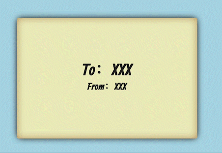
To begin, let's examine the HTML structure of our gift card. It consists of a div element with the class "envelope," which represents the entire gift card. Inside the "envelope" div, we have two main sections: the front and the back.
<div class="envelope new">
  <div class="front">

    <div class="to-from">
      <p>To:XXX</p>
      <p>From:XXX</p>
    </div>
  </div>
  <div class="back">
    <div class="letter">
      <h2>XX:</h2>
      <h3>XXXXXXX!</h3>
      <img src = "https://medibangpaint.com/wp-content/uploads/2021/08/0.png" width="50%" height = "50%">
    </div>
    <div class="flap left-flap"></div>
    <div class="flap right-flap"></div>
    <div class="flap bottom-flap"></div>
    <div class="flap top-flap"></div>
  </div>
</div>
CSS Styling:
Now, let's dive into the CSS section, where we will add styles to create the desired visual effects and animations.
- Fonts and Keyframes:
We start by importing the required fonts using the @import rule. In our case, we are using the "Allan" font with varying weights. Next, we define several keyframes that will be used for different animations throughout the interaction. Those keyframes will be very important since they will explain the different state of the giftcard. We will also explain those keyframes related to different sections of the letter closer in later parts of this tutorial.
@import url(https://fonts.googleapis.com/css?family=Allan:700,400);
@keyframes new {
  0% {
    left: 0%;
    margin-left: -550px;
  }
  100% {
    left: 50%;
    margin-left: -275px;
  }
}
@keyframes open {
  0% {
    transform: translate3d(0, 0, 0) rotateY(0);
  }
  33.333% {
    transform: translate3d(-100%, 0, 0) rotateY(-180deg);
  }
  66.666% {
    transform: translate3d(-100%, 0, 0) rotateY(-180deg);
  }
  100% {
    transform: translate3d(-100%, 733.33333px, 0) rotateY(-180deg);
  }
}
@keyframes flap-open {
  0% {
    transform: rotateX(0deg);
    z-index: 5;
  }
  50% {
    transform: rotateX(0deg);
    z-index: 5;
  }
  100% {
    transform: rotateX(-180deg);
    z-index: -1;
  }
}
@keyframes letter-out {
  0% {
    transform: translate3d(0, 0, 0);
    box-shadow: inset 0 0px 30px -5px #b08c5b, 0 0 10px -5px;
  }
  100% {
    transform: translate3d(0, -733.33333px, 0);
    box-shadow: inset 0 0px 30px -5px #a87e50, 0 0 20px -5px;
  }
}
@keyframes send {
  0% {
    transform: translate3d(-100%, 733.33333px, 0) rotateY(-180deg);
    left: 50%;
    margin-left: -275px;
  }
  25% {
    transform: translate3d(-100%, 0, 0) rotateY(-180deg);
    left: 50%;
    margin-left: -275px;
  }
  50% {
    transform: translate3d(-100%, 0, 0) rotateY(-180deg);
    left: 50%;
    margin-left: -275px;
  }
  75% {
    transform: translate3d(0, 0, 0) rotateY(0deg);
    left: 50%;
    margin-left: -275px;
  }
  100% {
    transform: translate3d(0, 0, 0) rotateY(0deg);
    left: 100%;
    margin-left: 20px;
  }
}
@keyframes flap-close {
  0% {
    transform: rotateX(-180deg);
    z-index: -1;
  }
  50% {
    transform: rotateX(0deg);
    z-index: 5;
  }
  100% {
    transform: rotateX(0deg);
    z-index: 5;
  }
}
@keyframes letter-in {
  0% {
    transform: translate3d(0, -733.33333px, 0);
    box-shadow: inset 0 0px 30px -5px #a87e50, 0 0 20px -5px;
  }
  100% {
    transform: translate3d(0, 0, 0);
    box-shadow: inset 0 0px 30px -5px #b08c5b, 0 0 10px -5px;
  }
}
- Body and Envelope Styles:
We set the body and HTML elements to take up the full width and height of the viewport. We apply a light blue background color to the body. The envelope is positioned absolutely at the center of the page using a combination of negative margins and translate transforms. It is also given a perspective value to create a 3D effect.
body, html {
  width: 100%;
  height: 100%;
}

body {
  margin: 0;
  background-color: lightblue;
  position: relative;
  perspective: 800px;
  overflow: hidden;
}

.envelope {
  z-index: 2;
  position: absolute;
  width: 550px;
  height: 366.66667px;
  top: 50%;
  left: 50%;
  margin-top: -183.33333px;
  margin-left: -275px;
  transform-style: preserve-3d;
  transform-origin: right center;
  transition: transform 1s ease;
  font-family: "Allan", sans-serif;
  color: #1F1F1F;
}
- Front and Back Styles:
The front and back sections of the envelope are styled using the .front and .back classes, respectively. They have a fixed width and height, a background color, and rounded corners. The front section is set to be clickable and has a table-like display to center its contents.
We will intialize the front and back with a rectangle but also with edges around them. We will use box-shadown here as well to create the shadowing for the envolope edges and also the flap edges. The edges with shadowing will make the envolope look more 3d like. We will style the back and the front of the envolope differently since the back needs the flaps.
.envelope .front, .envelope .back {
  position: absolute;
  width: 100%;
  height: 100%;
  background-color: #EDEDBF;
  border-radius: 5px;
  box-shadow: inset 0 0 30px -5px #a87e50, 0 0 20px -5px;
}
.envelope .front {
  backface-visibility: hidden;
  cursor: pointer;
  display: table;
  transform: translate3d(0, 0, 1px);
}
.envelope .front:focus {
  outline: none;
}

.envelope .front .to-from {
  transform: translate3d(0, 0, 1px);
  text-align: center;
  display: table-cell;
  vertical-align: middle;
}
.envelope .front .to-from p {
  font-weight: bold;
  margin: 0;
}
.envelope .front .to-from p:first-child {
  font-size: 50px;
  line-height: 50px;
}
.envelope .front .to-from p:last-child {
  font-size: 30px;
}
.envelope .back {
  transform: rotateY(180deg) translate3d(0, 0, 1px);
}
.envelope .back .flap {
  position: absolute;
  width: 100%;
  height: 100%;
  overflow: hidden;
}
.envelope .back .flap:before {
  content: "";
  position: absolute;
  background-color: #EDEDBF;
  box-shadow: inset 0 0 30px -7px #a87e50;
}
.envelope .back .top-flap:before, .envelope .back .bottom-flap:before {
  width: 388.90873px;
  height: 388.90873px;
}
.envelope .back .top-flap {
  z-index: 5;
  transform-origin: top center;
}
.envelope .back .top-flap:before {
  transform-origin: top left;
  transform: rotate(-45deg);
  border-bottom-left-radius: 50px;
  border-top-left-radius: 10px;
  border-bottom-right-radius: 10px;
}
.envelope .back .bottom-flap {
  z-index: 4;
}
.envelope .back .bottom-flap:before {
  transform-origin: left bottom;
  transform: rotate(45deg) translate(-15px, -15px);
  border-top-left-radius: 100px;
  border-bottom-left-radius: 10px;
  border-top-right-radius: 10px;
}
.envelope .back .left-flap:before, .envelope .back .right-flap:before {
  width: 269.27249px;
  height: 269.27249px;
  top: -5px;
}
.envelope .back .left-flap {
  z-index: 3;
}
.envelope .back .left-flap:before {
  transform-origin: top left;
  transform: rotate(45deg);
  border-top-left-radius: 20px;
  border-bottom-right-radius: 30px;
  border-top-right-radius: 5px;
}
.envelope .back .right-flap {
  z-index: 2;
}
.envelope .back .right-flap:before {
  right: 0;
  transform-origin: top right;
  transform: rotate(-45deg);
  border-top-right-radius: 20px;
  border-bottom-left-radius: 30px;
  border-top-left-radius: 5px;
}
.envelope .back .letter {
  z-index: 1;
  position: absolute;
  top: 5px;
  left: 10px;
  width: 530px;
  height: 346.66667px;
  background-color: #F2F2CF;
  border-radius: 5px;
  padding: 0 4%;
  box-sizing: border-box;
  box-shadow: inset 0 0px 30px -5px #B08C5B, 0 0 10px -5px;
}
.envelope .back .letter div {
  position: relative;
  margin-top: 25px;
}
.envelope .back .letter label {
  position: absolute;
  font-size: 16px;
  line-height: 20px;
  opacity: 0;
  top: -15px;
  transition: all 0.1s linear;
  color: #ADADAD;
}
.envelope .back .letter label.show {
  opacity: 1;
  top: -18px;
}
.envelope .back .letter label.focus {
  color: inherit;
}
.envelope .back .letter ::placeholder {
  color: #ADADAD;
}
.envelope .back .letter input[type='text'], .envelope .back .letter textarea {
  border: none;
  box-sizing: border-box;
  width: 100%;
  padding: 5px;
  margin: 0;
  background-color: #F6F6DF;
}
.envelope .back .letter input:focus, .envelope .back .letter textarea:focus {
  outline: none;
}
.envelope .back .letter input, .envelope .back .letter textarea {
  font-family: "Allan", sans-serif;
  font-size: 20px;
}
.envelope .back .letter input[type='text'] {
  height: 33px;
}
.envelope .back .letter input[type='submit'] {
  font-weight: bold;
  cursor: pointer;
  border: none;
  border-radius: 2px;
  padding: 5px 20px;
  background-color: #e7e1bc;
  margin: 0;
  -webkit-transition: all 0.1s linear;
  transition: all 0.1s linear;
}
.envelope .back .letter input[type='submit']:hover {
  background-color: #DCD0AA;
}
.envelope .back .letter textarea {
  resize: none;
  height: 117.66667px;
}
- Flap Styles:
The flaps of the envelope are created using the .flap class. They are positioned absolutely and have a pseudo-element (:before) to create the triangular shape. Each flap has its own animation, transform origin, and border radius to achieve the folding effect when the envelope opens.
We want to implement the flap style so that it opens up. In the animation where we try to open up the flap, we need to rotate the flap and make its z index lower so that it moves out of the way of the actual letter. Once that happens we will have the key frame letter out and send where we will show our letter. Finally we implement the flap-close state where it is the static state without any interaction. We will leave the cover over the letter and have it just sit there.
@keyframes flap-open {
  0% {
    transform: rotateX(0deg);
    z-index: 5;
  }
  50% {
    transform: rotateX(0deg);
    z-index: 5;
  }
  100% {
    transform: rotateX(-180deg);
    z-index: -1;
  }
}
@keyframes letter-out {
  0% {
    transform: translate3d(0, 0, 0);
    box-shadow: inset 0 0px 30px -5px #b08c5b, 0 0 10px -5px;
  }
  100% {
    transform: translate3d(0, -733.33333px, 0);
    box-shadow: inset 0 0px 30px -5px #a87e50, 0 0 20px -5px;
  }
}
@keyframes send {
  0% {
    transform: translate3d(-100%, 733.33333px, 0) rotateY(-180deg);
    left: 50%;
    margin-left: -275px;
  }
  25% {
    transform: translate3d(-100%, 0, 0) rotateY(-180deg);
    left: 50%;
    margin-left: -275px;
  }
  50% {
    transform: translate3d(-100%, 0, 0) rotateY(-180deg);
    left: 50%;
    margin-left: -275px;
  }
  75% {
    transform: translate3d(0, 0, 0) rotateY(0deg);
    left: 50%;
    margin-left: -275px;
  }
  100% {
    transform: translate3d(0, 0, 0) rotateY(0deg);
    left: 100%;
    margin-left: 20px;
  }
}
@keyframes flap-close {
  0% {
    transform: rotateX(-180deg);
    z-index: -1;
  }
  50% {
    transform: rotateX(0deg);
    z-index: 5;
  }
  100% {
    transform: rotateX(0deg);
    z-index: 5;
  }
}
- Letter Styles:
The letter section inside the envelope's back is styled using the .letter class. It has a background color, rounded corners, and box-shadow to simulate a paper-like appearance. The content is vertically centered using a combination of relative positioning and margin. The input fields and textarea are styled to have no borders and a background color similar to the envelope.
The letter style is pretty standard since it is static and no aninmations need to be done on it. However, we need to make sure that it is positioned so that at the static phase, the letter is not shown to the audience. Only the envelope is shown. The styling for the letter is similar to the envolope. We need to make sure the edges are round and we also need to make sure that there are shadows on the edges so it looks more 3d like.
.envelope .back .letter {
  z-index: 1;
  position: absolute;
  top: 5px;
  left: 10px;
  width: 530px;
  height: 346.66667px;
  background-color: #F2F2CF;
  border-radius: 5px;
  padding: 0 4%;
  box-sizing: border-box;
  box-shadow: inset 0 0px 30px -5px #B08C5B, 0 0 10px -5px;
}
.envelope .back .letter div {
  position: relative;
  margin-top: 25px;
}
.envelope .back .letter label {
  position: absolute;
  font-size: 16px;
  line-height: 20px;
  opacity: 0;
  top: -15px;
  transition: all 0.1s linear;
  color: #ADADAD;
}
.envelope .back .letter label.show {
  opacity: 1;
  top: -18px;
}
.envelope .back .letter label.focus {
  color: inherit;
}
.envelope .back .letter ::placeholder {
  color: #ADADAD;
}
.envelope .back .letter input[type='text'], .envelope .back .letter textarea {
  border: none;
  box-sizing: border-box;
  width: 100%;
  padding: 5px;
  margin: 0;
  background-color: #F6F6DF;
}
.envelope .back .letter input:focus, .envelope .back .letter textarea:focus {
  outline: none;
}
.envelope .back .letter input, .envelope .back .letter textarea {
  font-family: "Allan", sans-serif;
  font-size: 20px;
}
.envelope .back .letter input[type='text'] {
  height: 33px;
}
.envelope .back .letter input[type='submit'] {
  font-weight: bold;
  cursor: pointer;
  border: none;
  border-radius: 2px;
  padding: 5px 20px;
  background-color: #e7e1bc;
  margin: 0;
  -webkit-transition: all 0.1s linear;
  transition: all 0.1s linear;
}
.envelope .back .letter input[type='submit']:hover {
  background-color: #DCD0AA;
}
.envelope .back .letter textarea {
  resize: none;
  height: 117.66667px;
}
.envelope.new {
  animation: new 1s forwards;
}
.envelope.open {
  animation: open 3s forwards;
}
.envelope.open .top-flap {
  animation: flap-open 1s 1s forwards;
}
.envelope.open .letter {
  animation: letter-out 1s 2s forwards;
}
- Animation Classes:
We define additional classes such as .new, .open, and .send to control the animations of the envelope. These classes are added and removed dynamically using JavaScript/jQuery based on user interactions.
The animation of the interactive gift card involves several keyframes and transitions to create a realistic and engaging effect. Here's a breakdown of the animation steps:
- Opening Animation: When the page loads, the gift card starts in a closed state. The envelope div is positioned at the center of the page using negative margins and translate transforms. As the animation starts, the envelope moves from the left side of the screen to the center using the "new" keyframe. This gives the impression that the envelope is being brought into view.
- Clicking on the Envelope: When the user clicks on the front section of the envelope, an "open" animation is triggered. This animation uses the "open" keyframe to simulate the process of opening an envelope. The envelope rotates along the Y-axis and reveals the back section. The flaps of the envelope also move accordingly, creating a folding effect.
- Revealing the Letter: As the envelope opens, the letter inside slides out using the "letter-out" keyframe. This animation moves the letter from its initial position to a higher position, revealing its content. The letter has a background color and a box shadow, giving it a paper-like appearance.
Overall, the combination of these keyframes and animations creates an interactive and dynamic experience, mimicking the process of opening and closing a physical envelope to reveal a personalized message.
@keyframes new {
  0% {
    left: 0%;
    margin-left: -550px;
  }
  100% {
    left: 50%;
    margin-left: -275px;
  }
}
@keyframes open {
  0% {
    transform: translate3d(0, 0, 0) rotateY(0);
  }
  33.333% {
    transform: translate3d(-100%, 0, 0) rotateY(-180deg);
  }
  66.666% {
    transform: translate3d(-100%, 0, 0) rotateY(-180deg);
  }
  100% {
    transform: translate3d(-100%, 733.33333px, 0) rotateY(-180deg);
  }
}
@keyframes flap-open {
  0% {
    transform: rotateX(0deg);
    z-index: 5;
  }
  50% {
    transform: rotateX(0deg);
    z-index: 5;
  }
  100% {
    transform: rotateX(-180deg);
    z-index: -1;
  }
}
@keyframes letter-out {
  0% {
    transform: translate3d(0, 0, 0);
    box-shadow: inset 0 0px 30px -5px #b08c5b, 0 0 10px -5px;
  }
  100% {
    transform: translate3d(0, -733.33333px, 0);
    box-shadow: inset 0 0px 30px -5px #a87e50, 0 0 20px -5px;
  }
}
@keyframes flap-close {
  0% {
    transform: rotateX(-180deg);
    z-index: -1;
  }
  50% {
    transform: rotateX(0deg);
    z-index: 5;
  }
  100% {
    transform: rotateX(0deg);
    z-index: 5;
  }
}
@keyframes letter-in {
  0% {
    transform: translate3d(0, -733.33333px, 0);
    box-shadow: inset 0 0px 30px -5px #a87e50, 0 0 20px -5px;
  }
  100% {
    transform: translate3d(0, 0, 0);
    box-shadow: inset 0 0px 30px -5px #b08c5b, 0 0 10px -5px;
  }
}
JavaScript Interactions
The JavaScript code provided in the script tags allows the envelope to open when clicked and triggers the animation when the form is submitted. It also handles the input field animations, such as showing labels when there is input and applying focus styles.
The jquery code essentially just switches between open state and closed states when user gives an input which will be a click in our case. The jquery codes also checks and ensures that the envelope starts with the closed state.
$(function(){
  if (!$('.envelope').hasClass('open')){
    $('.envelope').click(function(){
      $(this).removeClass('new').addClass('open');
    });
  }

  $('.mailform input, .mailform textarea').on('keyup', function(){
    if(this.value !== ''){
      $(this).prev('label').addClass('show');
    } else {
      $(this).prev('label').removeClass('show');
    }
  }).on("focus",function(){
    $(this).prev("label").addClass('focus');
  }).on("blur",function(){
      $(this).prev("label").removeClass('focus');
  });

  $('.notification').find('p').last().click(function(){
  $(this).closest('.notification').prev('.envelope').removeClass('send').addClass('new');
  $(this).closest('.notification').prev('.envelope').find('.mailform')[0].reset();
    $(this).closest('.notification').prev('.envelope').find('label').removeClass('show');
  });

  $('.mailform').submit(function(event) {
    event.preventDefault();
    $(this).closest('.envelope').removeClass('open').addClass('send');
  });

});
Finished Product
Conclusion:
By following this detailed guide at OpenGenus, you can create an interactive gift card using HTML and CSS. The CSS section plays a crucial role in styling the elements, defining animations, and creating visual effects. Feel free to modify the styles and animations to match your desired design aesthetic. Have fun creating your personalized gift card experience!