
Table of Contents
- Introduction
- Approach 1
- Approach 2
- Conclusion
Introduction
In this tutorial at OpenGenus, we will explore how to create a stunning timeline using HTML, CSS, and JavaScript. Timelines are a great way to showcase events, milestones, or any chronological information in an organized and visually appealing manner. Let's dive in and build our own timeline!
Approach 1
In this approach, we will use vanilla html and css to acheive our goal of creating a timeline. We will use css to generate the structure of the graph by creating shapes. Then we will use the html to generate the text of the timeline.
Step 1: Setting Up the HTML Structure
We'll start by setting up the basic HTML structure for our timeline. Within the body tag, create a div element with a class of "timeline". Inside this div, we'll add multiple timeline items, each representing an event.
<body>
  <div class="timeline">
    <div class="timeline-item">
      <div class="date">2021</div>
      <div class="content">
        <h3>Event 1</h3>
        <p>Description of event 1.</p>
      </div>
    </div>
    <div class="timeline-item">
      <div class="date">2022</div>
      <div class="content">
        <h3>Event 2</h3>
        <p>Description of event 2.</p>
      </div>
    </div>
    <div class="timeline-item">
      <div class="date">2023</div>
      <div class="content">
        <h3>Event 3</h3>
        <p>Description of event 3.</p>
      </div>
    </div>
  </div>

</body>
Step 2: Styling the Timeline
Now, let's style our timeline using CSS. We'll position the timeline horizontally and add a horizontal line connecting the events. In the CSS section, add the necessary styles to position the timeline and draw the vertical line using the ::before pseudo-element.
Step 3: Adding Timeline Items
Each timeline item will consist of a date and content. Within the timeline div, create multiple div elements with a class of "timeline-item". Inside each item, add a div for the date and another div for the content. Feel free to add headings, paragraphs, or any other desired elements within the content div.
Step 4: Customize the Timeline
To make each event visually distinct, we can assign different colors to each timeline item. Add a custom class to each timeline item and define the background color for each class in the CSS section.
<head>
  <style>
    .timeline {
      position: relative;
      padding: 20px 0;
      display: flex;
      align-items: center;
      justify-content: center;
    }

    .timeline::before {
      content: '';
      position: absolute;
      width: 100%;
      height: 2px;
      background-color: #ccc;
      top: 50%;
      left: 0;
    }

    .timeline-item {
      position: relative;
      margin: 0 20px;
    }

    .timeline-item::before {
      content: '';
      position: absolute;
      width: 20px;
      height: 20px;
      background-color: #a93333;
      border-radius: 50%;
      top: calc(50% - 10px); /* Adjust the circle position */
      left: -10px; /* Adjust the circle position */
    }

    .timeline-item:last-child {
      margin-right: 0;
    }

    .timeline-item .date {
      font-weight: bold;
      margin-bottom: 5px;
      text-align: center;
    }

    .timeline-item .content {
      text-align: center;
    }
</head>

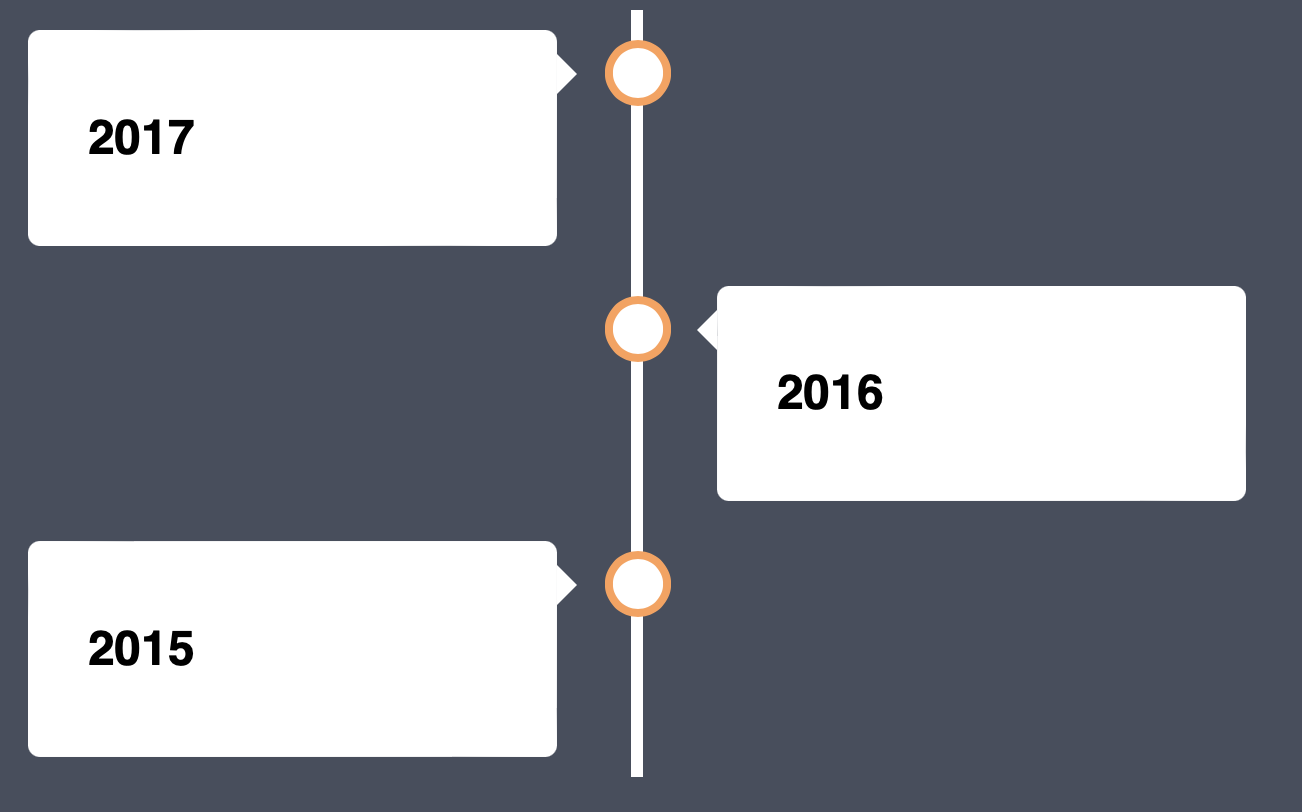
Now, we will give an alternative version of the timeline implementation. Instead of making it horizontal, we will make it vertical this time.
Step 1: Setting Up the HTML Structure
The first step is similar as we will set up the basic HTML structure for the text.
<body>

<div class="timeline">
  <div class="container left">
    <div class="content">
      <h2>Event 3</h2>

    </div>
  </div>
  <div class="container right">
    <div class="content">
      <h2>Event 2</h2>

    </div>
  </div>
  <div class="container left">
    <div class="content">
      <h2>Event 1</h2>

    </div>
  </div>
    </div>
  </div>
</div>

</body>
Step 2: Styling the timeline
We will use css to create the vertical timeline now. We'll position the timeline vertically and add a vertical line connecting the events. We will draw the line using ::before pseudo-element.
Step 3: Adding the events
Now, we will incopperate the HTML structure and move it around so that it fits the timeline and goes where it is supposed to go
* {
  box-sizing: border-box;
}

body {
  background-color: #474e5d;
  font-family: Helvetica, sans-serif;
}

/* The actual timeline (the vertical ruler) */
.timeline {
  position: relative;
  max-width: 1200px;
  margin: 0 auto;
}

/* The actual timeline (the vertical ruler) */
.timeline::after {
  content: '';
  position: absolute;
  width: 6px;
  background-color: white;
  top: 0;
  bottom: 0;
  left: 50%;
  margin-left: -3px;
}

/* Container around content */
.container {
  padding: 10px 40px;
  position: relative;
  background-color: inherit;
  width: 50%;
}

/* The circles on the timeline */
.container::after {
  content: '';
  position: absolute;
  width: 25px;
  height: 25px;
  right: -17px;
  background-color: white;
  border: 4px solid #FF9F55;
  top: 15px;
  border-radius: 50%;
  z-index: 1;
}

/* Place the container to the left */
.left {
  left: 0;
}

/* Place the container to the right */
.right {
  left: 50%;
}

/* Add arrows to the left container (pointing right) */
.left::before {
  content: " ";
  height: 0;
  position: absolute;
  top: 22px;
  width: 0;
  z-index: 1;
  right: 30px;
  border: medium solid white;
  border-width: 10px 0 10px 10px;
  border-color: transparent transparent transparent white;
}

/* Add arrows to the right container (pointing left) */
.right::before {
  content: " ";
  height: 0;
  position: absolute;
  top: 22px;
  width: 0;
  z-index: 1;
  left: 30px;
  border: medium solid white;
  border-width: 10px 10px 10px 0;
  border-color: transparent white transparent transparent;
}

/* Fix the circle for containers on the right side */
.right::after {
  left: -16px;
}

/* The actual content */
.content {
  padding: 20px 30px;
  background-color: white;
  position: relative;
  border-radius: 6px;
}

/* Media queries - Responsive timeline on screens less than 600px wide */
@media screen and (max-width: 600px) {
  /* Place the timelime to the left */
  .timeline::after {
  left: 31px;
  }

  /* Full-width containers */
  .container {
  width: 100%;
  padding-left: 70px;
  padding-right: 25px;
  }

  /* Make sure that all arrows are pointing leftwards */
  .container::before {
  left: 60px;
  border: medium solid white;
  border-width: 10px 10px 10px 0;
  border-color: transparent white transparent transparent;
  }

  /* Make sure all circles are at the same spot */
  .left::after, .right::after {
  left: 15px;
  }

  /* Make all right containers behave like the left ones */
  .right {
  left: 0%;
  }
}
Congratulations! Now, you have made the timeline vertically and horizontally using only HTML and CSS, now we will use some outside libraries in the next approach to make your life a lot easier.
Approach 2
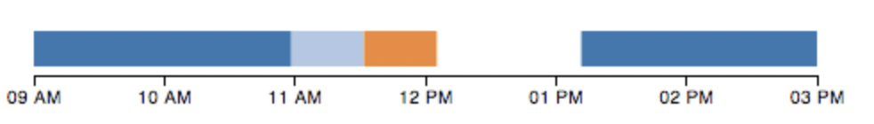
Now, we will also use library D3.js to showcase how to create a timeline
D3.js is a JavaScript library for manipulating documents based on data. D3 helps you bring data to life using HTML, SVG, and CSS. D3’s emphasis on web standards gives you the full capabilities of modern browsers without tying yourself to a proprietary framework, combining powerful visualization components and a data-driven approach to DOM manipulation.
When you are dealing with data, d3.js is very helpful
To import d3, you can simply do
<script src = "https://d3js.org/d3.v4.min.js"></script>
Suppose we have this dataset that represents the times
var testData = [
	{label: "person a", times: [
		{"starting_time": 1355752800000, "ending_time": 1355759900000},
		{"starting_time": 1355767900000, "ending_time": 1355774400000}]},
	{label: "person b", times: [
		{"starting_time": 1355759910000, "ending_time": 1355761900000}]},
	{label: "person c", times: [
		{"starting_time": 1355761910000, "ending_time": 1355763910000}]}
	];
with a simple call with the help of the library, we can create a timeline
var chart = d3.timelines();

var svg = d3.select("#timeline1").append("svg").attr("width", 500)
	.datum(testData).call(chart);
Conclusion
Congratulations! You have successfully created a beautiful timeline using HTML, CSS, and D3.js. You can further customize the styling, layout, and functionality of your timeline to suit your specific needs. Experiment with different designs, colors, and effects to make it truly unique.
Remember, timelines are versatile and can be used in various contexts such as project timelines, company milestones, personal achievements, and more. With the power of HTML, CSS, and JavaScript, you can create visually appealing and interactive timelines that effectively convey chronological information.